- Sass - Home
- Sass - Overview
- Sass - Installation
- Sass - Syntax
- Using Sass
- Sass - CSS Extensions
- Sass - Comments
- Sass - Script
- Sass - @-Rules and Directives
- Control Directives & Expressions
- Sass - Mixin Directives
- Sass - Function Directives
- Sass - Output Style
- Extending Sass
- Sass - Interview Questions
- Sass - Quick Guide
- Sass - Cheatsheet
- Sass - Useful Resources
- Sass - Discussion
Sass - Passing Content Blocks to a Mixin
Description
Block of styles is passed to the mixin for the placement inside the styles. In @content directive location, styles gets included into the mixin.
Variable Scope and Content Blocks
The block of content is evaluated in the scope, which is passed to a mixin where block is defined.
Example
The following example demonstrates the use of passing content blocks to mixin in the SCSS file −
pass_content.htm
<html>
   <head>
      <title>Mixin example of sass</title>
      <link rel = "stylesheet" type = "text/css" href = "sample.css"/>
   </head>

   <body>
      <div class = "block">
         <h1>Example using passing content blocks</h1>
         <p>Different Colors</p>
         <ul>
            <li>Red</li>
            <li>Green</li>
            <li>Blue</li>
         </ul>
      </div>
   </body>
</html>
Next, create file sample.scss.
sample.scss
@mixin element {
   @content;
}

@include element {
   .block {
      color: green;
   }
}
You can tell SASS to watch the file and update the CSS whenever SASS file changes, by using the following command −
sass --watch C:\ruby\lib\sass\sample.scss:sample.css
Next, execute the above command; it will create the sample.css file automatically with the following code −
sample.css
.block {
   color: green;
}
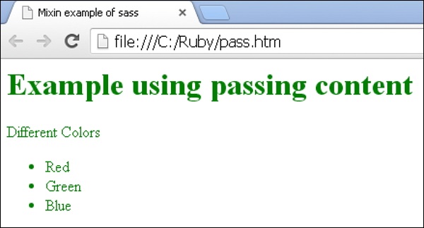
Output
Let us carry out the following steps to see how the above given code works −
Save the above given html code in pass_content.scss file.
Open this HTML file in a browser, an output is displayed as shown below.