
Article Categories
- All Categories
-
 Data Structure
-
 Networking
-
 RDBMS
RDBMS
-
 Operating System
-
 Java
Java
-
 MS Excel
-
 iOS
iOS
-
 HTML
HTML
-
 CSS
CSS
-
 Android
-
 Python
-
 C Programming
-
 C++
C++
-
 C#
C#
-
 MongoDB
-
 MySQL
MySQL
-
 Javascript
-
 PHP
PHP
-
 Economics & Finance
Using learning curves in Machine Learning Explained
Introduction
Machine learning, at its core, involves teaching computers to learn patterns and make decisions without explicit programming. It has revolutionized several industries by powering intelligent systems capable of solving complex problems. One crucial aspect of machine learning that often goes unnoticed is the concept of learning curves. These curves reflect a fundamental journey where models refine their predictive abilities over time. In this article, we will explore the intriguing world of learning curves in machine learning with creative examples and detailed explanations.
Learning Curves in Machine Learning
Learning curves are graphical representations visualizing changes in model performance as data set sizes increase or training progresses. Often depicted as plots comparing model error rates on both training and testing data against various sample sizes or iterations, they provide valuable insights into how well a model generalizes.
The Insightful Journey
Imagine embarking upon an adventure through uncharted territory?a similar analogy applies when diving into machine learning's exciting area?s intricate algorithms and methodologies.
Consider training an image classification algorithm with increasing amounts of labeled data?initially starting small but gradually progressing towards larger dataset sizes from thousands to millions of images. Throughout this journey, machines adapt to recognize patterns within the given dataset?beginning with simplicity before evolving toward greater complexity as more knowledge is gained from additional samples.
Initial Phase ? High Bias (Underfitting)
As our fictitious image classifier encounters its initial task?related challenges using only a limited number of observations (say 100 images), it will likely generalize poorly due to high bias or underfitting issues. The overly simplistic representation fails to capture critical nuances present within more substantial datasets?analogous to tentatively navigating unexplored paths yet being unable to derive accurate predictions or classifications due to inadequate information.
Mid?Phase ? Optimal Balance
Proceeding further into our expedition entails feeding the algorithm progressively larger labeled datasets comprising thousands (like 10,000) of images. At this stage, the learner strives an optimal balance between capturing intrinsic patterns and avoiding overgeneralization or excessive complexity. The model?s learning curve gradually evens out as it absorbs more knowledge?showing a convergence point where training error plateaus while testing error gradually decreases. This phase represents a significant milestone indicating good generalization capabilities in terms of handling new, unseen data.
Advanced Phase ? High Variance (Overfitting)
Venturing into the deepest parts of our machine learning odyssey unravels new challenges brought forth by highly diverse datasets comprising millions (or more) labeled images.
Approach 1: Python code ? Using learning curves in machine learning
Learning curves are an indispensable tool in any machine learning toolkit to unleash the true power of algorithmic performance.
Algorithm
Step 1 :Import the necessary libraries (scikit-learn, matplotlib).
Step 2 :Load the digits dataset using the load_digits() function from scikit?learn.
Step 3 :Assign the features and labels to X and Y respectively.
Step 4 :Generate learning curves using the learning_curve() function from scikit?learn
Use a linear kernel for the Support Vector Classifier (SVC)
Use 10?fold cross?validation
Use accuracy as the scoring metric
Vary the training size from 10% to 100%
Step 5 :Calculate mean and standard deviation of training and test scores across folds for each training size.
Step 6 :Plot mean training accuracy vs number of training examples with standard deviation shaded in (for transparency).
Step 7 :Plot mean cross?validation accuracy vs number of training examples with standard deviation shaded in (for transparency).
Step 8 :Add axis labels and plot title, Display plot.
Example
#Importing the required libraries that is load_digits, learning_curve, SVC (Support Vector Classifier), matplotlib
from sklearn.datasets import load_digits
from sklearn.model_selection import learning_curve
from sklearn.svm import SVC
import matplotlib.pyplot as plt
import numpy as np

#Loading the digits dataset and storing in digits variable
digits = load_digits()
#Storing the features to the variables
X, y = digits.data, digits.target

#The learning curve is generated using the required function
train_sizes, train_scores, test_scores = learning_curve(
#linear kernel is used for SVC
    SVC(kernel='linear'), X, y,
#cv is assigned with value 10-fold cross validation
    cv=10,
#Scoring variable is assigned to hold scoring metric
    scoring='accuracy',
#Using the parallel processing
    n_jobs=-1,
#By interchanging the training size from 10% to 100%
    train_sizes=np.linspace(0.1, 1.0, 10),
)
#To get the mean of the training scores
train_mean = np.mean(train_scores, axis=1)
#To get the standard deviation of the training scores
train_std = np.std(train_scores, axis=1)
#To get the mean test scores across folds
test_mean = np.mean(test_scores, axis=1)
#To get the standard deviation test scores across folds
test_std = np.std(test_scores, axis=1)
#It plots the graph between training accuracy vs number of training examples
plt.plot(train_sizes * len(y), train_mean,label="Training Accuracy")
#filling the area between mean and standard deviation with alpha 0.2
plt.fill_between(train_sizes * len(y), train_mean - train_std,
                 train_mean + train_std,alpha=0.2)
#It plots the graph between cross-validation accuracy vs number of training examples
plt.plot(train_sizes * len(y), test_mean,label="Cross-validation Accuracy")
# filling the area between mean and standard deviation with alpha 0.2
plt.fill_between(train_sizes * len(y), test_mean - test_std,
                 test_mean + test_std,alpha=0.2)
#Plotting the x axis with Number of training examples
plt.xlabel("Number of Training Examples")
#Plotting the y axis with accuracy
plt.ylabel("Accuracy")
#The plot with title "Learning curves: Training vs Cross-Validation Accuracy"
plt.title("Learning Curves: Training vs Cross-validation Accuracy")
#Adding the legends and displaying the output
plt.legend()
plt.show()
Output
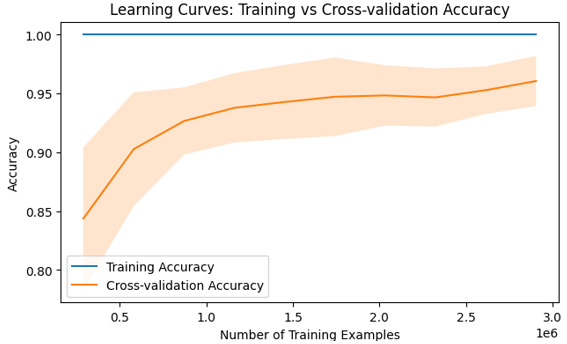
Conclusion
Understanding learning curves is crucial in machine learning as they provide insights into the performance trends of our models with varying dataset sizes or complexity levels. By visualizing the relationship between error rates and sample sizes using Python code like above, researchers can diagnose common pitfalls such as overfitting or under fitting while making informed decisions towards model optimization.

807 Views
