- Polymer - Home
- Polymer - Overview
- Polymer - Installation
- Polymer - Elements
- Polymer - Custom Elements
- Polymer - Shadow DOM and Styling
- Polymer - Events
- Polymer - Data System
Selected Reading
Polymer - Paper Button
The paper-button is a simple button that has a ripple effect from the point of contact. To get the paper-button in your directory, you should use the following command in the command prompt.
bower install --save PolymerElements/paper-button
Example
The following example specifies the use of paper-button element in Polymer.js. Create an index.html file and add the following code in it.
<!doctype html>
<html>
   <head>
      <link rel = 'import' href = 'my-app.html'>
   </head>

   <body>
      <h2>Paper-Button Example</h2>
      <my-app></my-app>
   </body>
</html>
Now, open the my-app.html file and include the following code in it.
<link rel = 'import' href = 'bower_components/polymer/polymer.html'>
<link rel = "import" href = "bower_components/paper-button/paper-button.html">
<link rel = "import" href = "bower_components/paper-styles/paper-styles.html">
<dom-module id = 'my-app'>
   <template>
      <div class = "container">
         <paper-button toggles raised class = "green">Active</paper-button>
         <paper-button disabled class = "disabled">Disabled</paper-button>
      </div>

      <div class = "container" ></div>
      <style is = "custom-style">
         #container {
            display: flex;
         }
         paper-button {
            font-family: 'Roboto', 'Noto', sans-serif;
            font-weight: normal;
            font-size: 14px;
            -webkit-font-smoothing: antialiased;
         }
         paper-button.green:hover {
            background-color: var(--paper-green-400);
         }
         paper-button.green {
            background-color: var(--paper-green-500);
            color: white;
         }
         paper-button.green[active] {
            background-color: var(--paper-red-500);
         }
         paper-button.disabled {
            color: black;
            background-color:#969696;
         }
      </style>
   </template>

   <script>
      Polymer ({
         is: 'my-app',
         ready: function() {
            this.async(function() {
            });
         }
      });
   </script>
</dom-module>
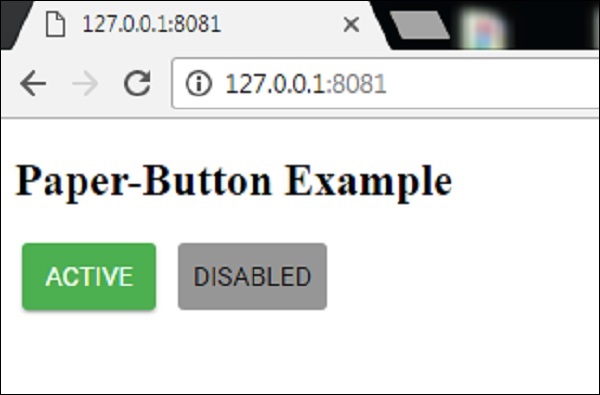
Output
To run the application, navigate to the created project directory and run the following command −
polymer serve
Now open the browser and navigate to http://127.0.0.1:8081/. Following will be the output.
polymer_elements.htm

Advertisements