- Polymer - Home
- Polymer - Overview
- Polymer - Installation
- Polymer - Elements
- Polymer - Custom Elements
- Polymer - Shadow DOM and Styling
- Polymer - Events
- Polymer - Data System
Polymer - Custom Elements
Polymer is a framework that allows creating custom elements using standard HTML elements. Custom web elements provide the following features −
It provides custom element name with associating class.
When you change the state of custom element instance, it will request the lifecycle callbacks.
If you change the attributes on an instance, then callback will be requested.
You can define the custom element using ES6 class and class can be associated with the custom element as shown in the following code.
//ElementDemo class is extending the HTMLElement
class ElementDemo extends HTMLElement {
   // code here
};

//link the new class with an element name
window.customElements.define('element-demo', ElementDemo);
The custom element can be used as a standard element as shown below −
<element-demo></element-demo>
Note − Custom element name should start with a lower case letter and contain a dash between the names.
Custom Element Lifecycle
Custom element lifecycle provides a set of custom element reactions which are responsible for change in element lifecycle and are defined in the following table.
| Sr.No. | Reactions & Description |
|---|---|
| 1 | constructor When you create an element or define the previously-created element, this element reaction will be called. |
| 2 | connectedCallback When you add an element to a document, this element reaction will be called. |
| 3 | disconnectedCallback When you remove an element from a document, this element reaction will be called. |
| 4 | attributeChangedCallback Whenever you change, append, remove, or replace an element from a document, this element reaction will be called. |
Element Upgrades
We can use custom elements before defining them by specification and any existing instances of an element will be upgraded to the custom class by adding a definition to that element.
The custom element state contains the following values −
uncustomized − The valid custom element name is either a built-in element or an unknown element, which cannot become a custom element.
undefined − The element can have a valid custom element name, but it cannot be defined.
custom − The element can have a valid custom element name, which can be defined and upgraded.
failed − Trying to upgrade the failed element of an invalid class.
Defining an Element
A custom element can be defined by creating a class which extends Polymer.Element and it passes the class to customElements.define method. The class contains is getter method that returns a HTML tag name of the custom element. For instance −
//ElementDemo class is extending the Polymer.Element
class ElementDemo extends Polymer.Element {
   static get is() { return 'element-demo'; }
   static get properties() {
      . . .
      . . .
   }
   constructor(){
      super();
      . . .
      . . .
   }
   . . .
   . . .
}

//Associate the new class with an element name
window.customElements.define(ElementDemo.is, ElementDemo);

// create an instance with createElement
var el1 = document.createElement('element-demo');
Imports and APIs
The Polymer elements can be defined by specifying the following three HTML imports −
polymer-element.html − It specifies the Polymer.Element base class.
legacy-element.html − It extends Polymer.Element using Polymer.LegacyElement base class and adds 1.x compatible legacy API. It also creates hybrid elements by defining the legacy Polymer() factory method.
polymer.html − It comprises the Polymer base classes along with helper elements, which were included in the 1.x polymer.html.
Define an Element in the Main HTML Document
You can define an element in the main HTML document using HTMLImports.whenReady() function.
Example
The following example shows how to define an element in the main HTML document. Create an index.html file and add the following code.
<!doctype html>
<html lang = "en">
   <head>
      <title>Polymer Example</title>
      <script src = "bower_components/webcomponentsjs/webcomponents-lite.js"></script>
      <link rel = "import" href = "bower_components/polymer/polymer.html">
      <link rel = "import" href = "define-element.html">
   </head>

   <body>
      <define-element></define-element>
   </body>
</html>
Now create a custom element called define-element.html and include the following code.
<dom-module id = "define-element">
   <template>
      <h2>Welcome to Tutorialspoint!!!</h2>
   </template>

   <script>
      HTMLImports.whenReady(function(){
         Polymer ({
            is: "define-element"
         })
      })
   </script>
</dom-module>
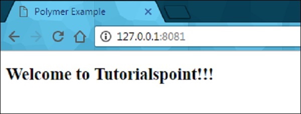
Output
To run the application, navigate to the created project directory and run the following command.
polymer serve
Now open the browser and navigate to http://127.0.0.1:8081/. Following will be the output.
Define a Legacy Element
Legacy element can be used to register an element using the Polymer function, which takes the prototype for a new element. The prototype should contain is which defines the HTML tag name for a custom element.
Example
//registering an element
ElementDemo = Polymer ({
   is: 'element-demo',

   //it is a legecy callback, called when the element has been created
   created: function() {
     this.textContent = 'Hello World!!!';
   }
});

//'createElement' is used to create an instance
var myelement1 = document.createElement('element-demo');

//use the constructor create an instance
var myelement2 = new ElementDemo();
Lifecycle Callbacks
Lifecycle callbacks are used to accomplish the tasks for built-in features of Polymer.Element class. Polymer uses ready callback, which will be invoked when Polymer completes creating and initializing DOM elements.
Following is a list of legacy callbacks in Polymer.js.
created − It is called when you create an element before setting the property values and initializing local DOM.
ready − It is called when you create an element after setting the property values and initializing local DOM.
attached − It is called after attaching the element to the document and can be called more than one time throughout the lifetime of an element.
detached − It is called after detaching the element from the document and can be called more than once throughout the lifetime of an element.
attributeChanged − It is called when there are changes in an element's attributes and it holds the attribute changes, which are not compatible with the declared properties.
Declaring Properties
The properties can be declared on an element to add default value and other specific features in the data system and they can be used to specify the following features −
It specifies the property type and default value.
It calls the observer method, when there are changes in the property value.
It specifies the read-only status to stop the unexpected changes to the property value.
It provides support for two-way data binding, which triggers an event when you change the property values.
It is a computed property, which calculates a value dynamically depending on the other properties.
It updates and reflects the corresponding attribute value, when you change the property values.
The following table shows keys for each property, which are supported by the properties object.
| Sr.No. | Key & Description | Type |
|---|---|---|
| 1 | type It deserializes from an attribute whose property type is determined using the type's constructor. |
constructor (Boolean, Date, Number, String, Array or Object) |
| 2 | value It specifies the default value for the property and if it is a function, then it uses the return value as the default value of the property. |
boolean, number, string or function. |
| 3 | reflectToAttribute If this key sets to true, then it sets the corresponding attribute on the host node. The attribute can be created as a standard HTML boolean attribute, if you set the property value as Boolean. |
boolean |
| 4 | readOnly You cannot set the property directly by assignment or data binding, if this key is set to true. |
boolean |
| 5 | notify You can use the property for two-way data binding, if this key is set to true and when you change the property, property-name-changed event will get triggered. |
boolean |
| 6 | computed You can calculate the value of an argument whenever it changes, by invoking the method and value will be simplified as method name and argument list. |
string |
| 7 | observer Invoke the method name, which is simplified by a value, when the property value changes. |
string |
Attribute Deserialization
Deserialize the property name that matches an attribute on instance according to the type specified and the same property name on the element instance, if the property is configured in the properties object.
You can set the specified type directly as the value of the property, if there are no other properties options defined in the properties object; otherwise, it will provide the value to the type key in the properties configuration object.
Configuring Boolean Properties
The Boolean property can be configured from markup, by setting it to false and if it is set to true, then you cannot configure from markup because the attribute with or without a value is equalized to true. Therefore, it is known as a standard behavior for attributes in the web platform.
The object and array properties can be configured by passing them in JSON format as −
<element-demo player = '{ "name": "Sachin", "country": "India" }'></element-demo>
Configuring Default Property Values
The default property can be configured using the value field in the properties object and it may be either primitive value, or a function which returns a value.
Example
The following example depicts how to configure the default property values in properties object.
<link rel = "import" href = "../../bower_components/polymer/polymer-element.html">

//it specifies the start of an element's local DOM
<dom-module id="polymer-app">
   <template>
      <style>
         :host {
            color:#33ACC9;
         }
      </style>
      <h2>Hello...[[myval]]!</h2>
   </template>

   <script>
      //cusom element extending the Polymer.Element class
      class PolymerApp extends Polymer.Element {
         static get is() { return 'polymer-app'; }
         static get properties() {
            return {
               myval: {
                  type: String,
                  //displaying this value on screen
                  value: 'Welcome to Tutorialspoint;!!!'
               },
               data: {
                  type: Object,
                  notify: true,
                  value: function() { return {}; }
               }
            }
         }
      }
      window.customElements.define(PolymerApp.is, PolymerApp);
   </script>
</dom-module>
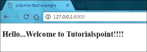
Output
Run the application as shown in the previous example, and navigate to http://127.0.0.1:8000/. Following will be the output.
Read-only Properties
You can avoid unexpected changes on produced data by setting the readOnly flag to true, in the properties object. Element uses the setter of the convention _setProperty(value), in order to change the property value.
Example
Following example depicts the use of read-only properties in the properties object. Create an index.html file and add the following code in it
<!doctype html>
<html>
   <head>
      <title>Polymer Example</title>
      <script src = "bower_components/webcomponentsjs/webcomponents-lite.js"></script>

      <link rel = "import" href = "bower_components/polymer/polymer.html">
      <link rel = "import" href = "my-element.html">
   </head>

   <body>
      <my-element></my-element>
   </body>
</html>
Now, create another file called my-element.html and include the following code.
<link rel = "import" href = "bower_components/polymer/polymer-element.html">
<link rel = "import" href = "prop-element.html">

//it specifies the start of an element's local DOM
<dom-module id = "my-element">
   <template>
      <prop-element my-prop = "{{demoProp}}"></prop-element>
      <p>Present value: <span>{{demoProp}}</span></p>
   </template>

   <script>
      Polymer ({
         is: "my-element", properties: {
            demoProp: String
         }
      });
   </script>
</dom-module>
Next, create one more file called prop-element.html and add the following code.
//it specifies the start of an element's local DOM
<dom-module id="prop-element">
   <template>
      <button on-click="onClickFunc">Change value</button>
   </template>

   <script>
      Polymer ({
         is: "prop-element", properties: {
            myProp: {
               type: String,
               notify: true,
               readOnly: true,
               value: 'This is initial value...'
            }
         },
         onClickFunc: function(){
            this._setMyProp('This is new value after clicking the button...');
         }
      });
   </script>
</dom-module>
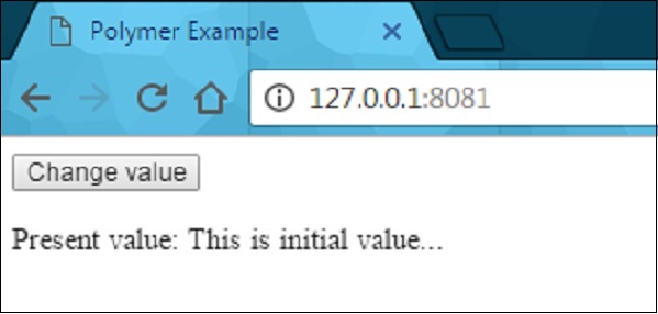
Output
Run the application as shown in the previous example, and navigate to http://127.0.0.1:8081/. Following will be the output.
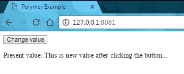
After clicking the button, it will change the value as shown in the following screenshot.
Reflecting Properties to Attributes
HTML attribute can be synchronized with the property value by setting the reflectToAttribute to true on a property in the properties configuration object.
Attribute Serialization
The property value can be serialized to the attribute, while reflecting or binding a property to an attribute, and by default values can be serialized depending on the value's current type.
String − There is no need of serialization.
Date or Number − Use the toString to serialize the values.
Boolean − Set the displayed non-valued attribute as either true or false.
Array or Object − Use the JSON.stringify to serialize the value.
