- Polymer - Home
- Polymer - Overview
- Polymer - Installation
- Polymer - Elements
- Polymer - Custom Elements
- Polymer - Shadow DOM and Styling
- Polymer - Events
- Polymer - Data System
Polymer - Iron Collapse
The <iron-collapse> elements are used to collapse a content. To show or hide the content, use opened or toggle().
The max-height/max-width of the collapsible element is automatically adjusted by the iron-collapse element.
The custom properties and mixins to be used for styling is as follows −
--iron-collapse-transition-duration − It is the duration of the animation transition. The default value is 300ms.
Example
To implement iron-collapse element, navigate to your project folder in the command prompt and use the following commands −
bower install PolymerElements/iron-collapse --save
bower install PolymerElements/paper-toggle-button --save
The above command installs both the elements in bower_components folder. Then you have to import both the files in your index.html file as shown below −
<link rel = "import" href = "iron-collapse/iron-collapse.html">
<link rel = "import" href = "paper-toggle-button/paper-toggle-button.html">
The following example demonstrates the use of iron-collapse element −
<!DOCTYPE html>
<html>
   <head>
      <title>iron-collapse</title>
      <base href = "http://polygit.org/polymer+:master/components/">
      <link rel = "import" href = "polymer/polymer.html">
      <link rel = "import" href = "paper-toggle-button/paper-toggle-button.html">
      <link rel = "import" href = "iron-collapse/iron-collapse.html">

      <style>
         #coll {
            display: flex;
            width: 500px;
         }
         demo-collapse{
            border: 2px solid LightGrey;
            width: 50%;
         }
      </style>
   </head>

   <body>
      <h3>Iron Collapse Example</h3>
      <dom-module id = "demo-collapse">
         <template>
            <paper-toggle-button checked = "{{opened}}">Collapse this</paper-toggle-button>
            <iron-collapse opened = "[[opened]]">
               <div><p>This is polymerjs iron-collapse.</p></div>
            </iron-collapse>
         </template>
      </dom-module>

      <script>
         Polymer ({
            is: 'demo-collapse',
         });
      </script>

      <div id = "coll">
         <demo-collapse></demo-collapse>
      </div>
   </body>
</html>
Output
To run the application, navigate to your project directory and run with the following command −
polymer serve
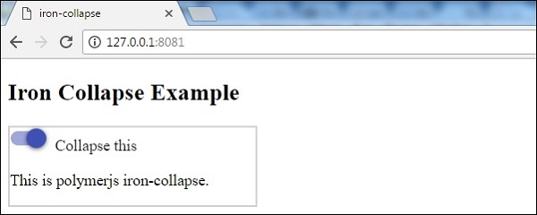
Now open the browser and navigate to http://127.0.0.1:8081/. Following will be the output.
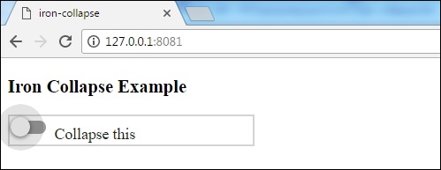
When you click the toggle button, following will be the output.