- Polymer - Home
- Polymer - Overview
- Polymer - Installation
- Polymer - Elements
- Polymer - Custom Elements
- Polymer - Shadow DOM and Styling
- Polymer - Events
- Polymer - Data System
Polymer - App Layout
The app-layout elements are comprised of components such as toolbars, drawers, and headers. These are used for building high-quality, responsive layouts just with markup. Some of the elements are listed in the following table.
| Sr.No. | Elements & Description |
|---|---|
| 1 | app-box This element works as container and has scroll effects, visual effects based on the scroll position. |
| 2 | app-drawer This is a navigation drawer which will slide in and out from left or right. |
| 3 | app-drawer-layout This will position the app-drawer and other content. |
| 4 | app-grid This is used for creating responsive and fluid grid layouts using custom properties. |
| 5 | app-header This element works at the top of the screen as a container for app-toolbars and has scroll effects, visual effects based on the scroll position. |
| 6 | app-header-layout This element acts as a cover that positions the app-header and other content. |
| 7 | app-scrollpos-control This element is used for saving and restoring the scroll position when multiple pages share the same document scroller. |
| 8 | app-toolbar It is a horizontal toolbar which contains items that can be used for labeling, navigating, searching and other actions. |
Example
To use app-layout elements you have to move into the project directory using the following command in the command prompt.
bower install PolymerElements/app-layout --save
The above command will install the app-layout elements in bower_components folder. Then, you have to import the file using <link> tag in your index.htmlfile.
<link rel = "import" href = "/bower_components/app-layout/app-layout.html">
<base href = "https://user-content-dot-custom-elements.appspot.com/PolymerElements/app-layout/v1.0.1/app-layout/">
<script src = "../webcomponentsjs/webcomponents-lite.min.js"></script>
<link rel = "import" href = "app-header/app-header.html">
<link rel = "import" href = "app-toolbar/app-toolbar.html">
<link rel = "import" href = "app-box/app-box.html">
<link rel = "import" href = "demo/sample-content.html">
<link rel = "import" href = "../iron-icons/iron-icons.html">

<style is = "custom-style">
   html, body {
      margin: 0;
      font-family: 'Roboto', 'Noto', sans-serif;
      -webkit-font-smoothing: antialiased;
      background: #f1f1f1;
      max-height: 368px;
   }
   app-toolbar {
      background-color: #4285f4;
      color: #fff;
   }
   paper-icon-button + [main-title] {
      margin-left: 24px;
   }
   paper-progress {
      display: block;
      width: 100%;
      --paper-progress-active-color: rgba(255, 255, 255, 0.5);
      --paper-progress-container-color: transparent;
   }
   app-header {
      @apply(--layout-fixed-top);
      color: #fff;
      --app-header-background-rear-layer: {
         background-color: green;
      };
   }
   sample-content {
      padding-top: 64px;
   }
</style>

<app-header reveals>
   <app-toolbar>
      <div main-title>First App</div>
   </app-toolbar>
</app-header>

<sample-content></sample-content><br>
<app-box style = "height: 100px;border-style: groove;">
   <div main-title>Welcome to Tutorialspoint</div>
</app-box>
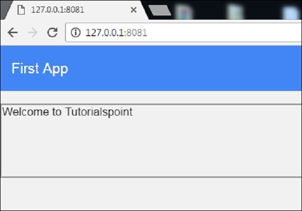
Output
Refresh the Polymer server and following will be the output.