- JqueryUI - Draggable
- JqueryUI - Droppable
- JqueryUI - Resizable
- JqueryUI - Selectable
- JqueryUI - Sortable
- JqueryUI Widgets
- JqueryUI - Accordion
- JqueryUI - Autocomplete
- JqueryUI - Button
- JqueryUI - Datepicker
- JqueryUI - Dialog
- JqueryUI - Menu
- JqueryUI - Progressbar
- JqueryUI - Slider
- JqueryUI - Spinner
- JqueryUI - Tabs
- JqueryUI - Tooltip
- JqueryUI Effects
- JqueryUI - Add Class
- JqueryUI - Color Animation
- JqueryUI - Effect
- JqueryUI - Hide
- JqueryUI - Remove Class
- JqueryUI - Show
- JqueryUI - Switch Class
- JqueryUI - Toggle
- JqueryUI - Toggle Class
- JqueryUI Utilities
- JqueryUI - Position
- JqueryUI - Widget Factory
- JqueryUI Useful Resources
- JqueryUI - Quick Guide
- JqueryUI - Useful Resources
- JqueryUI - Discussion
JqueryUI - Quick Guide
JqueryUI - Overview
JqueryUI is a powerful Javascript library built on top of jQuery JavaScript library. UI stands for User interface, It is a set of plug-ins for jQuery that adds new functionalities to the jQuery core library.
The set of plug-ins in JqueryUI includes interface interactions, effects, animations, widgets, and themes built on top of jQuery JavaScript Library.
It was released in September 2007, announced in a blog post by John Resig on jquery.com. The latest release, 1.10.4, requires jQuery 1.6 or later version. jQuery UI is a free, open source software, licensed under the MIT License.
Features
JqueryUI is categorized into four groups, interactions, widgets, effects, utilities. These will be discussed in detail in the subsequent chapters. The structure of the library is as shown in the image below −
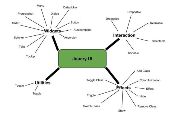
Interactions − These are the interactive plugins like drag, drop, resize and more which give the user the ability to interact with DOM elements.
Widgets − Using widgets which are jQuery plugins, you can create user interface elements like accordian,datepicker etc.
Effects − These are built on the internal jQuery effects. They contain a full suite of custom animations and transitions for DOM elements.
Utilities − These are a set of modular tools the JqueryUI library uses internally.
Benefits of JqueryUI
The below are some of the benefits of Jquery UI −
- Cohesive and Consistent APIs.
- Comprehensive Browser Support.
- Open Source and Free to Use.
- Good Documentation.
- Powerful Theming Mechanism.
- Stable and Maintenance Friendly.
JqueryUI - Environment Setup
This chapter will discuss about download and set up of JqueryUI library. We will also briefly study the directory structure and its contents. JqueryUI library can be used in two ways in your web page −
Download UI Library from Its Official Website
When you open the link http://jqueryui.com/, you will see there are three options to download JqueryUI library −
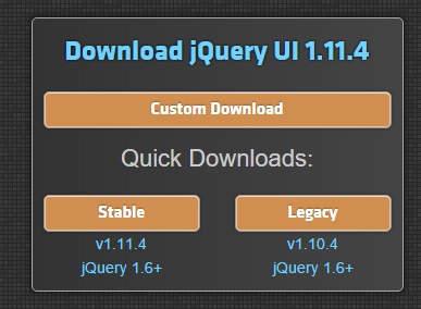
Custom Download − Click on this button to download a customized version of library.
Stable − Click on this button to get the stable and latest version of JqueryUI library.
Legacy − Click on this button to get the previous major release of the JqueryUI library.
Custom Download with Download Builder
Using Download Builder, you can create a custom build to include only those portions of the library that you need. You can download this new customized version of JqueryUI, depending on the chosen theme. You will see the following screen (same page is split into two images) −
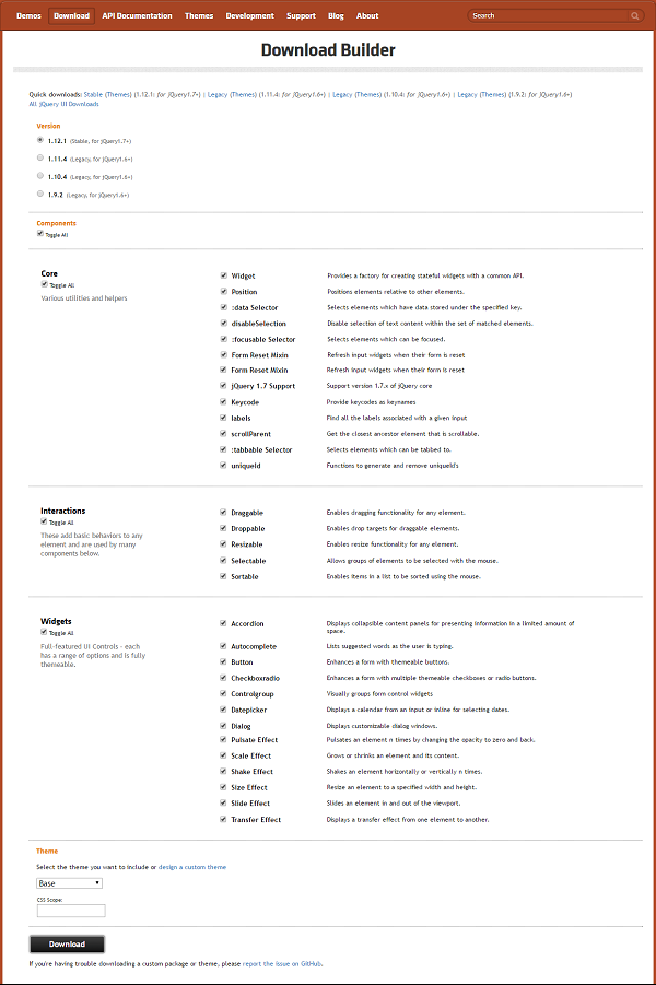
This is useful when you require only specific plugins or features of the JqueryUI library. The directory structure of this version is shown in the following figure −
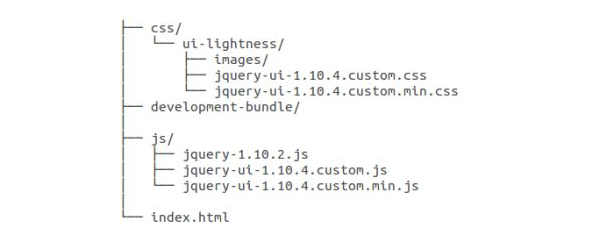
Uncompressed files are located in the development-bundle directory. The uncompressed file is best used during development or debugging; the compressed file saves bandwidth and improves performance in production.
Stable download
Click on the Stable button, which leads directly to a ZIP file containing the sources, examples, and documentation for latest version of JqueryUI library. Extract the ZIP file contents to a jqueryui directory.
This version contains all files including all dependencies, a large collection of demos, and even the librarys unit test suite. This version is helpful to getting started.
Legacy download
Click on the Legacy button, which leads directly to a ZIP file of previous major release of JqueryUI library. This version also contains all files including all dependencies, a large collection of demos, and even the librarys unit test suite. This version is helpful to get you started.
Download UI Library from CDNs
A CDN or Content Delivery Network is a network of servers designed to serve files to users. If you use a CDN link in your web page, it moves the responsibility of hosting files from your own servers to a series of external ones. This also offers an advantage that if the visitor to your webpage has already downloaded a copy of JqueryUI from the same CDN, it won't have to be re-downloaded.
The jQuery Foundation, Google, and Microsoft all provide CDNs that host jQuery core as well as jQuery UI.
Because a CDN does not require you to host your own version of jQuery and jQuery UI, it is perfect for demos and experimentation.
We are using the CDN versions of the library throughout this tutorial.
Example
Now let us write a simple example using JqueryUI. Let us create an HTML file, copy the following content to the <head> tag −
<link href = "https://code.jquery.com/ui/1.10.4/themes/ui-lightness/jquery-ui.css"
   rel = "stylesheet">
<script src = "https://code.jquery.com/jquery-1.10.2.js"></script>
<script src = "https://code.jquery.com/ui/1.10.4/jquery-ui.js"></script>
Details of the above code are −
The first line, adds jQuery UI theme (in our case ui-lightness) via CSS. This CSS will make our UI stylish.
Second line, adds the jQuery library, as jQuery UI is built on top of jQuery library.
Third line, adds the jQuery UI library. This enables jQuery UI in your page.
Now let's add some content to <head> tag −
<script type = "text/javascript">
   $(function () {
      $('#dialogMsg').dialog();
   });
</script>
In the <body> add this −
<body>
   <form id = "form1" runat = "server">
      <div id = "dialogMsg" title = "First JqueryUI Example">
         Hello this is my first JqueryUI example.
      </div>
   </form>
</body>
The complete HTML code is as follows. Save it as myfirstexample.html
<!DOCTYPE html>
<html>
   <head>
      <link href = "https://code.jquery.com/ui/1.10.4/themes/ui-lightness/jquery-ui.css"
         rel = "stylesheet">
      <script src = "https://code.jquery.com/jquery-1.10.2.js"></script>
      <script src = "https://code.jquery.com/ui/1.10.4/jquery-ui.js"></script>

      <script type = "text/javascript">
         $(function () {
            $('#dialogMsg').dialog();
         });
      </script>
   </head>

   <body>
      <form id = "form1" runat = "server">
         <div id = "dialogMsg" title = "First JqueryUI Example">
            Hello this is my first JqueryUI example.
         </div>
      </form>
   </body>
</html>
Open the above page in your browser. It will produce the following screen.

JqueryUI - Draggable
jQueryUI provides draggable() method to make any DOM element draggable. Once the element is draggable, you can move that element by clicking on it with the mouse and dragging it anywhere within the viewport.
Syntax
The draggable() method can be used in two forms −
$ (selector, context).draggable (options) Method
The draggable (options) method declares that an HTML element can be moved in the HTML page. The options parameter is an object that specifies the behavior of the elements involved.
Syntax
$(selector, context).draggable(options);
You can provide one or more options at a time using Javascript object. If there are more than one options to be provided then you will separate them using a comma as follows −
$(selector, context).draggable({option1: value1, option2: value2..... });
The following table lists the different options that can be used with this method −
| Sr.No. | Option & Description |
|---|---|
| 1 | addClasses
If this option is set to false, it will prevent the ui-draggable class from being added in the list of selected DOM elements. By default its value is true. |
| 2 | appendTo
Specifies the element in which the draggable helper should be appended to while dragging. By default its value is "parent". |
| 3 | axis
This option constrains dragging to either the horizontal (x) or vertical (y) axis. Possible values: "x", "y". |
| 4 | cancel
You can use this option to prevent dragging from starting on specified elements. By default its value is "input,textarea, button,select,option". |
| 5 | connectToSortable
You can use this option to specify a list whose elements are interchangeable. At the end of placement, the element is part of the list. By default its value is "false". |
| 6 | containment
Constrains dragging to within the bounds of the specified element or region. By default its value is "false". |
| 7 | cursor
Specifies the cursor CSS property when the element moves. It represents the shape of the mouse pointer. By default its value is "auto". |
| 8 | cursorAt
Sets the offset of the dragging helper relative to the mouse cursor. Coordinates can be given as a hash using a combination of one or two keys: { top, left, right, bottom }. By default its value is "false". |
| 9 | delay
Delay, in milliseconds, after which the first movement of the mouse is taken into account. The displacement may begin after that time. By default its value is "0". |
| 10 | disabled
When set to true, disables the ability to move items. Items cannot be moved until this function is enabled (using the draggable ("enable") instruction). By default its value is "false". |
| 11 | distance
Number of pixels that the mouse must be moved before the displacement is taken into account. By default its value is "1". |
| 12 | grid
Snaps the dragging helper to a grid, every x and y pixels. The array must be of the form [ x, y ]. By default its value is "false". |
| 13 | handle
If specified, restricts dragging from starting unless the mousedown occurs on the specified element(s). By default its value is "false". |
| 14 | helper
Allows for a helper element to be used for dragging display. By default its value is "original". |
| 15 | iframeFix
Prevent iframes from capturing the mousemove events during a drag. By default its value is "false". |
| 16 | opacity
Opacity of the element moved when moving. By default its value is "false". |
| 17 | refreshPositions
If set to true, all droppable positions are calculated on every mousemove. By default its value is "false". |
| 18 | revert
Indicates whether the element is moved back to its original position at the end of the move. By default its value is "false". |
| 19 | revertDuration
Duration of displacement (in milliseconds) after which the element returns to its original position (see options.revert). By default its value is "500". |
| 20 | scope
Used to group sets of draggable and droppable items, in addition to droppable's accept option. By default its value is "default". |
| 21 | scroll
When set to true (the default), the display will scroll if the item is moved outside the viewable area of the window. By default its value is "true". |
| 22 | scrollSensitivity
Indicates how many pixels the mouse must exit the window to cause scrolling of the display. By default its value is "20". |
| 23 | scrollSpeed
Indicates the scrolling speed of the display once scrolling begins. By default its value is "20". |
| 24 | snap
Adjusts the display of the item being moved on other elements (which are flown). By default its value is "false". |
| 25 | snapMode
Specifies how the adjustment should be made between the moved element and those indicated in options.snap. By default its value is "both". |
| 26 | snapTolerance
Maximum number of pixels in the difference in position necessary to establish the adjustment. By default its value is "20". |
| 27 | stack
Controls the z-index of the set of elements that match the selector, always brings the currently dragged item to the front. Very useful in things like window managers. By default its value is "false". |
| 28 | zIndex
Z-index for the helper while being dragged. By default its value is "false". |
The following section will show you a few working examples of drag functionality.
Default functionality
The following example demonstrates a simple example of draggable functionality passing no parameters to the draggable() method.
<!DOCTYPE html>
<html>
   <head>
      <link href = "https://code.jquery.com/ui/1.10.4/themes/ui-lightness/jquery-ui.css"
         rel = "stylesheet">
      <script src = "https://code.jquery.com/jquery-1.10.2.js"></script>
      <script src = "https://code.jquery.com/ui/1.10.4/jquery-ui.js"></script>

      <style>
         #draggable { width: 150px; height: 150px; padding: 0.5em; background:#eee;}
      </style>

      <script>
         $(function() {
            $( "#draggable" ).draggable();
         });
      </script>
   </head>

   <body>
      <div id = "draggable" class = "ui-widget-content">
         <p>Drag me !!!</p>
      </div>
   </body>
</html>
Let us save the above code in an HTML file dragexample.htm and open it in a standard browser that supports javascript. You must also see the following output. Now, you can play with the result −
Use of Disable, Distance, and Delay
The following example shows the usage of three important options (a) disabled (b) delay and (c) distance in the drag function of JqueryUI.
<!DOCTYPE html>
<html>
   <head>
      <link href = "https://code.jquery.com/ui/1.10.4/themes/ui-lightness/jquery-ui.css"
         rel = "stylesheet">
      <script src = "https://code.jquery.com/jquery-1.10.2.js"></script>
      <script src = "https://code.jquery.com/ui/1.10.4/jquery-ui.js"></script>
   </head>

   <body>
      <div id = "div1" style = "border:solid 1px;background-color:gainsboro;">
         <span>You can't move me!</span><br /><br />
      </div>
      <div id = "div2" style = "border:solid 1px;background-color:grey;">
         <span>
            Dragging will start only after you drag me for 50px
         </span>
         <br /><br />
      </div>
      <div id = "div3" style = "border:solid 1px;background-color:gainsboro;">
         <span>
            You have to wait for 500ms for dragging to start!
         </span>
         <br /><br />
      </div>

      <script>
         $("#div1 span").draggable (
            { disabled: true }
         );
         $("#div2 span").draggable (
            { distance: 50 }
         );
         $("#div3 span").draggable (
            { delay: 500 }
         );
      </script>
   </body>
</html>
Let us save the above code in an HTML file dragexample.htm and open it in a standard browser that supports javascript, you should see the following output. Now, you can play with the result −
Constrain Movement
The following example shows how to limit the movement of elements on the screen using containment option in the drag function of JqueryUI.
<!DOCTYPE html>
<html>
   <head>
      <link href = "https://code.jquery.com/ui/1.10.4/themes/ui-lightness/jquery-ui.css"
         rel = "stylesheet">
      <script src = "https://code.jquery.com/jquery-1.10.2.js"></script>
      <script src = "https://code.jquery.com/ui/1.10.4/jquery-ui.js"></script>
   </head>

   <body>
      <div id = "div4" style = "border:solid 1px;background-color:gainsboro;">
         <span>You can drag me only within this div.</span><br /><br />
      </div>
      <div id = "div5" style = "border:solid 1px;background-color:grey;">
         <span>You can drag me only along x axis.</span><br /><br />
      </div>

      <script>
         $("#div4 span").draggable ({
            containment : "#div4"
         });
         $("#div5 span").draggable ({
            axis : "x"
         });
      </script>
   </body>
</html>
Let us save the above code in an HTML file dragexample.htm and open it in a standard browser which supports javascript. It should produce the following output. Now, you can play with the output −
Here, <span> elements are prevented from going outside a <div> whose ID is div4. You can also impose constraints on vertical or horizontal motion using options axis worth "x" or "y", which is also demonstrated.
Move content by duplicating
The following example demonstrates how to move an item that is the clone of the selected element. This is done using the option helper with value clone.
<!DOCTYPE html>
<html>
   <head>
      <link href = "https://code.jquery.com/ui/1.10.4/themes/ui-lightness/jquery-ui.css"
         rel = "stylesheet">
      <script src = "https://code.jquery.com/jquery-1.10.2.js"></script>
      <script src = "https://code.jquery.com/ui/1.10.4/jquery-ui.js"></script>
   </head>

   <body>
      <div id = "div6" style = "border:solid 1px;background:#eee; height:50px;">
         <span>You can duplicate me....</span>
      </div>

      <script>
         $("#div6 span").draggable ({
            helper : "clone"
         });
      </script>
   </body>
</html>
Let us save the above code in an HTML file dragexample.htm and open it in a standard browser which supports javascript, you must also see the following output −
As you can see when the first element is being dragged, only the cloned element moves, while the original item stays put. If you release the mouse, the cloned element disappears and the original item is still in its original position.
Get Current Option Value
The following example demonstrates how you can get a value of any option at any time during your script execution. Here we will read the value of cursor and cursorAt options set at the time of execution. Similar way you can get value of any other options available.
<!DOCTYPE html>
<html>
   <head>
      <link href = "https://code.jquery.com/ui/1.10.4/themes/ui-lightness/jquery-ui.css"
         rel = "stylesheet">
      <script src = "https://code.jquery.com/jquery-1.10.2.js"></script>
      <script src = "https://code.jquery.com/ui/1.10.4/jquery-ui.js"></script>
   </head>

   <body>
      <div id = "divX" style = "border:solid 1px;background:#eee; height:50px;">
         <span>Click anywhere on me to see cursor type...</span>
      </div>

      <script>
         /* First make the item draggable */
         $("#divX span").draggable();

         $("#divX span").bind('click', function( event ) {
            var cursor = $( "#divX span" ).draggable( "option", "cursor" );
            var cursorAt = $( "#divX span" ).draggable( "option", "cursorAt" );
            alert("Cursor type - " + cursor + ", cursorAt - " + cursorAt);
         });
      </script>
   </body>
</html>
Let us save the above code in an HTML file dragexample.htm and open it in a standard browser which supports javascript, you must also see the following output −
$ (selector, context).draggable ("action", [params]) Method
The draggable (action, params) method can perform an action on the movable elements, such as to prevent displacement. The action is specified as a string in the first argument and optionally, one or more params can be provided based on the given action.
Basically, Here actions are nothing but they are jQuery methods which we can use in the form of string.
Syntax
$(selector, context).draggable ("action", [params]);
The following table lists the actions for this method −
| Sr.No. | Action & Description |
|---|---|
| 1 | destroy()
Remove drag functionality completely. The elements are no longer movable. This will return the element back to its pre-init state. |
| 2 | disable()
Disable drag functionality. Elements cannot be moved until the next call to the draggable("enable") method. |
| 3 | enable()
Reactivates drag management. The elements can be moved again. |
| 4 | option(optionName)
Gets the value currently associated with the specified optionName. Where optionName is name of the option to get and is of type String. |
| 5 | option()
Gets an object containing key/value pairs representing the current draggable options hash. |
| 6 | option(optionName, value)
Sets the value of the draggable option associated with the specified optionName. Where optionName is the name of the option to set and value is the value to set for the option. |
| 7 | option(options)
Sets one or more options for the draggable. Where options is a map of option-value pairs to set. |
| 8 | widget()
Returns a jQuery object containing the draggable element. |
Example
Now let us see an example using the actions from the above table. The following example demonstrates the use of actions disable and enable.
<!DOCTYPE html>
<html>
   <head>
      <link href = "https://code.jquery.com/ui/1.10.4/themes/ui-lightness/jquery-ui.css"
         rel = "stylesheet">
      <script src = "https://code.jquery.com/jquery-1.10.2.js"></script>
      <script src = "https://code.jquery.com/ui/1.10.4/jquery-ui.js"></script>
   </head>

   <body>
      <div id = "div7" style = "border:solid 1px;background-color:gainsboro;">
         <span>You can't move me. Dragging is disabled.</span><br><br>
      </div>
      <div id = "div8" style = "border:solid 1px;background-color:grey;">
         <span>You can move me. Dragging is enabled.</span><br><br>
      </div>

      <script>
         $("#div7 span").draggable ();
         $("#div7 span").draggable ('disable');
         $("#div8 span").draggable ();
         $("#div8 span").draggable ('enable');
      </script>
   </body>
</html>
Let us save the above code in an HTML file dragexample.htm and open it in a standard browser which supports javascript, you should see the following output −
As you can see first element is disabled and the second element's dragging is enabled which you can try to drag.
Event Management on the Moved elements
In addition to the draggable (options) method which we saw in the previous sections, JqueryUI provides event methods which gets triggered for a particular event. These event methods are listed below −
| Sr.No. | Event Method & Description |
|---|---|
| 1 | create(event, ui)
Triggered when the draggable is created. Where event is of type Event, and ui is of type Object. |
| 2 | drag(event, ui)
Triggered while the mouse is moved during the dragging. Where event is of type Event, and ui is of type Object like helper, position, offset. |
| 3 | start(event, ui)
Triggered when dragging starts. Where event is of type Event, and ui is of type Object like helper, position, offset. |
| 4 | stop(event, ui)
Triggered when dragging stops. Where event is of type Event, and ui is of type Object like helper, position, offset. |
Example
The following example demonstrates the use of event method during drag functionality. This example demonstrates use of drag event.
<!DOCTYPE html>
<html>
   <head>
      <link href = "https://code.jquery.com/ui/1.10.4/themes/ui-lightness/jquery-ui.css"
         rel = "stylesheet">
      <script src = "https://code.jquery.com/jquery-1.10.2.js"></script>
      <script src = "https://code.jquery.com/ui/1.10.4/jquery-ui.js"></script>
   </head>

   <body>
      <div id = "div9" style = "border:solid 1px;background-color:gainsboro;">
         <span>Drag me to check the event method firing</span><br /><br />
      </div>

      <script>
         $("#div9 span").draggable ({
            cursor: "move",
            axis : "x",
            drag: function( event, ui ) {
               alert("hi..");
            }
         });
      </script>
   </body>
</html>
Let us save the above code in an HTML file dragexample.htm and open it in a standard browser which supports javascript, you should the following output −
Now try to drag the written content and you will see that start of a drag event gets fired which results in showing a dialogue box and cursor will change to move icon and text will move in X-axis only.
JqueryUI - Droppable
jQueryUI provides droppable() method to make any DOM element droppable at a specified target (a target for draggable elements).
Syntax
The droppable() method can be used in two forms −
$ (selector, context).droppable (options) Method
The droppable (options) method declares that an HTML element can be used as an element in which you can drop other elements. The options parameter is an object that specifies the behavior of the elements involved.
Syntax
$(selector, context).droppable (options);
You can provide one or more options at a time using Javascript object. If there are more than one options to be provided then you will separate them using a comma as follows −
$(selector, context).droppable({option1: value1, option2: value2..... });
The following table lists the different options that can be used with this method −
| Sr.No. | Option & Description |
|---|---|
| 1 | accept
This option is used when you need to control which draggable elements are to be accepted for dropping. By default its value is *.
|
| 2 | activeClass
This option is a String representing one or more CSS classes to be added to the droppable element when an accepted element (one of those indicated in options.accept) is being dragged. By default its value is false. |
| 3 | addClasses
This option when set to false will prevent the ui-droppable class from being added to the droppable elements. By default its value is true. |
| 4 | disabled
This option when set to true disables the droppable. By default its value is false. |
| 5 | greedy
This option is used when you need to control which draggable elements are to be accepted for dropping on nested droppables. By default its value is false. If this option is set to true, any parent droppables will not receive the element. |
| 6 | hoverClass
This option is String representing one or more CSS classes to be added to the element of droppable when an accepted element (an element indicated in options.accept) moves into it. By default its value is false. |
| 7 | scope
This option is used to restrict the droppable action of draggable elements only to items that have the same options.scope (defined in draggable (options)). By default its value is "default". |
| 8 | tolerance
This option is a String that specifies which mode to use for testing whether a draggable is hovering over a droppable. By default its value is "intersect". |
The following section will show you a few working examples of drop functionality.
Default Functionality
The following example demonstrates a simple example of droppable functionality, passing no parameters to the droppable() method.
<!doctype html>
<html lang = "en">
   <head>
      <meta charset = "utf-8">
      <title>jQuery UI Droppable - Default functionality</title>
      <link href = "https://code.jquery.com/ui/1.10.4/themes/ui-lightness/jquery-ui.css"
         rel = "stylesheet">
      <script src = "https://code.jquery.com/jquery-1.10.2.js"></script>
      <script src = "https://code.jquery.com/ui/1.10.4/jquery-ui.js"></script>

      <style>
         #draggable-1 {
            width: 100px; height: 50px; padding: 0.5em; float: left;
            margin: 22px 5px 10px 0;
         }
         #droppable-1 {
            width: 120px; height: 90px;padding: 0.5em; float: left;
            margin: 10px;
         }
      </style>

      <script>
         $(function() {
            $( "#draggable-1" ).draggable();
            $( "#droppable-1" ).droppable();
         });
      </script>
   </head>

   <body>
      <div id = "draggable-1" class = "ui-widget-content">
         <p>Drag me to my target</p>
      </div>
      <div id = "droppable-1" class = "ui-widget-header">
         <p>Drop here</p>
      </div>
   </body>
</html>
Let us save the above code in an HTML file dropexample.htm and open it in a standard browser which supports javascript, you should see the following output. Now, you can play with the result −
Use of addClass, disabled and tolerance
The following example demonstrates the usage of three options (a) addClass (b) disabled and (c) tolerance in the drop function of JqueryUI.
<!doctype html>
<html lang = "en">
   <head>
      <meta charset = "utf-8">
      <title>jQuery UI Droppable - Default functionality</title>
      <link href = "https://code.jquery.com/ui/1.10.4/themes/ui-lightness/jquery-ui.css"
         rel = "stylesheet">
      <script src = "https://code.jquery.com/jquery-1.10.2.js"></script>
      <script src = "https://code.jquery.com/ui/1.10.4/jquery-ui.js"></script>

      <style>
         #draggable-2 {
            width: 100px; height: 50px; padding: 0.5em;
            margin: 0px 5px 10px 0;
         }
         #droppable-2,#droppable-3, #droppable-4,#droppable-5 {
            width: 120px; height: 90px;padding: 0.5em; float: left;
            margin: 10px;
         }
      </style>

      <script>
         $(function() {
            $( "#draggable-2" ).draggable();
            $( "#droppable-2" ).droppable({
               drop: function( event, ui ) {
                  $( this )
                  .addClass( "ui-state-highlight" )
                  .find( "p" )
                  .html( "Dropped!" );
               }
            });

            $( "#droppable-3" ).droppable({
               disabled : "true",
               drop: function( event, ui ) {
                  $( this )
                  .addClass( "ui-state-highlight" )
                  .find( "p" )
                  .html( "Dropped!" );
               }
            });

            $( "#droppable-4" ).droppable({
               tolerance: 'touch',
               drop: function( event, ui ) {
                  $( this )
                  .addClass( "ui-state-highlight" )
                  .find( "p" )
                  .html( "Dropped with a touch!" );
               }
            });

            $( "#droppable-5" ).droppable({
               tolerance: 'fit',
               drop: function( event, ui ) {
                  $( this )
                  .addClass( "ui-state-highlight" )
                  .find( "p" )
                  .html( "Dropped only when fully fit on the me!" );
               }
            });
         });
      </script>
   </head>

   <body>
      <div id = "draggable-2" class = "ui-widget-content">
         <p>Drag me to my target</p>
      </div>
      <div id = "droppable-2" class = "ui-widget-header">
         <p>Drop here</p>
      </div>
      <div id = "droppable-3" class = "ui-widget-header">
         <p>I'm disabled, you can't drop here!</p>
      </div>
      <div id = "droppable-4" class = "ui-widget-header">
         <p>Tolerance Touch!</p>
      </div>
      <div id = "droppable-5" class = "ui-widget-header">
         <p>Tolerance Fit!</p>
      </div>
   </body>
</html>
Let us save the above code in an HTML file dropexample.htm and open it in a standard browser which supports javascript, you should see the following output. Now, you can play with the result −
Now drop the element on the "Tolerance Touch!" box (just touch the edge of this box) and see the changes of target element. Now to drop the element on "Tolerance Fit!" target, the draggable element has to fully overlap the target element i.e "Tolerance Fit!" target.
Choose elements to be dropped
The following example demonstrates the use of option accept and scope option in the drag function of JqueryUI.
<!doctype html>
<html lang = "en">
   <head>
      <meta charset = "utf-8">
      <title>jQuery UI Droppable - Default functionality</title>
      <link href = "https://code.jquery.com/ui/1.10.4/themes/ui-lightness/jquery-ui.css"
         rel = "stylesheet">
      <script src = "https://code.jquery.com/jquery-1.10.2.js"></script>
      <script src = "https://code.jquery.com/ui/1.10.4/jquery-ui.js"></script>

      <style>
         .wrap {
            display: table-row-group;
         }
         #japanpeople,#indiapeople, #javatutorial,#springtutorial {
            width: 120px; height: 70px; padding: 0.5em; float: left;
            margin: 0px 5px 10px 0;
         }

         #japan,#india,#java,#spring {
            width: 140px; height: 100px;padding: 0.5em; float: left;
            margin: 10px;
         }
      </style>

      <script>
         $(function() {
            $( "#japanpeople" ).draggable();
            $( "#indiapeople" ).draggable();

            $( "#japan" ).droppable({
               accept: "#japanpeople",
               drop: function( event, ui ) {
                  $( this )
                  .addClass( "ui-state-highlight" )
                  .find( "p" )
                  .html( "Dropped!" );
               }
            });
            $( "#india" ).droppable({
               accept: "#indiapeople",
               drop: function( event, ui ) {
                  $( this )
                  .addClass( "ui-state-highlight" )
                  .find( "p" )
                  .html( "Dropped!" );
               }
            });

            $( "#javatutorial" ).draggable({scope : "java"});
            $( "#springtutorial" ).draggable({scope : "spring"});
            $( "#java" ).droppable({
               scope: "java",
               drop: function( event, ui ) {
                  $( this )
                  .addClass( "ui-state-highlight" )
                  .find( "p" )
                  .html( "Dropped!" );
               }
            });

            $( "#spring" ).droppable({
               scope: "spring",
               drop: function( event, ui ) {
                  $( this )
                  .addClass( "ui-state-highlight" )
                  .find( "p" )
                  .html( "Dropped!" );
               }
            });
         });
      </script>
   </head>

   <body>
      <div class = "wrap" >
         <div id = "japanpeople" class = "ui-widget-content">
            <p>People to be dropped to Japan</p>
         </div>

         <div id = "indiapeople" class = "ui-widget-content">
            <p>People to be dropped to India</p>
         </div>

         <div id = "japan" class = "ui-widget-header">
            <p>Japan</p>
         </div>

         <div id = "india" class = "ui-widget-header">
            <p>India</p>
         </div>
      </div>
      <hr/>

      <div class = "wrap" >
         <div id = "javatutorial" class = "ui-widget-content">
            <p>People who want to learn Java</p>
         </div>
         <div id = "springtutorial" class = "ui-widget-content">
            <p>People who want to learn Spring</p>
         </div>
         <div id = "java" class = "ui-widget-header">
            <p>Java</p>
         </div>

         <div id = "spring" class = "ui-widget-header">
            <p>Spring</p>
         </div>
      </div>
   </body>
</html>
Let us save the above code in an HTML file dropexample.htm and open it in a standard browser which supports javascript, you should see the following output. Now you can play with the output −
Here you can see that you can drop element "People from Japan" on only "Japan" target and element "People from India" on target India. Similary the scope for "People who want to learn Java" is set to target "Java" and "People who want to learn Spring" is set to "Spring target".
Managing appearance
The following example demonstrates the use of options activeClass and hoverClass of JqueryUI class, which help us manage appearance.
<!doctype html>
<html lang = "en">
   <head>
      <meta charset = "utf-8">
      <title>jQuery UI Droppable - Default functionality</title>
      <link href = "https://code.jquery.com/ui/1.10.4/themes/ui-lightness/jquery-ui.css"
         rel = "stylesheet">
      <script src = "https://code.jquery.com/jquery-1.10.2.js"></script>
      <script src = "https://code.jquery.com/ui/1.10.4/jquery-ui.js"></script>

      <style type = "text/css">
         #draggable-3 {
            width: 100px; height: 50px; padding: 0.5em; float: left;
            margin: 21px 5px 10px 0;
         }
         #droppable-6 {
            width: 120px; height: 90px;padding: 0.5em; float: left;
            margin: 10px;
         }
         .active {
            border-color : blue;
            background : grey;
         }
         .hover {
            border-color : red;
            background : green;
         }
      </style>

      <script>
         $(function() {
            $( "#draggable-3" ).draggable();
            $( "#droppable-6" ).droppable({
               activeClass: "active",
               hoverClass:  "hover",
               drop: function( event, ui ) {
                  $( this )
                  .addClass( "ui-state-highlight" )
                  .find( "p" )
                  .html( "Dropped!" );
               }
            });
         });
      </script>
   </head>

   <body>
      <div id = "draggable-3" class = "ui-widget-content">
         <p>Drag me to my target</p>
      </div>
      <div id = "droppable-6" class = "ui-widget-header">
         <p>Drop here</p>
      </div>
   </body>
</html>
Let us save the above code in an HTML file dropexample.htm and open it in a standard browser which supports javascript, you should see the following output −
You can notice that on dragging or hovering (over the target) of "Drag me to my target" element, changes the color of target element "Drop here".
$ (selector, context).droppable ("action", params) Method
The droppable ("action", params) method can perform an action on droppable elements, such as preventing droppable functionality. The action is specified as a string in the first argument (e.g., "disable" to prevent the drop). Check out the actions that can be passed, in the following table.
Syntax
$(selector, context).droppable ("action", params);;
The following table lists the different actions that can be used with this method −
| Sr.No. | Action & Description |
|---|---|
| 1 | destroy
This action destroys the droppable functionality of an element completely. The elements return to their pre-init state. |
| 2 | disable
This action disables the droppable operation. The elements are no longer droppable elements. This method does not accept any arguments. |
| 3 | enable
This action reactivate the droppable operation. The elements can again receive a droppable element. This method does not accept any arguments. |
| 4 | option
This action gets an object containing key/value pairs representing the current droppable options hash. This method does not accept any arguments. |
| 5 | option( optionName )
This action gets the value of currently associated droppable element with the specified optionName. This takes a String value as argument. |
| 6 | option( optionName, value )
This action sets the value of the droppable option associated with the specified optionName. |
| 7 | option( options )
This action is sets one or more options for the droppable. The argument options is a map of option-value pairs to be set. |
| 8 | widget
This action returns a jQuery object containing the droppable element. This method does not accept any arguments. |
Example
Now let us see an example using the actions from the above table. The following example demonstrates the use of destroy() method.
<!doctype html>
<html lang = "en">
   <head>
      <meta charset = "utf-8">
      <title>jQuery UI Droppable - Default functionality</title>
      <link href = "https://code.jquery.com/ui/1.10.4/themes/ui-lightness/jquery-ui.css"
         rel = "stylesheet">
      <script src = "https://code.jquery.com/jquery-1.10.2.js"></script>
      <script src = "https://code.jquery.com/ui/1.10.4/jquery-ui.js"></script>

      <style>
         .draggable-4 {
            width: 90px; height: 50px; padding: 0.5em; float: left;
            margin: 0px 5px 10px 0;
            border: 1px solid red;
            background-color:#B9CD6D;
         }
         .droppable-7 {
            width: 100px; height: 90px;padding: 0.5em; float: left;
            margin: 10px;
            border: 1px solid black;
            background-color:#A39480;
         }
         .droppable.active {
            background-color: red;
         }
      </style>

      <script>
         $(function() {
            $('.draggable-4').draggable({ revert: true });
            $('.droppable-7').droppable({
               hoverClass: 'active',
               drop: function(e, ui) {
                  $(this).html(ui.draggable.remove().html());
                  $(this).droppable('destroy');
                  $( this )
                  .addClass( "ui-state-highlight" )
                  .find( "p" )
                  .html( "i'm destroyed!" );
               }
            });
         });
      </script>
   </head>

   <body>
      <div class = "draggable-4"><p>drag 1</p></div>
      <div class = "draggable-4"><p>drag 2</p></div>
      <div class = "draggable-4"><p>drag 3</p></div>

      <div style = "clear: both;padding:10px"></div>

      <div class = "droppable-7">drop here</div>
      <div class = "droppable-7">drop here</div>
      <div class = "droppable-7">drop here</div>
   </body>
</html>
Let us save the above code in an HTML file dropexample.htm and open it in a standard browser which supports javascript, you should see the following output −
If you drop "drag1" on any of the elements named "drop here", you will notice that this element gets dropped and this action destroys the droppable functionality of an element completely. You cannot drop "drag2" and "drag3" on this element again.
Event Management on droppable elements
In addition to the droppable (options) method which we saw in the previous sections, JqueryUI provides event methods which gets triggered for a particular event. These event methods are listed below −
| Sr.No. | Event Method & Description |
|---|---|
| 1 | activate(event, ui)
This event is triggered when the accepted draggable element starts dragging. This can be useful if you want to make the droppable "light up" when it can be dropped on. |
| 2 | create(event, ui)
This event is triggered when a droppable element is created. Where event is of type Event, and ui is of type Object. |
| 3 | deactivate(event, ui)
This event is triggered when an accepted draggable stops dragging. Where event is of type Event, and ui is of type Object. |
| 4 | drop(event, ui)
This action is triggered when an element is dropped on the droppable. This is based on the tolerance option. Where event is of type Event, and ui is of type Object. |
| 5 | out(event, ui)
This event is triggered when an accepted draggable element is dragged out of the droppable. This is based on the tolerance option. Where event is of type Event, and ui is of type Object. |
| 6 | over(event, ui)
This event is triggered when an accepted draggable element is dragged over the droppable. This is based on the tolerance option. Where event is of type Event, and ui is of type Object. |
Example
The following example demonstrates the event method usage during drop functionality. This example demonstrates the use of events drop, over and out.
<!doctype html>
<html lang = "en">
   <head>
      <meta charset = "utf-8">
      <title>jQuery UI Droppable - Default functionality</title>
      <link href = "https://code.jquery.com/ui/1.10.4/themes/ui-lightness/jquery-ui.css"
         rel = "stylesheet">
      <script src = "https://code.jquery.com/jquery-1.10.2.js"></script>
      <script src = "https://code.jquery.com/ui/1.10.4/jquery-ui.js"></script>

      <style>
         #draggable-5 {
            width: 100px; height: 50px; padding: 0.5em; float: left;
            margin: 22px 5px 10px 0;
         }
         #droppable-8 {
            width: 120px; height: 90px;padding: 0.5em; float: left;
            margin: 10px;
         }
      </style>

      <script>
         $(function() {
            $( "#draggable-5" ).draggable();
            $("#droppable-8").droppable({
               drop: function (event, ui) {
                  $( this )
                  .addClass( "ui-state-highlight" )
                  .find( "p" )
                  .html( "Dropped!" );
               },
               over: function (event, ui) {
                  $( this )
                  .addClass( "ui-state-highlight" )
                  .find( "p" )
                  .html( "moving in!" );
               },
               out: function (event, ui) {
                  $( this )
                  .addClass( "ui-state-highlight" )
                  .find( "p" )
                  .html( "moving out!" );
               }
            });
         });
      </script>
   </head>

   <body>
      <div id = "draggable-5" class = "ui-widget-content">
         <p>Drag me to my target</p>
      </div>
      <div id = "droppable-8" class = "ui-widget-header">
         <p>Drop here</p>
      </div>
   </body>
</html>
Let us save the above code in an HTML file dropexample.htm and open it in a standard browser which supports javascript, you should see the following output −
Here you will notice how the message in the droppable element changes as you drag the element.
JqueryUI - Resizable
jQueryUI provides resizable() method to resize any DOM element. This method simplifies the resizing of element which otherwise takes time and lot of coding in HTML. The resizable () method displays an icon in the bottom right of the item to resize.
Syntax
The resizable() method can be used in two forms −
$ (selector, context).resizable (options) Method
The resizable (options) method declares that an HTML element can be resized. The options parameter is an object that specifies the behavior of the elements involved when resizing.
Syntax
$(selector, context).resizable (options);
You can provide one or more options at a time of using Javascript object. If there are more than one options to be provided then you will separate them using a comma as follows −
$(selector, context).resizable({option1: value1, option2: value2..... });
The following table lists the different options that can be used with this method −
| Sr.No. | Option & Description |
|---|---|
| 1 | alsoResize
This option is of type Selector, jQuery , or any DOM Element. It represents elements that also resize when resizing the original object. By default its value is false. |
| 2 | animate
This option when set to true is used to enable a visual effect during resizing when the mouse button is released. The default value is false (no effect). |
| 3 | animateDuration
This option is used to set the duration (in milliseconds) of the resizing effect. This option is used only when animate option is true. By default its value is "slow". |
| 4 | animateEasing
This option is used to specify which easing to apply when using the animate option. By default its value is "swing". |
| 5 | aspectRatio
This option is used to indicate whether to keep the aspect (height and width) ratio for the item. By default its value is false. |
| 6 | autoHide
This option is used to hide the magnification icon or handles, except when the mouse is over the item. By default its value is false. |
| 7 | cancel
This option is used to prevent resizing on specified elements. By default its value is input,textarea,button,select,option. |
| 8 | containment
This option is used restrict the resizing of elements within a specified element or region. By default its value is false. |
| 9 | delay
This option is used to set tolerance or delay in milliseconds. Resizing or displacement will begin thereafter. By default its value is 0. |
| 10 | disabled
This option disables the resizing mechanism when set to true. The mouse no longer resizes elements, until the mechanism is enabled, using the resizable ("enable"). By default its value is false. |
| 11 | distance
With this option, the resizing starts only when the mouse moves a distance(pixels). By default its value is 1 pixel. This can help prevent unintended resizing when clicking on an element. |
| 12 | ghost
This option when set to true, a semi-transparent helper element is shown for resizing. This ghost item will be deleted when the mouse is released. By default its value is false. |
| 13 | grid
This option is of type Array [x, y], indicating the number of pixels that the element expands horizontally and vertically during movement of the mouse. By default its value is false. |
| 14 | handles
This option is a character string indicating which sides or angles of the element can be resized. By default its values are e, s, se. |
| 15 | helper
This option is used to add a CSS class to style the element to be resized. When the element is resized a new <div> element is created, which is the one that is scaled (ui-resizable-helper class). Once the resize is complete, the original element is sized and the <div> element disappears. By default its value is false. |
| 16 | maxHeight
This option is used to set the maximum height the resizable should be allowed to resize to. By default its value is null. |
| 17 | maxWidth
This option is used to set the maximum width the resizable should be allowed to resize to. By default its value is null. |
| 18 | minHeight
This option is used to set the minimum height the resizable should be allowed to resize to. By default its value is 10. |
| 19 | minWidth
This option is used to set the minimum width the resizable should be allowed to resize to. By default its value is 10. |
The following section will show you few a working examples of resize functionality.
Default Functionality
The following example demonstrates a simple example of resizable functionality, passing no parameters to the resizable() method.
<!doctype html>
<html lang = "en">
   <head>
      <meta charset = "utf-8">
      <title>jQuery UI Resizable functionality</title>
      <link href = "https://code.jquery.com/ui/1.10.4/themes/ui-lightness/jquery-ui.css"
         rel = "stylesheet">
      <script src = "https://code.jquery.com/jquery-1.10.2.js"></script>
      <script src = "https://code.jquery.com/ui/1.10.4/jquery-ui.js"></script>

      <!-- CSS -->
      <style>
         .ui-widget-header {
            background:#b9cd6d;
            border: 1px solid #b9cd6d;
            color: #FFFFFF;
            font-weight: bold;
         }
         .ui-widget-content {
            background: #cedc98;
            border: 1px solid #DDDDDD;
            color: #333333;
         }
         #resizable { width: 150px; height: 150px; padding: 0.5em;
            text-align: center; margin: 0; }
      </style>

      <!-- Javascript -->
      <script>
         $(function() {
            $( "#resizable" ).resizable();
         });
      </script>
   </head>

   <body>
      <!-- HTML -->
      <div id = "resizable" class = "ui-widget-content">
         <h3 class = "ui-widget-header">Pull my edges to resize me!!</h3>
      </div>
  </body>
</html>
Let us save the above code in an HTML file resizeexample.htm and open it in a standard browser which supports javascript, you should see the following output. Now, you can play with the result −
Drag the square border to resize.
Use of animate and ghost
The following example demonstrates the usage of two options animate and ghost in the resize function of JqueryUI.
<!doctype html>
<html lang = "en">
   <head>
      <meta charset = "utf-8">
      <title>jQuery UI Resizable functionality</title>
      <link href = "https://code.jquery.com/ui/1.10.4/themes/ui-lightness/jquery-ui.css"
         rel = "stylesheet">
      <script src = "https://code.jquery.com/jquery-1.10.2.js"></script>
      <script src = "https://code.jquery.com/ui/1.10.4/jquery-ui.js"></script>

      <!-- CSS -->
      <style>
         .ui-widget-header {
            background:#b9cd6d;
            border: 1px solid #b9cd6d;
            color: #FFFFFF;
            font-weight: bold;
         }
         .ui-widget-content {
            background: #cedc98;
            border: 1px solid #DDDDDD;
            color: #333333;
         }
         #resizable-2,#resizable-3 {
            width: 150px; height: 150px; padding: 0.5em;
            text-align: center; margin: 0; }
      </style>

      <!-- Javascript -->
      <script>
         $(function() {
            $( "#resizable-2" ).resizable({
               animate: true
            });
            $( "#resizable-3" ).resizable({
               ghost: true
            });
         });
      </script>
   </head>

   <body>
      <!-- HTML -->
      <div id = "resizable-2" class = "ui-widget-content">
         <h3 class = "ui-widget-header">
            Pull my edges and Check the animation!!
         </h3>
      </div><br>
      <div id = "resizable-3" class = "ui-widget-content">
         <h3 class = "ui-widget-header">I'm ghost!!</h3>
      </div>
   </body>
</html>
Let us save the above code in an HTML file resizeexample.htm and open it in a standard browser which supports javascript, you must also see the following output. Now, you can play with the result −
Drag the square border to resize and see the effect of animate and ghost options.
Use of containment, minHeight, and minWidth
The following example demonstrates the usage of three options containment, minHeight and minWidth in the resize function of JqueryUI.
<!doctype html>
<html lang = "en">
   <head>
      <meta charset = "utf-8">
      <title>jQuery UI Resizable functionality</title>
      <link href = "https://code.jquery.com/ui/1.10.4/themes/ui-lightness/jquery-ui.css"
         rel = "stylesheet">
      <script src = "https://code.jquery.com/jquery-1.10.2.js"></script>
      <script src = "https://code.jquery.com/ui/1.10.4/jquery-ui.js"></script>

      <style>
         .ui-widget-header {
            background:#b9cd6d;
            border: 1px solid #b9cd6d;
            color: #FFFFFF;
            font-weight: bold;
         }
         .ui-widget-content {
            background: #cedc98;
            border: 1px solid #DDDDDD;
            color: #333333;
         }
         #container-1 { width: 300px; height: 300px; }
         #resizable-4 {background-position: top left;
            width: 150px; height: 150px; }
         #resizable-4, #container { padding: 0.5em; }
      </style>

      <script>
         $(function() {
            $( "#resizable-4" ).resizable({
               containment: "#container",
               minHeight: 70,
               minWidth: 100
            });
         });
      </script>
   </head>

   <body>
      <div id = "container" class = "ui-widget-content">
         <div id = "resizable-4" class = "ui-state-active">
            <h3 class = "ui-widget-header">
               Resize contained to this container
            </h3>
         </div>
      </div>
   </body>
</html>
Let us save the above code in an HTML file resizeexample.htm and open it in a standard browser which supports javascript, you should see the following output. Now, you can play with the result −
Drag the square border to resize, you cannot resize beyond the main container.
Use of delay, distance, and autoHide
The following example demonstrates the usage of three options delay, distance and autoHide in the resize function of JqueryUI.
<!doctype html>
<html lang = "en">
   <head>
      <meta charset = "utf-8">
      <title>jQuery UI Resizable functionality</title>
      <link href = "https://code.jquery.com/ui/1.10.4/themes/ui-lightness/jquery-ui.css"
         rel = "stylesheet">
      <script src = "https://code.jquery.com/jquery-1.10.2.js"></script>
      <script src = "https://code.jquery.com/ui/1.10.4/jquery-ui.js"></script>

      <style>
         .ui-widget-header {
            background:#b9cd6d;
            border: 1px solid #b9cd6d;
            color: #FFFFFF;
            font-weight: bold;
         }
         .ui-widget-content {
            background: #cedc98;
            border: 1px solid #DDDDDD;
            color: #333333;
         }
         .square {
            width: 150px;
            height: 150px;
            border: 1px solid black;
            text-align: center;
            float: left;
            margin-left: 20px;
            -right: 20px;
         }
      </style>

      <script>
         $(function() {
            $( "#resizable-5" ).resizable({
               delay: 1000
            });

            $( "#resizable-6" ).resizable({
               distance: 40
            });
            $( "#resizable-7" ).resizable({
               autoHide: true
            });
         });
      </script>
   </head>

   <body>
      <div id = "resizable-5" class = "square ui-widget-content">
         <h3 class = "ui-widget-header">
            Resize starts after delay of 1000ms
         </h3>
      </div><br>
      <div id = "resizable-6" class = "square ui-widget-content">
         <h3 class = "ui-widget-header">
            Resize starts at distance of 40px
         </h3>
      </div><br>
      <div id = "resizable-7" class = "square ui-widget-content">
         <h3 class = "ui-widget-header">
            Hover over me to see the magnification icon!
         </h3>
      </div>
   </body>
</html>
Let us save the above code in an HTML file resizeexample.htm and open it in a standard browser which supports javascript, you should see the following output. Now, you can play with the result −
Drag the square border to resize and you can notice that −
The first square box resizes after a delay of 1000ms,
Second square box starts resizing after the mouse moves 40px.
Hover the mouse on the third square box, and the magnification icon appears.
Use of alsoResize
The following example demonstrates the usage of option alsoResize in the resize function of JqueryUI.
<!doctype html>
<html lang = "en">
   <head>
      <meta charset = "utf-8">
      <title>jQuery UI Resizable functionality</title>
      <link href = "https://code.jquery.com/ui/1.10.4/themes/ui-lightness/jquery-ui.css"
         rel = "stylesheet">
      <script src = "https://code.jquery.com/jquery-1.10.2.js"></script>
      <script src = "https://code.jquery.com/ui/1.10.4/jquery-ui.js"></script>

      <!-- CSS -->
      <style>
         .ui-widget-header {
            background:#b9cd6d;
            border: 1px solid #b9cd6d;
            color: #FFFFFF;
            font-weight: bold;
         }
         .ui-widget-content {
            background: #cedc98;
            border: 1px solid #DDDDDD;
            color: #333333;
         }
         #resizable-8,#resizable-9{ width: 150px; height: 150px;
            padding: 0.5em;text-align: center; margin: 0; }
      </style>

      <!-- Javascript -->
      <script>
         $(function() {
            $( "#resizable-8" ).resizable({
               alsoResize: "#resizable-9"
            });
            $( "#resizable-9" ).resizable();
         });
      </script>
   </head>

   <body>
      <!-- HTML -->
      <div id = "resizable-8" class = "ui-widget-content">
         <h3 class = "ui-widget-header">Resize!!</h3>
      </div><br>
      <div id = "resizable-9" class = "ui-widget-content">
         <h3 class = "ui-widget-header">I also get resized!!</h3>
      </div>
   </body>
</html>
Let us save the above code in an HTML file resizeexample.htm and open it in a standard browser which supports javascript, you should see the following output. Now, you can play with the result −
Drag the square border to resize and you can notice that the second square box also resizes with the first square box.
Use of AspectRatio, Grid
The following example demonstrates the usage of option aspectRatio and grid in the resize function of JqueryUI.
<!doctype html>
<html lang = "en">
   <head>
      <meta charset = "utf-8">
      <title>jQuery UI Resizable functionality</title>
      <link href = "https://code.jquery.com/ui/1.10.4/themes/ui-lightness/jquery-ui.css"
         rel = "stylesheet">
      <script src = "https://code.jquery.com/jquery-1.10.2.js"></script>
      <script src = "https://code.jquery.com/ui/1.10.4/jquery-ui.js"></script>

      <style>
         .ui-widget-header {
            background:#b9cd6d;
            border: 1px solid #b9cd6d;
            color: #FFFFFF;
            font-weight: bold;
         }
         .ui-widget-content {
            background: #cedc98;
            border: 1px solid #DDDDDD;
            color: #333333;
         }
         .square {
            width: 150px;
            height: 150px;
            border: 1px solid black;
            text-align: center;
            float: left;
            margin-left: 20px;
            margin-right: 20px;
         }
      </style>

      <script>
         $(function() {
            $( "#resizable-10" ).resizable({
               aspectRatio: 10 / 3
            });

            $( "#resizable-11" ).resizable({
               grid: [50,20]
            });

         });
      </script>
   </head>

   <body>
      <div id = "resizable-10" class = "square ui-widget-content">
         <h3 class = "ui-widget-header">
            Resize with aspectRatio of 10/3
         </h3>
      </div>
      <div id = "resizable-11" class = "square ui-widget-content">
         <h3 class = "ui-widget-header">
            Snap me to the grid of [50,20]
         </h3>
      </div>
   </body>
</html>
Let us save the above code in an HTML file resizeexample.htm and open it in a standard browser which supports javascript, you should see the following output. Now, you can play with the result −
Drag the square border to resize, the first square box resizes with the aspect ratio of 10 / 3 and the second one resizes with grid of [50,20].
$ (selector, context).resizable ("action", params) Method
The resizable ("action", params) method can perform an action on resizable elements, such as allowing or preventing resizing functionality. The action is specified as a string in the first argument (e.g., "disable" to prevent the resize). Check out the actions that can be passed, in the following table.
Syntax
$(selector, context).resizable ("action", params);;
The following table lists the different actions that can be used with this method −
| Sr.No. | Action & Description |
|---|---|
| 1 | destroy
This action destroys the resizable functionality of an element completely. This will return the element back to its pre-init state. |
| 2 | disable
This action disables the resizing functionality of an element. This method does not accept any arguments. |
| 3 | enable
This action enables the resizing functionality of an element. This method does not accept any arguments. |
| 4 | option( optionName )
This action retrieves the value of the specified optionName. This option corresponds to one of those used with resizable (options). |
| 5 | option()
Gets an object containing key/value pairs representing the current resizable options hash. This does not accept any arguments. |
| 6 | option(optionName, value )
This action sets the value of the resizable option with the specified optionName. This option corresponds to one of those used with resizable (options). |
| 7 | option( options )
This action sets one or more options for the resizable. |
| 8 | widget()
This action returns a jQuery object containing the resizable element. This method does not accept any arguments. |
Example
Now let us see an example using the actions from the above table. The following example demonstrates the use of destroy() and disable() methods.
<!doctype html>
<html lang = "en">
   <head>
      <meta charset = "utf-8">
      <title>jQuery UI Resizable functionality</title>
      <link href = "https://code.jquery.com/ui/1.10.4/themes/ui-lightness/jquery-ui.css"
         rel = "stylesheet">
      <script src = "https://code.jquery.com/jquery-1.10.2.js"></script>
      <script src = "https://code.jquery.com/ui/1.10.4/jquery-ui.js"></script>

      <!-- CSS -->
      <style>
         .ui-widget-header {
            background:#b9cd6d;
            border: 1px solid #b9cd6d;
            color: #FFFFFF;
            font-weight: bold;
         }
         .ui-widget-content {
            background: #cedc98;
            border: 1px solid #DDDDDD;
            color: #333333;
         }
         #resizable-12,#resizable-13 { width: 150px; height: 150px;
            padding: 0.5em;text-align: center; margin: 0; }
      </style>

      <!-- Javascript -->
      <script>
         $(function() {
            $( "#resizable-12" ).resizable();
            $( "#resizable-12" ).resizable('disable');
            $( "#resizable-13" ).resizable();
            $( "#resizable-13" ).resizable('destroy');
         });
      </script>
   </head>

   <body>
      <!-- HTML -->
      <div id = "resizable-12" class = "ui-widget-content">
         <h3 class = "ui-widget-header">I'm disable!!</h3>
      </div><br>
      <div id = "resizable-13" class = "ui-widget-content">
         <h3 class = "ui-widget-header">I'm Destroyed!!</h3>
      </div>
   </body>
</html>
Let us save the above code in an HTML file resizeexample.htm and open it in a standard browser which supports javascript, you should see the following output −
You cannot resize the first square box as its disabled and the second square box is destroyed.
Event Management on resizable elements
In addition to the resizable (options) method which we saw in the previous sections, JqueryUI provides event methods which gets triggered for a particular event. These event methods are listed below −
| Sr.No. | Event Method & Description |
|---|---|
| 1 | create(event, ui)
This event is triggered when the resizable element is created. |
| 2 | resize(event, ui)
This event is triggered when the handler of resizable element is dragged. |
| 3 | start(event, ui)
This event is triggered at the start of a resize operation. |
| 4 | stop(event, ui)
This event is triggered at the end of a resize operation. |
Example
The following example demonstrates the event method usage during resize functionality. This example demonstrates the use of events create, and resize.
<!doctype html>
<html lang = "en">
   <head>
      <meta charset = "utf-8">
      <title>jQuery UI Resizable functionality</title>
      <link href = "https://code.jquery.com/ui/1.10.4/themes/ui-lightness/jquery-ui.css"
         rel = "stylesheet">
      <script src = "https://code.jquery.com/jquery-1.10.2.js"></script>
      <script src="https://code.jquery.com/ui/1.10.4/jquery-ui.js"></script>

      <!-- CSS -->
      <style>
         .ui-widget-header {
            background:#b9cd6d;
            border: 1px solid #b9cd6d;
            color: #FFFFFF;
            font-weight: bold;
         }
         .ui-widget-content {
            background: #cedc98;
            border: 1px solid #DDDDDD;
            color: #333333;
         }
         #resizable-14{ width: 150px; height: 150px;
         padding: 0.5em;text-align: center; margin: 0; }
      </style>

      <!-- Javascript -->
      <script>
         $(function() {
            $( "#resizable-14" ).resizable({
               create: function( event, ui ) {
                  $("#resizable-15").text ("I'm Created!!");
               },
               resize: function (event, ui) {
                  $("#resizable-16").text ("top = " + ui.position.top +
                     ", left = " + ui.position.left +
                     ", width = " + ui.size.width +
                     ", height = " + ui.size.height);
               }
            });
         });
      </script>
   </head>

   <body>
      <!-- HTML -->
      <div id = "resizable-14" class = "ui-widget-content">
         <h3 class = "ui-widget-header">Resize !!</h3>
      </div><br>
      <span id = "resizable-15"></span><br>
      <span id = "resizable-16"></span>
   </body>
</html>
Let us save the above code in an HTML file resizeexample.htm and open it in a standard browser which supports javascript, should must see the following output −
Drag the square box and you will see the output getting displayed on resize event.
JqueryUI - Selectable
jQueryUI provides selectable() method to select DOM element individually or in a group. With this method elements can be selected by dragging a box (sometimes called a lasso) with the mouse over the elements. Also, elements can be selected by clicking or dragging while holding the Ctrl/Meta key, allowing for multiple (non-contiguous) selections.
Syntax
The selectable() method can be used in two forms −
$ (selector, context).selectable (options) Method
The selectable (options) method declares that an HTML element contains selectable items. The options parameter is an object that specifies the behavior of the elements involved when selecting.
Syntax
$(selector, context).selectable (options);
You can provide one or more options at a time using Javascript object. If there are more than one options to be provided, then you will separate them using a comma as follows −
$(selector, context).selectable({option1: value1, option2: value2..... });
The following table lists the different options that can be used with this method −
| Sr.No. | Option & Description |
|---|---|
| 1 | appendTo
This option is tells which element the selection helper (the lasso) should be appended to. By default its value is body. |
| 2 | autoRefresh
This option if set to true, the position and size of each selectable item is computed at the beginning of a select operation. By default its value is true. |
| 3 | cancel
This option forbids selecting if you start selection of elements. By default its value is input,textarea,button,select,option. |
| 4 | delay
This option is used to set time in milliseconds and defines when the selecting should start. This can be used to prevent unwanted selections. By default its value is 0. |
| 5 | disabled
This option when set to true, disables the selection mechanism. Users cannot select the elements until the mechanism is restored using the selectable ("enable") instruction. By default its value is false. |
| 6 | distance
This option is the distance (in pixels) the mouse must move to consider the selection in progress. This is useful, for example, to prevent simple clicks from being interpreted as a group selection. By default its value is 0. |
| 7 | filter
This option is a selector indicating which elements can be part of the selection. By default its value is *. |
| 8 | tolerance
This option specifies which mode to use for testing whether the selection helper (the lasso) should select an item. By default its value is touch. |
The following section will show you a few working examples of selectable functionality.
Default Functionality
The following example demonstrates a simple example of selectable functionality, passing no parameters to the selectable() method.
<!doctype html>
<html lang = "en">
   <head>
      <meta charset = "utf-8">
      <title>jQuery UI selectable-1</title>
      <link href = "https://code.jquery.com/ui/1.10.4/themes/ui-lightness/jquery-ui.css"
         rel = "stylesheet">
      <script src = "https://code.jquery.com/jquery-1.10.2.js"></script>
      <script src = "https://code.jquery.com/ui/1.10.4/jquery-ui.js"></script>

      <style>
         #selectable-1 .ui-selecting { background: #707070 ; }
         #selectable-1 .ui-selected { background: #EEEEEE; color: #000000; }
         #selectable-1 { list-style-type: none; margin: 0;
            padding: 0; width: 20%; }
         #selectable-1 li { margin: 3px; padding: 0.4em;
            font-size: 16px; height: 18px; }
         .ui-widget-content {
            background: #cedc98;
            border: 1px solid #DDDDDD;
            color: #333333;
         }
      </style>
      <script>
         $(function() {
            $( "#selectable-1" ).selectable();
         });
      </script>
   </head>

   <body>
      <ol id = "selectable-1">
         <li class = "ui-widget-content">Product 1</li>
         <li class = "ui-widget-content">Product 2</li>
         <li class = "ui-widget-content">Product 3</li>
         <li class = "ui-widget-content">Product 4</li>
         <li class = "ui-widget-content">Product 5</li>
         <li class = "ui-widget-content">Product 6</li>
         <li class = "ui-widget-content">Product 7</li>
      </ol>
   </body>
</html>
Let us save the above code in an HTML file selectableexample.htm and open it in a standard browser which supports javascript, you should see the following output. Now, you can play with the result −
Try to click on products, use CTRLS key to select multiple products.
Use of Delay and Distance
The following example demonstrates the usage of two options delay and distance in the selectable function of JqueryUI.
<!doctype html>
<html lang = "en">
   <head>
      <meta charset = "utf-8">
      <title>jQuery UI Selectable</title>
      <link href = "https://code.jquery.com/ui/1.10.4/themes/ui-lightness/jquery-ui.css"
         rel = "stylesheet">
      <script src = "https://code.jquery.com/jquery-1.10.2.js"></script>
      <script src = "https://code.jquery.com/ui/1.10.4/jquery-ui.js"></script>

      <style>
         #selectable-2 .ui-selecting,#selectable-3 .ui-selecting {
            background: #707070 ; }
         #selectable-2 .ui-selected,#selectable-3 .ui-selected {
            background: #EEEEEE; color: #000000; }
         #selectable-2,#selectable-3 { list-style-type: none; margin: 0;
            padding: 0; width: 20%; }
         #selectable-2 li,#selectable-3 li { margin: 3px; padding: 0.4em;
            font-size: 16px; height: 18px; }
         .ui-widget-content {
            background: #cedc98;
            border: 1px solid #DDDDDD;
            color: #333333;
         }
      </style>

      <script>
         $(function() {
            $( "#selectable-2" ).selectable({
               delay : 1000
            });
            $( "#selectable-3" ).selectable({
               distance : 100
            });
         });
      </script>
   </head>

   <body>
      <h3>Starts after delay of 1000ms</h3>
      <ol id = "selectable-2">
         <li class = "ui-widget-content">Product 1</li>
         <li class = "ui-widget-content">Product 2</li>
         <li class = "ui-widget-content">Product 3</li>
      </ol>
      <h3>Starts after mouse moves distance of 100px</h3>
      <ol id = "selectable-3">
         <li class = "ui-widget-content">Product 4</li>
         <li class = "ui-widget-content">Product 5</li>
         <li class = "ui-widget-content">Product 6</li>
         <li class = "ui-widget-content">Product 7</li>
      </ol>
   </body>
</html>
Let us save the above code in an HTML file selectableexample.htm and open it in a standard browser which supports javascript, you should see the following output. Now, you can play with the result −
Try to click on products, use CTRL key to select multiple products. You will notice that selection of the Product 1, Product 2 and Product 3 start after a delay of 1000ms. Selection of the Product 4, Product 5, Product 6 and Product 7 can't be done individually. The selection starts only after the mouse moves a distance of 100px.
Use of Filter
The following example demonstrates the usage of two options delay and distance in the selectable function of JqueryUI.
<!doctype html>
<html lang = "en">
   <head>
      <meta charset = "utf-8">
      <title>jQuery UI selectable-4</title>
      <link href = "https://code.jquery.com/ui/1.10.4/themes/ui-lightness/jquery-ui.css"
         rel = "stylesheet">
      <script src = "https://code.jquery.com/jquery-1.10.2.js"></script>
      <script src = "https://code.jquery.com/ui/1.10.4/jquery-ui.js"></script>

      <style>
         #selectable-4 .ui-selecting { background: #707070 ; }
         #selectable-4 .ui-selected { background: #EEEEEE; color: #000000; }
         #selectable-4 { list-style-type: none; margin: 0;
            padding: 0; width: 20%; }
         #selectable-4 li { margin: 3px; padding: 0.4em;
            font-size: 16px; height: 18px; }
         .ui-widget-content {
            background: #cedc98;
            border: 1px solid #DDDDDD;
            color: #333333;
         }
      </style>

      <script>
         $(function() {
            $( "#selectable-4" ).selectable({
               filter : "li:first-child"
            });
         });
      </script>
   </head>

   <body>
      <ol id = "selectable-4">
         <li class = "ui-widget-content">Product 1</li>
         <li class = "ui-widget-content">Product 2</li>
         <li class = "ui-widget-content">Product 3</li>
         <li class = "ui-widget-content">Product 4</li>
         <li class = "ui-widget-content">Product 5</li>
         <li class = "ui-widget-content">Product 6</li>
         <li class = "ui-widget-content">Product 7</li>
      </ol>
   </body>
</html>
Let us save the above code in an HTML file selectableexample.htm and open it in a standard browser which supports javascript, you should see the following output. Now, you can play with the result −
Try to click on products. You will notice that only first product can be selected.
$ (selector, context).selectable ("action", params) Method
The selectable ("action", params) method can perform an action on selectable elements, such as preventing selectable functionality. The action is specified as a string in the first argument (e.g., "disable" to stop the selection). Check out the actions that can be passed, in the following table.
Syntax
$(selector, context).selectable ("action", params);;
The following table lists the different actions that can be used with this method −
| Sr.No. | Action & Description |
|---|---|
| 1 | destroy
This action removes the selectable functionality of an element completely. The elements return to their pre-init state. |
| 2 | disable
This action deactivates the selectable functionality of an element. This method does not accept any arguments. |
| 3 | enable
This action enables the selectable functionality of an element. This method does not accept any arguments. |
| 4 | option( optionName )
This action gets the value currently associated with the specified optionName. |
| 5 | option()
This action gets an object containing key/value pairs representing the current selectable options hash. |
| 6 | option( optionName, value )
This action sets the value of the selectable option associated with the specified optionName. The argument optionName is name of the option to be set and value is the value to be set for the option. |
| 7 | option( options )
This action is sets one or more options for the selectable. The argument options is a map of option-value pairs to be set. |
| 8 | refresh
This action causes the size and position of the selectable elements to be refreshed. Used mostly when the autoRefresh option is disabled (set to false). This method does not accept any arguments. |
| 9 | widget
This action returns a jQuery object containing the selectable element. This method does not accept any arguments. |
Example
Now let us see an example using the actions from the above table. The following example demonstrates the use of disable() and option( optionName, value ) methods.
<!doctype html>
<html lang = "en">
   <head>
      <meta charset = "utf-8">
      <title>jQuery UI Selectable</title>
      <link href = "https://code.jquery.com/ui/1.10.4/themes/ui-lightness/jquery-ui.css"
         rel = "stylesheet">
      <script src = "https://code.jquery.com/jquery-1.10.2.js"></script>
      <script src = "https://code.jquery.com/ui/1.10.4/jquery-ui.js"></script>

      <style>
         #selectable-5 .ui-selecting,#selectable-6 .ui-selecting {
            background: #707070 ; }
         #selectable-5 .ui-selected,#selectable-6 .ui-selected {
            background: #EEEEEE; color: #000000; }
         #selectable-5,#selectable-6 {
            list-style-type: none; margin: 0; padding: 0; width: 20%; }
         #selectable-5 li,#selectable-6 li {
            margin: 3px; padding: 0.4em; font-size: 16px; height: 18px; }
         .ui-widget-content {
            background: #cedc98;
            border: 1px solid #DDDDDD;
            color: #333333;
         }
      </style>

      <script>
         $(function() {
            $( "#selectable-5" ).selectable();
            $( "#selectable-5" ).selectable('disable');
            $( "#selectable-6" ).selectable();
            $( "#selectable-6" ).selectable( "option", "distance", 1 );
         });
      </script>
   </head>

   <body>
      <h3>Disabled using disable() method</h3>
      <ol id = "selectable-5">
         <li class = "ui-widget-content">Product 1</li>
         <li class = "ui-widget-content">Product 2</li>
         <li class = "ui-widget-content">Product 3</li>
      </ol>
      <h3>Select using method option( optionName, value )</h3>
      <ol id = "selectable-6">
         <li class = "ui-widget-content">Product 4</li>
         <li class = "ui-widget-content">Product 5</li>
         <li class = "ui-widget-content">Product 6</li>
         <li class = "ui-widget-content">Product 7</li>
      </ol>
   </body>
</html>
Let us save the above code in an HTML file selectableexample.htm and open it in a standard browser which supports javascript, you should see the following output −
Try to click on products, use CTRL key to select multiple products. You will notice that Product 1, Product 2, and Product 3 are disabled. Selection of Product 4, Product 5, Product 6 and Product 7 happens after the mouse moves distance of 1px.
Event Management on Selectable Elements
In addition to the selectable (options) method which we saw in the previous sections, JqueryUI provides event methods which gets triggered for a particular event. These event methods are listed below −
| Sr.No. | Event Method & Description |
|---|---|
| 1 | create(event, ui)
This event is triggered when the selectable element is created. Where event is of type Event, and ui is of type Object. |
| 2 | selected(event, ui)
This event is triggered for each element that becomes selected. Where event is of type Event, and ui is of type Object. |
| 3 | selecting(event, ui)
This event is triggered for each selectable element thats about to get selected. Where event is of type Event, and ui is of type Object. |
| 4 | start(event, ui)
This event is triggered at the beginning of the select operation. Where event is of type Event, and ui is of type Object. |
| 5 | stop(event, ui)
This event is triggered at the end of the select operation. Where event is of type Event, and ui is of type Object. |
| 6 | unselected(event, ui)
This event is triggered at the end of the select operation for each element that becomes unselected. Where event is of type Event, and ui is of type Object. |
| 7 | unselecting(event, ui)
This event is triggered during select operation for each selected element thats about to become unselected. Where event is of type Event, and ui is of type Object. |
Example
The following example demonstrates the event method usage during selectable functionality. This example demonstrates the use of event selected.
<!doctype html>
<html lang = "en">
   <head>
      <meta charset = "utf-8">
      <title>jQuery UI selectable-7</title>
      <link href = "https://code.jquery.com/ui/1.10.4/themes/ui-lightness/jquery-ui.css"
         rel = "stylesheet">
      <script src = "https://code.jquery.com/jquery-1.10.2.js"></script>
      <script src = "https://code.jquery.com/ui/1.10.4/jquery-ui.js"></script>

      <style>
         #selectable-7 .ui-selecting { background: #707070 ; }
         #selectable-7 .ui-selected { background: #EEEEEE; color: #000000; }
         #selectable-7 { list-style-type: none; margin: 0;
            padding: 0; width: 20%; }
         #selectable-7 li { margin: 3px; padding: 0.4em;
            font-size: 16px; height: 18px; }
         .ui-widget-content {
            background: #cedc98;
            border: 1px solid #DDDDDD;
            color: #333333;
         }
         .resultarea {
            background: #cedc98;
            border-top: 1px solid #000000;
            border-bottom: 1px solid #000000;
            color: #333333;
            font-size:14px;
         }
      </style>

      <script>
         $(function() {
            $( "#selectable-7" ).selectable({
               selected: function() {
                  var result = $( "#result" ).empty();
                  $( ".ui-selected", this ).each(function() {
                     var index = $( "#selectable-7 li" ).index( this );
                     result.append( " #" + ( index + 1 ) );
                  });
               }
            });
         });
      </script>
   </head>

   <body>
      <h3>Events</h3>
      <ol id = "selectable-7">
         <li class = "ui-widget-content">Product 1</li>
         <li class = "ui-widget-content">Product 2</li>
         <li class = "ui-widget-content">Product 3</li>
         <li class = "ui-widget-content">Product 4</li>
         <li class = "ui-widget-content">Product 5</li>
         <li class = "ui-widget-content">Product 6</li>
         <li class = "ui-widget-content">Product 7</li>
      </ol>
      <span class = "resultarea">Selected Product</span>>
      <span id = result class = "resultarea"></span>
   </body>
</html>
Let us save the above code in an HTML file selectableexample.htm and open it in a standard browser which supports javascript, you should see the following output −
Try to click on products, use CTRL key to select multiple products. You will notice that the product number selected is printed at the bottom.
JqueryUI - Sortable
jQueryUI provides sortable() method to reorder elements in list or grid using the mouse. This method performs sortability action based upon an operation string passed as the first parameter.
Syntax
The sortable () method can be used in two forms −
$ (selector, context).sortable (options) Method
The sortable (options) method declares that an HTML element contains interchangeable elements. The options parameter is an object that specifies the behavior of the elements involved during reordering.
Syntax
$(selector, context).sortable(options);
The following table lists the different options that can be used with this method −
| Sr.No. | Option & Description |
|---|---|
| 1 | appendTo
This option specifies the element in which the new element created with options.helper will be inserted during the time of the move/drag. By default its value is parent. |
| 2 | axis
This option indicates an axis of movement ("x" is horizontal, "y" is vertical). By default its value is false. |
| 3 | cancel
This option is used to prevent sorting of elements by clicking on any of the selector elements. By default its value is "input,textarea,button,select,option". |
| 4 | connectWith
This option is a Selector that identifies another sortable element that can accept items from this sortable. This allows items from one list to be moved to other lists, a frequent and useful user interaction. If omitted, no other element is connected. This is a one-way relationship. By default its value is false. |
| 5 | containment
This option indicates an element within which the displacement takes place. The element will be represented by a selector (only the first item in the list will be considered), a DOM element, or the string "parent" (parent element) or "window" (HTML page). |
| 6 | cursor
Specifies the cursor CSS property when the element moves. It represents the shape of the mouse pointer. By default its value is "auto". |
| 7 | cursorAt
Sets the offset of the dragging helper relative to the mouse cursor. Coordinates can be given as a hash using a combination of one or two keys: { top, left, right, bottom }. By default its value is "false". |
| 8 | delay
Delay, in milliseconds, after which the first movement of the mouse is taken into account. The displacement may begin after that time. By default its value is "0". |
| 9 | disabled
This option if set to true, disables the sortable functionality. By default its value is false. |
| 10 | distance
Number of pixels that the mouse must be moved before the sorting starts. If specified, sorting will not start until after mouse is dragged beyond distance. By default its value is "1". |
| 11 | dropOnEmpty
This option if set to false, then items from this sortable can't be dropped on an empty connect sortable. By default its value is true. |
| 12 | forceHelperSize
If this option if set to true forces the helper to have a size. By default its value is false. |
| 13 | forcePlaceholderSize
This option when set to true, takes into account the size of the placeholder when an item is moved. This option is only useful if options.placeholder is initialized. By default its value is false. |
| 14 | grid
This option is an Array [x, y] indicating the number of pixels that the sorting element moves horizontally and vertically during displacement of the mouse. By default its value is false. |
| 15 | handle
If specified, restricts sort from starting unless the mousedown occurs on the specified element(s). By default its value is false. |
| 16 | helper
Allows for a helper element to be used for dragging display. By default its value is original. |
| 17 | items
This option specifies which items inside the DOM element to be sorted. By default its value is > *. |
| 18 | opacity
This option is used to define the opacity of the helper while sorting. By default its value is false. |
| 19 | placeholder
This option is used to class name that gets applied to the otherwise white space.By default its value is false. |
| 20 | revert
This option decides whether the sortable items should revert to their new positions using a smooth animation. By default its value is false. |
| 21 | scroll
This option is used to enable scrolling. If set to true the page scrolls when coming to an edge. By default its value is true. |
| 22 | scrollSensitivity
This option indicates how many pixels the mouse must exit the visible area to cause scrolling. By default its value is 20. This option is used only with options.scroll set to true. |
| 23 | scrollSpeed
This option indicates the scrolling speed of the display once the scrolling begins. By default its value is 20. |
| 24 | tolerance
This option is a String that specifies which mode to use for testing whether the item being moved is hovering over another item. By default its value is "intersect". |
| 25 | zIndex
This option represents z-index for element/helper while being sorted. By default its value is 1000. |
The following section will show you a few working examples of drag functionality.
Default functionality
The following example demonstrates a simple example of sortable functionality, passing no parameters to the sortable() method.
<!DOCTYPE html>
<html>
   <head>
      <title>jQuery UI Sortable - Example</title>
      <link href = "https://code.jquery.com/ui/1.10.4/themes/ui-lightness/jquery-ui.css"
         rel = "stylesheet">
      <script src = "https://code.jquery.com/jquery-1.10.2.js"></script>
      <script src = "https://code.jquery.com/ui/1.10.4/jquery-ui.js"></script>

      <style>
         #sortable-1 { list-style-type: none; margin: 0;
            padding: 0; width: 25%; }
         #sortable-1 li { margin: 0 3px 3px 3px; padding: 0.4em;
            padding-left: 1.5em; font-size: 17px; height: 16px; }
         .default {
            background: #cedc98;
            border: 1px solid #DDDDDD;
            color: #333333;
         }
      </style>

      <script>
         $(function() {
            $( "#sortable-1" ).sortable();
         });
      </script>
   </head>

   <body>
      <ul id = "sortable-1">
         <li class = "default">Product 1</li>
         <li class = "default">Product 2</li>
         <li class = "default">Product 3</li>
         <li class = "default">Product 4</li>
         <li class = "default">Product 5</li>
         <li class = "default">Product 6</li>
         <li class = "default">Product 7</li>
      </ul>
   </body>
</html>
Let us save the above code in an HTML file sortexample.htm and open it in a standard browser which supports javascript, you should see the following output. Now, you can play with the result −
Re-arrange the products above, use mouse to drag items.
Use of Options Delay and Distance
The following example demonstrates the usage of three options (a) delay and (b) distance in the sort function of JqueryUI.
<!DOCTYPE html>
<html>
   <head>
      <title>jQuery UI Sortable - Example</title>
      <link href = "https://code.jquery.com/ui/1.10.4/themes/ui-lightness/jquery-ui.css"
         rel = "stylesheet">
      <script src = "https://code.jquery.com/jquery-1.10.2.js"></script>
      <script src = "https://code.jquery.com/ui/1.10.4/jquery-ui.js"></script>

      <style>
         #sortable-2, #sortable-3 { list-style-type: none; margin: 0;
            padding: 0; width: 25%; }
         #sortable-2 li, #sortable-3 li { margin: 0 3px 3px 3px; padding: 0.4em;
            padding-left: 1.5em; font-size: 17px; height: 16px; }
         .default {
            background: #cedc98;
            border: 1px solid #DDDDDD;
            color: #333333;
         }
      </style>

      <script>
         $(function() {
            $( "#sortable-2" ).sortable({
               delay:500
            });
            $( "#sortable-3" ).sortable({
               distance:30
            });
         });
      </script>
   </head>

   <body>
      <h3>Delay by 500ms</h3>
      <ul id = "sortable-2">
         <li class = "default">Product 1</li>
         <li class = "default">Product 2</li>
         <li class = "default">Product 3</li>
         <li class = "default">Product 4</li>
      </ul>
      <h3>Distance Delay by 30px</h3>
      <ul id = "sortable-3">
         <li class = "default">Product 1</li>
         <li class = "default">Product 2</li>
         <li class = "default">Product 3</li>
         <li class = "default">Product 4</li>
      </ul>
   </body>
</html>
Let us save the above code in an HTML file sortexample.htm and open it in a standard browser which supports javascript, you should see the following output. Now, you can play with the result −
Re-arrange the products above, use mouse to drag items. To prevent accidental sorting either by delay (time) or distance, we have set a number of milliseconds the element needs to be dragged before sorting starts with the delay option. We have also set a distance in pixels the element needs to be dragged before sorting starts with the distance option.
Use of Placeholder
The following example demonstrates the usage of three option placeholder in the sort function of JqueryUI.
<!DOCTYPE html>
<html>
   <head>
      <title>jQuery UI Sortable - Example</title>
      <link href = "https://code.jquery.com/ui/1.10.4/themes/ui-lightness/jquery-ui.css"
         rel = "stylesheet">
      <script src = "https://code.jquery.com/jquery-1.10.2.js"></script>
      <script src = "https://code.jquery.com/ui/1.10.4/jquery-ui.js"></script>

      <style>
         #sortable-4 { list-style-type: none; margin: 0;
            padding: 0; width: 25%; }
         #sortable-4 li { margin: 0 3px 3px 3px; padding: 0.4em;
            padding-left: 1.5em; font-size: 17px; height: 16px; }
         .highlight {
            border: 1px solid red;
            font-weight: bold;
            font-size: 45px;
            background-color: #333333;
         }
         .default {
            background: #cedc98;
            border: 1px solid #DDDDDD;
            color: #333333;
         }
      </style>

      <script>
         $(function() {
            $( "#sortable-4" ).sortable({
               placeholder: "highlight"
            });
         });
      </script>
   </head>

   <body>
      <ul id = "sortable-4">
         <li class = "default">Product 1</li>
         <li class = "default">Product 2</li>
         <li class = "default">Product 3</li>
         <li class = "default">Product 4</li>
         <li class = "default">Product 5</li>
         <li class = "default">Product 6</li>
         <li class = "default">Product 7</li>
      </ul>
   </body>
</html>
Let us save the above code in an HTML file sortexample.htm and open it in a standard browser which supports javascript, you should see the following output. Now, you can play with the result −
Try to drag items to rearrange them, while you're dragging items, the placeholder (we have used highlight class to style this space) will show up on an available place.
Use of Options Connectwith and Droponempty
The following example demonstrates the usage of three options (a) connectWith and (b) dropOnEmpty in the sort function of JqueryUI.
<!DOCTYPE html>
<html>
   <head>
      <title>jQuery UI Sortable - Example</title>
      <link href = "https://code.jquery.com/ui/1.10.4/themes/ui-lightness/jquery-ui.css"
         rel = "stylesheet">
      <script src = "https://code.jquery.com/jquery-1.10.2.js"></script>
      <script src = "https://code.jquery.com/ui/1.10.4/jquery-ui.js"></script>

      <style>
         #sortable-5, #sortable-6,#sortable-7 {
            list-style-type: none; margin: 0; padding: 0;
            width: 20%;float:left }
         #sortable-5 li, #sortable-6 li,#sortable-7 li {
            margin: 0 3px 3px 3px; padding: 0.4em;
            padding-left: 1.5em; font-size: 17px; height: 16px; }
         .default {
            background: #cedc98;
            border: 1px solid #DDDDDD;
            color: #333333;
         }
      </style>

      <script>
         $(function() {
            $( "#sortable-5, #sortable-6" ).sortable({
               connectWith: "#sortable-5, #sortable-6"
            });
            $( "#sortable-7").sortable({
               connectWith: "#sortable-5",
               dropOnEmpty: false
            });
         });
      </script>
   </head>

   <body>
      <ul id = "sortable-5"><h3>List 1</h3>
         <li class = "default">A</li>
         <li class = "default">B</li>
         <li class = "default">C</li>
         <li class = "default">D</li>
      </ul>
      <ul id = "sortable-6"><h3>List 2</h3>
         <li class = "default">a</li>
         <li class = "default">b</li>
         <li class = "default">c</li>
         <li class = "default">d</li>
      </ul>
      <ul id = "sortable-7"><h3>List 3</h3>
         <li class = "default">e</li>
         <li class = "default">f</li>
         <li class = "default">g</li>
         <li class = "default">h</li>
      </ul>
   </body>
</html>
Let us save the above code in an HTML file sortexample.htm and open it in a standard browser which supports javascript, you should see the following output. Now, you can play with the result −
Sort items from one List1 into another (List2) and vice versa, by passing a selector into the connectWith option. This is done by grouping all related lists with a CSS class, and then pass that class into the sortable function (i.e., connectWith: '#sortable-5, #sortable-6').
Try to drag the items under List 3 to the List 2 or List 1. As we have set dropOnEmpty option to false, it won't be possible to drop these items.
$ (selector, context).sortable ("action", [params]) Method
The sortable (action, params) method can perform an action on the sortable elements, such as to prevent displacement. The action is specified as a string in the first argument and optionally, one or more params can be provided based on the given action.
Basically, here actions are nothing but they are jQuery methods which we can use in the form of string.
Syntax
$(selector, context).sortable ("action", [params]);
The following table lists the actions for this method −
| Sr.No. | Action & Description |
|---|---|
| 1 | cancel()
This action cancels the current sort operation. This is most useful within handlers for the sort receive and sort stop events. This method does not accept any arguments. |
| 2 | destroy()
This action removes the sortability functionality completely. This will return the element back to its pre-init state. This method does not accept any arguments. |
| 3 | disable()
This action disables the sortability of any sortable elements in the wrapped set. The sortability of the elements isnt removed and can be restored by calling the enable variant of this method. This method does not accept any arguments. |
| 4 | enable()
Re-enables sortability on any sortable elements in the wrapped set whose sortability has been disabled. Note that this method wont add sortability to any non-sortable elements. This method does not accept any arguments. |
| 5 | option( optionName )
This action gets the value currently associated with the specified optionName. Where optionName is the name of the option to get. |
| 6 | option()
Gets an object containing key/value pairs representing the current sortable options hash.. This method does not accept any arguments. |
| 7 | option( optionName, value )
This action sets the value of the sortable option associated with the specified optionName. Where optionName is the name of the option to set and value is the value to set for the option. |
| 8 | option( options )
Sets one or more options for the sortable. Where options is a map of option-value pairs to set. |
| 9 | refresh()
This action refreshes the list of items if necessary. This method does not accept any arguments. Calling this method will cause new items added to the sortable to be recognized. |
| 10 | toArray( options )
This method returns an array of the id values of the sortable elements in sorted order. This method takes Options as parameter, to customize the serialization or sorted order. |
| 11 | serialize( options )
This method returns a serialized query string (submittable via Ajax) formed from the sortable. |
| 12 | refreshPositions()
This method is used mostly internally to refresh the cached information of the sortable. This method does not accept any arguments. |
| 13 | widget()
This method returns a jQuery object containing the sortable element. This method does not accept any arguments. |
Example
Now let us see an example using the actions from the above table. The following example demonstrates the use of toArray( options ) method.
<!DOCTYPE html>
<html>
   <head>
      <title>jQuery UI Sortable - Example</title>
      <link href = "https://code.jquery.com/ui/1.10.4/themes/ui-lightness/jquery-ui.css"
         rel = "stylesheet">
      <script src = "https://code.jquery.com/jquery-1.10.2.js"></script>
      <script src="https://code.jquery.com/ui/1.10.4/jquery-ui.js"></script>

      <style>
         #sortable-8{ list-style-type: none; margin: 0;
            padding: 0; width: 25%; float:left;}
         #sortable-8 li{ margin: 0 3px 3px 3px; padding: 0.4em;
            padding-left: 1.5em; font-size: 17px; height: 16px; }
         .default {
            background: #cedc98;
            border: 1px solid #DDDDDD;
            color: #333333;
         }
      </style>

      <script>
         $(function() {
            $('#sortable-8').sortable({
               update: function(event, ui) {
                  var productOrder = $(this).sortable('toArray').toString();
                  $("#sortable-9").text (productOrder);
               }
            });
         });
      </script>
   </head>

   <body>
      <ul id = "sortable-8">
         <li id = "1" class = "default">Product 1</li>
         <li id = "2" class = "default">Product 2</li>
         <li id = "3" class = "default">Product 3</li>
         <li id = "4" class = "default">Product 4</li>
      </ul>
      <br>
      <h3><span id = "sortable-9"></span></h3>
   </body>
</html>
Let us save the above code in an HTML file sortexample.htm and open it in a standard browser which supports javascript, you should see the following output. Now, you can play with the result −
Try sorting the items, the order of items is displayed at the bottom. Here we are calling $(this).sortable('toArray').toString(), which will give a string list of all the item id's, it might look like 1,2,3,4.
Event Management on The Sortable Elements
In addition to the sortable (options) method which we saw in the previous sections, JqueryUI provides event methods as which gets triggered for a particular event. These event methods are listed below −
| Sr.No. | Event Method & Description |
|---|---|
| 1 | activate(event, ui)
This event is triggered on the sortable when a sort operation starts on connected sortable. |
| 2 | beforeStop(event, ui)
This event is triggered when the sort operation is about to end, with the helper and placeholder element reference still valid. |
| 3 | change(event, ui)
This event is triggered when the sorted element changes position within the DOM. |
| 4 | create(event, ui)
This event is triggered when the sortable is created. |
| 5 | deactivate(event, ui)
This event is triggered when a connected sort stops, propagated to the connected sortable. |
| 6 | out(event, ui)
This event is triggered when the sort item is moved away from a connected list. |
| 7 | over(event, ui)
This event is triggered when a sort item moves into a connected list. |
| 8 | receive(event, ui)
This event is triggered when a connected list has received a sort item from another list. |
| 9 | remove(event, ui)
This event is triggered when the sort item is removed from a connected list and is dragged into another. |
| 10 | sort(event, ui)
This event is repeatedly triggered for mousemove events during a sort operation. |
| 11 | start(event, ui)
This event is triggered when a sort operation starts. |
| 12 | stop(event, ui)
This event is triggered when a sort operation has concluded. |
| 13 | update(event, ui)
This event is triggered when a sort operation stops and the position of the item has been changed. |
Example
The following example demonstrates the event method usage during drop functionality. This example demonstrates the use of events receive, start and stop.
<!DOCTYPE html>
<html>
   <head>
      <title>jQuery UI Sortable - Example</title>
      <link href = "https://code.jquery.com/ui/1.10.4/themes/ui-lightness/jquery-ui.css"
         rel = "stylesheet">
      <script src = "https://code.jquery.com/jquery-1.10.2.js"></script>
      <script src = "https://code.jquery.com/ui/1.10.4/jquery-ui.js"></script>

      <style>
         #sortable-10, #sortable-11 { list-style-type: none;
            margin: 0; padding: 0; width: 80%; }
         #sortable-10 li, #sortable-11 li { margin: 0 3px 3px 3px;
            padding: 0.4em; padding-left: 1.5em;
            font-size: 17px; height: 16px; }
         .highlight {
            border: 1px solid #000000;
            font-weight: bold;
            font-size: 45px;
            background-color: #cedc98;
         }
         .default {
            background: #cedc98;
            border: 1px solid #DDDDDD;
            color: #333333;
         }
         .wrap {
            display: table-row-group;
         }
         .wrap1 {
            float:left;
            width: 100px;
         }
      </style>

      <script>
         $(function() {
            $( "#sortable-10" ).sortable({
               start: function (event, ui) {
                  $("span#result").html ($("span#result").html ()
                     + "<b>start</b><br>");
               },
               receive : function (event, ui) {
                  $("span#result").html ($("span#result").html ()
                     + ", receive");
               },
               stop: function (event, ui) {
                  $("span#result").html ($("span#result").html ()
                     + "<b>stop</b><br>");
               }
            });
            $( "#sortable-11" ).sortable({
               connectWith : "#sortable-10, #sortable-11"
            });
         });
      </script>
   </head>

   <body>
      <div class = "wrap">
         <div class = "wrap1">
            <h3>List 1</h3>
            <ul id = "sortable-10">
               <li class = "default">A</li>
               <li class = "default">B</li>
               <li class = "default">C</li>
               <li class = "default">D</li>
            </ul>
         </div>
         <div class = "wrap1">
            <h3>List 2</h3>
            <ul id = "sortable-11">
               <li class = "default">a</li>
               <li class = "default">b</li>
               <li class = "default">c</li>
               <li class = "default">d</li>
            </ul>
         </div>
      </div>
      <hr />
      <span id = result></span>
   </body>
</html>
Let us save the above code in an HTML file sortexample.htm and open it in a standard browser which supports javascript, you should see the following output. Now, you can play with the result −
Try sorting the items in List 1, you will see the message getting displayed at the start and stop of event. Now drop items from List 2 to List 1, again a message gets displayed on the receive event.
JqueryUI - Accordion
Accordion Widget in jQueryUI is a jQuery based expandable and collapsible content holder that is broken into sections and probably looks like tabs. jQueryUI provides accordion() method to achieve this.
Syntax
The accordion() method can be used in two forms −
$ (selector, context).accordion (options) Method
The accordion (options) method declares that an HTML element and its contents should be treated and managed as accordion menus. The options parameter is an object that specifies the appearance and behavior of the menu involved.
Syntax
$(selector, context).accordion (options);
You can provide one or more options at a time using Javascript object. If there are more than one options to be provided then you will separate them using a comma as follows −
$(selector, context).accordion({option1: value1, option2: value2..... });
The following table lists the different options that can be used with this method −
| Sr.No. | Option & Description |
|---|---|
| 1 | active
Indicates the index of the menu that is open when the page is first accessed. By default its value is 0, i.e the first menu. |
| 2 | animate
This option is used to set how to animate changing panels. By default its value is {}. |
| 3 | collapsible
This option when set to true, it allows users to close a menu by clicking on it. By default, clicks on the open panels header have no effect. By default its value is false. |
| 4 | disabled
This option when set to true disables the accordion. By default its value is false. |
| 5 | event
This option specifies the event used to select an accordion header. By default its value is click. |
| 6 | header
This option specifies a selector or element to override the default pattern for identifying the header elements. By default its value is > li > :first-child,> :not(li):even. |
| 7 | heightStyle
This option is used to control the height of accordion and panels. By default its value is auto. |
| 8 | icons
This option is an object that defines the icons to use to the left of the header text for opened and closed panels. The icon to use for closed panels is specified as a property named header, whereas the icon to use for open panels is specified as a property named headerSelected. By default its value is { "header": "ui-icon-triangle-1-e", "activeHeader": "ui-icon-triangle-1-s" }. |
The following section will show you a few working examples of accordion widget functionality.
Default Functionality
The following example demonstrates a simple example of accordion widget functionality, passing no parameters to the accordion() method.
<!doctype html>
<html lang = "en">
   <head>
      <meta charset = "utf-8">
      <title>jQuery UI Accordion Example </title>
      <link href = "https://code.jquery.com/ui/1.10.4/themes/ui-lightness/jquery-ui.css"
         rel = "stylesheet">
      <script src = "https://code.jquery.com/jquery-1.10.2.js"></script>
      <script src = "https://code.jquery.com/ui/1.10.4/jquery-ui.js"></script>

      <script>
         $(function() {
            $( "#accordion-1" ).accordion();
         });
      </script>

      <style>
         #accordion-1{font-size: 14px;}
      </style>
   </head>

   <body>
      <div id = "accordion-1">
         <h3>Tab 1</h3>
         <div>
            <p>
               Lorem ipsum dolor sit amet, consectetur adipisicing elit,
               sed do eiusmod tempor incididunt ut labore et dolore magna aliqua.
               Ut enim ad minim veniam, quis nostrud exercitation ullamco
               laboris nisi ut aliquip ex ea commodo consequat.
            </p>
         </div>
         <h3>Tab 2</h3>
         <div>
            <p>
               Lorem ipsum dolor sit amet, consectetur adipisicing elit,
               sed do eiusmod tempor incididunt ut labore et dolore magna aliqua.
               Ut enim ad minim veniam, quis nostrud exercitation ullamco
               laboris nisi ut aliquip ex ea commodo consequat.
            </p>
         </div>
         <h3>Tab 3</h3>
         <div>
            <p>
               Lorem ipsum dolor sit amet, consectetur adipisicing elit,
               sed do eiusmod tempor incididunt ut labore et dolore magna aliqua.
               Ut enim ad minim veniam, quis nostrud exercitation ullamco
               laboris nisi ut aliquip ex ea commodo consequat.
            </p>
         </div>
      </div>
   </body>
</html>
Let us save the above code in an HTML file accordionexample.htm and open it in a standard browser which supports javascript, you must also see the following output. Now, you can play with the result −
Click headers(Tab 1,Tab 2,Tab 3) to expand/collapse content that is broken into logical sections, much like tabs.
Use of collapsible
The following example demonstrates the usage of three options collapsible in the accordion widget of JqueryUI.
<!doctype html>
<html lang = "en">
   <head>
      <meta charset = "utf-8">
      <title>jQuery UI Accordion Example </title>
      <link href = "https://code.jquery.com/ui/1.10.4/themes/ui-lightness/jquery-ui.css"
         rel = "stylesheet">
      <script src = "https://code.jquery.com/jquery-1.10.2.js"></script>
      <script src = "https://code.jquery.com/ui/1.10.4/jquery-ui.js"></script>

      <script>
         $(function() {
            $( "#accordion-2" ).accordion({
               collapsible: true
            });
         });
      </script>

      <style>
         #accordion-2{font-size: 14px;}
      </style>
   </head>

   <body>
      <div id = "accordion-2">
         <h3>Tab 1</h3>
         <div>
            <p>
               Lorem ipsum dolor sit amet, consectetur adipisicing elit,
               sed do eiusmod tempor incididunt ut labore et dolore magna
               aliqua. Ut enim ad minim veniam, quis nostrud exercitation
               ullamco laboris nisi ut aliquip ex ea commodo consequat.
            </p>
         </div>
         <h3>Tab 2</h3>
         <div>
            <p>
               Lorem ipsum dolor sit amet, consectetur adipisicing elit,
               sed do eiusmod tempor incididunt ut labore et dolore magna
               aliqua. Ut enim ad minim veniam, quis nostrud exercitation
               ullamco laboris nisi ut aliquip ex ea commodo consequat.
            </p>
         </div>
         <h3>Tab 3</h3>
         <div>
            <p>
               Lorem ipsum dolor sit amet, consectetur adipisicing elit,
               sed do eiusmod tempor incididunt ut labore et dolore magna
               aliqua. Ut enim ad minim veniam, quis nostrud exercitation
               ullamco laboris nisi ut aliquip ex ea commodo consequat.
            </p>
            <ul>
               <li>List item one</li>
               <li>List item two</li>
               <li>List item three</li>
            </ul>
         </div>
      </div>
   </body>
</html>
Let us save the above code in an HTML file accordionexample.htm and open it in a standard browser which supports javascript, you must also see the following output. Now, you can play with the result −
Here we have set collapsible to true. Click on an accordion header, this allows collapsing the active section.
Use of heightStyle
The following example demonstrates the usage of three options heightStyle in the accordion widget of JqueryUI.
<!doctype html>
<html lang = "en">
   <head>
      <meta charset = "utf-8">
      <title>jQuery UI Accordion Example </title>
      <link href = "https://code.jquery.com/ui/1.10.4/themes/ui-lightness/jquery-ui.css"
         rel = "stylesheet">
      <script src = "https://code.jquery.com/jquery-1.10.2.js"></script>
      <script src = "https://code.jquery.com/ui/1.10.4/jquery-ui.js"></script>

      <script>
         $(function() {
            $( "#accordion-3" ).accordion({
               heightStyle: "content"
            });
            $( "#accordion-4" ).accordion({
               heightStyle: "fill"
            });
         });
      </script>

      <style>
         #accordion-3, #accordion-4{font-size: 14px;}
      </style>
   </head>

   <body>
      <h3>Height style-content</h3>
      <div style = "height:250px">
         <div id = "accordion-3">
            <h3>Tab 1</h3>
            <div>
               <p>
                  Lorem ipsum dolor sit amet, consectetur adipisicing elit,
                  sed do eiusmod tempor incididunt ut labore et dolore
                  magna aliqua.
               </p>
               <ul>
                  <li>List item one</li>
                  <li>List item two</li>
                  <li>List item three</li>
                  <li>List item four</li>
                  <li>List item five</li>
               </ul>
            </div>
            <h3>Tab 2</h3>
            <div>
               <p>
                  Lorem ipsum dolor sit amet, consectetur adipisicing elit,
                  sed do eiusmod tempor incididunt ut labore et dolore
                  magna aliqua.
               </p>
            </div>
            <h3>Tab 3</h3>
            <div>
               <p>
                  Lorem ipsum dolor sit amet, consectetur adipisicing elit,
                  sed do eiusmod tempor incididunt ut labore et dolore
                  magna aliqua.
               </p>
            </div>
         </div>
      </div><br><br>

      <h3>Height style-Fill</h3>
      <div style = "height:250px">
         <div id = "accordion-4">
            <h3>Tab 1</h3>
            <div>
               <p>
                  Lorem ipsum dolor sit amet, consectetur adipisicing
                  elit, sed do eiusmod tempor incididunt ut labore
                  et dolore magna aliqua.
               </p>
               <ul>
                  <li>List item one</li>
                  <li>List item two</li>
                  <li>List item three</li>
                  <li>List item four</li>
                  <li>List item five</li>
               </ul>
            </div>
            <h3>Tab 2</h3>
            <div>
               <p>
                  Lorem ipsum dolor sit amet, consectetur adipisicing
                  elit, sed do eiusmod tempor incididunt ut labore
                  et dolore magna aliqua.
               </p>
            </div>
            <h3>Tab 3</h3>
            <div>
               <p>
                  Lorem ipsum dolor sit amet, consectetur adipisicing
                  elit, sed do eiusmod tempor incididunt ut labore
                  et dolore magna aliqua.
               </p>
            </div>
         </div>
      </div>
   </body>
</html>
Let us save the above code in an HTML file accordionexample.htm and open it in a standard browser which supports javascript, you must also see the following output. Now, you can play with the result −
Here we have two accordions, the first one has heightStyle option set to content, which allows the accordion panels to keep their native height. Second accordion has heightStyle option set to fill, the script will automatically set the dimensions of the accordion to the height of its parent container.
$ (selector, context).accordion ("action", params) Method
The accordion ("action", params) method can perform an action on accordion elements, such as selecting/de-selecting the accordion menu. The action is specified as a string in the first argument (e.g., "disable" disables all menus). Check out the actions that can be passed, in the following table.
Syntax
$(selector, context).accordion ("action", params);;
The following table lists the different actions that can be used with this method −
| Sr.No. | Action & Description |
|---|---|
| 1 | destroy
This action destroys the accordion functionality of an element completely. The elements return to their pre-init state. |
| 2 | disable
This action disable all menus. No click will be taken into account. This method does not accept any arguments. |
| 3 | enable
This action reactivate all menus. The clicks are again considered. This method does not accept any arguments. |
| 4 | option( optionName )
This action gets the value of currently associated accordion element with the specified optionName. This takes a String value as argument. |
| 5 | option
This action gets an object containing key/value pairs representing the current accordion options hash. |
| 6 | option( optionName, value )
This action sets the value of the accordion option associated with the specified optionName. |
| 7 | option( options )
This action sets one or more options for the accordion. |
| 8 | refresh
This action processes any headers and panels that were added or removed directly in the DOM. It then recomputes the height of the accordion panels. Results depend on the content and the heightStyle option. This method does not accept any arguments. |
| 9 | widget
This action returns the accordion widget element; the one annotated with the ui-accordion class name. |
Example
Now let us see an example using the actions from the above table. The following example demonstrates the use of option( optionName, value ) method.
<!doctype html>
<html lang = "en">
   <head>
      <meta charset = "utf-8">
      <title>jQuery UI Accordion Example </title>
      <link href = "https://code.jquery.com/ui/1.10.4/themes/ui-lightness/jquery-ui.css"
         rel = "stylesheet">
      <script src = "https://code.jquery.com/jquery-1.10.2.js"></script>
      <script src="https://code.jquery.com/ui/1.10.4/jquery-ui.js"></script>

      <script>
         $(function() {
            $( "#accordion-5" ).accordion({
               disabled: false
            });
            $("input").each(function () {
               $(this).change(function () {
                  if ($(this).attr("id") == "disableaccordion") {
                     $("#accordion-5").accordion("option", "disabled", true);
                  } else {
                     $("#accordion-5").accordion("option", "disabled", false);
                  }
               });
            });
         });
      </script>

      <style>
         #accordion-5{font-size: 14px;}
      </style>
   </head>

   <body>
      <div id = "accordion-5">
         <h3>Tab 1</h3>
            <div>
               <p>
                  Lorem ipsum dolor sit amet, consectetur adipisicing elit,
                  sed do eiusmod tempor incididunt ut labore et dolore magna
                  aliqua. Ut enim ad minim veniam, quis nostrud
                  exercitation ullamco laboris nisi ut aliquip ex ea
                  commodo consequat.
               </p>
            </div>
            <h3>Tab 2</h3>
            <div>
               <p>
                  Lorem ipsum dolor sit amet, consectetur adipisicing elit,
                  sed do eiusmod tempor incididunt ut labore et dolore magna
                  aliqua. Ut enim ad minim veniam, quis nostrud
                  exercitation ullamco laboris nisi ut aliquip ex ea
                  commodo consequat.
               </p>
            </div>
            <h3>Tab 3</h3>
            <div>
               <p>
                  Lorem ipsum dolor sit amet, consectetur adipisicing elit,
                  sed do eiusmod tempor incididunt ut labore et dolore magna
                  aliqua. Ut enim ad minim veniam, quis nostrud
                  exercitation ullamco laboris nisi ut aliquip ex ea
                  commodo consequat.
               </p>
               <ul>
                  <li>List item one</li>
                  <li>List item two</li>
                  <li>List item three</li>
               </ul>
            </div>
         </div>
         <div style = "margin-top:30px">
            <input type = "radio" name = "disable" id = "disableaccordion"
               value = "disable">Disable accordion
            <input type = "radio" name = "disable" id = "enableaccordion" checked
               value = "enable">Enable accordion
         </div>
     </body>
</html>
Let us save the above code in an HTML file accordionexample.htm and open it in a standard browser which supports javascript, you must also see the following output −
Here we demonstrate enabling and disabling of the accordions. Select the respective radio buttons to check each action.
Event Management on accordion elements
In addition to the accordion (options) method which we saw in the previous sections, JqueryUI provides event methods which gets triggered for a particular event. These event methods are listed below −
| Sr.No. | Event Method & Description |
|---|---|
| 1 | activate(event, ui)
This event is triggered when a menu is activated. This event is only fired on panel activation, it is not fired for the initial panel when the accordion widget is created. |
| 2 | beforeActivate(event, ui)
This event is triggered before a panel is activated. This event can be canceled to prevent the panel from activating. |
| 3 | create(event, ui)
This event is triggered when the accordion is created. |
Example
The following example demonstrates the event method usage in accordion widgets. This example demonstrates the use of events create, beforeActive and active.
<!doctype html>
<html lang = "en">
   <head>
      <meta charset = "utf-8">
      <title>jQuery UI Accordion Example </title>
      <link href = "https://code.jquery.com/ui/1.10.4/themes/ui-lightness/jquery-ui.css"
         rel = "stylesheet">
      <script src = "https://code.jquery.com/jquery-1.10.2.js"></script>
      <script src = "https://code.jquery.com/ui/1.10.4/jquery-ui.js"></script>

      <script>
         $(function() {
            $( "#accordion-6" ).accordion({
               create: function (event, ui) {
                  $("span#result").html ($("span#result").html () +
                     "<b>Created</b><br>");
               },

               beforeActivate : function (event, ui) {
                  $("span#result").html ($("span#result").html () +
                     ", <b>beforeActivate</b><br>");
               },

               activate: function (event, ui) {
                  $("span#result").html ($("span#result").html () +
                     "<b>activate</b><br>");
               }
            });
         });
      </script>

      <style>
         #accordion-6{font-size: 14px;}
      </style>
   </head>

   <body>
      <div id = "accordion-6">
         <h3>Tab 1</h3>
         <div>
            <p>
               Lorem ipsum dolor sit amet, consectetur adipisicing elit,
               sed do eiusmod tempor incididunt ut labore et dolore
               magna aliqua. Ut enim ad minim veniam, quis nostrud
               exercitation ullamco laboris nisi ut aliquip ex ea
               commodo consequat.
            </p>
         </div>
         <h3>Tab 2</h3>
         <div>
            <p>
               Lorem ipsum dolor sit amet, consectetur adipisicing elit,
               sed do eiusmod tempor incididunt ut labore et dolore
               magna aliqua. Ut enim ad minim veniam, quis nostrud
               exercitation ullamco laboris nisi ut aliquip ex ea
               commodo consequat.
            </p>
         </div>
         <h3>Tab 3</h3>
         <div>
            <p>
               Lorem ipsum dolor sit amet, consectetur adipisicing elit,
               sed do eiusmod tempor incididunt ut labore et dolore
               magna aliqua. Ut enim ad minim veniam, quis nostrud
               exercitation ullamco laboris nisi ut aliquip ex ea
               commodo consequat.
            </p>
            <ul>
               <li>List item one</li>
               <li>List item two</li>
               <li>List item three</li>
            </ul>
         </div>
      </div>
      <hr />
      <span id = result></span>
   </body>
</html>
Let us save the above code in an HTML file accordionexample.htm and open it in a standard browser which supports javascript, you must also see the following output −
Here we are displaying a text at the bottom, based on events.
JqueryUI - Autocomplete
Auto completion is a mechanism frequently used in modern websites to provide the user with a list of suggestions for the beginning of the word, which he/she has typed in a text box. The user can then select an item from the list, which will be displayed in the input field. This feature prevents the user from having to enter an entire word or a set of words.
JQueryUI provides an autocomplete widget a control that acts a lot like a <select> dropdown, but filters the choices to present only those that match what the user is typing into a control. jQueryUI provides the autocomplete() method to create a list of suggestions below the input field and adds new CSS classes to the elements concerned to give them the appropriate style.
Syntax
The autocomplete() method can be used in two forms −
$ (selector, context).autocomplete (options) Method
The autocomplete (options) method declares that an HTML <input> element must be managed as an input field that will be displayed above a list of suggestions. The options parameter is an object that specifies the behavior of the list of suggestions when the user is typing in the input field.
Syntax
$(selector, context).autocomplete (options);
You can provide one or more options at a time using Javascript object. If there are more than one options to be provided then you will separate them using a comma as follows −
$(selector, context).autocomplete({option1: value1, option2: value2..... });
The following table lists the different options that can be used with this method −
| Sr.No. | Option & Description |
|---|---|
| 1 | appendTo
This option is used append an element to the menu. By default its value is null. |
| 2 | autoFocus
This option when set to true, the first item of the menu will automatically be focused when the menu is shown. By default its value is false. |
| 3 | delay
This option is an Integer representing number of milliseconds to wait before trying to obtain the matching values (as specified by the source option). This can help reduce thrashing when non-local data is being obtained by giving the user time to enter more characters before the search is initiated. By default its value is 300. |
| 4 | disabled
This option if specified and true, the autocomplete widget is initially disabled. By default its value is false. |
| 5 | minLength
The number of characters that must be entered before trying to obtain the matching values (as specified by the source option). This can prevent too large a value set from being presented when a few characters isnt enough to whittle the set down to a reasonable level. By default its value is 1. |
| 6 | position
This option identifies the position of the suggestions menu in relation to the associated input element. The of option defaults to the input element, but you can specify another element to position against. By default its value is { my: "left top", at: "left bottom", collision: "none" }. |
| 7 | source
This option specifies the manner in which the data that matches the input data is obtained. A value must be provided or the autocomplete widget wont be created. By default its value is none; must be specified. |
The following section will show you a few working examples of autocomplete widget functionality.
Default Functionality
The following example demonstrates a simple example of autocomplete widget functionality, passing no parameters to the autocomplete() method.
<!doctype html>
<html lang = "en">
   <head>
      <meta charset = "utf-8">
      <title>jQuery UI Autocomplete functionality</title>
      <link href = "https://code.jquery.com/ui/1.10.4/themes/ui-lightness/jquery-ui.css"
         rel = "stylesheet">
      <script src = "https://code.jquery.com/jquery-1.10.2.js"></script>
      <script src = "https://code.jquery.com/ui/1.10.4/jquery-ui.js"></script>

      <!-- Javascript -->
      <script>
         $(function() {
            var availableTutorials  =  [
               "ActionScript",
               "Bootstrap",
               "C",
               "C++",
            ];
            $( "#automplete-1" ).autocomplete({
               source: availableTutorials
            });
         });
      </script>
   </head>

   <body>
      <!-- HTML -->
      <div class = "ui-widget">
         <p>Type "a" or "s"</p>
         <label for = "automplete-1">Tags: </label>
         <input id = "automplete-1">
      </div>
   </body>
</html>
Let us save the above code in an HTML file autocompleteexample.htm and open it in a standard browser which supports javascript, you should see the following output. Now, you can play with the result −
Use of autoFocus
The following example demonstrates the usage of option autoFocus in the autocomplete widget of JqueryUI.
<!doctype html>
<html lang = "en">
   <head>
      <meta charset = "utf-8">
      <title>jQuery UI Autocomplete functionality</title>
      <link href = "https://code.jquery.com/ui/1.10.4/themes/ui-lightness/jquery-ui.css"
         rel = "stylesheet">
      <script src = "https://code.jquery.com/jquery-1.10.2.js"></script>
      <script src = "https://code.jquery.com/ui/1.10.4/jquery-ui.js"></script>

      <!-- Javascript -->
      <script>
         $(function() {
            var availableTutorials = [
               "ActionScript",
               "Bootstrap",
               "C",
               "C++",
            ];
            $( "#automplete-2" ).autocomplete({
               source: availableTutorials,
               autoFocus:true
            });
         });
      </script>
   </head>

   <body>
      <!-- HTML -->
      <div class = "ui-widget">
         <p>Type "a" or "s"</p>
         <label for = "automplete-2">Tags: </label>
         <input id = "automplete-2">
      </div>
   </body>
</html>
Let us save the above code in an HTML file autocompleteexample.htm and open it in a standard browser which supports javascript, you must also see the following output. Now, you can play with the result −
Use of minLength and delay
The following example demonstrates the usage of two options minLength and delay in the autocomplete widget of JqueryUI.
<!doctype html>
<html lang = "en">
   <head>
      <meta charset = "utf-8">
      <title>jQuery UI Autocomplete functionality</title>
      <link href = "https://code.jquery.com/ui/1.10.4/themes/ui-lightness/jquery-ui.css"
         rel = "stylesheet">
      <script src = "https://code.jquery.com/jquery-1.10.2.js"></script>
      <script src = "https://code.jquery.com/ui/1.10.4/jquery-ui.js"></script>

      <!-- Javascript -->
      <script>
         $(function() {
            var availableTutorials = [
               "ActionScript",
               "Bootstrap",
               "C",
               "C++",
               "Ecommerce",
               "Jquery",
               "Groovy",
               "Java",
               "JavaScript",
               "Lua",
               "Perl",
               "Ruby",
               "Scala",
               "Swing",
               "XHTML"
            ];
            $( "#automplete-3" ).autocomplete({
               minLength:2,
               delay:500,
               source: availableTutorials
            });
         });
      </script>
   </head>

   <body>
      <!-- HTML -->
      <div class = "ui-widget">
         <p>Type two letter for e.g:ja,sc etc</p>
         <label for = "automplete-3">Tags: </label>
         <input id = "automplete-3">
      </div>
   </body>
</html>
Let us save the above code in an HTML file autocompleteexample.htm and open it in a standard browser which supports javascript, you must also see the following output. Now, you can play with the result −
Use of Label
The following example demonstrates the usage of option label in the autocomplete widget of JqueryUI.
<!doctype html>
<html lang = "en">
   <head>
      <meta charset = "utf-8">
      <title>jQuery UI Autocomplete functionality</title>
      <link href = "https://code.jquery.com/ui/1.10.4/themes/ui-lightness/jquery-ui.css"
         rel = "stylesheet">
      <script src = "https://code.jquery.com/jquery-1.10.2.js"></script>
      <script src = "https://code.jquery.com/ui/1.10.4/jquery-ui.js"></script>

      <!-- Javascript -->
      <script>
         $(function() {
            $( "#autocomplete-4" ).autocomplete({
               source: [
                  { label: "India", value: "IND" },
                  { label: "Australia", value: "AUS" }
               ]
            });
         });
      </script>
   </head>

   <body>
      <!-- HTML -->
      <div class = "ui-widget">
         <p>Type I OR A</p>
         <input id = "autocomplete-4">
      </div>
   </body>
</html>
Let us save the above code in an HTML file autocompleteexample.htm and open it in a standard browser which supports javascript, you must also see the following output. Now, you can play with the result −
Use of External Source
The following example demonstrates the use of external file for source option in the autocomplete widget of JqueryUI.
<!doctype html>
<html lang = "en">
   <head>
      <meta charset = "utf-8">
      <title>jQuery UI Autocomplete functionality</title>
      <link href = "https://code.jquery.com/ui/1.10.4/themes/ui-lightness/jquery-ui.css"
         rel = "stylesheet">
      <script src = "https://code.jquery.com/jquery-1.10.2.js"></script>
      <script src = "https://code.jquery.com/ui/1.10.4/jquery-ui.js"></script>

      <!-- Javascript -->
      <script>
         $(function() {
            $( "#autocomplete-5" ).autocomplete({
               source: "/jqueryui/search.php",
               minLength: 2
            });
         });
      </script>
   </head>

   <body>
      <input id = "autocomplete-5">
   </body>
</html>
The file search.php is placed at the same location as the above file (autocompleteexample.html). Contents of search.php are as below −
<?
$term = $_GET[ "term" ];
$companies = array(
   array( "label" => "JAVA", "value" => "1" ),
   array( "label" => "DATA IMAGE PROCESSING", "value" => "2" ),
   array( "label" => "JAVASCRIPT", "value" => "3" ),
   array( "label" => "DATA MANAGEMENT SYSTEM", "value" => "4" ),
   array( "label" => "COMPUTER PROGRAMMING", "value" => "5" ),
   array( "label" => "SOFTWARE DEVELOPMENT LIFE CYCLE", "value" => "6" ),
   array( "label" => "LEARN COMPUTER FUNDAMENTALS", "value" => "7" ),
   array( "label" => "IMAGE PROCESSING USING JAVA", "value" => "8" ),
   array( "label" => "CLOUD COMPUTING", "value" => "9" ),
   array( "label" => "DATA MINING", "value" => "10" ),
   array( "label" => "DATA WAREHOUSE", "value" => "11" ),
   array( "label" => "E-COMMERCE", "value" => "12" ),
   array( "label" => "DBMS", "value" => "13" ),
   array( "label" => "HTTP", "value" => "14" )

);

$result = array();
foreach ($companies as $company) {
   $companyLabel = $company[ "label" ];
	if ( strpos( strtoupper($companyLabel), strtoupper($term) )!== false ) {
      array_push( $result, $company );
   }
}

echo json_encode( $result );
?>
Let us save the above code in an HTML file autocompleteexample.htm and open it in a standard browser which supports javascript, you must also see the following output. Now, you can play with the result −
Type two letter words for e.g: ja, sc etc
$ (selector, context).autocomplete ("action", params) Method
The autocomplete ("action", params) method can perform an action on the list of suggestions, such as show or hide. The action is specified as a String in the first argument (e.g., "close" to hide the list). Check out the actions that can be passed, in the following table.
Syntax
$(selector, context).autocomplete ("action", params);;
The following table lists the different actions that can be used with this method −
| Sr.No. | Action & Description |
|---|---|
| 1 | close
This action hides the list of suggestions in the Autocomplete menu. This method does not accept any arguments. |
| 2 | destroy
This action removes the autocomplete functionality. Lists of suggestions are deleted. This method does not accept any arguments. |
| 3 | disable
This action disables the autocompletion mechanism. The list of suggestions no longer appears. This method does not accept any arguments. |
| 4 | enable
This action reactivates the autocompletion mechanism. The list of suggestions will again be displayed. This method does not accept any arguments. |
| 5 | option( optionName )
This action retrieves the value of the specified param optionName. This option corresponds to one of those used with autocomplete (options). |
| 6 | option
This action gets an object containing key/value pairs representing the current autocomplete options hash. |
| 7 | option( optionName, value )
This action sets the value of the autocomplete option associated with the specified optionName. The argument optionName is name of the option to be set and value is the value to be set for the option. |
| 8 | option( options )
This action is sets one or more options for the autocomplete. The argument options is a map of option-value pairs to be set. |
| 9 | search( [value ] )
This action searches for correspondence between the string value and the data source (specified in options.source). The minimum number of characters (indicated in options.minLength) must be reached in value, otherwise the search is not performed. |
| 10 | widget
Retrieve the <ul> DOM element corresponding to the list of suggestions. This is an object of jQuery class that allows easy access to the list without using jQuery selectors. |
Example
Now let us see an example using the actions from the above table. The following example demonstrates the use of option( optionName, value ) method.
<!doctype html>
<html lang = "en">
   <head>
      <meta charset = "utf-8">
      <title>jQuery UI Autocomplete functionality</title>
      <link href = "https://code.jquery.com/ui/1.10.4/themes/ui-lightness/jquery-ui.css"
         rel = "stylesheet">
      <script src = "https://code.jquery.com/jquery-1.10.2.js"></script>
      <script src = "https://code.jquery.com/ui/1.10.4/jquery-ui.js"></script>

      <!-- Javascript -->
      <script>
         $(function() {
            var availableTutorials = [
               "ActionScript",
               "Bootstrap",
               "C",
               "C++",
               "Ecommerce",
               "Jquery",
               "Groovy",
               "Java",
               "JavaScript",
               "Lua",
               "Perl",
               "Ruby",
               "Scala",
               "Swing",
               "XHTML"
            ];
            $( "#automplete-6" ).autocomplete({
               source: availableTutorials
            });
            $( "#automplete-6" ).autocomplete("option", "position",
               { my : "right-10 top+10", at: "right top" })
         });
      </script>
   </head>

   <body>
      <!-- HTML -->
      <div class = "ui-widget">
         <p>Type "a" or "s"</p>
         <label for = "automplete-6">Tags: </label>
         <input id = "automplete-6">
      </div>
   </body>
</html>
Let us save the above code in an HTML file autocompleteexample.htm and open it in a standard browser which supports javascript, you must also see the following output −
Extension Points
The autocomplete widget can be extended as its built with the widget factory. When extending widgets, you have the ability to override or add to the behavior of existing methods. The following table lists methods that act as extension points with the same API stability as the plugin methods listed above.
| Sr.No. | Method & Description |
|---|---|
| 1 | _renderItem( ul, item )
This method controls the creation of each option in the widget's menu. This method creates a new <li> element, appends it to the menu and return it. |
| 2 | _renderMenu( ul, items )
This method controls building the widget's menu. |
| 3 | _resizeMenu()
This method controls sizing the menu before it is displayed.The menu element is available at this.menu.element. This method does not accept any arguments. |
Event Management on Autocomplete Elements
In addition to the autocomplete (options) method which we saw in the previous sections, JqueryUI provides event methods which gets triggered for a particular event. These event methods are listed below −
| Sr.No. | Event Method & Description |
|---|---|
| 1 | change(event, ui)
This event is triggered when the value of the <input> element is changed based upon a selection. When triggered, this event will always come after the close event is triggered. |
| 2 | close(event, ui)
This event is triggered whenever the autocomplete menu closes. |
| 3 | create(event, ui)
This event is triggered when the autocomplete is created. |
| 4 | focus(event, ui)
This event is triggered whenever one of the menu choices receives focus. Unless canceled (for example, by returning false), the focused value is set into the <input> element. |
| 5 | open(event, ui)
This event is triggered after the data has been readied and the menu is about to open. |
| 6 | response(event, ui)
This event is triggered after a search completes, before the menu is shown. This event is always triggered when a search completes, even if the menu will not be shown because there are no results or the Autocomplete is disabled. |
| 7 | search(event, ui)
This event is triggered after any delay and minLength criteria have been met, just before the mechanism specified by source is activated. If canceled, the search operation is aborted. |
| 8 | select(event, ui)
This event is triggered when a value is selected from the autocomplete menu. Canceling this event prevents the value from being set into the <input> element (but doesnt prevent the menu from closing). |
Example
The following example demonstrates the event method usage in autocomplete widgets. This example demonstrates the use of events focus, and select.
<!doctype html>
<html lang = "en">
   <head>
      <meta charset = "utf-8">
      <title>jQuery UI Autocomplete functionality</title>
      <link href = "https://code.jquery.com/ui/1.10.4/themes/ui-lightness/jquery-ui.css"
         rel = "stylesheet">
      <script src = "https://code.jquery.com/jquery-1.10.2.js"></script>
      <script src = "https://code.jquery.com/ui/1.10.4/jquery-ui.js"></script>

      <style>
         #project-label {
            display: block;
            font-weight: bold;
            margin-bottom: 1em;
         }
         #project-icon {
            float: left;
            height: 32px;
            width: 32px;
         }
         #project-description {
            margin: 0;
            padding: 0;
         }
      </style>

      <!-- Javascript -->
      <script>
         $(function() {
            var projects = [
               {
                  value: "java",
                  label: "Java",
                  desc: "write once run anywhere",
               },
               {
                  value: "jquery-ui",
                  label: "jQuery UI",
                  desc: "the official user interface library for jQuery",
               },
               {
                  value: "Bootstrap",
                  label: "Twitter Bootstrap",
                  desc: "popular front end frameworks ",
               }
            ];

            $( "#project" ).autocomplete({
               minLength: 0,
               source: projects,
               focus: function( event, ui ) {
                  $( "#project" ).val( ui.item.label );
                  return false;
               },

               select: function( event, ui ) {
                  $( "#project" ).val( ui.item.label );
                  $( "#project-id" ).val( ui.item.value );
                  $( "#project-description" ).html( ui.item.desc );
                  return false;
               }
            })

            .data( "ui-autocomplete" )._renderItem = function( ul, item ) {
               return $( "<li>" )
               .append( "<a>" + item.label + "<br>" + item.desc + "</a>" )
               .appendTo( ul );
            };
         });
      </script>
   </head>

   <body>
      <div id = "project-label">Select a project (type "a" for a start):</div>
      <input id = "project">
      <input type = "hidden" id = "project-id">
      <p id = "project-description"></p>
   </body>
</html>
Let us save the above code in an HTML file autocompleteexample.htm and open it in a standard browser which supports javascript. You must also see the following output −
JqueryUI - Button
jQueryUI provides button() method to transform the HTML elements (like buttons, inputs and anchors) into themeable buttons, with automatic management of mouse movements on them, all managed transparently by jQuery UI.
In order to group radio buttons, Button also provides an additional widget, called Buttonset. Buttonset is used by selecting a container element (which contains the radio buttons) and calling .buttonset().
Syntax
The button() method can be used in two forms −
$ (selector, context).button (options) Method
The button (options) method declares that an HTML element should be treated as button. The options parameter is an object that specifies the behavior and appearance of the button.
Syntax
$(selector, context).button (options);
You can provide one or more options at a time using Javascript object. If there are more than one options to be provided then you will separate them using a comma as follows −
$(selector, context).button({option1: value1, option2: value2..... });
The following table lists the different options that can be used with this method −
| Sr.No. | Option & Description |
|---|---|
| 1 | disabled
This option deactivates the button is set to true. By default its value is false. |
| 2 | icons
This option specifies that one or two icons are to be displayed in the button: primary icons to the left, secondary icons to the right. The primary icon is identified by the primary property of the object, and the secondary icon is identified by the secondary property. By default its value is primary: null, secondary: null. |
| 3 | label
This option specifies text to display on the button that overrides the natural label. If omitted, the natural label for the element is displayed. In the case of radio buttons and checkboxes, the natural label is the <label> element associated with the control. By default its value is null. |
| 4 | text
This option specifies whether text is to be displayed on the button. If specified as false, text is suppressed if (and only if) the icons option specifies at least one icon. By default its value is true. |
Default Functionality
The following example demonstrates a simple example of button widget functionality, passing no parameters to the button() method.
<!doctype html>
<html lang = "en">
   <head>
      <meta charset = "utf-8">
      <title>jQuery UI Buttons functionality</title>
      <link href = "https://code.jquery.com/ui/1.10.4/themes/ui-lightness/jquery-ui.css"
         rel = "stylesheet">
      <script src = "https://code.jquery.com/jquery-1.10.2.js"></script>
      <script src = "https://code.jquery.com/ui/1.10.4/jquery-ui.js"></script>

      <script>
         $(function() {
            $( "#button-1, #button-2, #button-3, #button-4" ).button();
            $( "#button-5" ).buttonset();
         });
      </script>
   </head>

   <body>
      <button id = "button-1">A button element</button>
      <input id = "button-2" type = "submit" value = "A submit button">
      <a id = "button-3" href = "">An anchor</a>
      <input type = "checkbox"  id = "button-4" >
      <label for = "button-4">Toggle</label>
      <br><br>
      <div id = "button-5">
         <input type = "checkbox" id = "check1">
         <label for = "check1">Left</label>
         <input type = "checkbox" id = "check2">
         <label for = "check2">Middle</label>
         <input type = "checkbox" id = "check3">
         <label for = "check3">Right</label>
      </div>
   </body>
</html>
Let us save the above code in an HTML file buttonexample.htm and open it in a standard browser which supports javascript, you should see the following output. Now, you can play with the result −
This example demonstrates the markup that can be used for buttons: A button element, an input of type submit and an anchor.
Use of icons, text and disabled
The following example demonstrates the usage of two options icons, text and disabled in the button function of JqueryUI.
<!doctype html>
<html lang = "en">
   <head>
      <meta charset = "utf-8">
      <title>jQuery UI Buttons functionality</title>
      <link href = "https://code.jquery.com/ui/1.10.4/themes/ui-lightness/jquery-ui.css"
         rel = "stylesheet">
      <script src = "https://code.jquery.com/jquery-1.10.2.js"></script>
      <script src = "https://code.jquery.com/ui/1.10.4/jquery-ui.js"></script>

      <script>
         $(function() {
            $( "#button-6" ).button({
               icons: {
                  primary: "ui-icon-locked"
               },
               text: false
            });
            $( "#button-7" ).button({
               disabled:true
            });
            $( "#button-8" ).button({
               icons: {
                  primary: "ui-icon-gear",
                  secondary: "ui-icon-triangle-1-s"
               }
            });
         });
      </script>
   </head>

   <body>
      <button id = "button-6">
         Button with icon only
      </button>
      <button id = "button-7">
         Button Disabled
      </button>
      <button id = "button-8">
         Button with two icons
      </button>
   </body>
</html>
Let us save the above code in an HTML file buttonexample.htm and open it in a standard browser which supports javascript, you should see the following output. Now, you can play with the result −
Here you can see a button with only icon, a button with two icons and a disabled button.
$ (selector, context).button ("action", params) Method
The button ("action", params) method can perform an action on buttons, such as disabling the button. The action is specified as a string in the first argument (e.g., "disable" to disable button). Check out the actions that can be passed, in the following table.
Syntax
$(selector, context).button ("action", params);
The following table lists the different actions that can be used with this method −
| Sr.No. | Action & Description |
|---|---|
| 1 | destroy
This action removes the button functionality of an element completely. The elements return to their pre-init state. This method does not accept any arguments. |
| 2 | disable
This action disables the button functionality of an element. This method does not accept any arguments. |
| 3 | enable
This action enables the button functionality of an element. This method does not accept any arguments. |
| 4 | option( optionName )
This action retrieves the value of the option specified in optionName. Where optionName is a String. |
| 5 | option
This action retrieves an object containing key/value pairs representing the current button options hash. |
| 6 | option( optionName, value )
This action sets the value of the button option associated with the specified optionName. |
| 7 | option( options )
This action sets one or more options for the button. Where options is map of option-value pairs to set. |
| 8 | refresh
This action refreshes the display of the button. This is useful when the buttons are handled by the program and the display does not necessarily correspond to the internal state. This method does not accept any arguments. |
| 9 | widget
This action returns a jQuery object containing the button element. This method does not accept any arguments. |
Example
Now let us see an example using the actions from the above table. The following example demonstrates the use of destroy() and disable() methods.
<!doctype html>
<html lang = "en">
   <head>
      <meta charset = "utf-8">
      <title>jQuery UI Buttons functionality</title>
      <link href = "https://code.jquery.com/ui/1.10.4/themes/ui-lightness/jquery-ui.css"
         rel = "stylesheet">
      <script src = "https://code.jquery.com/jquery-1.10.2.js"></script>
      <script src = "https://code.jquery.com/ui/1.10.4/jquery-ui.js"></script>

      <script>
         $(function() {
            $( "#button-9" ).button({
               text: false,
               icons: {
                  primary: "ui-icon-seek-start"
               }
            });
            $( "#button-9" ).button('destroy');
            $( "#button-10" ).button({
               icons: {
                  primary: "ui-icon-seek-prev"
               }
            });
            $( "#button-10" ).button('disable');
            $( "#button-11" ).button({
               text: false,
               icons: {
                  primary: "ui-icon-play"
               }
            });
         });
      </script>
   </head>

   <body>
      <button id = "button-9">
         I'm destroyed
      </button>
      <button id = "button-10">
         I'm disabled
      </button>
      <button id = "button-11">
         play
      </button>
   </body>
</html>
Let us save the above code in an HTML file buttonexample.htm and open it in a standard browser which supports javascript, you should see the following output −
Event Management on Buttons
In addition to the button (options) method which we saw in the previous sections, JqueryUI provides event methods which gets triggered for a particular event. These event methods are listed below −
| Sr.No. | Event Method & Description |
|---|---|
| 1 | create(event, ui)
This event is triggered when the button is created. Where event is of type Event, and ui is of type Object. |
Example
The following example demonstrates the event method usage for button widget functionality. This example demonstrates the use of event create.
<!doctype html>
<html lang = "en">
   <head>
      <meta charset = "utf-8">
      <title>jQuery UI Buttons functionality</title>
      <link href = "https://code.jquery.com/ui/1.10.4/themes/ui-lightness/jquery-ui.css"
         rel = "stylesheet">
      <script src = "https://code.jquery.com/jquery-1.10.2.js"></script>
      <script src = "https://code.jquery.com/ui/1.10.4/jquery-ui.js"></script>

      <style>
         .resultarea {
            background: #cedc98;
            border-top: 1px solid #000000;
            border-bottom: 1px solid #000000;
            color: #333333;
            font-size:14px;
         }
      </style>

      <script>
         $(function() {
            $( "#button-12" ).button({
               create: function() {
                  $("p#result").html ($("p#result")
                  .html () + "<b>created</b><br>");
               }
            });
         });
      </script>
   </head>

   <body>
      <button id = "button-12">
         A button element
      </button>
      <p class = "resultarea" id = result></p>
   </body>
</html>
Let us save the above code in an HTML file buttonexample.htm and open it in a standard browser which supports javascript, you must also see the following output −
JqueryUI - Datepicker
Datepickers in jQueryUI allow users to enter dates easily and visually. You can customize the date format and language, restrict the selectable date ranges and add in buttons and other navigation options easily.
jQueryUI provides datepicker() method that creates a datepicker and changes the appearance of HTML elements on a page by adding new CSS classes. Transforms the <input>, <div>, and <span> elements in the wrapped set into a datepicker control.
By default, for <input> elements, the datepicker calendar opens in a small overlay when the associated text field gains focus. For an inline calendar, simply attach the datepicker to a <div>, or <span> element.
Syntax
The datepicker() method can be used in two forms −
$ (selector, context).datepicker (options) Method
The datepicker (options) method declares that an <input> element (or <div>, or <span>, depending on how you choose to display the calendar) should be managed as a datepicker. The options parameter is an object that specifies the behavior and appearance of the datepicker elements.Syntax
$(selector, context).datepicker(options);
You can provide one or more options at a time using Javascript object. If there are more than one options to be provided then you will separate them using a comma as follows −
$(selector, context).datepicker({option1: value1, option2: value2..... });
The following table lists the different options that can be used with this method −
| Sr.No. | Option & Description |
|---|---|
| 1 | altField
This option specifies a jQuery selector for a field that is also updated with any date selections. The altFormat option can be used to set the format for this value. This is quite useful for setting date values into a hidden input element to be submitted to the server, while displaying a more user-friendly format to the user. By default its value is "". |
| 2 | altFormat
This option is used when an altField option is specified. It provides the format for the value to be written to the alternate element. By default its value is "". |
| 3 | appendText
This option is a String value to be placed after the <input> element, intended to show instructions to the user. By default its value is "". |
| 4 | autoSize
This option when set to true resizes the <input> element to accommodate the datepickers date format as set with the dateFormat option. By default its value is false. |
| 5 | beforeShow
This option is a callback function thats invoked just before a datepicker is displayed, with the <input> element and datepicker instance passed as parameters. This function can return an options hash used to modify the datepicker. By default its value is "". |
| 6 | beforeShowDay
This option is a callback function which takes a date as parameter, thats invoked for each day in the datepicker just before its displayed, with the date passed as the only parameter. This can be used to override some of the default behavior of the day elements. This function must return a three-element array.By default its value is null. |
| 7 | buttonImage
This option specifies the path to an image to be displayed on the button enabled by setting the showOn option to one of buttons or both. If buttonText is also provided, the button text becomes the alt attribute of the button. By default its value is "". |
| 8 | buttonImageOnly
This option if set to true, specifies that the image specified by buttonImage is to appear standalone (not on a button). The showOn option must still be set to one of button or both for the image to appear. By default its value is false. |
| 9 | buttonText
This option specifies the caption for the button enabled by setting the showOn option to one of button or both. By default its value is "...". |
| 10 | calculateWeek
This option is a custom function to calculate and return the week number for a date passed as the lone parameter. The default implementation is that provided by the $.datepicker.iso8601Week() utility function. |
| 11 | changeMonth
This option if set to true, a month dropdown is displayed, allowing the user to directly change the month without using the arrow buttons to step through them. By default its value is false. |
| 12 | changeYear
This option if set to true, a year dropdown is displayed, allowing the user to directly change the year without using the arrow buttons to step through them. Option yearRange can be used to control which years are made available for selection. By default its value is false. |
| 13 | closeText
This option specifies the text to replace the default caption of Done for the close button. It is used when the button panel is displayed via the showButtonPanel option. By default its value is "Done". |
| 14 | constrainInput
This option if set true (the default), text entry into the <input> element is constrained to characters allowed by the current dateformat option. By default its value is true. |
| 15 | currentText
This option specifies the text to replace the default caption of Today for the current button. This is used if the button panel is displayed via the showButtonPanel option. By default its value is Today. |
| 16 | dateFormat
This option specifies the date format to be used. By default its value is mm/dd/yy. |
| 17 | dayNames
This option is a 7-element array providing the full day names with the 0th element representing Sunday. Can be used to localize the control. By default its value is [ "Sunday", "Monday", "Tuesday", "Wednesday", "Thursday", "Friday", "Saturday" ]. |
| 18 | dayNamesMin
This option is a 7-element array providing the minimal day names with the 0th element representing Sunday, used as column headers. Can be used to localize the control. By default its value is [ "Su", "Mo", "Tu", "We", "Th", "Fr", "Sa" ]. |
| 19 | dayNamesShort
This option specifies a 7-element array providing the short day names with the 0th element representing Sunday. Can be used to localize the control. By default its value is [ "Sun", "Mon", "Tue", "Wed", "Thu", "Fri", "Sat" ]. |
| 20 | defaultDate
This option sets the initial date for the control, overriding the default value of today, if the <input> element has no value. This can be a Date instance, the number of days from today, or a string specifying an absolute or relative date. By default its value is null. |
| 21 | duration
This option specifies the speed of the animation that makes the datepicker appear. Can be one of slow, normal, or fast, or the number of milliseconds for the animation to span. By default its value is normal. |
| 22 | firstDay
This option specifies which day is considered the first day of the week, and will be displayed as the left-most column. By default its value is 0. |
| 23 | gotoCurrent
This option when set to true, the current day link is set to the selected date, overriding the default of today. By default its value is false. |
| 24 | hideIfNoPrevNext
This option if set to true, hides the next and previous links (as opposed to merely disabling them) when they arent applicable, as determined by the settings of the minDate and maxDate options. By default its value is false. |
| 25 | isRTL
This option when set to true, specifies the localizations as a right-to-left language. By default its value is false. |
| 26 | maxDate
This option sets the maximum selectable date for the control. This can be a Date instance, the number of days from today, or a string specifying an absolute or relative date. By default its value is null. |
| 27 | minDate
This option sets the minimum selectable date for the control. This can be a Date instance, the number of days from today, or a string specifying an absolute or relative date. By default its value is null. |
| 28 | monthNames
This option is a 12-element array providing the full month names with the 0th element representing January. Can be used to localize the control. By default its value is [ "January", "February", "March", "April", "May", "June", "July", "August", "September", "October", "November", "December" ]. |
| 29 | monthNamesShort
This option specifies a 12-element array providing the short month names with the 0th element representing January. Can be used to localize the control. By default its value is [ "Jan", "Feb", "Mar", "Apr", "May", "Jun", "Jul", "Aug", "Sep", "Oct", "Nov", "Dec" ]. |
| 30 | navigationAsDateFormat
This option if set to true, the navigation links for nextText, prevText, and currentText are passed through the $.datepicker.formatDate() function prior to display. This allows date formats to be supplied for those options that get replaced with the relevant values. By default its value is false. |
| 31 | nextText
This option specifies the text to replace the default caption of Next for the next month navigation link. ThemeRoller replaces this text with an icon. By default its value is Next. |
| 32 | numberOfMonths
This option specifies the number of months to show in the datepicker. By default its value is 1. |
| 33 | onChangeMonthYear
This option is a callback thats invoked when the datepicker moves to a new month or year, with the selected year, month (1-based), and datepicker instance passed as parameters, and the function context is set to the input field element. By default its value is null. |
| 34 | onClose
This option is a callback invoked whenever a datepicker is closed, passed the selected date as text (the empty string if there is no selection), and the datepicker instance, and the function context is set to the input field element. By default its value is null. |
| 35 | onSelect
This option is a callback invoked whenever a date is selected, passed the selected date as text (the empty string if there is no selection), and the datepicker instance, and the function context is set to the input field element. By default its value is null. |
| 36 | prevText
This option specifies the text to replace the default caption of Prev for the previous month navigation link. (Note that the ThemeRoller replaces this text with an icon). By default its value is PrevdefaultDatedayNamesMin. |
| 37 | selectOtherMonths
This option if set to true, days shown before or after the displayed month(s) are selectable. Such days arent displayed unless the showOtherMonths option is true. By default its value is false. |
| 38 | shortYearCutoff
This option if its a number, specifies a value between 0 and 99 years before which any 2-digit year values will be considered to belong to the previous century. If this option is a string, the value undergoes a numeric conversion and is added to the current year. The default is +10 which represents 10 years from the current year. |
| 39 | showAnim
This option specifies sets the name of the animation to be used to show and hide the datepicker. If specified, must be one of show (the default), fadeIn, slideDown, or any of the jQuery UI show/hide animations. By default its value is show. |
| 40 | showButtonPanel
This option if set to true, a button panel at the bottom of the datepicker is displayed, containing current and close buttons. The caption of these buttons can be provided via the currentText and closeText options. By default its value is false. |
| 41 | showCurrentAtPos
This option specifies the 0-based index, starting at the upper left, of where the month containing the current date should be placed within a multi-month display. By default its value is 0. |
| 42 | showMonthAfterYear
This option specifies if set to true, the positions of the month and year are reversed in the header of the datepicker. By default its value is false. |
| 43 | showOn
This option specifies when the datepicker should appear. The possible values are focus, button or both. By default its value is focus. |
| 44 | showOptions
This option provides a hash to be passed to the animation when a jQuery UI animation is specified for the showAnim option. By default its value is {}. |
| 45 | showOtherMonths
This option if set to true, dates before or after the first and last days of the current month are displayed. These dates aren't selectable unless the selectOtherMonths option is also set to true. By default its value is false. |
| 46 | showWeek
This option if set to true, the week number is displayed in a column to the left of the month display. The calculateWeek option can be used to alter the manner in which this value is determined. By default its value is false. |
| 47 | stepMonths
This option specifies specifies how many months to move when one of the month navigation controls is clicked. By default its value is 1. |
| 48 | weekHeader
This option specifies the text to display for the week number column, overriding the default value of Wk, when showWeek is true. By default its value is Wk. |
| 49 | yearRange
This option specifies limits on which years are displayed in the dropdown in the form from:to when changeYear is true. The values can be absolute or relative (for example: 2005:+2, for 2005 through 2 years from now). The prefix c can be used to make relative values offset from the selected year rather than the current year (example: c-2:c+3). By default its value is c-10:c+10. |
| 50 | yearSuffix
This option displays additional text after the year in the datepicker header. By default its value is "". |
The following section will show you a few working examples of datepicker functionality.
Default functionality
The following example demonstrates a simple example of datepicker functionality passing no parameters to the datepicker() method.
<!doctype html>
<html lang = "en">
<head>
<meta charset = "utf-8">
<title>jQuery UI Datepicker functionality</title>
<link href = "https://code.jquery.com/ui/1.10.4/themes/ui-lightness/jquery-ui.css"
rel = "stylesheet">
<script src = "https://code.jquery.com/jquery-1.10.2.js"></script>
<script src = "https://code.jquery.com/ui/1.10.4/jquery-ui.js"></script>
<!-- Javascript -->
<script>
$(function() {
$( "#datepicker-1" ).datepicker();
});
</script>
</head>
<body>
<!-- HTML -->
<p>Enter Date: <input type = "text" id = "datepicker-1"></p>
</body>
</html>
Let us save the above code in an HTML file datepickerexample.htm and open it in a standard browser which supports javascript, you must also see the following output. Now, you can play with the result −
Inline Datepicker
The following example demonstrates a simple example of inline datepicker functionality.
<!doctype html>
<html lang = "en">
<head>
<meta charset = "utf-8">
<title>jQuery UI Datepicker functionality</title>
<link href = "https://code.jquery.com/ui/1.10.4/themes/ui-lightness/jquery-ui.css"
rel = "stylesheet">
<script src = "https://code.jquery.com/jquery-1.10.2.js"></script>
<script src = "https://code.jquery.com/ui/1.10.4/jquery-ui.js"></script>
<!-- Javascript -->
<script>
$(function() {
$( "#datepicker-2" ).datepicker();
});
</script>
</head>
<body>
<!-- HTML -->
Enter Date: <div id = "datepicker-2"></div>
</body>
</html>
Let us save the above code in an HTML file datepickerexample.htm and open it in a standard browser which supports javascript, you must also see the following output. Now, you can play with the result −
In the above example we use <div> element to get the inline date picker.
Use of appendText, dateFormat, altField and altFormat
The following example shows the usage of three important options (a) appendText (b) dateFormat (c) altField and (d) altFormat in the datepicker function of JqueryUI.
<!doctype html>
<html lang = "en">
<head>
<meta charset = "utf-8">
<title>jQuery UI Datepicker functionality</title>
<link href = "https://code.jquery.com/ui/1.10.4/themes/ui-lightness/jquery-ui.css"
rel = "stylesheet">
<script src = "https://code.jquery.com/jquery-1.10.2.js"></script>
<script src = "https://code.jquery.com/ui/1.10.4/jquery-ui.js"></script>
<!-- Javascript -->
<script>
$(function() {
$( "#datepicker-3" ).datepicker({
appendText:"(yy-mm-dd)",
dateFormat:"yy-mm-dd",
altField: "#datepicker-4",
altFormat: "DD, d MM, yy"
});
});
</script>
</head>
<body>
<!-- HTML -->
<p>Enter Date: <input type = "text" id = "datepicker-3"></p>
<p>Alternate Date: <input type = "text" id = "datepicker-4"></p>
</body>
</html>
Let us save the above code in an HTML file datepickerexample.htm and open it in a standard browser which supports javascript, you must also see the following output. Now, you can play with the result −
In the above example, you can see that the date formate for first input is set as yy-mm-dd. If you select some date from datepicker the same date is reflected in the second input field whose date format is set as "DD, d MM, yy".
Use of beforeShowDay
The following example shows the usage of option beforeShowDay in the datepicker function of JqueryUI.
<!doctype html>
<html lang = "en">
<head>
<meta charset = "utf-8">
<title>jQuery UI Datepicker functionality</title>
<link href = "https://code.jquery.com/ui/1.10.4/themes/ui-lightness/jquery-ui.css"
rel = "stylesheet">
<script src = "https://code.jquery.com/jquery-1.10.2.js"></script>
<script src = "https://code.jquery.com/ui/1.10.4/jquery-ui.js"></script>
<!-- Javascript -->
<script>
$(function() {
$( "#datepicker-5" ).datepicker({
beforeShowDay : function (date) {
var dayOfWeek = date.getDay ();
// 0 : Sunday, 1 : Monday, ...
if (dayOfWeek == 0 || dayOfWeek == 6) return [false];
else return [true];
}
});
});
</script>
</head>
<body>
<!-- HTML -->
<p>Enter Date: <input type = "text" id = "datepicker-5"></p>
</body>
</html>
Let us save the above code in an HTML file datepickerexample.htm and open it in a standard browser which supports javascript, you must also see the following output. Now, you can play with the result −
In the above example sunday and saturday are disabled.
Use of showOn, buttonImage, and buttonImageOnly
The following example shows the usage of three important options (a) showOn (b) buttonImage and (c) buttonImageOnly in the datepicker function of JqueryUI.
<!doctype html>
<html lang = "en">
<head>
<meta charset = "utf-8">
<title>jQuery UI Datepicker functionality</title>
<link href = "https://code.jquery.com/ui/1.10.4/themes/ui-lightness/jquery-ui.css"
rel = "stylesheet">
<script src = "https://code.jquery.com/jquery-1.10.2.js"></script>
<script src = "https://code.jquery.com/ui/1.10.4/jquery-ui.js"></script>
<!-- Javascript -->
<script>
$(function() {
$( "#datepicker-6" ).datepicker({
showOn:"button",
buttonImage: "/jqueryui/images/calendar-icon.png",
buttonImageOnly: true
});
});
</script>
</head>
<body>
<!-- HTML -->
<p>Enter Date: <input type = "text" id = "datepicker-6"></p>
</body>
</html>
Let us save the above code in an HTML file datepickerexample.htm and open it in a standard browser which supports javascript, you must also see the following output. Now, you can play with the result −
In the above example an icon is displayed which needs to b clicked to open the datepicker.
Use of defaultDate, dayNamesMin, and duration
The following example shows the usage of three important options (a) dayNamesMin (b) dayNamesMin and (c) duration in the datepicker function of JqueryUI.
<!doctype html>
<html lang = "en">
<head>
<meta charset = "utf-8">
<title>jQuery UI Datepicker functionality</title>
<link href = "https://code.jquery.com/ui/1.10.4/themes/ui-lightness/jquery-ui.css"
rel = "stylesheet">
<script src = "https://code.jquery.com/jquery-1.10.2.js"></script>
<script src = "https://code.jquery.com/ui/1.10.4/jquery-ui.js"></script>
<!-- Javascript -->
<script>
$(function() {
$( "#datepicker-7" ).datepicker({
defaultDate:+9,
dayNamesMin: [ "So", "Mo", "Di", "Mi", "Do", "Fr", "Sa" ],
duration: "slow"
});
});
</script>
</head>
<body>
<!-- HTML -->
<p>Enter Date: <input type = "text" id = "datepicker-7"></p>
</body>
</html>
Let us save the above code in an HTML file datepickerexample.htm and open it in a standard browser which supports javascript, you must also see the following output. Now, you can play with the result −
In the above example the names of the days are changed using dayNamesMin. You can also see a default date is set.
Use of prevText, nextText, showOtherMonths and selectOtherMonths
The following example shows the usage of three important options (a) prevText (b) nextText (c) showOtherMonths and (d) selectOtherMonths in the datepicker function of JqueryUI.
<!doctype html>
<html lang = "en">
<head>
<meta charset = "utf-8">
<title>jQuery UI Datepicker functionality</title>
<link href = "https://code.jquery.com/ui/1.10.4/themes/ui-lightness/jquery-ui.css"
rel = "stylesheet">
<script src = "https://code.jquery.com/jquery-1.10.2.js"></script>
<script src = "https://code.jquery.com/ui/1.10.4/jquery-ui.js"></script>
<!-- Javascript -->
<script>
$(function() {
$( "#datepicker-8" ).datepicker({
prevText:"click for previous months",
nextText:"click for next months",
showOtherMonths:true,
selectOtherMonths: false
});
$( "#datepicker-9" ).datepicker({
prevText:"click for previous months",
nextText:"click for next months",
showOtherMonths:true,
selectOtherMonths: true
});
});
</script>
</head>
<body>
<!-- HTML -->
<p>Enter Start Date: <input type = "text" id = "datepicker-8"></p>
<p>Enter End Date: <input type = "text" id = "datepicker-9"></p>
</body>
</html>
Let us save the above code in an HTML file datepickerexample.htm and open it in a standard browser which supports javascript, you must also see the following output. Now, you can play with the result −
In the above example the prev and nect links have captions. If you click on the element, the datepicker opens. Now in the first datepicker, the other months dates are disable as selectOtherMonths is setfalse. In the second date picker for second input type, the selectOtherMonths is set totrue.
Use of changeMonth, changeYear, and numberOfMonths
The following example shows the usage of three important options (a) changeMonth (b) changeYear and (c) numberOfMonths in the datepicker function of JqueryUI.
<!doctype html>
<html lang = "en">
<head>
<meta charset = "utf-8">
<title>jQuery UI Datepicker functionality</title>
<link href = "https://code.jquery.com/ui/1.10.4/themes/ui-lightness/jquery-ui.css"
rel = "stylesheet">
<script src = "https://code.jquery.com/jquery-1.10.2.js"></script>
<script src = "https://code.jquery.com/ui/1.10.4/jquery-ui.js"></script>
<!-- Javascript -->
<script>
$(function() {
$( "#datepicker-10" ).datepicker({
changeMonth:true,
changeYear:true,
numberOfMonths:[2,2]
});
});
</script>
</head>
<body>
<!-- HTML -->
<p>Enter Date: <input type = "text" id = "datepicker-10"></p>
</body>
</html>
Let us save the above code in an HTML file datepickerexample.htm and open it in a standard browser which supports javascript, you must also see the following output. Now, you can play with the result −
In the above example, you can see dropdown menus for Month and Year fields. And we are dispalying 4 months in an array structure of [2,2].
Use of showWeek, yearSuffix, and showAnim
The following example shows the usage of three important options (a) showWeek (b) yearSuffix and (c) showAnim in the datepicker function of JqueryUI.
<!doctype html>
<html lang = "en">
<head>
<meta charset = "utf-8">
<title>jQuery UI Datepicker functionality</title>
<link href = "https://code.jquery.com/ui/1.10.4/themes/ui-lightness/jquery-ui.css"
rel = "stylesheet">
<script src = "https://code.jquery.com/jquery-1.10.2.js"></script>
<script src = "https://code.jquery.com/ui/1.10.4/jquery-ui.js"></script>
<!-- Javascript -->
<script>
$(function() {
$( "#datepicker-11" ).datepicker({
showWeek:true,
yearSuffix:"-CE",
showAnim: "slide"
});
});
</script>
</head>
<body>
<!-- HTML -->
<p>Enter Date: <input type = "text" id = "datepicker-11"></p>
</body>
</html>
Let us save the above code in an HTML file datepickerexample.htm and open it in a standard browser which supports javascript, you must also see the following output. Now, you can play with the result −
In the above example, you can see that week numbers are displayed on the left side of datepicker as showWeek is set to true. The year is have a suffix of "-CE".
$ (selector, context).datepicker ("action", [params]) Method
The datepicker (action, params) method can perform an action on the calendar, such as such as selecting a new date. The action is specified as a string in the first argument and optionally, one or more params can be provided based on the given action.
Basically, here actions are nothing but they are jQuery methods which we can use in the form of string.
Syntax
$(selector, context).datepicker ("action", [params]);
The following table lists the actions for this method −
| Sr.No. | Action & Description |
|---|---|
| 1 | destroy()
This action removes the datepicker functionality completely. This will return the element back to its pre-init state. This method does not accept any arguments. |
| 2 | dialog( date [, onSelect ] [, settings ] [, pos ] )
This action displays datepicker in a jQuery UI dialog box. |
| 3 | getDate()
This action returns the Date corresponding to the selected date. This method does not accept any arguments. |
| 4 | hide()
This action closes the previously opened date picker. This method does not accept any arguments. |
| 5 | isDisabled()
This action checks if the date picker funcitonality is disabled. This method does not accept any arguments. |
| 6 | option( optionName )
This action retrieves the value currently associated with the specified optionName. |
| 7 | option()
This action gets an object containing key/value pairs representing the current datepicker options hash. This method does not accept any arguments. |
| 8 | option( optionName, value )
This action sets the value of the datepicker option associated with the specified optionName. |
| 9 | option( options )
This action sets one or more options for the datepicker. |
| 10 | refresh()
This action redraws the date picker, after having made some external modifications. This method does not accept any arguments. |
| 11 | setDate( date )
This action sets the specified date as the current date of the datepicker. |
| 12 | show()
This action opens the date picker. If the datepicker is attached to an input, the input must be visible for the datepicker to be shown. This method does not accept any arguments. |
| 13 | widget()
This action returns a jQuery object containing the datepicker. |
The following examples show the use of some of the actions listed in the above table.
Use of setDate() action
Now let us see an example using the actions from the above table. The following example demonstrates the use of actions setDate.
<!doctype html>
<html lang = "en">
<head>
<meta charset = "utf-8">
<title>jQuery UI Datepicker functionality</title>
<link href = "https://code.jquery.com/ui/1.10.4/themes/ui-lightness/jquery-ui.css"
rel = "stylesheet">
<script src = "https://code.jquery.com/jquery-1.10.2.js"></script>
<script src = "https://code.jquery.com/ui/1.10.4/jquery-ui.js"></script>
<!-- Javascript -->
<script>
$(function() {
$( "#datepicker-12" ).datepicker();
$( "#datepicker-12" ).datepicker("setDate", "10w+1");
});
</script>
</head>
<body>
<!-- HTML -->
<p>Enter Date: <input type = "text" id = "datepicker-12"></p>
</body>
</html>
Let us save the above code in an HTML file datepickerexample.htm and open it in a standard browser which supports javascript, you must also see the following output −
Use of show() action
The following example demonstrates the use of action show.
<!doctype html>
<html lang = "en">
<head>
<meta charset = "utf-8">
<title>jQuery UI Datepicker functionality</title>
<link href = "https://code.jquery.com/ui/1.10.4/themes/ui-lightness/jquery-ui.css"
rel = "stylesheet">
<script src = "https://code.jquery.com/jquery-1.10.2.js"></script>
<script src = "https://code.jquery.com/ui/1.10.4/jquery-ui.js"></script>
<!-- Javascript -->
<script>
$(function() {
$( "#datepicker-13" ).datepicker();
$( "#datepicker-13" ).datepicker("show");
});
</script>
</head>
<body>
<!-- HTML -->
<p>Enter Date: <input type = "text" id = "datepicker-13"></p>
</body>
</html>
Let us save the above code in an HTML file datepickerexample.htm and open it in a standard browser which supports javascript, you must also see the following output −
Event Management on datepicker elements
There are no datepicker event methods as of now!
JqueryUI - Dialog
Dialog boxes are one of the nice ways of presenting information on an HTML page. A dialog box is a floating window with a title and content area. This window can be moved, resized, and of course, closed using "X" icon by default.
jQueryUI provides dialog() method that transforms the HTML code written on the page into HTML code to display a dialog box.
Syntax
The dialog() method can be used in two forms −
$ (selector, context).dialog (options) Method
The dialog (options) method declares that an HTML element can be administered in the form of a dialog box. The options parameter is an object that specifies the appearance and behavior of that window.Syntax
$(selector, context).dialog(options);
You can provide one or more options at a time using Javascript object. If there are more than one options to be provided then you will separate them using a comma as follows −
$(selector, context).dialog({option1: value1, option2: value2..... });
The following table lists the different options that can be used with this method −
| Sr.No. | Option & Description |
|---|---|
| 1 | appendTo
If this option is set to false, it will prevent the ui-draggable class from being added in the list of selected DOM elements. By default its value is true. |
| 2 | autoOpen
This option unless set to false, the dialog box is opened upon creation. When false, the dialog box will be opened upon a call to dialog('open'). By default its value is true. |
| 3 | buttons
This option adds buttons in the dialog box. These are listed as objects, and each property is the text on the button. The value is a callback function called when the user clicks the button. By default its value is {}. |
| 4 | closeOnEscape
Unless this option set to false, the dialog box will be closed when the user presses the Escape key while the dialog box has focus. By default its value is true. |
| 5 | closeText
This option contains text to replace the default of Close for the close button. By default its value is "close". |
| 6 | dialogClass
If this option is set to false, it will prevent the ui-draggable class from being added in the list of selected DOM elements. By default its value is "". |
| 7 | draggable
Unless you this option to false, dialog box will be draggable by clicking and dragging the title bar. By default its value is true. |
| 8 | height
This option sets the height of the dialog box. By default its value is "auto". |
| 9 | hide
This option is used to set the effect to be used when the dialog box is closed. By default its value is null. |
| 11 | maxHeight
This option sets maximum height, in pixels, to which the dialog box can be resized. By default its value is false. |
| 12 | maxWidth
This option sets the maximum width to which the dialog can be resized, in pixels. By default its value is false. |
| 13 | minHeight
This option is the minimum height, in pixels, to which the dialog box can be resized. By default its value is 150. |
| 14 | minWidth
This option is the minimum width, in pixels, to which the dialog box can be resized. By default its value is 150. |
| 15 | modal
If this option is set to true, the dialog will have modal behavior; other items on the page will be disabled, i.e., cannot be interacted with. Modal dialogs create an overlay below the dialog but above other page elements. By default its value is false. |
| 16 | position
This option specifies the initial position of the dialog box. Can be one of the predefined positions: center (the default), left, right, top, or bottom. Can also be a 2-element array with the left and top values (in pixels) as [left,top], or text positions such as ['right','top']. By default its value is { my: "center", at: "center", of: window }. |
| 17 | resizable
This option unless set to false, the dialog box is resizable in all directions. By default its value is true. |
| 18 | show
This option is an effect to be used when the dialog box is being opened. By default its value is null. |
| 20 | title
This option specifies the text to appear in the title bar of the dialog box. By default its value is null. |
| 21 | width
This option specifies the width of the dialog box in pixels. By default its value is 300. |
The following section will show you a few working examples of dialog functionality.
Default functionality
The following example demonstrates a simple example of dialog functionality passing no parameters to the dialog() method.
<!doctype html>
<html lang = "en">
<head>
<meta charset = "utf-8">
<title>jQuery UI Dialog functionality</title>
<link href = "https://code.jquery.com/ui/1.10.4/themes/ui-lightness/jquery-ui.css"
rel = "stylesheet">
<script src = "https://code.jquery.com/jquery-1.10.2.js"></script>
<script src = "https://code.jquery.com/ui/1.10.4/jquery-ui.js"></script>
<!-- CSS -->
<style>
.ui-widget-header,.ui-state-default, ui-button {
background:#b9cd6d;
border: 1px solid #b9cd6d;
color: #FFFFFF;
font-weight: bold;
}
</style>
<!-- Javascript -->
<script>
$(function() {
$( "#dialog-1" ).dialog({
autoOpen: false,
});
$( "#opener" ).click(function() {
$( "#dialog-1" ).dialog( "open" );
});
});
</script>
</head>
<body>
<!-- HTML -->
<div id = "dialog-1"
title = "Dialog Title goes here...">This my first jQuery UI Dialog!</div>
<button id = "opener">Open Dialog</button>
</body>
</html>
Let us save the above code in an HTML file dialogexample.htm and open it in a standard browser which supports javascript, you must also see the following output. Now, you can play with the result −
Use of buttons, title and position
The following example demonstrates the usage of three options buttons, title and position in the dialog widget of JqueryUI.
<!doctype html>
<html lang = "en">
<head>
<meta charset = "utf-8">
<title>jQuery UI Dialog functionality</title>
<link href = "https://code.jquery.com/ui/1.10.4/themes/ui-lightness/jquery-ui.css"
rel = "stylesheet">
<script src = "https://code.jquery.com/jquery-1.10.2.js"></script>
<script src = "https://code.jquery.com/ui/1.10.4/jquery-ui.js"></script>
<!-- CSS -->
<style>
.ui-widget-header,.ui-state-default, ui-button {
background:#b9cd6d;
border: 1px solid #b9cd6d;
color: #FFFFFF;
font-weight: bold;
}
</style>
<!-- Javascript -->
<script>
$(function() {
$( "#dialog-2" ).dialog({
autoOpen: false,
buttons: {
OK: function() {$(this).dialog("close");}
},
title: "Success",
position: {
my: "left center",
at: "left center"
}
});
$( "#opener-2" ).click(function() {
$( "#dialog-2" ).dialog( "open" );
});
});
</script>
</head>
<body>
<!-- HTML -->
<div id = "dialog-2"
title = "Dialog Title goes here...">This my first jQuery UI Dialog!</div>
<button id = "opener-2">Open Dialog</button>
</body>
</html>
Let us save the above code in an HTML file dialogexample.htm and open it in a standard browser which supports javascript, you must also see the following output. Now, you can play with the result −
Use of hide, show and height
The following example demonstrates the usage of three options hide, show and height in the dialog widget of JqueryUI.
<!doctype html>
<html lang = "en">
<head>
<meta charset = "utf-8">
<title>jQuery UI Dialog functionality</title>
<link href = "https://code.jquery.com/ui/1.10.4/themes/ui-lightness/jquery-ui.css"
rel = "stylesheet">
<script src = "https://code.jquery.com/jquery-1.10.2.js"></script>
<script src = "https://code.jquery.com/ui/1.10.4/jquery-ui.js"></script>
<!-- CSS -->
<style>
.ui-widget-header,.ui-state-default, ui-button {
background:#b9cd6d;
border: 1px solid #b9cd6d;
color: #FFFFFF;
font-weight: bold;
}
</style>
<!-- Javascript -->
<script>
$(function() {
$( "#dialog-3" ).dialog({
autoOpen: false,
hide: "puff",
show : "slide",
height: 200
});
$( "#opener-3" ).click(function() {
$( "#dialog-3" ).dialog( "open" );
});
});
</script>
</head>
<body>
<!-- HTML -->
<div id = "dialog-3"
title = "Dialog Title goes here...">This my first jQuery UI Dialog!</div>
<button id = "opener-3">Open Dialog</button>
</body>
</html>
Let us save the above code in an HTML file dialogexample.htm and open it in a standard browser which supports javascript, you must also see the following output. Now, you can play with the result −
Use of Modal
The following example demonstrates the usage of three options buttons, title and position in the dialog widget of JqueryUI.
<!doctype html>
<html lang = "en">
<head>
<meta charset = "utf-8">
<title>jQuery UI Dialog functionality</title>
<link href = "https://code.jquery.com/ui/1.10.4/themes/ui-lightness/jquery-ui.css"
rel = "stylesheet">
<script src = "https://code.jquery.com/jquery-1.10.2.js"></script>
<script src = "https://code.jquery.com/ui/1.10.4/jquery-ui.js"></script>
<!-- CSS -->
<style>
.ui-widget-header,.ui-state-default, ui-button {
background:#b9cd6d;
border: 1px solid #b9cd6d;
color: #FFFFFF;
font-weight: bold;
}
</style>
<!-- Javascript -->
<script>
$(function() {
$( "#dialog-4" ).dialog({
autoOpen: false,
modal: true,
buttons: {
OK: function() {$(this).dialog("close");}
},
});
$( "#opener-4" ).click(function() {
$( "#dialog-4" ).dialog( "open" );
});
});
</script>
</head>
<body>
<!-- HTML -->
<div id = "dialog-4" title = "Dialog Title goes here...">This my first jQuery UI Dialog!</div>
<button id = "opener-4">Open Dialog</button>
<p>
Lorem ipsum dolor sit amet, consectetur adipisicing elit, sed do eiusmod tempor incididunt
ut labore et dolore magna aliqua. Ut enim ad minim veniam, quis nostrud exercitation ullamco
laboris nisi ut aliquip ex ea commodo consequat.
</p>
<label for = "textbox">Enter Name: </label>
<input type = "text">
</body>
</html>
Let us save the above code in an HTML file dialogexample.htm and open it in a standard browser which supports javascript, you must also see the following output. Now, you can play with the result −
$ (selector, context).dialog ("action", [params]) Method
The dialog (action, params) method can perform an action on the dialog box, such as closing the box. The action is specified as a string in the first argument and optionally, one or more params can be provided based on the given action.
Basically, here actions are nothing but they are jQuery methods which we can use in the form of string.
Syntax
$(selector, context).dialog ("action", [params]);
The following table lists the actions for this method −
| Sr.No. | Action & Description |
|---|---|
| 1 | close()
This action closes the dialog box. This method does not accept any arguments. |
| 2 | destroy()
This action removes the dialog box competely. This will return the element back to its pre-init state. This method does not accept any arguments. |
| 3 | isOpen()
This action checks if the dialog box is open. This method does not accept any arguments. |
| 4 | moveToTop()
This action positions the corresponding dialog boxes to the foreground (on top of the others). This method does not accept any arguments. |
| 5 | open()
This action opens the dialog box. This method does not accept any arguments. |
| 6 | option( optionName )
This action gets the value currently associated with the specified optionName. Where optionName is the name of the option to get. |
| 7 | option()
This action gets an object containing key/value pairs representing the current dialog options hash. This method does not accept any arguments. |
| 8 | option( optionName, value )
This action sets the value of the dialog option associated with the specified optionName. |
| 9 | option( options )
This action sets one or more options for the dialog. |
| 10 | widget()
This action returns the dialog boxs widget element; the element annotated with the ui-dialog class name. This method does not accept any arguments. |
Example
Now let us see an example using the actions from the above table. The following example demonstrates the use of isOpen(), open() and close() methods.
<!doctype html>
<html lang = "en">
<head>
<meta charset = "utf-8">
<title>jQuery UI Dialog functionality</title>
<link href = "https://code.jquery.com/ui/1.10.4/themes/ui-lightness/jquery-ui.css"
rel = "stylesheet">
<script src = "https://code.jquery.com/jquery-1.10.2.js"></script>
<script src = "https://code.jquery.com/ui/1.10.4/jquery-ui.js"></script>
<!-- CSS -->
<style>
.ui-widget-header,.ui-state-default, ui-button {
background:#b9cd6d;
border: 1px solid #b9cd6d;
color: #FFFFFF;
font-weight: bold;
}
</style>
<!-- Javascript -->
<script type = "text/javascript">
$(function() {
$("#toggle").click(function() {
($("#dialog-5").dialog("isOpen") == false) ? $(
"#dialog-5").dialog("open") : $("#dialog-5").dialog("close") ;
});
$("#dialog-5").dialog({autoOpen: false});
});
</script>
</head>
<body>
<button id = "toggle">Toggle dialog!</button>
<div id = "dialog-5" title = "Dialog Title!">
Click on the Toggle button to open and close this dialog box.
</div>
</body>
</html>
Let us save the above code in an HTML file dialogexample.htm and open it in a standard browser which supports javascript, you must also see the following output −
Event Management on Dialog Box
In addition to the dialog (options) method which we saw in the previous sections, JqueryUI provides event methods as which gets triggered for a particular event. These event methods are listed below −
| Sr.No. | Event Method & Description |
|---|---|
| 1 | beforeClose(event, ui)
This event is triggered when the dialog box is about to close. Returning false prevents the dialog box from closing. It is handy for dialog boxes with forms that fail validation. Where event is of type Event, and ui is of type Object. |
| 2 | close(event, ui)
This event is triggered when the dialog box is closed. Where event is of type Event, and ui is of type Object. |
| 3 | create(event, ui)
This event is triggered when the dialog box is created. Where event is of type Event, and ui is of type Object. |
| 4 | drag(event, ui)
This event is triggered repeatedly as a dialog box is moved about during a drag. Where event is of type Event, and ui is of type Object. |
| 5 | dragStart(event, ui)
This event is triggered when a repositioning of the dialog box commences by dragging its title bar. Where event is of type Event, and ui is of type Object. |
| 6 | dragStop(event, ui)
This event is triggered when a drag operation terminates. Where event is of type Event, and ui is of type Object. |
| 7 | focus(event, ui)
This event is triggered when the dialog gains focus. Where event is of type Event, and ui is of type Object. |
| 8 | open(event, ui)
This event is triggered when the dialog box is opened. Where event is of type Event, and ui is of type Object. |
| 9 | resize(event, ui)
This event is triggered repeatedly as a dialog box is resized. Where event is of type Event, and ui is of type Object. |
| 10 | resizeStart(event, ui)
This event is triggered when a resize of the dialog box commences. Where event is of type Event, and ui is of type Object. |
| 11 | resizeStop(event, ui)
This event is triggered when a resize of the dialog box terminates. Where event is of type Event, and ui is of type Object. |
The following examples demonstrate the use of the events listed in the above table.
Use of beforeClose Event method
The following example demonstrates the use of beforeClose event method.
<!doctype html>
<html lang = "en">
<head>
<meta charset = "utf-8">
<title>jQuery UI Dialog functionality</title>
<link href = "https://code.jquery.com/ui/1.10.4/themes/ui-lightness/jquery-ui.css"
rel = "stylesheet">
<script src = "https://code.jquery.com/jquery-1.10.2.js"></script>
<script src = "https://code.jquery.com/ui/1.10.4/jquery-ui.js"></script>
<!-- CSS -->
<style>
.ui-widget-header,.ui-state-default, ui-button {
background:#b9cd6d;
border: 1px solid #b9cd6d;
color: #FFFFFF;
font-weight: bold;
}
.invalid { color: red; }
textarea {
display: inline-block;
width: 100%;
margin-bottom: 10px;
}
</style>
<!-- Javascript -->
<script type = "text/javascript">
$(function() {
$( "#dialog-6" ).dialog({
autoOpen: false,
buttons: {
OK: function() {
$( this ).dialog( "close" );
}
},
beforeClose: function( event, ui ) {
if ( !$( "#terms" ).prop( "checked" ) ) {
event.preventDefault();
$( "[for = terms]" ).addClass( "invalid" );
}
},
width: 600
});
$( "#opener-5" ).click(function() {
$( "#dialog-6" ).dialog( "open" );
});
});
</script>
</head>
<body>
<div id = "dialog-6">
<p>You must accept these terms before continuing.</p>
<textarea>This Agreement and the Request constitute the entire agreement of the
parties with respect to the subject matter of the Request. This Agreement shall be
governed by and construed in accordance with the laws of the State, without giving
effect to principles of conflicts of law.</textarea>
<div>
<label for = "terms">I accept the terms</label>
<input type = "checkbox" id = "terms">
</div>
</div>
<button id = "opener-5">Open Dialog</button>
</body>
</html>
Let us save the above code in an HTML file dialogexample.htm and open it in a standard browser which supports javascript, you must also see the following output −
Use of resize Event method
The following example demonstrates the use of resize event method.
<!doctype html>
<html lang = "en">
<head>
<meta charset = "utf-8">
<title>jQuery UI Dialog functionality</title>
<link href = "https://code.jquery.com/ui/1.10.4/themes/ui-lightness/jquery-ui.css"
rel = "stylesheet">
<script src = "https://code.jquery.com/jquery-1.10.2.js"></script>
<script src = "https://code.jquery.com/ui/1.10.4/jquery-ui.js"></script>
<!-- CSS -->
<style>
.ui-widget-header,.ui-state-default, ui-button {
background:#b9cd6d;
border: 1px solid #b9cd6d;
color: #FFFFFF;
font-weight: bold;
}
</style>
<!-- Javascript -->
<script type = "text/javascript">
$(function() {
$( "#dialog-7" ).dialog({
autoOpen: false,
resize: function( event, ui ) {
$( this ).dialog( "option", "title",
ui.size.height + " x " + ui.size.width );
}
});
$( "#opener-6" ).click(function() {
$( "#dialog-7" ).dialog( "open" );
});
});
</script>
</head>
<body>
<div id = "dialog-7" title = "Dialog Title goes here..."
>Resize this dialog to see the dialog co-ordinates in the title!</div>
<button id = "opener-6">Open Dialog</button>
</body>
</html>
Let us save the above code in an HTML file dialogexample.htm and open it in a standard browser which supports javascript, you must also see the following output −
Extension Points
The dialog widget is built with the widget factory and can be extended. To extend widgets, we can either override or add to the behavior of existing methods. Following method provides as extension point with the same API stability as the dialog methods. Listed in the above table.
| Sr.No. | Method & Description |
|---|---|
| 1 | _allowInteraction(event)
This method allows the user to interact with a given target element by whitelisting elements that are not children of the dialog but allow the users to be able to use. Where event is of type Event. |
The jQuery UI Widget Factory is an extensible base on which all of jQuery UI's widgets are built. Using the widget factory to build a plugin provides conveniences for state management, as well as conventions for common tasks like exposing plugin methods and changing options after instantiation.
JqueryUI - Menu
A menu widget usually consists of a main menu bar with pop up menus. Items in pop up menus often have sub pop up menus. A menu can be created using the markup elements as long as the parent-child relation is maintained (using <ul> or <ol>). Each menu item has an anchor element.
The Menu Widget in jQueryUI can be used for inline and popup menus, or as a base for building more complex menu systems. For example, you can create nested menus with custom positioning.
jQueryUI provides menu() methods to create a menu.
Syntax
The menu() method can be used in two forms −
$ (selector, context).menu (options) Method
The menu (options) method declares that an HTML element and its contents should be treated and managed as menus. The options parameter is an object that specifies the appearance and behavior of the menu items involved.
Syntax
$(selector, context).menu (options);
You can provide one or more options at a time using Javascript object. If there are more than one options to be provided then you will separate them using a comma as follows −
$(selector, context).menu({option1: value1, option2: value2..... });
The following table lists the different options that can be used with this method −
| Sr.No. | Option & Description |
|---|---|
| 1 | disabled
This option if set to true disables the menu. By default its value is false. |
| 2 | icons
This option sets the icons for submenus. By default its value is { submenu: "ui-icon-carat-1-e" }. |
| 3 | menus
This option is a selector for the elements that serve as the menu container, including sub-menus. By default its value is ul. |
| 4 | position
This option sets the position of submenus in relation to the associated parent menu item. By default its value is { my: "left top", at: "right top" }. |
| 5 | role
This option is used to customize the ARIA roles used for the menu and menu items. By default its value is menu. |
Default Functionality
The following example demonstrates a simple example of menu widget functionality, passing no parameters to the menu() method.
<!doctype html>
<html lang = "en">
<head>
<meta charset = "utf-8">
<title>jQuery UI Menu functionality</title>
<link href = "https://code.jquery.com/ui/1.10.4/themes/ui-lightness/jquery-ui.css"
rel = "stylesheet">
<script src = "https://code.jquery.com/jquery-1.10.2.js"></script>
<script src = "https://code.jquery.com/ui/1.10.4/jquery-ui.js"></script>
<!-- CSS -->
<style>
.ui-menu {
width: 200px;
}
</style>
<!-- Javascript -->
<script>
$(function() {
$( "#menu-1" ).menu();
});
</script>
</head>
<body>
<!-- HTML -->
<ul id = "menu-1">
<li><a href = "#">Spring</a></li>
<li><a href = "#">Hibernate</a></li>
<li><a href = "#">Java</a>
<ul>
<li><a href = "#">Java IO</a></li>
<li><a href = "#">Swing</a></li>
<li><a href = "#">Jaspr Reports</a></li>
</ul>
</li>
<li><a href = "#">JSF</a></li>
<li><a href = "#">HTML5</a></li>
</ul>
</body>
</html>
Let us save the above code in an HTML file menuexample.htm and open it in a standard browser which supports javascript, you must also see the following output. Now, you can play with the result −
In the above example, you can see a themeable menu with mouse and keyboard interactions for navigation.
Use of icons and position
The following example demonstrates the usage of two options icons, and position in the menu function of JqueryUI.
<!doctype html>
<html lang = "en">
<head>
<meta charset = "utf-8">
<title>jQuery UI Menu functionality</title>
<link href = "https://code.jquery.com/ui/1.10.4/themes/ui-lightness/jquery-ui.css"
rel = "stylesheet">
<script src = "https://code.jquery.com/jquery-1.10.2.js"></script>
<script src = "https://code.jquery.com/ui/1.10.4/jquery-ui.js"></script>
<!-- CSS -->
<style>
.ui-menu {
width: 200px;
}
</style>
<!-- Javascript -->
<script>
$(function() {
$( "#menu-2" ).menu({
icons: { submenu: "ui-icon-circle-triangle-e"},
position: { my: "right top", at: "right-10 top+5" }
});
});
</script>
</head>
<body>
<!-- HTML -->
<ul id = "menu-2">
<li><a href = "#">Spring</a></li>
<li><a href = "#">Hibernate</a></li>
<li><a href = "#">Java</a>
<ul>
<li><a href = "#">Java IO</a></li>
<li><a href = "#">Swing</a></li>
<li><a href = "#">Jaspr Reports</a></li>
</ul>
</li>
<li><a href = "#">JSF</a></li>
<li><a href = "#">HTML5</a></li>
</ul>
</body>
</html>
Let us save the above code in an HTML file menuexample.htm and open it in a standard browser which supports javascript, you must also see the following output. Now, you can play with the result −
In the above example, you can see we have applied an icon image for the submenu list and also changed the submenu position.
$ (selector, context).menu ("action", params) Method
The menu ("action", params) method can perform an action on menu elements, such as enabling/disabling the menu. The action is specified as a string in the first argument (e.g., "disable" disables the menu). Check out the actions that can be passed, in the following table.
Syntax
$(selector, context).menu ("action", params);;
The following table lists the different actions that can be used with this method −
| Sr.No. | Action & Description |
|---|---|
| 1 | blur( [event ] )
This action removes the focus from a menu. It triggers the menu's blur event by resetting any active element style. Where event is of type Event and represents what triggered the menu to blur. |
| 2 | collapse( [event ] )
This action closes the current active sub-menu. Where event is of type Event and represents what triggered the menu to collapse. |
| 3 | collapseAll( [event ] [, all ] )
This action closes all the open submenus. |
| 4 | destroy()
This action removes menu functionality completely. This will return the element back to its pre-init state. This method does not accept any arguments. |
| 5 | disable()
This action disables the menu. This method does not accept any arguments. |
| 6 | enable()
This action enables the the menu. This method does not accept any arguments. |
| 7 | expand( [event ] )
This action opens the sub-menu below the currently active item, if one exists. Where event is of type Event and represents what triggered the menu to expand. |
| 8 | focus( [event ], item )
This action activates a particular menu item, begins opening any sub-menu if present and triggers the menu's focus event. Where event is of type Event and represents what triggered the menu to gain focus. and item is a jQuery object representing the menu item to focus/activate. |
| 9 | isFirstItem()
This action returns a boolean value, which states if the current active menu item is the first menu item. This method does not accept any arguments. |
| 10 | isLastItem()
This action returns a boolean value, which states if the current active menu item is the last menu item. This method does not accept any arguments. |
| 11 | next( [event ] )
This action delegates the active state to the next menu item. Where event is of type Event and represents what triggered the focus to move. |
| 12 | nextPage( [event ] )
This action moves active state to first menu item below the bottom of a scrollable menu or the last item if not scrollable. Where event is of type Event and represents what triggered the focus to move. |
| 13 | option( optionName )
This action gets the value currently associated with the specified optionName. Where optionName is of type String and represents the name of the option to get. |
| 14 | option()
This action gets an object containing key/value pairs representing the current menu options hash. |
| 15 | option( optionName, value )
This action sets the value of the menu option associated with the specified optionName. Where optionName is of type String and represents name of option to set and value is of type Object and represents value to set for the option. |
| 16 | option( options )
This action sets one or more options for the menu. Where options is of type Object and represents a map of option-value pairs to set. |
| 17 | previous( [event ] )
This action moves active state to previous menu item. Where event is of type Event and represents what triggered the focus to move. |
| 18 | previousPage( [event ] )
This action moves active state to first menu item above the top of a scrollable menu or the first item if not scrollable. Where event is of type Event and represents what triggered the focus to move. |
| 19 | refresh()
This action initializes sub-menus and menu items that have not already been initialized. This method does not accept any arguments. |
| 20 | select( [event ] )
This action selects the currently active menu item, collapses all sub-menus and triggers the menu's select event. Where event is of type Event and represents what triggered the selection. |
| 21 | widget()
This action returns a jQuery object containing the menu. This method does not accept any arguments. |
The following examples demonstrate how to use the actions given in the above table.
Use of disable method
The following example demonstrates the use of disable() method.
<!doctype html>
<html lang = "en">
<head>
<meta charset = "utf-8">
<title>jQuery UI Menu functionality</title>
<link href = "https://code.jquery.com/ui/1.10.4/themes/ui-lightness/jquery-ui.css"
rel = "stylesheet">
<script src = "https://code.jquery.com/jquery-1.10.2.js"></script>
<script src = "https://code.jquery.com/ui/1.10.4/jquery-ui.js"></script>
<!-- CSS -->
<style>
.ui-menu {
width: 200px;
}
</style>
<!-- Javascript -->
<script>
$(function() {
$( "#menu-3" ).menu();
$( "#menu-3" ).menu("disable");
});
</script>
</head>
<body>
<!-- HTML -->
<ul id = "menu-3">
<li><a href = "#">Spring</a></li>
<li><a href = "#">Hibernate</a></li>
<li><a href = "#">Java</a>
<ul>
<li><a href = "#">Java IO</a></li>
<li><a href = "#">Swing</a></li>
<li><a href = "#">Jaspr Reports</a></li>
</ul>
</li>
<li><a href = "#">JSF</a></li>
<li><a href = "#">HTML5</a></li>
</ul>
</body>
</html>
Let us save the above code in an HTML file menuexample.htm and open it in a standard browser which supports javascript, you must also see the following output −
In the above example, you can see the menu is disabled.
Use of focus and collapseAll methods
The following example demonstrates the use of focus() and collapseAll methods.
<!doctype html>
<html lang = "en">
<head>
<meta charset = "utf-8">
<title>jQuery UI Menu functionality</title>
<link href = "https://code.jquery.com/ui/1.10.4/themes/ui-lightness/jquery-ui.css"
rel = "stylesheet">
<script src = "https://code.jquery.com/jquery-1.10.2.js"></script>
<script src = "https://code.jquery.com/ui/1.10.4/jquery-ui.js"></script>
<!-- CSS -->
<style>
.ui-menu {
width: 200px;
}
</style>
<!-- Javascript -->
<script>
$(function() {
var menu = $("#menu-4").menu();
$( "#menu-4" ).menu(
"focus", null, $( "#menu-4" ).menu().find( ".ui-menu-item:last" ));
$(menu).mouseleave(function () {
menu.menu('collapseAll');
});
});
</script>
</head>
<body>
<!-- HTML -->
<ul id = "menu-4">
<li><a href = "#">Spring</a></li>
<li><a href = "#">Hibernate</a></li>
<li><a href = "#">JSF</a></li>
<li><a href = "#">HTML5</a></li>
<li><a href = "#">Java</a>
<ul>
<li><a href = "#">Java IO</a></li>
<li><a href = "#">Swing</a></li>
<li><a href = "#">Jaspr Reports</a></li>
</ul>
</li>
</ul>
</body>
</html>
Let us save the above code in an HTML file menuexample.htm and open it in a standard browser which supports javascript, you must also see the following output −
In the above example, you can see the focus is on the last menu item. Now expand the submenu and when the mouse leaves the submenu, the submenu is closed.
Event Management on menu elements
In addition to the menu (options) method which we saw in the previous sections, JqueryUI provides event methods which gets triggered for a particular event. These event methods are listed below −
| Sr.No. | Event Method & Description |
|---|---|
| 1 | blur(event, ui)
This event is triggered when a menu loses focus. |
| 2 | create(event, ui)
This event is triggered when a menu is created. |
| 3 | focus(event, ui)
This event is triggered when a menu gains focus or when any menu item is activated. |
| 4 | select(event, ui)
This event is triggered when a menu item is selected. |
Example
The following example demonstrates the event method usage for menu widget functionality. This example demonstrates the use of event create, blur and focus.
<!doctype html>
<html lang = "en">
<head>
<meta charset = "utf-8">
<title>jQuery UI Menu functionality</title>
<link href = "https://code.jquery.com/ui/1.10.4/themes/ui-lightness/jquery-ui.css"
rel = "stylesheet">
<script src = "https://code.jquery.com/jquery-1.10.2.js"></script>
<script src = "https://code.jquery.com/ui/1.10.4/jquery-ui.js"></script>
<!-- CSS -->
<style>
.ui-menu {
width: 200px;
}
</style>
<!-- Javascript -->
<script>
$(function() {
$( "#menu-5" ).menu({
create: function( event, ui ) {
var result = $( "#result" );
result.append( "Create event<br>" );
},
blur: function( event, ui ) {
var result = $( "#result" );
result.append( "Blur event<br>" );
},
focus: function( event, ui ) {
var result = $( "#result" );
result.append( "focus event<br>" );
}
});
});
</script>
</head>
<body>
<!-- HTML -->
<ul id = "menu-5">
<li><a href = "#">Spring</a></li>
<li><a href = "#">Hibernate</a></li>
<li><a href = "#">JSF</a></li>
<li><a href = "#">HTML5</a></li>
<li><a href = "#">Java</a>
<ul>
<li><a href = "#">Java IO</a></li>
<li><a href = "#">Swing</a></li>
<li><a href = "#">Jaspr Reports</a></li>
</ul>
</li>
</ul>
<span id = "result"></span>
</body>
</html>
Let us save the above code in an HTML file menuexample.htm and open it in a standard browser which supports javascript, you must also see the following output −
In the above example, we are printing the messages based on the events triggered.
JqueryUI - Progressbar
Progress bars indicate the completion percentage of an operation or process. We can categorize progress bar as determinate progress bar and indeterminate progress bar.
Determinate progress bar should only be used in situations where the system can accurately update the current status. A determinate progress bar should never fill from left to right, then loop back to empty for a single process.
If the actual status cannot be calculated, an indeterminate progress bar should be used to provide user feedback.
jQueryUI provides an easy-to-use progress bar widget that we can use to let users know that our application is hard at work performing the requested operation. jQueryUI provides progressbar() method to create progress bars.
Syntax
The progressbar() method can be used in two forms −
$ (selector, context).progressbar (options) Method
The progressbar (options) method declares that an HTML element can be managed in the form of a progress bar. The options parameter is an object that specifies the appearance and behavior of progress bars.
Syntax
$(selector, context).progressbar (options);
You can provide one or more options at a time using Javascript object. If there are more than one options to be provided then you will separate them using a comma as follows −
$(selector, context).progressbar({option1: value1, option2: value2..... });
The following table lists the different options that can be used with this method −
| Sr.No. | Option & Description |
|---|---|
| 1 | disabled
This option when set to true disables the progress bars. By default its value is false. |
| 2 | max
This option sets the maximum value for a progress bar. By default its value is 100. |
| 3 | value
This option specifies the initial value of the progress bar. By default its value is 0. |
The following section will show you a few working examples of progressbar functionality.
Default Functionality
The following example demonstrates a simple example of progressbar functionality, passing no parameters to the progressbar() method.
<!doctype html>
<html lang = "en">
<head>
<meta charset = "utf-8">
<title>jQuery UI ProgressBar functionality</title>
<link href = "https://code.jquery.com/ui/1.10.4/themes/ui-lightness/jquery-ui.css"
rel = "stylesheet">
<script src = "https://code.jquery.com/jquery-1.10.2.js"></script>
<script src = "https://code.jquery.com/ui/1.10.4/jquery-ui.js"></script>
<style>
.ui-widget-header {
background: #cedc98;
border: 1px solid #DDDDDD;
color: #333333;
font-weight: bold;
}
</style>
<script>
$(function() {
$( "#progressbar-1" ).progressbar({
value: 30
});
});
</script>
</head>
<body>
<div id = "progressbar-1"></div>
</body>
</html>
Let us save the above code in an HTML file progressbarexample.htm and open it in a standard browser which supports javascript, you must also see the following output. Now, you can play with the result −
This example shows the creation of progress bar using of progressbar() method. This is a default determinate progress bar.
Use of max and value
The following example demonstrates the usage of two options values and max in the progressbar function of JqueryUI.
<!doctype html>
<html lang = "en">
<head>
<meta charset = "utf-8">
<title>jQuery UI ProgressBar functionality</title>
<link href = "https://code.jquery.com/ui/1.10.4/themes/ui-lightness/jquery-ui.css"
rel = "stylesheet">
<script src = "https://code.jquery.com/jquery-1.10.2.js"></script>
<script src = "https://code.jquery.com/ui/1.10.4/jquery-ui.js"></script>
<style>
.ui-widget-header {
background: #cedc98;
border: 1px solid #DDDDDD;
color: #333333;
font-weight: bold;
}
</style>
<script>
$(function() {
var progressbar = $( "#progressbar-2" );
$( "#progressbar-2" ).progressbar({
value: 30,
max:300
});
function progress() {
var val = progressbar.progressbar( "value" ) || 0;
progressbar.progressbar( "value", val + 1 );
if ( val < 99 ) {
setTimeout( progress, 100 );
}
}
setTimeout( progress, 3000 );
});
</script>
</head>
<body>
<div id = "progressbar-2"></div>
</body>
</html>
Let us save the above code in an HTML file progressbarexample.htm and open it in a standard browser which supports javascript, you must also see the following output. Now, you can play with the result −
Here you can see that the progress bar fills from right to left and stops when the value reaches 300.
$ (selector, context).progressbar ("action", params) Method
The progressbar ("action", params) method can perform an action on progress bar, such as changing the percentage filled. The action is specified as a string in the first argument (e.g., "value" to change the percentage filled). Check out the actions that can be passed, in the following table.
Syntax
$(selector, context).progressbar ("action", params);;
The following table lists the different actions that can be used with this method −
| Sr.No. | Action & Description |
|---|---|
| 1 | destroy
This action removes the progress bar functionality of an element completely. The elements return to their pre-init state. This method does not accept any arguments. |
| 2 | destroy
This action removes the progress bar functionality of an element completely. The elements return to their pre-init state. This method does not accept any arguments. |
| 3 | disable
This action disables the progress bar functionality of an element. This method does not accept any arguments. |
| 4 | enable
This action enables the progress bar functionality. This method does not accept any arguments. |
| 5 | option( optionName )
This action retrieves the value currently associated with specified optionName. Where optionName is a String. |
| 6 | option
This action gets an object containing key/value pairs representing the current progressbar options hash. This method does not accept any arguments. |
| 7 | option( optionName, value )
This action sets the value of the progressbar option associated with the specified optionName. |
| 8 | option( options )
This action sets one or more options for the progress bars. The argument options is a map of option-value pairs to be set. |
| 9 | value
This action retrieves the current value of options.value, that is, the percentage of fill in the progress bar. |
| 10 | value( value )
This action specifies a new value to the percentage filled in the progress bar. The argument value can be a Number or Boolean. |
| 11 | widget
This action returns a jQuery object containing the progressbar. This method does not accept any arguments. |
| Sr.No. | Event Method & Description |
|---|---|
| 1 | change(event, ui)
This event is triggered whenever the value of progress bar changes. Where event is of type Event, and ui is of type Object. |
| 2 | complete(event, ui)
This event is triggered when the progressbar reaches the maximumm value. Where event is of type Event, and ui is of type Object. |
| 3 | create(event, ui)
This event is triggered whenever progressbar is created. Where event is of type Event, and ui is of type Object. |
Example
The following example demonstrates the event method usage during progressbar functionality. This example demonstrates the use of events change and complete.
<!doctype html>
<html lang = "en">
<head>
<meta charset = "utf-8">
<title>jQuery UI ProgressBar functionality</title>
<link href = "https://code.jquery.com/ui/1.10.4/themes/ui-lightness/jquery-ui.css"
rel = "stylesheet">
<script src = "https://code.jquery.com/jquery-1.10.2.js"></script>
<script src = "https://code.jquery.com/ui/1.10.4/jquery-ui.js"></script>
<style>
.ui-widget-header {
background: #cedc98;
border: 1px solid #DDDDDD;
color: #333333;
font-weight: bold;
}
.progress-label {
position: absolute;
left: 50%;
top: 13px;
font-weight: bold;
text-shadow: 1px 1px 0 #fff;
}
</style>
<script>
$(function() {
var progressbar = $( "#progressbar-5" );
progressLabel = $( ".progress-label" );
$( "#progressbar-5" ).progressbar({
value: false,
change: function() {
progressLabel.text(
progressbar.progressbar( "value" ) + "%" );
},
complete: function() {
progressLabel.text( "Loading Completed!" );
}
});
function progress() {
var val = progressbar.progressbar( "value" ) || 0;
progressbar.progressbar( "value", val + 1 );
if ( val < 99 ) {
setTimeout( progress, 100 );
}
}
setTimeout( progress, 3000 );
});
</script>
</head>
<body>
<div id = "progressbar-5">
<div class = "progress-label">
Loading...
</div>
</div>
</body>
</html>
Let us save the above code in an HTML file progressbarexample.htm and open it in a standard browser which supports javascript, you must also see the following output −
Here you can see as the progressbar changes its changed value is printed and upon complete event the "Loading Completed!" message displays.
JqueryUI - Slider
A slider is used whenever a numeric value within a certain range is to be obtained. The advantage of a slider over text input is that it becomes impossible for the user to enter a bad value. Any value that they can pick with the slider is valid.
jQueryUI provides us a slider control through slider widget. jQueryUI provides slider() method changes the appearance of HTML elements in the page, adding new CSS classes that give them the appropriate style.
Syntax
The slider () method can be used in two forms −
$ (selector, context).slider (options) Method
The slider (options) method declares that an HTML element should be managed as a slider. The options parameter is an object that specifies the appearance and behavior of slider.
Syntax
$(selector, context).slider (options);
You can provide one or more options at a time using Javascript object. If there are more than one options to be provided then you will separate them using a comma as follows −
$(selector, context).slider({option1: value1, option2: value2..... });
The following table lists the different options that can be used with this method −
| Sr.No. | Option & Description |
|---|---|
| 1 | animate
This option when set to true, creates an animated effect when users click directly on the axis. By default its value is false. |
| 2 | disabled
This option when set to true, disables the slider. By default its value is false. |
| 3 | max
This option specifies the upper value of the range that the slider can attainthe value represented when the handle is moved to the far right (for horizontal sliders) or top (for vertical sliders). By default its value is 100. |
| 4 | min
This option specifies the lower value of the range that the slider can attainthe value represented when the handle is moved to the far left (for horizontal sliders) or bottom (for vertical sliders). By default its value is 0. |
| 5 | orientation
This option indicates the horizontal or vertical orientation of the slider. By default its value is horizontal. |
| 6 | range
This option specifies whether the slider represents a range. By default its value is false. |
| 7 | step
This option specifies discrete intervals between the minimum and maximum values that the slider is allowed to represent. By default its value is 1. |
| 8 | value
This option specifies the initial value of a single-handle slider. If there are multiple handles (see the values options), specifies the value for the first handle. By default its value is 1. |
| 9 | values
This option is of type Array and causes multiple handles to be created and specifies the initial values for those handles. This option should be an array of possible values, one for each handle. By default its value is null. |
The following section will show you a few working examples of slider functionality.
Default Functionality
The following example demonstrates a simple example of slider functionality, passing no parameters to the slider() method.
<!doctype html>
<html lang = "en">
<head>
<meta charset = "utf-8">
<title>jQuery UI Slider functionality</title>
<link href = "https://code.jquery.com/ui/1.10.4/themes/ui-lightness/jquery-ui.css"
rel = "stylesheet">
<script src = "https://code.jquery.com/jquery-1.10.2.js"></script>
<script src = "https://code.jquery.com/ui/1.10.4/jquery-ui.js"></script>
<!-- Javascript -->
<script>
$(function() {
$( "#slider-1" ).slider();
});
</script>
</head>
<body>
<!-- HTML -->
<div id = "slider-1"></div>
</body>
</html>
Let us save the above code in an HTML file sliderexample.htm and open it in a standard browser which supports javascript, you must also see the following output. Now, you can play with the result −
In the above example, it is a basic horizontal slider and has a single handle that can be moved with the mouse or by using the arrow keys.
Use of value, animate, and orientation
The following example demonstrates the usage of three options (a) value (b) animate and, (c) orientation in the slider function of JqueryUI.
<!doctype html>
<html lang = "en">
<head>
<meta charset = "utf-8">
<title>jQuery UI Slider functionality</title>
<link href = "https://code.jquery.com/ui/1.10.4/themes/ui-lightness/jquery-ui.css"
rel = "stylesheet">
<script src = "https://code.jquery.com/jquery-1.10.2.js"></script>
<script src = "https://code.jquery.com/ui/1.10.4/jquery-ui.js"></script>
<!-- Javascript -->
<script>
$(function() {
$( "#slider-2" ).slider({
value: 60,
animate:"slow",
orientation: "horizontal"
});
});
</script>
</head>
<body>
<!-- HTML -->
<div id = "slider-2"></div>
</body>
</html>
Let us save the above code in an HTML file sliderexample.htm and open it in a standard browser which supports javascript, you must also see the following output. Now, you can play with the result −
In the above example the value of slider i.e the initial value is set as 60, hence you see the handle at initial value of 60. Now just click directly on the axis and see the animation effect.
Use of Range, Min, Max and Values
The following example demonstrates the usage of three options (a) range, (b) min, (c) max, and (d) values in the slider function of JqueryUI.
<!doctype html>
<html lang = "en">
<head>
<meta charset = "utf-8">
<title>jQuery UI Slider functionality</title>
<link href = "https://code.jquery.com/ui/1.10.4/themes/ui-lightness/jquery-ui.css"
rel = "stylesheet">
<script src = "https://code.jquery.com/jquery-1.10.2.js"></script>
<script src = "https://code.jquery.com/ui/1.10.4/jquery-ui.js"></script>
<!-- Javascript -->
<script>
$(function() {
$( "#slider-3" ).slider({
range:true,
min: 0,
max: 500,
values: [ 35, 200 ],
slide: function( event, ui ) {
$( "#price" ).val( "$" + ui.values[ 0 ] + " - $" + ui.values[ 1 ] );
}
});
$( "#price" ).val( "$" + $( "#slider-3" ).slider( "values", 0 ) +
" - $" + $( "#slider-3" ).slider( "values", 1 ) );
});
</script>
</head>
<body>
<!-- HTML -->
<p>
<label for = "price">Price range:</label>
<input type = "text" id = "price"
style = "border:0; color:#b9cd6d; font-weight:bold;">
</p>
<div id = "slider-3"></div>
</body>
</html>
Let us save the above code in an HTML file sliderexample.htm and open it in a standard browser which supports javascript, you must also see the following output. Now, you can play with the result −
In the above example we have set the range option to true to capture a range of values with two drag handles. The space between the handles is filled with a different background color to indicate those values are selected.
$ (selector, context).slider ("action", params) Method
The slider ("action", params) method allows an action on the slider, such as moving the cursor to a new location. The action is specified as a string in the first argument (e.g., "value" to indicate a new value of the cursor). Check out the actions that can be passed, in the following table.
Syntax
$(selector, context).slider ("action", params);;
The following table lists the different actions that can be used with this method −
| Sr.No. | Action & Description |
|---|---|
| 1 | destroy
This action destroys the slider functionality of an element completely. The elements return to their pre-init state. This method does not accept any arguments. |
| 2 | disable
This action disables the slider functionality. This method does not accept any arguments. |
| 3 | enable
This action enables the slider functionality. This method does not accept any arguments. |
| 4 | option( optionName )
This action retrieves the value of the specified param option. This option corresponds to one of those used with slider (options). Where optionName is the name of the option to get. |
| 5 | option()
This action gets an object containing key/value pairs representing the current slider options hash. |
| 6 | option( optionName, value )
This action sets the value of the slider option associated with the specified optionName. The argument optionName is name of the option to be set and value is the value to be set for the option. |
| 7 | option( options )
This action sets one or more options for the slider. The argument options is a map of option-value pairs to be set. |
| 8 | value
This action retrieves the current value of options.value (the slider). Use only if the slider is unique (if not, use slider ("values")). This signature does not accept any arguments. |
| 9 | value( value )
This action sets the value of the slider. |
| 10 | values
This action retrieves the current value of options.values (the value of the sliders in an array). This signature does not accept any arguments. |
| 11 | values( index )
This action gets the value for the specified handle. Where index is of type Integer and is a zero-based index of the handle. |
| 12 | values( index, value )
This action sets the value for the specified handle. Where index is the zero-based index of the handle and value is the value to set. |
| 13 | values( values )
This action sets the value for all the handles. |
| 14 | widget
This action returns a jQuery object containing the slider. This method does not accept any arguments. |
Example
Now let us see an example using the actions from the above table. The following example demonstrates the use of disable() and value() method.
<!doctype html>
<html lang = "en">
<head>
<meta charset = "utf-8">
<title>jQuery UI Slider functionality</title>
<link href = "https://code.jquery.com/ui/1.10.4/themes/ui-lightness/jquery-ui.css"
rel = "stylesheet">
<script src = "https://code.jquery.com/jquery-1.10.2.js"></script>
<script src = "https://code.jquery.com/ui/1.10.4/jquery-ui.js"></script>
<!-- Javascript -->
<script>
$(function() {
$( "#slider-4" ).slider({
orientation:"vertical"
});
$( "#slider-4" ).slider('disable');
$( "#slider-5" ).slider({
orientation:"vertical",
value:50,
slide: function( event, ui ) {
$( "#minval" ).val( ui.value );
}
});
$( "#minval" ).val( $( "#slider-5" ).slider( "value" ) );
});
</script>
</head>
<body>
<!-- HTML -->
<div id = "slider-4"></div>
<p>
<label for = "minval">Minumum value:</label>
<input type = "text" id = "minval"
style = "border:0; color:#b9cd6d; font-weight:bold;">
</p>
<div id = "slider-5"></div>
</body>
</html>
Let us save the above code in an HTML file sliderexample.htm and open it in a standard browser which supports javascript, you must also see the following output −
In the above example, the first slider is disabled and the second slider the value is set to 50.
Event Management on slider elements
In addition to the slider (options) method which we saw in the previous sections, JqueryUI provides event methods which gets triggered for a particular event. These event methods are listed below −
| Sr.No. | Event Method & Description |
|---|---|
| 1 | change(event, ui)
This event is triggered handles value changes, either through user action or programmatically. |
| 2 | create(event, ui)
This event is triggered when the slider is created. |
| 3 | slide(event, ui)
This event is triggered for mouse move events whenever the handle is being dragged through the slider. Returning false cancels the slide. |
| 4 | start(event, ui)
This event is triggered when the user starts sliding. |
| 5 | stop(event, ui)
This event is triggered when a slide stops. |
Example
The following example demonstrates the event method usage during slider functionality. This example demonstrates the use of events start, stop, change and slide.
<!doctype html>
<html lang = "en">
<head>
<meta charset = "utf-8">
<title>jQuery UI Slider functionality</title>
<link href = "https://code.jquery.com/ui/1.10.4/themes/ui-lightness/jquery-ui.css"
rel = "stylesheet">
<script src = "https://code.jquery.com/jquery-1.10.2.js"></script>
<script src = "https://code.jquery.com/ui/1.10.4/jquery-ui.js"></script>
<!-- Javascript -->
<script>
$(function() {
$( "#slider-6" ).slider({
range:true,
min: 0,
max: 500,
values: [ 35, 200 ],
start: function( event, ui ) {
$( "#startvalue" )
.val( "$" + ui.values[ 0 ] + " - $" + ui.values[ 1 ] );
},
stop: function( event, ui ) {
$( "#stopvalue" )
.val( "$" + ui.values[ 0 ] + " - $" + ui.values[ 1 ] );
},
change: function( event, ui ) {
$( "#changevalue" )
.val( "$" + ui.values[ 0 ] + " - $" + ui.values[ 1 ] );
},
slide: function( event, ui ) {
$( "#slidevalue" )
.val( "$" + ui.values[ 0 ] + " - $" + ui.values[ 1 ] );
}
});
});
</script>
</head>
<body>
<!-- HTML -->
<div id = "slider-6"></div>
<p>
<label for = "startvalue">Start:</label>
<input type = "text" id = "startvalue"
style = "border:0; color:#b9cd6d; font-weight:bold;">
</p>
<p>
<label for = "stopvalue">Stop:</label>
<input type = "text" id = "stopvalue"
style = "border:0; color:#b9cd6d; font-weight:bold;">
</p>
<p>
<label for = "changevalue">Change:</label>
<input type = "text" id = "changevalue"
style = "border:0; color:#b9cd6d; font-weight:bold;">
</p>
<p>
<label for = "slidevalue">Slide:</label>
<input type = "text" id = "slidevalue"
style = "border:0; color:#b9cd6d; font-weight:bold;">
</p>
</body>
</html>
Let us save the above code in an HTML file sliderexample.htm and open it in a standard browser which supports javascript, you must also see the following output −
JqueryUI - Spinner
Spinner widget adds a up/down arrow to the left of a input box thus allowing a user to increment/decrement a value in the input box. It allows users to type a value directly, or modify an existing value by spinning with the keyboard, mouse or scrollwheel. It also has a step feature to skip values. In addition to the basic numeric features, it also enables globalized formatting options (ie currency, thousand separator, decimals, etc.) thus providing a convenient internationalized masked entry box.
The following example depends on Globalize. You can get the Globalize files from https://github.com/jquery/globalize. Click the releases link, select the version you want, and download the .zip or tar.gz file. Extract the files and copy the following files to the folder where your example is located.
lib/globalize.js : This file contains the Javascript code for dealing with localizations
lib/globalize.culture.js : This file contains a complete set of the locales that the Globalize library comes with.
These files are also present in the external folder of your jquery-ui library.
jQueryUI provides spinner() method which creates a spinner.
Syntax
The spinner() method can be used in two forms −
$ (selector, context).spinner (options) Method
The spinner (options) method declares that an HTML element and its contents should be treated and managed as spinner. The options parameter is an object that specifies the appearance and behavior of the spinner elements involved.
Syntax
$(selector, context).spinner (options);
You can provide one or more options at a time using Javascript object. If there are more than one options to be provided then you will separate them using a comma as follows −
$(selector, context).spinner({option1: value1, option2: value2..... });
The following table lists the different options that can be used with this method −
| Sr.No. | Option & Description |
|---|---|
| 1 | culture
This option sets the culture to use for parsing and formatting the value. By default its value is null which means the currently set culture in Globalize is used. |
| 2 | disabled
This option if set to true disables spinner. By default its value is false. |
| 3 | icons
This option sets icons to use for buttons, matching an icon provided by the jQuery UI CSS Framework. By default its value is { down: "ui-icon-triangle-1-s", up: "ui-icon-triangle-1-n" }. |
| 4 | incremental
This option controls the number of steps taken when holding down a spin button. By default its value is true. |
| 5 | max
This option indicates the maximum allowed value. By default its value is null which means there is no maximum enforced. |
| 6 | min
This option indicates the minimum allowed value. By default its value is null which means there is no minimum enforced. |
| 7 | numberFormat
This option indicates format of numbers passed to Globalize, if available. Most common are "n" for a decimal number and "C" for a currency value. By default its value is null. |
| 8 | page
This option indicates the number of steps to take when paging via the pageUp/pageDown methods. By default its value is 10. |
| 9 | step
This option indicates size of the step to take when spinning via buttons or via the stepUp()/stepDown() methods. The element's step attribute is used if it exists and the option is not explicitly set. |
The following section will show you a few working examples of spinner widget functionality.
Default Functionality
The following example demonstrates a simple example of spinner widget functionality, passing no parameters to the spinner() method.
<!doctype html>
<html lang = "en">
<head>
<meta charset = "utf-8">
<title>jQuery UI Spinner functionality</title>
<link href = "https://code.jquery.com/ui/1.10.4/themes/ui-lightness/jquery-ui.css"
rel = "stylesheet">
<script src = "https://code.jquery.com/jquery-1.10.2.js"></script>
<script src = "https://code.jquery.com/ui/1.10.4/jquery-ui.js"></script>
<!-- CSS -->
<style type = "text/css">
#spinner-1 input {width: 100px}
</style>
<!-- Javascript -->
<script>
$(function() {
$( "#spinner-1" ).spinner();
});
</script>
</head>
<body>
<!-- HTML -->
<div id = "example">
<input type = "text" id = "spinner-1" value = "0" />
</div>
</body>
</html>
Let us save the above code in an HTML file spinnerexample.htm and open it in a standard browser which supports javascript, you must also see the following output. Now, you can play with the result −
Use of Min, Max and Step Options
The following example demonstrates the usage of three options min, max and step in the spinner widget of JqueryUI.
<!doctype html>
<html lang = "en">
<head>
<meta charset = "utf-8">
<title>jQuery UI Spinner functionality</title>
<link href = "https://code.jquery.com/ui/1.10.4/themes/ui-lightness/jquery-ui.css"
rel = "stylesheet">
<script src = "https://code.jquery.com/jquery-1.10.2.js"></script>
<script src = "https://code.jquery.com/ui/1.10.4/jquery-ui.js"></script>
<!-- CSS -->
<style type = "text/css">
#spinner-2,#spinner-3 input {width: 100px}
</style>
<!-- Javascript -->
<script>
$(function() {
$( "#spinner-2" ).spinner({
min: -10,
max: 10
});
$('#spinner-3').spinner({
step: 100,
min: -1000000,
max: 1000000
});
});
</script>
</head>
<body>
<!-- HTML -->
<div id = "example">
Spinner Min, Max value set:
<input type = "text" id = "spinner-2" value = "0" /><br><br>
Spinner increments/decrements in step of of 100:
<input type = "text" id = "spinner-3" value = "0" />
</div>
</body>
</html>
Let us save the above code in an HTML file spinnerexample.htm and open it in a standard browser which supports javascript, you must also see the following output. Now, you can play with the result −
In the above example, you can see in the first spinner the max and min values are set to 10 and -10 respectively. Hence crossing these values, the spinner will stop incrementing/decrementing. In the second spinner the spinner value increments/decrements in steps of 100.
Use of icons Option
The following example demonstrates the usage of option icons in the spinner widget of JqueryUI.
<!doctype html>
<html lang = "en">
<head>
<meta charset = "utf-8">
<title>jQuery UI Spinner functionality</title>
<link href = "https://code.jquery.com/ui/1.10.4/themes/ui-lightness/jquery-ui.css"
rel = "stylesheet">
<script src = "https://code.jquery.com/jquery-1.10.2.js"></script>
<script src = "https://code.jquery.com/ui/1.10.4/jquery-ui.js"></script>
<!-- CSS -->
<style type = "text/css">
#spinner-5 input {width: 100px}
</style>
<!-- Javascript -->
<script>
$(function() {
$( "#spinner-5" ).spinner({
icons: {
down: "custom-down-icon", up: "custom-up-icon"
}
});
});
</script>
</head>
<body>
<!-- HTML -->
<div id = "example">
<input type = "text" id = "spinner-5" value = "0" />
</div>
</body>
</html>
Let us save the above code in an HTML file spinnerexample.htm and open it in a standard browser which supports javascript, you must also see the following output. Now, you can play with the result −
In the above example, you can notice the images spinner are changed.
Use of culture, numberFormat, and page options
The following example demonstrates the usage of three options culture, numberFormat and page in the spinner widget of JqueryUI.
<!doctype html>
<html lang = "en">
<head>
<meta charset = "utf-8">
<title>jQuery UI Spinner functionality</title>
<link href = "https://code.jquery.com/ui/1.10.4/themes/ui-lightness/jquery-ui.css"
rel = "stylesheet">
<script src = "https://code.jquery.com/jquery-1.10.2.js"></script>
<script src = "https://code.jquery.com/ui/1.10.4/jquery-ui.js"></script>
<script src = "/jqueryui/jquery-ui-1.10.4/external/jquery.mousewheel.js"></script>
<script src = "/jqueryui/jquery-ui-1.10.4/external/globalize.js"></script>
<script src = "/jqueryui/jquery-ui-1.10.4/external/globalize.culture.de-DE.js"></script>
<script>
$(function() {
$( "#spinner-4" ).spinner({
culture:"de-DE",
numberFormat:"C",
step:2,
page:10
});
});
</script>
</head>
<body>
<p>
<label for = "spinner-4">Amount to donate:</label>
<input id = "spinner-4" name = "spinner" value = "5">
</p>
</body>
</html>
Let us save the above code in an HTML file spinnerexample.htm and open it in a standard browser which supports javascript, you must also see the following output. Now, you can play with the result −
In the above example, you can see the spinner displays the number in currency format as the numberFormat is set to "C" and culture is set to "de-DE". Here we have used the Globalize files from the jquery-ui library.
$ (selector, context).spinner ("action", params) Method
The spinner ("action", params) method can perform an action on spinner elements, such as enabling/disabling the spinner. The action is specified as a string in the first argument (e.g., "disable" disables the spinner). Check out the actions that can be passed, in the following table.
Syntax
$(selector, context).spinner ("action", params);;
The following table lists the different actions that can be used with this method −
| Sr.No. | Action & Description |
|---|---|
| 1 | destroy
This action destroys the spinner functionality of an element completely. The elements return to their pre-init state. This method does not accept any arguments. |
| 2 | disable
This action disables the spinner functionality. This method does not accept any arguments. |
| 3 | enable
This action enables the spinner functionality. This method does not accept any arguments. |
| 4 | option( optionName )
This action gets the value currently associated with the specified optionName. Where optionName is the name of the option to get. |
| 5 | option
This action gets an object containing key/value pairs representing the current spinner options hash. This method does not accept any arguments. |
| 6 | option( optionName, value )
This action sets the value of the spinner option associated with the specified optionName. |
| 7 | option( options )
This action sets one or more options for the spinner. |
| 8 | pageDown( [pages ] )
This action decrements the value by the specified number of pages, as defined by the page option. |
| 9 | pageUp( [pages ] )
This action increments the value by the specified number of pages, as defined by the page option. |
| 10 | stepDown( [steps ] )
This action decrements the value by the specified number of steps. |
| 11 | stepUp( [steps ] )
This action increments the value by the specified number of steps. |
| 12 | value
This action gets the current value as a number. The value is parsed based on the numberFormat and culture options. This method does not accept any arguments. |
| 13 | value( value )
This action sets the value. if value is passed value is parsed based on the numberFormat and culture options. |
| 14 | widget
This action returns the spinner widget element; the one annotated with the ui-spinner class name. |
The following examples demonstrate how to use the actions given in the above table.
Use of action stepUp, stepDown, pageUp, and pageDown
The following example demonstrates the use of stepUp, stepDown, pageUp and pageDown methods.
<!doctype html>
<html lang = "en">
<head>
<meta charset = "utf-8">
<title>jQuery UI Spinner functionality</title>
<link href = "https://code.jquery.com/ui/1.10.4/themes/ui-lightness/jquery-ui.css"
rel = "stylesheet">
<script src = "https://code.jquery.com/jquery-1.10.2.js"></script>
<script src = "https://code.jquery.com/ui/1.10.4/jquery-ui.js"></script>
<!-- CSS -->
<style type = "text/css">
#spinner-6 input {width: 100px}
</style>
<!-- Javascript -->
<script>
$(function() {
$("#spinner-6").spinner();
$('button').button();
$('#stepUp-2').click(function () {
$("#spinner-6").spinner("stepUp");
});
$('#stepDown-2').click(function () {
$("#spinner-6").spinner("stepDown");
});
$('#pageUp-2').click(function () {
$("#spinner-6").spinner("pageUp");
});
$('#pageDown-2').click(function () {
$("#spinner-6").spinner("pageDown");
});
});
</script>
</head>
<body>
<!-- HTML -->
<input id = "spinner-6" />
<br/>
<button id = "stepUp-2">Increment</button>
<button id = "stepDown-2">Decrement</button>
<button id = "pageUp-2">Increment Page</button>
<button id = "pageDown-2">Decrement Page</button>
</body>
</html>
Let us save the above code in an HTML file spinnerexample.htm and open it in a standard browser which supports javascript, you also must see the following output −
In the above example, use the respective buttons to increment/decrement the spinner.
Use of action enable, and disable
The following example demonstrates the use of enable and disable methods.
<!doctype html>
<html lang = "en">
<head>
<meta charset = "utf-8">
<title>jQuery UI Spinner functionality</title>
<link href = "https://code.jquery.com/ui/1.10.4/themes/ui-lightness/jquery-ui.css"
rel = "stylesheet">
<script src = "https://code.jquery.com/jquery-1.10.2.js"></script>
<script src = "https://code.jquery.com/ui/1.10.4/jquery-ui.js"></script>
<!-- CSS -->
<style type = "text/css">
#spinner-7 input {width: 100px}
</style>
<!-- Javascript -->
<script>
$(function() {
$("#spinner-7").spinner();
$('button').button();
$('#stepUp-3').click(function () {
$("#spinner-7").spinner("enable");
});
$('#stepDown-3').click(function () {
$("#spinner-7").spinner("disable");
});
});
</script>
</head>
<body>
<!-- HTML -->
<input id = "spinner-7" />
<br/>
<button id = "stepUp-3">Enable</button>
<button id = "stepDown-3">Disable</button>
</body>
</html>
Let us save the above code in an HTML file spinnerexample.htm and open it in a standard browser which supports javascript, you must also see the following output −
In the above example, use the Enable/Disable buttons to enable or disable the spinner.
Event Management on Spinner Elements
In addition to the spinner (options) method which we saw in the previous sections, JqueryUI provides event methods which gets triggered for a particular event. These event methods are listed below −
| Sr.No. | Event Method & Description |
|---|---|
| 1 | change(event, ui)
This event is triggered when the value of the spinner has changed and the input is no longer focused. |
| 2 | create(event, ui)
This event is triggered when the spinner is created. |
| 3 | spin(event, ui)
This event is triggered during increment/decrement. |
| 4 | start(event, ui)
This event is triggered before a spin. Can be canceled, preventing the spin from occurring. |
| 5 | stop(event, ui)
This event is triggered after a spin. |
Example
The following example demonstrates the event method usage in spinner widgets. This example demonstrates the use of events spin, change and stop.
<!doctype html>
<html lang = "en">
<head>
<meta charset = "utf-8">
<title>jQuery UI Spinner functionality</title>
<link href = "https://code.jquery.com/ui/1.10.4/themes/ui-lightness/jquery-ui.css"
rel = "stylesheet">
<script src = "https://code.jquery.com/jquery-1.10.2.js"></script>
<script src = "https://code.jquery.com/ui/1.10.4/jquery-ui.js"></script>
<!-- CSS -->
<style type = "text/css">
#spinner-8 input {width: 100px}
</style>
<!-- Javascript -->
<script>
$(function() {
$( "#spinner-8" ).spinner({
spin: function( event, ui ) {
var result = $( "#result-2" );
result.append( "Spin Value: "+$( "#spinner-8" ).spinner("value") );
},
change: function( event, ui ) {
var result = $( "#result-2" );
result.append( "Change value: "+$( "#spinner-8" ).spinner("value") );
},
stop: function( event, ui ) {
var result = $( "#result-2" );
result.append( "Stop value: "+$( "#spinner-8" ).spinner("value") );
}
});
});
</script>
</head>
<body>
<!-- HTML -->
<div id = "example">
<input type = "text" id = "spinner-8" value = "0" />
</div>
<span id = "result-2"></span>
</body>
</html>
Let us save the above code in an HTML file spinnerexample.htm and open it in a standard browser which supports javascript, you must also see the following output −
In the above example change the value of the spinner and see, the messages being displayed below for spin and stop events. Now change the focus of the spinner and you see a message being displayed on change event.
Extension Points
The spinner widget is built with the widget factory and can be extended. To extend widgets, we can either override or add to the behavior of existing methods. Following method provides as extension point with the same API stability as the spinner methods. Listed in the above table.
| Sr.No. | Method & Description |
|---|---|
| 1 | _buttonHtml(event)
This method return a String which is an HTML. This HTML can be used for the spinner's increment and decrement buttons. Each button must be given a ui-spinner-button class name for the associated events to work. This method does not accept any arguments. |
| 2 | _uiSpinnerHtml(event)
This method determine the HTML to use to wrap the spinner's <input> element. This method does not accept any arguments. |
The jQuery UI Widget Factory is an extensible base on which all of jQuery UI's widgets are built. Using the widget factory to build a plugin provides conveniences for state management, as well as conventions for common tasks like exposing plugin methods and changing options after instantiation.
JqueryUI - Tabs
Tabs are sets of logically grouped content that allow us to quickly flip between them to. Tabs allow us to save space like accordions. For tabs to work properly following set of markups needs to use −
Tabs must be in a list either ordered(<ol>) or unordered(<ul>).
Each tab title must be within each <li> and wrapped by anchor (<a>) tag with an href attribute.
Each tab panel may be any valid element but it must have an id, which corresponds to the hash in the anchor of the associated tab.
jQueryUI provides us tabs () method drastically changes the appearance of HTML elements inside the page. This method traverses (internally in jQuery UI) HTML code and adds new CSS classes to the elements concerned (here, the tabs) to give them the appropriate style.
Syntax
The tabs () method can be used in two forms −
$ (selector, context).tabs (options) Method
The tabs (options) method declares that an HTML element and its content should be managed as tabs. The options parameter is an object that specifies the appearance and behavior of tabs.
Syntax
$(selector, context).tabs (options);
You can provide one or more options at a time using JavaScript object. If there are more than one options to be provided then you will separate them using a comma as follows −
$(selector, context).tabs({option1: value1, option2: value2..... });
The following table lists the different options that can be used with this method −
| Sr.No. | Option & Description |
|---|---|
| 1 | active
This option specifies the current active tab/panel. By default its value is 0. |
| 2 | collapsible
This option set to true, it allows tabs to be deselected. When set to false (the default), clicking on a selected tab does not deselect (it remains selected). By default its value is false. |
| 3 | disabled
This option uses an array to indicate index tabs that are disabled (and therefore cannot be selected). For example, use [0, 1] to disable the first two tabs. By default its value is false. |
| 4 | event
This option is a name of the event that lets users select a new tab. If, for example, this option is set to "mouseover", passing the mouse over a tab will select it. By default its value is "click". |
| 5 | heightStyle
This option controls the height of the tabs widget and each panel. By default its value is "content". |
| 6 | hide
This option specifies how to animate hiding of panel. By default its value is null. |
| 7 | show
This option specifies how to animate showing of panel. By default its value is null. |
The following section will show you a few working examples of tabs functionality.
Default Functionality
The following example demonstrates a simple example of tabs functionality, passing no parameters to the tabs() method.
<!doctype html>
<html lang = "en">
<head>
<meta charset = "utf-8">
<title>jQuery UI Tabs functionality</title>
<link href = "https://code.jquery.com/ui/1.10.4/themes/ui-lightness/jquery-ui.css
" rel = "stylesheet">
<script src = "https://code.jquery.com/jquery-1.10.2.js"></script>
<script src = "https://code.jquery.com/ui/1.10.4/jquery-ui.js"></script>
<script>
$(function() {
$( "#tabs-1" ).tabs();
});
</script>
<style>
#tabs-1{font-size: 14px;}
.ui-widget-header {
background:#b9cd6d;
border: 1px solid #b9cd6d;
color: #FFFFFF;
font-weight: bold;
}
</style>
</head>
<body>
<div id = "tabs-1">
<ul>
<li><a href = "#tabs-2">Tab 1</a></li>
<li><a href = "#tabs-3">Tab 2</a></li>
<li><a href = "#tabs-4">Tab 3</a></li>
</ul>
<div id = "tabs-2">
<p>
Neque porro quisquam est qui dolorem ipsum quia dolor sit
amet, consectetur, adipisci velit...
</p>
</div>
<div id = "tabs-3">
<p>
Lorem ipsum dolor sit amet, consectetur adipisicing elit,
sed do eiusmod tempor incididunt ut labore et dolore magna aliqua.
Ut enim ad minim veniam, quis nostrud exercitation ullamco laboris
nisi ut aliquip ex ea commodo consequat.
</p>
</div>
<div id = "tabs-4">
<p>
ed ut perspiciatis unde omnis iste natus error sit
voluptatem accusantium doloremque laudantium, totam rem aperiam,
eaque ipsa quae ab illo inventore veritatis et quasi architecto
beatae vitae dicta sunt explicabo.
</p>
<p>
Lorem ipsum dolor sit amet, consectetur adipisicing elit,
sed do eiusmod tempor incididunt ut labore et dolore magna aliqua.
Ut enim ad minim veniam, quis nostrud exercitation ullamco laboris
nisi ut aliquip ex ea commodo consequat.
</p>
</div>
</div>
</body>
</html>
Let us save the above code in an HTML file tabsexample.htm and open it in a standard browser which supports javascript, you should see the following output. Now, you can play with the result −
In the above example, click on tabs to swap between content.
Use of heightStyle, collapsible, and hide
The following example demonstrates the usage of three options (a) heightStyle (b) collapsible, and (c) hide in the tabs function of JqueryUI.
<!doctype html>
<html lang = "en">
<head>
<meta charset = "utf-8">
<title>jQuery UI Tabs functionality</title>
<link href = "https://code.jquery.com/ui/1.10.4/themes/ui-lightness/jquery-ui.css"
rel = "stylesheet">
<script src = "https://code.jquery.com/jquery-1.10.2.js"></script>
<script src = "https://code.jquery.com/ui/1.10.4/jquery-ui.js"></script>
<script>
$(function() {
$( "#tabs-5" ).tabs({
heightStyle:"fill",
collapsible:true,
hide:"slideUp"
});
});
</script>
<style>
#tabs-5{font-size: 14px;}
.ui-widget-header {
background:#b9cd6d;
border: 1px solid #b9cd6d;
color: #FFFFFF;
font-weight: bold;
}
</style>
</head>
<body>
<div id = "tabs-5">
<ul>
<li><a href = "#tabs-6">Tab 1</a></li>
<li><a href = "#tabs-7">Tab 2</a></li>
<li><a href = "#tabs-8">Tab 3</a></li>
</ul>
<div id = "tabs-6">
<p>Neque porro quisquam est qui dolorem ipsum quia dolor
sit amet, consectetur, adipisci velit...
</p>
</div>
<div id = "tabs-7">
<p>Lorem ipsum dolor sit amet, consectetur adipisicing elit,
sed do eiusmod tempor incididunt ut labore et dolore magna
aliqua. Ut enim ad minim veniam, quis nostrud exercitation
ullamco laboris nisi ut aliquip ex ea commodo consequat.
</p>
</div>
<div id = "tabs-8">
<p>
ed ut perspiciatis unde omnis iste natus error sit voluptatem
accusantium doloremque laudantium, totam rem aperiam, eaque ipsa quae
ab illo inventore veritatis et quasi architecto beatae vitae dicta
sunt explicabo.
</p>
<p>
Lorem ipsum dolor sit amet, consectetur adipisicing elit,
sed do eiusmod tempor incididunt ut labore et dolore magna aliqua.
Ut enim ad minim veniam, quis nostrud exercitation ullamco laboris
nisi ut aliquip ex ea commodo consequat.
</p>
</div>
</div>
</body>
</html>
Let us save the above code in an HTML file tabsexample.htm and open it in a standard browser which supports javascript, you must also see the following output. Now, you can play with the result −
Click the selected tab to toggle its content closed/open. You can also see the animation effect "slideUp" when the tab is closed.
Use of Event
The following example demonstrates the usage of three options event in the tabs function of JqueryUI.
<!doctype html>
<html lang = "en">
<head>
<meta charset = "utf-8">
<title>jQuery UI Tabs functionality</title>
<link href = "https://code.jquery.com/ui/1.10.4/themes/ui-lightness/jquery-ui.css"
rel="stylesheet">
<script src = "https://code.jquery.com/jquery-1.10.2.js"></script>
<script src = "https://code.jquery.com/ui/1.10.4/jquery-ui.js"></script>
<script>
$(function() {
$( "#tabs-9" ).tabs({
event:"mouseover"
});
});
</script>
<style>
#tabs-9{font-size: 14px;}
.ui-widget-header {
background:#b9cd6d;
border: 1px solid #b9cd6d;
color: #FFFFFF;
font-weight: bold;
}
</style>
</head>
<body>
<div id = "tabs-9">
<ul>
<li><a href = "#tabs-10">Tab 1</a></li>
<li><a href = "#tabs-11">Tab 2</a></li>
<li><a href = "#tabs-12">Tab 3</a></li>
</ul>
<div id = "tabs-10">
<p>Neque porro quisquam est qui dolorem ipsum quia dolor
sit amet, consectetur, adipisci velit... </p>
</div>
<div id = "tabs-11">
<p>
Lorem ipsum dolor sit amet, consectetur adipisicing elit,
sed do eiusmod tempor incididunt ut labore et dolore magna aliqua.
Ut enim ad minim veniam, quis nostrud exercitation ullamco laboris
nisi ut aliquip ex ea commodo consequat.
</p>
</div>
<div id = "tabs-12">
<p>
ed ut perspiciatis unde omnis iste natus error sit
voluptatem accusantium doloremque laudantium, totam rem aperiam,
eaque ipsa quae ab illo inventore veritatis et quasi architecto
beatae vitae dicta sunt explicabo.
</p>
<p>
Lorem ipsum dolor sit amet, consectetur adipisicing elit,
sed do eiusmod tempor incididunt ut labore et dolore magna aliqua.
Ut enim ad minim veniam, quis nostrud exercitation ullamco laboris
nisi ut aliquip ex ea commodo consequat.
</p>
</div>
</div>
</body>
</html>
Let us save the above code in an HTML file tabsexample.htm and open it in a standard browser which supports javascript, you must also see the following output. Now, you can play with the result −
In the above example toggle the sections open/closed with mouseover the tabs.
$ (selector, context).tabs ("action", params) Method
The tabs ("action", params) method allows an action on the tabs (through a JavaScript program), selecting, disabling, adding, or removing a tab. The action is specified as a string in the first argument (e.g., "add" to add a new tab). Check out the actions that can be passed, in the following table.
Syntax
$(selector, context).tabs ("action", params);;
The following table lists the different actions that can be used with this method −
| Sr.No. | Action & Description |
|---|---|
| 1 | destroy
This action destroys the tabs functionality of an element completely. The elements return to their pre-init state. This method does not accept any arguments. |
| 2 | disable
This action disables all tabs. This method does not accept any arguments. |
| 3 | disable( index )
This action disables the specified tab. Where index is the tab to be disabled. |
| 4 | enable
This action activates all the tabs. This signature does not accept any arguments. |
| 5 | enable( index )
This action activates a specified tab. Where index is the tab to be enabled. |
| 6 | load( index )
This action forces a reload of the indexed tab, ignoring the cache. Where index is the tab to load. |
| 7 | option( optionName )
This action gets the value currently associated with the specified optionName. |
| 8 | option
This action gets an object containing key/value pairs representing the current tabs options hash. |
| 9 | option( optionName, value )
This action sets the value of the tabs option associated with the specified optionName. The argument optionName is name of the option to be set and value is the value to be set for the option. |
| 10 | option( options )
This action sets one or more options to the tabs. |
| 11 | refresh
This action recomputes the height of the tab panels when any tabs that were added or removed directly in the DOM. Results depend on the content and the heightStyle option. |
| 12 | widget
This action returns the element serving as the tabs widget, annotated with the ui-tabs class name. |
Use of Action Disable()
Now let us see an example using the actions from the above table. The following example demonstrates the use of disable() method.
<!doctype html>
<html lang = "en">
<head>
<meta charset = "utf-8">
<title>jQuery UI Tabs functionality</title>
<link href = "https://code.jquery.com/ui/1.10.4/themes/ui-lightness/jquery-ui.css"
rel = "stylesheet">
<script src = "https://code.jquery.com/jquery-1.10.2.js"></script>
<script src = "https://code.jquery.com/ui/1.10.4/jquery-ui.js"></script>
<script>
$(function() {
$( "#tabs-13" ).tabs();
$( "#tabs-13" ).tabs("disable");
});
</script>
<style>
#tabs-13{font-size: 14px;}
.ui-widget-header {
background:#b9cd6d;
border: 1px solid #b9cd6d;
color: #FFFFFF;
font-weight: bold;
}
</style>
</head>
<body>
<div id = "tabs-13">
<ul>
<li><a href = "#tabs-14">Tab 1</a></li>
<li><a href = "#tabs-15">Tab 2</a></li>
<li><a href = "#tabs-16">Tab 3</a></li>
</ul>
<div id = "tabs-14">
<p>
Neque porro quisquam est qui dolorem ipsum quia dolor
sit amet, consectetur, adipisci velit...
</p>
</div>
<div id = "tabs-15">
<p>
Lorem ipsum dolor sit amet, consectetur adipisicing elit,
sed do eiusmod tempor incididunt ut labore et dolore magna aliqua.
Ut enim ad minim veniam, quis nostrud exercitation ullamco
laboris nisi ut aliquip ex ea commodo consequat.
</p>
</div>
<div id = "tabs-16">
<p>
ed ut perspiciatis unde omnis iste natus error sit
voluptatem accusantium doloremque laudantium, totam rem aperiam,
eaque ipsa quae ab illo inventore veritatis et quasi architecto
beatae vitae dicta sunt explicabo.
</p>
<p>
Lorem ipsum dolor sit amet, consectetur adipisicing elit,
sed do eiusmod tempor incididunt ut labore et dolore magna aliqua.
Ut enim ad minim veniam, quis nostrud exercitation ullamco laboris
nisi ut aliquip ex ea commodo consequat.
</p>
</div>
</div>
</body>
</html>
Let us save the above code in an HTML file tabsexample.htm and open it in a standard browser which supports javascript, you must also see the following output −
Here you can see all the tabs are disabled.
Use of Action Disable(index)
Now let us see an example using the actions from the above table. The following example demonstrates the use of disable(index) method.
<!doctype html>
<html lang = "en">
<head>
<meta charset = "utf-8">
<title>jQuery UI Tabs functionality</title>
<link href = "https://code.jquery.com/ui/1.10.4/themes/ui-lightness/jquery-ui.css"
rel = "stylesheet">
<script src = "https://code.jquery.com/jquery-1.10.2.js"></script>
<script src = "https://code.jquery.com/ui/1.10.4/jquery-ui.js"></script>
<script>
$(function() {
$( "#tabs-17" ).tabs();
$( "#tabs-17" ).tabs("disable",2);
});
</script>
<style>
#tabs-17{font-size: 14px;}
.ui-widget-header {
background:#b9cd6d;
border: 1px solid #b9cd6d;
color: #FFFFFF;
font-weight: bold;
}
</style>
</head>
<body>
<div id = "tabs-17">
<ul>
<li><a href = "#tabs-18">Tab 1</a></li>
<li><a href = "#tabs-19">Tab 2</a></li>
<li><a href = "#tabs-20">Tab 3</a></li>
</ul>
<div id = "tabs-18">
<p>
Neque porro quisquam est qui dolorem ipsum quia dolor
sit amet, consectetur, adipisci velit...
</p>
</div>
<div id = "tabs-19">
<p>
Lorem ipsum dolor sit amet, consectetur adipisicing elit,
sed do eiusmod tempor incididunt ut labore et dolore magna aliqua.
Ut enim ad minim veniam, quis nostrud exercitation ullamco laboris
nisi ut aliquip ex ea commodo consequat.
</p>
</div>
<div id = "tabs-20">
<p>
ed ut perspiciatis unde omnis iste natus error sit voluptatem
accusantium doloremque laudantium, totam rem aperiam, eaque ipsa quae
ab illo inventore veritatis et quasi architecto beatae vitae dicta
sunt explicabo.
</p>
<p>
Lorem ipsum dolor sit amet, consectetur adipisicing elit,
sed do eiusmod tempor incididunt ut labore et dolore magna aliqua.
Ut enim ad minim veniam, quis nostrud exercitation ullamco laboris nisi
ut aliquip ex ea commodo consequat.
</p>
</div>
</div>
</body>
</html>
Let us save the above code in an HTML file tabsexample.htm and open it in a standard browser which supports javascript, you should see the following output −
In the above example, you notice that Tab 3 is disabled.
Event Management on tabs elements
In addition to the tabs (options) method which we saw in the previous sections, JqueryUI provides event methods which gets triggered for a particular event. These event methods are listed below −
| Sr.No. | Event Method & Description |
|---|---|
| 1 | activate(event, ui)
This event is triggered after the tab has been activated (after the completion of animation). |
| 2 | beforeActivate(event, ui)
This event is triggered before a the tab has been activated. |
| 3 | beforeLoad(event, ui)
This event is triggered when a remote tab is about to be loaded, after the beforeActivate event. This event is triggered just before the Ajax request is made. |
| 4 | create(event, ui)
This event is triggered when tabs are created. |
| 5 | load(event, ui)
This event is triggered after a remote tab has been loaded. |
Example
The following example demonstrates the event method usage in tabs widgets. This example demonstrates the use of events activate and create.
<!doctype html>
<html lang = "en">
<head>
<meta charset = "utf-8">
<title>jQuery UI Tabs functionality</title>
<link href = "https://code.jquery.com/ui/1.10.4/themes/ui-lightness/jquery-ui.css"
rel = "stylesheet">
<script src = "https://code.jquery.com/jquery-1.10.2.js"></script>
<script src = "https://code.jquery.com/ui/1.10.4/jquery-ui.js"></script>
<script>
$(function() {
$( "#tabs-21" ).tabs({
activate: function( event, ui ) {
var result = $( "#result-2" ).empty();
result.append( "activated" );
},
create: function( event, ui ) {
var result = $( "#result-1" ).empty();
result.append( "created" );
}
});
});
</script>
<style>
#tabs-21{font-size: 14px;}
.ui-widget-header {
background:#b9cd6d;
border: 1px solid #b9cd6d;
color: #FFFFFF;
font-weight: bold;
}
.resultarea {
background: #cedc98;
border-top: 1px solid #000000;
border-bottom: 1px solid #000000;
color: #333333;
font-size:14px;
}
</style>
</head>
<body>
<div id = "tabs-21">
<ul>
<li><a href = "#tabs-22">Tab 1</a></li>
<li><a href = "#tabs-23">Tab 2</a></li>
<li><a href = "#tabs-24">Tab 3</a></li>
</ul>
<div id = "tabs-22">
<p>
Neque porro quisquam est qui dolorem ipsum quia dolor
sit amet, consectetur, adipisci velit...
</p>
</div>
<div id = "tabs-23">
<p>
Lorem ipsum dolor sit amet, consectetur adipisicing elit,
sed do eiusmod tempor incididunt ut labore et dolore magna aliqua.
Ut enim ad minim veniam, quis nostrud exercitation ullamco laboris
nisi ut aliquip ex ea commodo consequat.
</p>
</div>
<div id = "tabs-24">
<p>
ed ut perspiciatis unde omnis iste natus error sit voluptatem
accusantium doloremque laudantium, totam rem aperiam, eaque ipsa quae
ab illo inventore veritatis et quasi architecto beatae vitae dicta
sunt explicabo.
</p>
<p>
Lorem ipsum dolor sit amet, consectetur adipisicing elit,
sed do eiusmod tempor incididunt ut labore et dolore magna aliqua. Ut
enim ad minim veniam, quis nostrud exercitation ullamco laboris nisi
ut aliquip ex ea commodo consequat.
</p>
</div>
</div><br>
<span class = "resultarea" id = result-1></span><br>
<span class = "resultarea" id = result-2></span>
</body>
</html>
Let us save the above code in an HTML file tabsexample.htm and open it in a standard browser which supports javascript, you should see the following output −
Click on the tabs to see a message getting printed below on specific to events.
JqueryUI - Tooltip
Tooltip widget of jQueryUI replaces the native tooltips. This widget adds new themes and allows for customization. First let us understand what tooltips are? Tooltips can be attached to any element. To display tooltips, just add title attribute to input elements and title attribute value will be used as tooltip. When you hover the element with your mouse, the title attribute is displayed in a little box next to the element.
jQueryUI provides tooltip() method to add tooltip to any element on which you want to display tooltip. This gives a fade animation by default to show and hide the tooltip, compared to just toggling the visibility.
Syntax
The tooltip() method can be used in two forms −
$ (selector, context).tooltip (options) Method
The tooltip (options) method declares that a tooltip can be added to an HTML element. The options parameter is an object that specifies the behavior and appearance of the tooltip.Syntax
$(selector, context).tooltip(options);
You can provide one or more options at a time using Javascript object. If there are more than one options to be provided then you will separate them using a comma as follows −
$(selector, context).tooltip({option1: value1, option2: value2..... });
The following table lists the different options that can be used with this method −
| Sr.No. | Option & Description |
|---|---|
| 1 | content
This option represents content of a tooltip. By default its value is function returning the title attribute. |
| 2 | disabled
This option when set to true disables the tooltip. By default its value is false. |
| 3 | hide
This option represents the animation effect when hiding the tooltip. By default its value is true. |
| 4 | items
This option indicates which items can show tooltips. By default its value is [title]. |
| 5 | position
This option decides the position of the tooltip w.r.t the associated target element. By default its value is function returning the title attribute. Possible values are: my, at, of, collision, using, within. |
| 6 | show
This option represents how to animate the showing of tooltip. By default its value is true. |
| 7 | tooltipClass
This option is a class which can be added to the tooltip widget for tooltips such as warning or errors. By default its value is null. |
| 8 | track
This option when set to true, the tooltip follows/tracks the mouse. By default its value is false. |
The following section will show you a few working examples of tooltip functionality.
Default Functionality
The following example demonstrates a simple example of tooltip functionality passing no parameters to the tooltip() method.
<!doctype html>
<html lang = "en">
<head>
<meta charset = "utf-8">
<title>jQuery UI Tooltip functionality</title>
<link href = "https://code.jquery.com/ui/1.10.4/themes/ui-lightness/jquery-ui.css"
rel = "stylesheet">
<script src = "https://code.jquery.com/jquery-1.10.2.js"></script>
<script src = "https://code.jquery.com/ui/1.10.4/jquery-ui.js"></script>
<!-- Javascript -->
<script>
$(function() {
$("#tooltip-1").tooltip();
$("#tooltip-2").tooltip();
});
</script>
</head>
<body>
<!-- HTML -->
<label for = "name">Name:</label>
<input id = "tooltip-1" title = "Enter You name">
<p><a id = "tooltip-2" href = "#" title = "Nice tooltip">
I also have a tooltip</a></p>
</body>
</html>
Let us save the above code in an HTML file tooltipexample.htm and open it in a standard browser which supports javascript, you must also see the following output. Now, you can play with the result −
In the above example, hover over the links above or use the tab key to cycle the focus on each element.
Use of Content, Track and Disabled
The following example shows the usage of three important options (a) content (b) track and (c) disabled in the tooltip function of JqueryUI.
<!doctype html>
<html lang = "en">
<head>
<meta charset = "utf-8">
<title>jQuery UI Tooltip functionality</title>
<link href = "https://code.jquery.com/ui/1.10.4/themes/ui-lightness/jquery-ui.css"
rel = "stylesheet">
<script src = "https://code.jquery.com/jquery-1.10.2.js"></script>
<script src = "https://code.jquery.com/ui/1.10.4/jquery-ui.js"></script>
<!-- Javascript -->
<script>
$(function() {
$( "#tooltip-3" ).tooltip({
content: "<strong>Hi!</strong>",
track:true
}),
$( "#tooltip-4" ).tooltip({
disabled: true
});
});
</script>
</head>
<body>
<!-- HTML -->
<label for = "name">Message:</label>
<input id = "tooltip-3" title = "tooltip"><br><br><br>
<label for = "name">Tooltip disabled for me:</label>
<input id = "tooltip-4" title = "tooltip">
</body>
</html>
Let us save the above code in an HTML file tooltipexample.htm and open it in a standard browser which supports javascript, you must also see the following output. Now, you can play with the result −
In the above example, the content of tooltip of first box is set using content option. You can also notice the tooltip follows the mouse. The tooltip for second input box is disabled.
Use of Position
The following example shows the usage of option position in the tooltip function of JqueryUI.
<!doctype html>
<html lang = "en">
<head>
<meta charset = "utf-8">
<title>jQuery UI Tooltip functionality</title>
<link href = "https://code.jquery.com/ui/1.10.4/themes/ui-lightness/jquery-ui.css"
rel = "stylesheet">
<script src = "https://code.jquery.com/jquery-1.10.2.js"></script>
<script src = "https://code.jquery.com/ui/1.10.4/jquery-ui.js"></script>
<!-- CSS -->
<style>
body {
margin-top: 100px;
}
.ui-tooltip-content::after, .ui-tooltip-content::before {
content: "";
position: absolute;
border-style: solid;
display: block;
left: 90px;
}
.ui-tooltip-content::before {
bottom: -10px;
border-color: #AAA transparent;
border-width: 10px 10px 0;
}
.ui-tooltip-content::after {
bottom: -7px;
border-color: white transparent;
border-width: 10px 10px 0;
}
</style>
<!-- Javascript -->
<script>
$(function() {
$( "#tooltip-7" ).tooltip({
position: {
my: "center bottom",
at: "center top-10",
collision: "none"
}
});
});
</script>
</head>
<body>
<!-- HTML -->
<label for = "name">Enter Date of Birth:</label>
<input id = "tooltip-7" title = "Please use MM.DD.YY format.">
</body>
</html>
Let us save the above code in an HTML file tooltipexample.htm and open it in a standard browser which supports javascript, you must also see the following output. Now, you can play with the result −
In the above example the tooltip position is set on top of the input box.
$ (selector, context).tooltip ("action", [params]) Method
The tooltip (action, params) method can perform an action on the tooltip elements, such as disabling the tooltip. The action is specified as a string in the first argument and optionally, one or more params can be provided based on the given action.
Basically, here actions are nothing but they are jQuery methods which we can use in the form of string.
Syntax
$(selector, context).tooltip ("action", [params]);
The following table lists the actions for this method −
| Sr.No. | Action & Description |
|---|---|
| 1 | close()
This action closes the tooltip. This method does not accept any arguments. |
| 2 | destroy()
This action removes the tooltip functionality completely. This will return the element back to its pre-init state. This method does not accept any arguments. |
| 3 | disable()
This action deactivates the tooltip. This method does not accept any arguments. |
| 4 | enable()
This action activates the tooltip. This method does not accept any arguments. |
| 5 | open()
This action programmatically opens the tooltip. This method does not accept any arguments. |
| 6 | option( optionName )
This action gets the value associated with optionName for the tooltip. This method does not accept any arguments. |
| 7 | option()
This action gets an object containing key/value pairs representing the current tooltip options hash. This method does not accept any arguments. |
| 8 | option( optionName, value )
This action sets the value of the tooltip option associated with the specified optionName. |
| 9 | option( options )
This action sets one or more options for tooltip. |
| 10 | widget()
This action returns a jQuery object containing the original element. This method does not accept any arguments. |
Examples
Now let us see an example using the actions from the above table. The following example demonstrates the use of actions disable and enable.
<!doctype html>
<html lang = "en">
<head>
<meta charset = "utf-8">
<title>jQuery UI Tooltip functionality</title>
<link href = "https://code.jquery.com/ui/1.10.4/themes/ui-lightness/jquery-ui.css"
rel = "stylesheet">
<script src = "https://code.jquery.com/jquery-1.10.2.js"></script>
<script src = "https://code.jquery.com/ui/1.10.4/jquery-ui.js"></script>
<!-- Javascript -->
<script>
$(function() {
$("#tooltip-8").tooltip({
//use 'of' to link the tooltip to your specified input
position: { of: '#myInput', my: 'left center', at: 'left center' },
}),
$('#myBtn').click(function () {
$('#tooltip-8').tooltip("open");
});
});
</script>
</head>
<body style = "padding:100px;">
<!-- HTML -->
<a id = "tooltip-8" title = "Message" href = "#"></a>
<input id = "myInput" type = "text" name = "myInput" value = "0" size = "7" />
<input id = "myBtn" type = "submit" name = "myBtn" value = "myBtn" class = "myBtn" />
</body>
</html>
Let us save the above code in an HTML file tooltipexample.htm and open it in a standard browser which supports javascript, you must also see the following output −
In the above example, click on myBtn button and a tooltip pops up.
Event Management on Tooltip elements
In addition to the tooltip (options) method which we saw in the previous sections, JqueryUI provides event methods as which gets triggered for a particular event. These event methods are listed below −
| Sr.No. | Event Method & Description |
|---|---|
| 1 | create(event, ui)
Triggered when the tooltip is created. Where event is of type Event, and ui is of type Object. |
| 2 | close(event, ui)
Triggered when the tooltip is closed. Usually triggers on focusout or mouseleave. Where event is of type Event, and ui is of type Object. |
| 3 | open(event, ui)
Triggered when the tooltip is displayed or shown. Usually triggered on focusin or mouseover. Where event is of type Event, and ui is of type Object. |
Examples
The following example demonstrates event method usage during tooltip functionality. This example demonstrates use of open and close events.
<!doctype html>
<html lang = "en">
<head>
<meta charset = "utf-8">
<title>jQuery UI Tooltip functionality</title>
<link href = "https://code.jquery.com/ui/1.10.4/themes/ui-lightness/jquery-ui.css"
rel = "stylesheet">
<script src = "https://code.jquery.com/jquery-1.10.2.js"></script>
<script src = "https://code.jquery.com/ui/1.10.4/jquery-ui.js"></script>
<!-- Javascript -->
<script>
$(function() {
$('.tooltip-9').tooltip({
items: 'a.tooltip-9',
content: 'Hello welcome',
show: "slideDown", // show immediately
open: function(event, ui) {
ui.tooltip.hover(
function () {
$(this).fadeTo("slow", 0.5);
});
}
});
});
$(function() {
$('.tooltip-10').tooltip({
items: 'a.tooltip-10',
content: 'Welcome to TutorialsPoint',
show: "fold",
close: function(event, ui) {
ui.tooltip.hover(function() {
$(this).stop(true).fadeTo(500, 1);
},
function() {
$(this).fadeOut('500', function() {
$(this).remove();
});
});
}
});
});
</script>
</head>
<body style = "padding:100px;">
<!-- HTML -->
<div id = "target">
<a href = "#" class = "tooltip-9">Hover over me!</a>
<a href = "#" class = "tooltip-10">Hover over me too!</a>
</div>
</body>
</html>
Let us save the above code in an HTML file tooltipexample.htm and open it in a standard browser which supports javascript, you must also see the following output −
In the above example the tooltip for Hover over me! disappear immediately whereas the tooltip for Hover over me too! fades out after duration of 1000ms.
JqueryUI - Add Class
This chapter will discuss the addClass() method, which is one of the methods used to manage jQueryUI visual effects. addClass() method allow animating the changes to the CSS properties.
addClass() method add specified classes to the matched elements while animating all style changes.
Syntax
Added In Version 1.0 of jQueryUI
The addClass() method has its basic syntax as follows −
.addClass( className [, duration ] [, easing ] [, complete ] )
| Sr.No. | Parameter & Description |
|---|---|
| 1 | className This is a String containing one or more CSS classes (separated by spaces). |
| 2 | duration This is of type Number or String, and indicates the number of milliseconds of the effect. A value of 0 takes the element directly in the new style, without progress. Its default value is 400. |
| 3 | easing This is of type String and indicates the way to progress in the effect. Its default value is swing. Possible values are here. |
| 4 | complete This is a callback method called for each element when the effect is complete for this element. |
Added In Version 1.9 of jQueryUI
With version 1.9, this method now supports a children option, which will also animate descendant elements.
.addClass( className [, options ] )
| Sr.No. | Parameter & Description |
|---|---|
| 1 | className This is a String containing one or more CSS classes (separated by spaces). |
| 2 | options This represents all animation settings. All properties are optional. Possible values are −
|
Examples
The following example demonstrates the use of addClass() methods.
Passing single class
<!DOCTYPE html>
<html>
<head>
<meta charset = "utf-8">
<title>jQuery UI addClass Example</title>
<link href = "https://code.jquery.com/ui/1.10.4/themes/ui-lightness/jquery-ui.css"
rel = "stylesheet">
<script src = "https://code.jquery.com/jquery-1.10.2.js"></script>
<script src = "https://code.jquery.com/ui/1.10.4/jquery-ui.js"></script>
<style>
.elemClass {
width: 200px;
height: 50px;
background-color: #b9cd6d;
}
.myClass {
font-size: 40px; background-color: #ccc; color: white;
}
</style>
<script type = "text/javascript">
$(document).ready(function() {
$('.button').click(function() {
if (this.id == "add") {
$('#animTarget').addClass("myClass", "fast")
} else {
$('#animTarget').removeClass("myClass", "fast")
}
})
});
</script>
</head>
<body>
<div id = animTarget class = "elemClass">
Hello!
</div>
<button class = "button" id = "add">Add Class</button>
<button class = "button" id = "remove">Remove Class</button>
</body>
</html>
Let us save the above code in an HTML file addclassexample.htm and open it in a standard browser which supports javascript, you must also see the following output. Now, you can play with the result −
Click on the Add Class and Remove Class buttons to see the effect of classes on the box.
Passing multiple classes
This example shows how to pass multiple classes to the addClass method.
<!doctype html>
<html lang = "en">
<head>
<meta charset = "utf-8">
<title>jQuery UI addClass Example</title>
<link href = "https://code.jquery.com/ui/1.10.4/themes/ui-lightness/jquery-ui.css"
rel = "stylesheet">
<script src = "https://code.jquery.com/jquery-1.10.2.js"></script>
<script src = "https://code.jquery.com/ui/1.10.4/jquery-ui.js"></script>
<!-- CSS -->
<style>
.red { color: red; }
.big { font-size: 5em; }
.spaced { padding: 1em; }
</style>
<script>
$(document).ready(function() {
$('.button-1').click(function() {
$( "#welcome" ).addClass( "red big spaced", 3000 );
});
});
</script>
</head>
<body>
<p id = "welcome">Welcome to Tutorials Point!</p>
<button class = "button-1">Click me</button>
</body>
</html>
Let us save the above code in an HTML file addclassexample.htm and open it in a standard browser which supports javascript, you must also see the following output. Now, you can play with the result −
JqueryUI - Color Animation
jQueryUI extends some core jQuery methods so that you can animate different transitions for an element. One of them being animate method. jQueryUI extends the jQuery animate method, to add support for animating colors. You can animate one of several CSS properties that define an elements colors. Following are the CSS properties that the animate method supports.
backgroundColor − Sets the background color of the element.
borderTopColor − Sets the color for top side of the element border.
borderBottomColor − Sets the color for bottom side of the element border.
borderLeftColor − Sets the color for left side of the element border.
borderRightColor − Sets the color for right side of the element border.
color − Sets the text color of the element.
outlineColor − Sets the color for the outline; used to emphasize the element.
Syntax
The following is the syntax of the jQueryUI animate method −
$( "#selector" ).animate(
{ backgroundColor: "black",
color: "white"
}
);
You can set any number of properties in this method separated by , (comma).
Example
The following example demonstrates the use of addClass() methods.
<!DOCTYPE html>
<html>
<head>
<meta charset = "utf-8">
<title>jQuery UI addClass Example</title>
<link href = "https://code.jquery.com/ui/1.10.4/themes/ui-lightness/jquery-ui.css"
rel = "stylesheet">
<script src = "https://code.jquery.com/jquery-1.10.2.js"></script>
<script src = "https://code.jquery.com/ui/1.10.4/jquery-ui.js"></script>
<style>
.elemClass {
width: 200px;
height: 50px;
background-color: #b9cd6d;
}
.myClass {
font-size: 40px; background-color: #ccc; color: white;
}
</style>
<script type = "text/javascript">
$(document).ready(function() {
$('#button-1').click(function() {
$('#animTarget').animate({
backgroundColor: "black",
color: "white"
})
})
});
</script>
</head>
<body>
<div id = animTarget class = "elemClass">
Hello!
</div>
<button id = "button-1">Click Me</button>
</body>
</html>
Let us save the above code in an HTML file animateexample.htm and open it in a standard browser which supports javascript, you must also see the following output. Now, you can play with the result −
Click on the button and see how the animation changes of the box.
JqueryUI - Effect
This chapter will discuss the effect() method, which is one of the methods used to manage jQueryUI visual effects. effect() method applies an animation effect to the elements without having to show or hide it.
Syntax
The effect() method has the following syntax −
.effect( effect [, options ] [, duration ] [, complete ] )
| Sr.No. | Parameter & Description |
|---|---|
| 1 | effect This is a String indicating which effect to use for the transition. |
| 2 | options This is of type Object and indicates effect-specific settings and easing. Additionally, each effect has its own set of options that can be specified common across multiple effects described in the table jQueryUI Effects. |
| 3 | duration This is of type Number or String, and indicates the number of milliseconds of the effect. Its default value is 400. |
| 4 | complete This is a callback method called for each element when the effect is complete for this element. |
jQueryUI Effects
The following table describes the various effects that can be used with the effects() method −
| Sr.No. | Effect & Description |
|---|---|
| 1 | blind Shows or hides the element in the manner of a window blind: by moving the bottom edge down or up, or the right edge to the right or left, depending upon the specified direction and mode. |
| 2 | bounce Causes the element to appear to bounce in the vertical or horizontal direction, optionally showing or hiding the element. |
| 3 | clip Shows or hides the element by moving opposite borders of the element together until they meet in the middle, or vice versa. |
| 4 | drop Shows or hides the element by making it appear to drop onto, or drop off of, the page. |
| 5 | explode Shows or hides the element by splitting it into multiple pieces that move in radial directions as if imploding into, or exploding from, the page. |
| 6 | fade Shows or hides the element by adjusting its opacity. This is the same as the core fade effects, but without options. |
| 7 | fold Shows or hides the element by adjusting opposite borders in or out, and then doing the same for the other set of borders. |
| 8 | highlight Calls attention to the element by momentarily changing its background color while showing or hiding the element. |
| 9 | puff Expands or contracts the element in place while adjusting its opacity. |
| 10 | pulsate Adjusts the opacity of the element on and off before ensuring that the element is shown or hidden as specified. |
| 11 | scale Expands or contracts the element by a specified percentage. |
| 12 | shake Shakes the element back and forth, either vertically or horizontally. |
| 13 | size Resizes the element to a specified width and height. Similar to scale except for how the target size is specified. |
| 14 | slide Moves the element such that it appears to slide onto or off of the page. |
| 15 | transfer Animates a transient outline element that makes the element appear to transfer to another element. The appearance of the outline element must be defined via CSS rules for the ui-effects-transfer class, or the class specified as an option. |
Examples
The following examples demonstrates the use of effect() method with different effect listed in the above table.
Effect - Shake
<!doctype html>
<html lang = "en">
<head>
<meta charset = "utf-8">
<title>jQuery UI effect Example</title>
<link href = "https://code.jquery.com/ui/1.10.4/themes/ui-lightness/jquery-ui.css"
rel = "stylesheet">
<script src = "https://code.jquery.com/jquery-1.10.2.js"></script>
<script src = "https://code.jquery.com/ui/1.10.4/jquery-ui.js"></script>
<!-- CSS -->
<style>
#box-1 {
height: 100px;
width: 100px;
background: #b9cd6d;
}
</style>
<script>
$(document).ready(function() {
$('#box-1').click(function() {
$( "#box-1" ).effect( "shake", {
times: 10,
distance: 100
}, 3000, function() {
$( this ).css( "background", "#cccccc" );
});
});
});
</script>
</head>
<body>
<div id = "box-1">Click On Me</div>
</body>
</html>
Let us save the above code in an HTML file effectexample.htm and open it in a standard browser which supports javascript, you should see the following output. Now, you can play with the result −
Effect - explode
<!doctype html>
<html lang="en">
<head>
<meta charset="utf-8">
<title>jQuery UI effect Example</title>
<link href="https://code.jquery.com/ui/1.10.4/themes/ui-lightness/jquery-ui.css"
rel="stylesheet">
<script src="https://code.jquery.com/jquery-1.10.2.js"></script>
<script src="https://code.jquery.com/ui/1.10.4/jquery-ui.js"></script>
<!-- CSS -->
<style>
#box-2 {
height: 100px;
width: 100px;
background: #b9cd6d;
}
</style>
<script>
$(document).ready(function() {
$('#box-2').click(function() {
$( "#box-2" ).effect({
effect: "explode",
easing: "easeInExpo",
pieces: 4,
duration: 5000
});
});
});
</script>
</head>
<body>
<div id="box-2"></div>
</body>
</html>
Let us save the above code in an HTML file effectexample.htm and open it in a standard browser which supports javascript, you must also see the following output. Now, you can play with the result −
JqueryUI - Hide
This chapter will discuss the hide() method, which is one of the methods used to manage jQueryUI visual effects. effect() method applies an animation effect to hide elements.
Syntax
The hide() method has the following syntax −
.hide( effect [, options ] [, duration ] [, complete ] )
| Sr.No. | Parameter & Description |
|---|---|
| 1 | effect This is a String indicating which effect to use for the transition. |
| 2 | options This is of type Object and indicates effect-specific settings and easing. Additionally, each effect has its own set of options that can be specified common across multiple effects described in the table jQueryUI Effects. |
| 3 | duration This is of type Number or String, and indicates the number of milliseconds of the effect. Its default value is 400. |
| 4 | complete This is a callback method called for each element when the effect is complete for this element. |
jQueryUI Effects
The following table describes the various effects that can be used with the hide() method −
| Sr.No. | Effect & Description |
|---|---|
| 1 | blind Shows or hides the element in the manner of a window blind: by moving the bottom edge down or up, or the right edge to the right or left, depending upon the specified direction and mode. |
| 2 | bounce Causes the element to appear to bounce in the vertical or horizontal direction, optionally showing or hiding the element. |
| 3 | clip Shows or hides the element by moving opposite borders of the element together until they meet in the middle, or vice versa. |
| 4 | drop Shows or hides the element by making it appear to drop onto, or drop off of, the page. |
| 5 | explode Shows or hides the element by splitting it into multiple pieces that move in radial directions as if imploding into, or exploding from, the page. |
| 6 | fade Shows or hides the element by adjusting its opacity. This is the same as the core fade effects, but without options. |
| 7 | fold Shows or hides the element by adjusting opposite borders in or out, and then doing the same for the other set of borders. |
| 8 | highlight Calls attention to the element by momentarily changing its background color while showing or hiding the element. |
| 9 | puff Expands or contracts the element in place while adjusting its opacity. |
| 10 | pulsate Adjusts the opacity of the element on and off before ensuring that the element is shown or hidden as specified. |
| 11 | scale Expands or contracts the element by a specified percentage. |
| 12 | shake Shakes the element back and forth, either vertically or horizontally. |
| 14 | size Resizes the element to a specified width and height. Similar to scale except for how the target size is specified. |
| 15 | slide Moves the element such that it appears to slide onto or off of the page. |
| 16 | transfer Animates a transient outline element that makes the element appear to transfer to another element. The appearance of the outline element must be defined via CSS rules for the ui-effects-transfer class, or the class specified as an option. |
Examples
The following examples demonstrates the use of hide() method with different effect listed in the above table.
Effect - Blind
The following example shows the use of hide() method with blind effect. Click on the button Blind Effect Hide to see the blind effect before the element hides.
<!doctype html>
<html lang = "en">
<head>
<meta charset = "utf-8">
<title>jQuery UI hide Example</title>
<link href = "https://code.jquery.com/ui/1.10.4/themes/ui-lightness/jquery-ui.css"
rel = "stylesheet">
<script src = "https://code.jquery.com/jquery-1.10.2.js"></script>
<script src = "https://code.jquery.com/ui/1.10.4/jquery-ui.js"></script>
<!-- CSS -->
<style>
.toggler { width: 500px; height: 200px; }
#button { padding: .5em 1em; text-decoration: none; }
#effect { width: 240px; height: 135px; padding: 0.4em; position: relative; }
#effect h3 { margin: 0; padding: 0.4em; text-align: center; }
</style>
<script>
$(function() {
function runEffect() {
$( "#effect" ).hide( "blind", {times: 10, distance: 100}, 1000, callback );
};
// callback function to bring a hidden box back
function callback() {
setTimeout(function() {
$( "#effect" ).removeAttr( "style" ).hide().fadeIn();
}, 1000 );
};
$( "#button" ).click(function() {
runEffect();
return false;
});
});
</script>
</head>
<body>
<div class = "toggler">
<div id = "effect" class = "ui-widget-content ui-corner-all">
<h3 class = "ui-widget-header ui-corner-all">Hide</h3>
<p>
Lorem ipsum dolor sit amet, consectetur adipisicing elit, sed do eiusmod tempor incididunt ut labore.
</p>
</div>
</div>
<a href = "#" id = "button" class = "ui-state-default ui-corner-all">Blind Effect Hide</a>
</body>
</html>
Let us save the above code in an HTML file hideexample.htm and open it in a standard browser which supports javascript, you should see the following output. Now, you can play with the result −
Effect - Shake
The following example shows the use of shake() method with blind effect. Click on the button Shake Effect Hide to see the shake effect before the element hides.
<!doctype html>
<html lang = "en">
<head>
<meta charset = "utf-8">
<title>jQuery UI hide Example</title>
<link href = "https://code.jquery.com/ui/1.10.4/themes/ui-lightness/jquery-ui.css"
rel = "stylesheet">
<script src = "https://code.jquery.com/jquery-1.10.2.js"></script>
<script src = "https://code.jquery.com/ui/1.10.4/jquery-ui.js"></script>
<!-- CSS -->
<style>
.toggler-1 { width: 500px; height: 200px; }
#button-1 { padding: .5em 1em; text-decoration: none; }
#effect-1 { width: 240px; height: 135px; padding: 0.4em; position: relative; }
#effect-1 h3 { margin: 0; padding: 0.4em; text-align: center; }
</style>
<script>
$(function() {
function runEffect() {
$( "#effect-1" ).hide( "shake", {times: 10, distance: 100}, 1000, callback );
};
// callback function to bring a hidden box back
function callback() {
setTimeout(function() {
$( "#effect-1" ).removeAttr( "style" ).hide().fadeIn();
}, 1000 );
};
// set effect from select menu value
$( "#button-1" ).click(function() {
runEffect();
return false;
});
});
</script>
</head>
<body>
<div class = "toggler-1">
<div id = "effect-1" class = "ui-widget-content ui-corner-all">
<h3 class = "ui-widget-header ui-corner-all">Hide</h3>
<p>
Lorem ipsum dolor sit amet, consectetur adipisicing elit, sed do eiusmod tempor incididunt ut labore.
</p>
</div>
</div>
<a href = "#" id = "button-1" class = "ui-state-default ui-corner-all">Shake Effect Hide</a>
</body>
</html>
Let us save the above code in an HTML file hideexample.htm and open it in a standard browser which supports javascript, you must also see the following output. Now, you can play with the result −
JqueryUI - Remove Class
This chapter will discuss the removeClass() method, wh ich is one of the methods used to manage jQueryUI visual effects. removeClass() method removes the applied classes from the elements.
removeClass() method removes the specified classes to the matched elements while animating all style changes.
Syntax
Added In Version 1.0 of jQueryUI
The removeClass() method has its basic syntax as follows −
.removeClass( className [, duration ] [, easing ] [, complete ] )
| Sr.No. | Parameter & Description |
|---|---|
| 1 | className This is a String containing one or more CSS classes (separated by spaces) to be removed. |
| 2 | duration This is of type Number or String, and indicates the number of milliseconds of the effect. A value of 0 takes the element directly in the new style, without progress. Its default value is 400. |
| 3 | easing This is of type String and indicates the way to progress in the effect. Its default value is swing. Possible values are here. |
| 4 | complete This is a callback method called for each element when the effect is complete for this element. |
Added In Version 1.9 of jQueryUI
With version 1.9, this method now supports a children option, which will also animate descendant elements.
.removeClass( className [, options ] )
| Sr.No. | Parameter & Description |
|---|---|
| 1 | className This is a String containing one or more CSS classes (separated by spaces). |
| 2 |
options This represents all animation settings. All properties are optional. Possible values are −
|
Examples
The following example demonstrates the use of removeClass() methods.
Passing single class
<!DOCTYPE html>
<html>
<head>
<meta charset = "utf-8">
<title>jQuery UI removeClass Example</title>
<link href = "https://code.jquery.com/ui/1.10.4/themes/ui-lightness/jquery-ui.css"
rel = "stylesheet">
<script src = "https://code.jquery.com/jquery-1.10.2.js"></script>
<script src = "https://code.jquery.com/ui/1.10.4/jquery-ui.js"></script>
<style>
.elemClass {
width: 200px;
height: 50px;
background-color: #b9cd6d;
}
.myClass {
font-size: 40px; background-color: #ccc; color: white;
}
</style>
<script type = "text/javascript">
$(document).ready(function() {
$('.button').click(function() {
if (this.id == "add") {
$('#animTarget').addClass("myClass", "fast")
} else {
$('#animTarget').removeClass("myClass", "fast")
}
})
});
</script>
</head>
<body>
<div id = animTarget class = "elemClass">
Hello!
</div>
<button class = "button" id = "add">Add Class</button>
<button class = "button" id = "remove">Remove Class</button>
</body>
</html>
Let us save the above code in an HTML file removeclassexample.htm and open it in a standard browser which supports javascript, you must also see the following output. Now, you can play with the result −
Click on the Add Class and Remove Class buttons to see the effect of classes on the box.
JqueryUI - Show
This chapter will discuss the show() method, which is one of the methods used to manage jQueryUI visual effects. show() method displays an item using the indicated effect.
show() method toggles the visibility of the wrapped elements using the specified effect.
Syntax
The show() method has the following syntax −
.show( effect [, options ] [, duration ] [, complete ] )
| Sr.No. | Parameter & Description |
|---|---|
| 1 | effect This is a String indicating which effect to use for the transition.This is a String and represents the effect to use when adjusting the element visibility. The effects are listed in the table below. |
| 2 | options This is of type Object and indicates effect-specific settings and easing. Additionally, each effect has its own set of options that can be specified common across multiple effects described in the table jQueryUI Effects. |
| 3 | duration This is of type Number or String and determines how long the animation will run. Its default value is 400. |
| 4 | complete This is a callback method called for each element when the effect is complete for this element. |
jQueryUI Effects
The following table describes the various effects that can be used with the effects() method −
| Sr.No. | Effect & Description |
|---|---|
| 1 | blind Shows or hides the element in the manner of a window blind: by moving the bottom edge down or up, or the right edge to the right or left, depending upon the specified direction and mode. |
| 2 | bounce Causes the element to appear to bounce in the vertical or horizontal direction, optionally showing or hiding the element. |
| 3 | clip Shows or hides the element by moving opposite borders of the element together until they meet in the middle, or vice versa. |
| 4 | drop Shows or hides the element by making it appear to drop onto, or drop off of, the page. |
| 5 | explode Shows or hides the element by splitting it into multiple pieces that move in radial directions as if imploding into, or exploding from, the page. |
| 6 | fade Shows or hides the element by adjusting its opacity. This is the same as the core fade effects, but without options. |
| 7 | fold Shows or hides the element by adjusting opposite borders in or out, and then doing the same for the other set of borders. |
| 8 | highlight Calls attention to the element by momentarily changing its background color while showing or hiding the element. |
| 9 | puff Expands or contracts the element in place while adjusting its opacity. |
| 10 | pulsate Adjusts the opacity of the element on and off before ensuring that the element is shown or hidden as specified. |
| 11 | scale Expands or contracts the element by a specified percentage. |
| 12 | shake Shakes the element back and forth, either vertically or horizontally. |
| 13 | size Resizes the element to a specified width and height. Similar to scale except for how the target size is specified. |
| 14 | slide Moves the element such that it appears to slide onto or off of the page. |
| 15 | transfer Animates a transient outline element that makes the element appear to transfer to another element. The appearance of the outline element must be defined via CSS rules for the ui-effects-transfer class, or the class specified as an option. |
Examples
The following example demonstrates the use of show() method.
Show with Shake Effect
The following examples demonstrates show() method with shake effect.
<!doctype html>
<html lang = "en">
<head>
<meta charset = "utf-8">
<title>jQuery UI show Example</title>
<link href = "https://code.jquery.com/ui/1.10.4/themes/ui-lightness/jquery-ui.css"
rel = "stylesheet">
<script src = "https://code.jquery.com/jquery-1.10.2.js"></script>
<script src = "https://code.jquery.com/ui/1.10.4/jquery-ui.js"></script>
<!-- CSS -->
<style>
.toggler { width: 500px; height: 200px; }
#button { padding: .5em 1em; text-decoration: none; }
#effect { width: 240px; height: 135px; padding: 0.4em; position: relative; }
#effect h3 { margin: 0; padding: 0.4em; text-align: center; }
</style>
<script>
$(function() {
// run the currently selected effect
function runEffect() {
// run the effect
$( "#effect" ).show( "shake", {times: 10,distance: 100}, 1000, callback);
};
//callback function to bring a hidden box back
function callback() {
setTimeout(function() {
$( "#effect:visible" ).removeAttr( "style" ).fadeOut();
}, 1000 );
};
$( "#button" ).click(function() {
runEffect();
return false;
});
$( "#effect" ).hide();
});
</script>
</head>
<body>
<div class = "toggler">
<div id = "effect" class = "ui-widget-content ui-corner-all">
<h3 class = "ui-widget-header ui-corner-all">Show</h3>
<p>
Lorem ipsum dolor sit amet, consectetur adipisicing elit, sed do eiusmod tempor incididunt ut labore.
</p>
</div>
</div>
<a href = "#" id = "button" class = "ui-state-default ui-corner-all">Run Effect</a>
</body>
</html>
Let us save the above code in an HTML file showexample.htm and open it in a standard browser which supports javascript, you must also see the following output. Now, you can play with the result −
Click on the Add Class and Remove Class buttons to see the effect of classes on the box.
Show with Blind Effect
The following example demonstrates the use of show() method with blind effect.
<!doctype html>
<html lang = "en">
<head>
<meta charset = "utf-8">
<title>jQuery UI show Example</title>
<link href = "https://code.jquery.com/ui/1.10.4/themes/ui-lightness/jquery-ui.css"
rel = "stylesheet">
<script src = "https://code.jquery.com/jquery-1.10.2.js"></script>
<script src = "https://code.jquery.com/ui/1.10.4/jquery-ui.js"></script>
<!-- CSS -->
<style>
.toggler { width: 500px; height: 200px; }
#button { padding: .5em 1em; text-decoration: none; }
#effect { width: 240px; height: 135px; padding: 0.4em; position: relative; }
#effect h3 { margin: 0; padding: 0.4em; text-align: center; }
</style>
<script>
$(function() {
// run the currently selected effect
function runEffect() {
// run the effect
$( "#effect" ).show( "blind", {times: 10,distance: 100}, 1000, callback);
};
//callback function to bring a hidden box back
function callback() {
setTimeout(function() {
$( "#effect:visible" ).removeAttr( "style" ).fadeOut();
}, 1000 );
};
// set effect from select menu value
$( "#button" ).click(function() {
runEffect();
return false;
});
$( "#effect" ).hide();
});
</script>
</head>
<body>
<div class = "toggler">
<div id = "effect" class = "ui-widget-content ui-corner-all">
<h3 class = "ui-widget-header ui-corner-all">Show</h3>
<p>
Lorem ipsum dolor sit amet, consectetur adipisicing elit, sed do eiusmod tempor incididunt ut labore.
</p>
</div>
</div>
<a href = "#" id = "button" class = "ui-state-default ui-corner-all">Run Effect</a>
</body>
</html>
Let us save the above code in an HTML file showexample.htm and open it in a standard browser which supports javascript, you must also see the following output. Now, you can play with the result −
JqueryUI - Switch Class
This chapter will discuss the switchClass() method, which is a useful new class for manipulation. switchClass() method move from one CSS one CSS class to another, animating the transition from one state to the other.
Syntax
Added In Version 1.0 of jQueryUI
The switchClass() method has its basic syntax as follows −
.switchClass( removeClassName, addClassName [, duration ] [, easing ] [, complete ] )
| Sr.No. | Parameter & Description |
|---|---|
| 1 | removeClassName This is a String and represents the CSS class name, or space-delimited list of class names, to be removed. |
| 2 | addClassName This is of type String and represents one or more class names (space separated) to be added to the class attribute of each matched element. |
| 3 | duration This is of type Number or String and optionally provides one of slow, normal, fast, or the duration of the effect in milliseconds. If omitted, the animate() method determines the default. Its default value is 400. |
| 4 | easing The name of the easing function to be passed to the animate() method. |
| 5 | complete This is a callback method called for each element when the effect is complete for this element. |
Added In Version 1.9 of jQueryUI
With version 1.9, this method now supports a children option, which will also animate descendant elements.
.switchClass( removeClassName, addClassName [, options ] )
| Sr.No. | Parameter & Description |
|---|---|
| 1 | removeClassName This is a String and represents the CSS class name, or space-delimited list of class names, to be removed. |
| 2 | addClassName This is of type String and represents one or more class names (space separated) to be added to the class attribute of each matched element. |
| 3 |
options This represents all animation settings. All properties are optional. Possible values are −
|
Examples
The following example demonstrates the use of switchClass() method.
<!doctype html>
<html lang = "en">
<head>
<meta charset = "utf-8">
<title>jQuery UI Switch Class Example</title>
<link href = "https://code.jquery.com/ui/1.10.4/themes/ui-lightness/jquery-ui.css"
rel = "stylesheet">
<script src = "https://code.jquery.com/jquery-1.10.2.js"></script>
<script src = "https://code.jquery.com/ui/1.10.4/jquery-ui.js"></script>
<!-- CSS -->
<style>
.LargeClass {
font-family: Arial;
font-size: large;
font-weight: bold;
color: Red;
}
.NormalClass {
font-family: Arial;
font-size: small;
font-weight: bold;
color: Blue;
}
</style>
<script>
$(function() {
$('#btnSwitch').click(function() {
$(".NormalClass").switchClass("NormalClass","LargeClass",'fast');
$(".LargeClass").switchClass("LargeClass","NormalClass",'fast');
return false;
});
});
</script>
</head>
<body>
<div class = "NormalClass">
Tutorials Point Rocks!!!
</div>
<div class = "NormalClass">
Welcome to Tutorials Point!!!
</div>
<br />
<input type = "button" id = "btnSwitch" value = "Switch Class" />
</body>
</html>
Let us save the above code in an HTML file switchclassexample.htm and open it in a standard browser which supports javascript, you must also see the following output. Now, you can play with the result −
Click on the Switch Class button to see the effect of classes on the box.
JqueryUI - Toggle
This chapter will discuss the toggle() method of jQueryUI visual effects. toggle() method toggles the show () or hide () methods depending on whether the element is hidden or not.
Syntax
The toggle() method has the following syntax −
.toggle( effect [, options ] [, duration ] [, complete ] )
| Sr.No. | Parameter & Description |
|---|---|
| 1 | effect This is a String indicating which effect to use for the transition.This is a String and represents the effect to use when adjusting the element visibility. The effects are listed in the table below. |
| 2 | options This is of type Object and indicates effect-specific settings and easing. Additionally, each effect has its own set of options that can be specified common across multiple effects described in the table jQueryUI Effects. |
| 3 | duration This is of type Number or String and determines how long the animation will run. Its default value is 400. |
| 4 | complete This is a callback method called for each element when the effect is complete for this element. |
jQueryUI Effects
The following table describes the various effects that can be used with the effects() method −
| Sr.No. | Effect & Description |
|---|---|
| 1 | blind Shows or hides the element in the manner of a window blind: by moving the bottom edge down or up, or the right edge to the right or left, depending upon the specified direction and mode. |
| 2 | bounce Causes the element to appear to bounce in the vertical or horizontal direction, optionally showing or hiding the element. |
| 3 | clip Shows or hides the element by moving opposite borders of the element together until they meet in the middle, or vice versa. |
| 4 | drop Shows or hides the element by making it appear to drop onto, or drop off of, the page. |
| 5 | explode Shows or hides the element by splitting it into multiple pieces that move in radial directions as if imploding into, or exploding from, the page. |
| 6 | fade Shows or hides the element by adjusting its opacity. This is the same as the core fade effects, but without options. |
| 7 | fold Shows or hides the element by adjusting opposite borders in or out, and then doing the same for the other set of borders. |
| 8 | highlight Calls attention to the element by momentarily changing its background color while showing or hiding the element. |
| 9 | puff Expands or contracts the element in place while adjusting its opacity. |
| 10 | pulsate Adjusts the opacity of the element on and off before ensuring that the element is shown or hidden as specified. |
| 11 | scale Expands or contracts the element by a specified percentage. |
| 12 | shake Shakes the element back and forth, either vertically or horizontally. |
| 13 | size Resizes the element to a specified width and height. Similar to scale except for how the target size is specified. |
| 14 | slide Moves the element such that it appears to slide onto or off of the page. |
| 15 | transfer Animates a transient outline element that makes the element appear to transfer to another element. The appearance of the outline element must be defined via CSS rules for the ui-effects-transfer class, or the class specified as an option. |
Example
The following example demonstrates the use of toggle() method with different effect listed in the above table.
<!doctype html>
<html lang = "en">
<head>
<meta charset = "utf-8">
<title>jQuery UI Toggle Example</title>
<link href = "https://code.jquery.com/ui/1.10.4/themes/ui-lightness/jquery-ui.css"
rel = "stylesheet">
<script src = "https://code.jquery.com/jquery-1.10.2.js"></script>
<script src = "https://code.jquery.com/ui/1.10.4/jquery-ui.js"></script>
<!-- CSS -->
<style>
.toggler { width: 500px; height: 200px; }
#button { padding: .5em 1em; text-decoration: none; }
#effect { width: 240px; height: 135px; padding: 0.4em; position: relative; }
#effect h3 { margin: 0; padding: 0.4em; text-align: center; }
</style>
<script>
$(function() {
function runEffect() {
$( "#effect" ).toggle('explode', 300);
};
$( "#button" ).click(function() {
runEffect();
return false;
});
});
</script>
</head>
<body>
<div class = "toggler">
<div id = "effect" class = "ui-widget-content ui-corner-all">
<h3 class = "ui-widget-header ui-corner-all">Toggle</h3>
<p>
Lorem ipsum dolor sit amet, consectetur adipisicing elit, sed do eiusmod tempor incididunt ut labore.
</p>
</div>
</div>
<a href = "#" id = "button" class = "ui-state-default ui-corner-all">Toggle</a>
</body>
</html>
Let us save the above code in an HTML file toggleexample.htm and open it in a standard browser which supports javascript, you must also see the following output. Now, you can play with the result −
Click on the Toggle button to check how the classes are shown and hidden.
JqueryUI - Toggle Class
This chapter will discuss the toggleClass() method, which is a useful new class for manipulation. toggleClass() method adds or removes one or more classes from each element in the set of matched elements.
Syntax
Added in Version 1.0 of jQueryUI
The toggleClass() method has its basic syntax as follows −
.toggleClass( className [, switch ] [, duration ] [, easing ] [, complete ] )
| Sr.No. | Parameter & Description |
|---|---|
| 1 | className This is a String and represents the CSS class name, or space-delimited list of class names, to be added, removed, or toggled. |
| 2 | switch This is of type Boolean and if specified, forces the toggleClass() method to add the class if true, or to remove the class if false. |
| 3 | duration This is of type Number or String and optionally provides one of slow, normal, fast, or the duration of the effect in milliseconds. If omitted, the animate() method determines the default. Its default value is 400. |
| 4 | easing The name of the easing function to be passed to the animate() method. |
| 5 | complete This is a callback method called for each element when the effect is complete for this element. |
Added In Version 1.9 of jQueryUI
With version 1.9, this method now supports a children option, which will also animate descendant elements.
.toggleClass( className [, switch ] [, options ] )
| Sr.No. | Parameter & Description |
|---|---|
| 1 | className This is a String and represents the CSS class name, or space-delimited list of class names, to be added, removed, or toggled. |
| 2 | switch This is of type Boolean and if specified, forces the toggleClass() method to add the class if true, or to remove the class if false. |
| 3 | options This represents all animation settings. All properties are optional. Possible values are −
|
Examples
The following example demonstrates the use of toggleClass() method.
<!doctype html>
<html lang = "en">
<head>
<meta charset = "utf-8">
<title>jQuery UI Switch Class Example</title>
<link href = "https://code.jquery.com/ui/1.10.4/themes/ui-lightness/jquery-ui.css"
rel = "stylesheet">
<script src = "https://code.jquery.com/jquery-1.10.2.js"></script>
<script src = "https://code.jquery.com/ui/1.10.4/jquery-ui.js"></script>
<!-- CSS -->
<style>
.class1 {
border-width : 10px;
border-color : grey;
background-color : #cedc98;
color : black;
}
</style>
<script>
function toggle () {
$("#para").toggleClass ("class1", 1000);
}
</script>
</head>
<body>
<button onclick = toggle()> Toggle </button>
<p id = "para" style = border-style:solid> Welcome to Tutorials Point </p>
</body>
</html>
Let us save the above code in an HTML file toggleclassexample.htm and open it in a standard browser which supports javascript, you must also see the following output. Now, you can play with the result −
Click on the Toggle button to see how the CSS classes are changeed for the text.
JqueryUI - Position
In this chapter we shall see one of the utility methods of jqueryUi, the position() method. The position() method allows you to position an element with respect to another element or mouse event.
jQuery UI extends the .position() method from jQuery core in a way that lets you describe how you want to position an element the same way you would naturally describe it to another person. Instead of working with numbers and math, you work with meaningful words (such as left and right) and relationships.
Syntax
The following is the syntax of the position() method −
.position( options )
Where options is of type Object and provides the information that specifies how the elements of the wrapped set are to be positioned. Following table lists the different options that can be used with this method −
| Sr.No. | Option & Description |
|---|---|
| 1 | my
This option specifies the location of the wrapped elements (the ones being re-positioned) to align with the target element or location. By default its value is center. |
| 2 | at
This option is of type String and specifies the location of the target element against which to align the re-positioned elements. Takes the same values as the my option. By default its value is center. |
| 3 | of
This is of type Selector or Element or jQuery or Event. It identifies the target element against which the wrapped elements are to be re-positioned, or an Event instance containing mouse coordinates to use as the target location. By default its value is null. |
| 4 | collision
This option is of type String and specifies the rules to be applied when the positioned element extends beyond the window in any direction. By default its value is flip. |
| 5 | using
This option is a function that replaces the internal function that changes the element position. Called for each wrapped element with a single argument that consists of an object hash with the left and top properties set to the computed target position, and the element set as the function context. By default its value is null. |
| 6 | within
This option is a Selector or Element or jQuery element, and allows you to specify which element to use as the bounding box for collision detection. This can come in handy if you need to contain the positioned element within a specific section of your page. By default its value is window. |
Example
The following example demontstrates the use of position method.
<!doctype html>
<html lang = "en">
<head>
<meta charset = "utf-8">
<title>jQuery UI position method Example</title>
<link href = "https://code.jquery.com/ui/1.10.4/themes/ui-lightness/jquery-ui.css"
rel = "stylesheet">
<script src = "https://code.jquery.com/jquery-1.10.2.js"></script>
<script src = "https://code.jquery.com/ui/1.10.4/jquery-ui.js"></script>
<!-- CSS -->
<style>
.positionDiv {
position: absolute;
width: 75px;
height: 75px;
background: #b9cd6d;
}
#targetElement {
width: 300px;
height: 500px;
padding-top:50px;
}
</style>
<script>
$(function() {
// Position the dialog offscreen to the left, but centered vertically
$( "#position1" ).position({
my: "center",
at: "center",
of: "#targetElement"
});
$( "#position2" ).position({
my: "left top",
at: "left top",
of: "#targetElement"
});
$( "#position3" ).position({
my: "right-10 top+10",
at: "right top",
of: "#targetElement"
});
$( document ).mousemove(function( event ) {
$( "#position4" ).position({
my: "left+3 bottom-3",
of: event,
collision: "fit"
});
});
});
</script>
</head>
<body>
<div id = "targetElement">
<div class = "positionDiv" id = "position1">Box 1</div>
<div class = "positionDiv" id = "position2">Box 2</div>
<div class = "positionDiv" id = "position3">Box 3</div>
<div class = "positionDiv" id = "position4">Box 4</div>
</div>
</body>
</html>
Let us save the above code in an HTML file positionmethodexample.htm and open it in a standard browser which supports javascript, you must also see the following output. Now, you can play with the result −
In this example we see that −
Box 1 is aligned to center (horizontally and vertically) of the div element.
Box 2is aligned to left top (horizontally and vertically) of the div element.
Box 3is displayed in the top right corner of the window, but leave some padding so that the message stands out more. This is done using the horizontal and vertical values of my or at.
For Box 4, the of value is set as an event object. This is an event associated with a pointer and moves with the mouse event.
JqueryUI - Widget Factory
Earlier, the only way to write custom controls in jQuery was to extend the $.fn namespace. This works well for simple widgets. Suppose you build more stateful widgets, it quickly becomes cumbersome. To aid in the process of building widgets, Widget Factory was introduced in the jQuery UI, which removes most of the boilerplate that is typically associated with managing a widget.
The jQueryUI Widget Factory is simply a function ($.widget) that takes a string name and an object as arguments and creates a jQuery plugin and a "Class" to encapsulate its functionality.
Syntax
The following is the syntax of jQueryUI Widget Factory method −
jQuery.widget( name [, base ], prototype )
name − It is a string containing a namespace and the widget name (separated by a dot) of the widget to create.
base − The base widget to inherit from. This must be a constructor that can be instantiated with the `new` keyword. Defaults to jQuery.Widget.
prototype − The object to use as a prototype for the widget to inherit from. For instance, jQuery UI has a "mouse" plugin on which the rest of the interaction plugins are based. In order to achieve this, draggable, droppable, etc. all inherit from the mouse plugin like so: jQuery.widget( "ui.draggable", $.ui.mouse, {...} ); If you do not supply this argument, the widget will inherit directly from the "base widget," jQuery.Widget (note the difference between lowercase "w" jQuery.widget and uppercase "W" jQuery.Widget).
Base Widget
Base widget is the widget used by the widget factory.
Options
The following table lists the different options that can be used with the base widget −
| Sr.No. | Option & Description |
|---|---|
| 1 | disabledhide
This option disables the widget if set to true. By default its value is false. |
| 2 | hide
This option determines how to animate the hiding of the element. By default its value is null. |
| 3 | show
This option determines how to animate the showing of the element. By default its value is null. |
Methods
The following table lists the different methods that can be used with the base widget −
| Sr.No. | Action & Description |
|---|---|
| 1 | _create()
This method is the widget's constructor. There are no parameters, but this.element and this.options are already set. |
| 2 | _delay( fn [, delay ] )
This method invokes the provided function after a specified delay. Returns the timeout ID for use with clearTimeout(). |
| 3 | _destroy()
The public destroy() method cleans up all common data, events, etc. and then delegates out to this _destroy() method for custom, widget-specific, cleanup. |
| 4 | _focusable( element )
This method sets up element to apply the ui-state-focus class on focus. The event handlers are automatically cleaned up on destroy. |
| 5 | _getCreateEventData()
All widgets trigger the create event. By default, no data is provided in the event, but this method can return an object which will be passed as the create event's data. |
| 6 | _getCreateOptions()
This method allows the widget to define a custom method for defining options during instantiation. The user-provided options override the options returned by this method, which override the default options. |
| 7 | _hide( element, option [, callback ] )
This method hides an element immediately, using built-in animation methods, or using custom effects. See the hide option for possible option values. |
| 8 | _hoverable( element )
This method Sets up element to apply the ui-state-hover class on hover. The event handlers are automatically cleaned up on destroy. |
| 9 | _init()
Any time the plugin is called with no arguments or with only an option hash, the widget is initialized; this includes when the widget is created. |
| 10 | _off( element, eventName )
This method unbinds event handlers from the specified element(s). |
| 11 | _on( [suppressDisabledCheck ] [, element ], handlers )
Binds event handlers to the specified element(s). Delegation is supported via selectors inside the event names, e.g., "click .foo". |
| 12 | _setOption( key, value )
This method is called from the _setOptions() method for each individual option. Widget state should be updated based on changes. |
| 13 | _setOptions( options )
This method is called whenever the option() method is called, regardless of the form in which the option() method was called. |
| 14 | _show( element, option [, callback ] )
Shows an element immediately, using built-in animation methods, or using custom effects. See the show option for possible option values. |
| 15 | _super( [arg ] [, ... ] )
This method invokes the method of the same name from the parent widget, with any specified arguments. Essentially .call(). |
| 16 | _superApply( arguments )
Invokes the method of the same name from the parent widget, with the array of arguments. |
| 17 | _trigger( type [, event ] [, data ] )
This method triggers an event and its associated callback. The option with the name equal to type is invoked as the callback. |
| 18 | destroy()
This method removes the widget functionality completely. This will return the element back to its pre-init state. |
| 19 | disable()
This method disables the widget. |
| 20 | enable()
This method enables the widget. |
| 21 | option( optionName )
This method gets the value currently associated with the specified optionName. |
| 22 | option()
This method gets an object containing key/value pairs representing the current widget options hash. |
| 23 | option( optionName, value )
This method sets the value of the widget option associated with the specified optionName. |
| 24 | option( options )
This method sets one or more options for the widget. |
| 25 | widget()
This method returns a jQuery object containing the original element or other relevant generated element. |
Events
| Sr.No. | Event Method & Description |
|---|---|
| 1 | create( event, ui )
This event is triggered when a widget is created. |
jQueryUI widget factory Lifecycle
The jQueryUI widget factory, provides an object-oriented way to manage the lifecycle of a widget. These lifecycle activities include −
Creating and destroying a widget: For example,
$( "#elem" ).progressbar();
Changing widget options: For example
$( "#elem" ).progressbar({ value: 20 });
Making "super" calls in subclassed widgets: For example
$( "#elem" ).progressbar( "value" ); or $( "#elem" ).progressbar( "value", 40 );
Event notifications: For example
$( "#elem" ).bind( "progressbarchange", function() {
alert( "The value has changed!" );
});
Example
Now let us create a custom widget in the following example. We will create a button widget. We will see how to create options, methods and events in a widget in the following examples −
Creating Custom Widget
Let us first create a simple custom widget.
<!DOCTYPE html>
<html>
<head>
<meta charset = "utf-8">
<title>jQuery UI Widget - Default functionality</title>
<link rel = "stylesheet" href = "//code.jquery.com/ui/1.10.4/themes/smoothness/jquery-ui.css">
<script src = "https://code.jquery.com/jquery-1.10.2.js"></script>
<script src = "https://code.jquery.com/ui/1.10.4/jquery-ui.js"></script>
<script>
$(function() {
$.widget("iP.myButton", {
_create: function() {
this._button = $("<button>");
this._button.text("My first Widget Button");
this._button.width(this.options.width)
this._button.css("background-color", this.options.color);
this._button.css("position", "absolute");
this._button.css("left", "100px");
$(this.element).append(this._button);
},
});
$("#button1").myButton();
});
</script>
</head>
<body>
<div id = "button1"></div>
</body>
</html>
Let us save the above code in an HTML file widgetfactoryexample.htm and open it in a standard browser which supports javascript, you must also see the following output −
Adding Options To Custom Widget
In the previous example, we used the _create function to create a custom control. But users generally want to customize the control by setting and modifying options. We can define an options object which stores the default values for all of the options you define. _setOption function is used for this purpose. It is called for each individual option that the user sets. Here we are setting width and background-color of the button.
<!DOCTYPE html>
<html>
<head>
<meta charset = "utf-8">
<title>jQuery UI Widget - Default functionality</title>
<link rel = "stylesheet" href = "//code.jquery.com/ui/1.10.4/themes/smoothness/jquery-ui.css">
<script src = "https://code.jquery.com/jquery-1.10.2.js"></script>
<script src = "https://code.jquery.com/ui/1.10.4/jquery-ui.js"></script>
<script>
$(function() {
$.widget("iP.myButton", {
_create: function() {
this._button = $("<button>");
this._button.text("My first Widget Button");
this._button.width(this.options.width)
this._button.css("background-color", this.options.color);
this._button.css("position", "absolute");
this._button.css("left", "100px");
$(this.element).append(this._button);
},
_setOption: function(key, value) {
switch (key) {
case "width":
this._button.width(value);
break;
case "color":
this._button.css("background-color",value);
break;
}
},
});
$("#button2").myButton();
$("#button2").myButton("option", {width:100,color:"#cedc98"});
});
</script>
</head>
<body>
<div id = "button2"></div>
</body>
</html>
Let us save the above code in an HTML file widgetfactoryexample.htm and open it in a standard browser which supports javascript, you must also see the following output −
Adding Methods to Custom Widget
In the following example we will add methods that the user can make use of and these are very easy to build into the framework. We will write a Move method, that shifts the button a specified horizontal distance. To make this work, we also need to set the position and left properties in the _create function −
this._button.css("position", "absolute");
this._button.css("left", "100px");
Following this, the user can now call your method in the usual jQuery UI way −
this._button.css("position", "absolute");
this._button.css("left", "100px");
$("button3").myButton("move", 200);
<!DOCTYPE html>
<html>
<head>
<meta charset = "utf-8">
<title>jQuery UI Widget - Default functionality</title>
<link rel = "stylesheet" href = "//code.jquery.com/ui/1.10.4/themes/smoothness/jquery-ui.css">
<script src = "https://code.jquery.com/jquery-1.10.2.js"></script>
<script src = "https://code.jquery.com/ui/1.10.4/jquery-ui.js"></script>
<script>
$(function() {
$.widget("iP.myButton", {
_create: function() {
this._button = $("<button>");
this._button.text("My first Widget Button");
this._button.width(this.options.width)
this._button.css("background-color", this.options.color);
this._button.css("position", "absolute");
this._button.css("left", "100px");
$(this.element).append(this._button);
},
move: function(dx) {
var x = dx + parseInt(this._button.css("left"));
this._button.css("left", x);
if(x>400) { this._trigger("outbounds",{}, {position:x}); }
}
});
$("#button3").myButton();
$("#button3").myButton("move", 200);
});
</script>
</head>
<body>
<div id = "button3"></div>
</body>
</html>
Let us save the above code in an HTML file widgetfactoryexample.htm and open it in a standard browser which supports javascript, you must also see the following output −
Adding Events To Custom Widget
In this example we will demonstrate how to create an event. To create an event all you have to do is use the _trigger method. The first parameter is the name of the event, the second any standard event object you want to pass and the third any custom event object you want to pass.
Here we are firing an event when if the button moves beyond x=400. All you have to do is to add to the move function −
if(x<400) { this._trigger("outbounds",{}, {position:x}); }
In this case the event is called outbounds and an empty event object is passed with a custom event object that simply supplies the position as its only property.
The entire move function is −
move: function(dx) {
var x = dx + parseInt(this._button.css("left"));
this._button.css("left", x);
if(x<400) { this._trigger("outbounds",{}, {position:x}); }
}
The user can set the event handling function by simply defining an option of the same name.
$("button4").myButton("option", {
width: 100,
color: "red",
outbounds:function(e,ui) {
alert(ui.position);}
});
<!DOCTYPE html>
<html>
<head>
<meta charset = "utf-8">
<title>jQuery UI Widget - Default functionality</title>
<link rel = "stylesheet" href = "//code.jquery.com/ui/1.10.4/themes/smoothness/jquery-ui.css">
<script src = "https://code.jquery.com/jquery-1.10.2.js"></script>
<script src = "https://code.jquery.com/ui/1.10.4/jquery-ui.js"></script>
<script>
$(function() {
$.widget("iP.myButton", {
_create: function() {
this._button = $("<button>");
this._button.text("My first Widget Button");
this._button.width(this.options.width)
this._button.css("background-color", this.options.color);
this._button.css("position", "absolute");
this._button.css("left", "100px");
$(this.element).append(this._button);
},
move: function(dx) {
var x = dx + parseInt(this._button.css("left"));
this._button.css("left", x);
if(x>400) { this._trigger("outbounds",{}, {position:x}); }
}
});
$("#button4").myButton();
$("#button4").on("mybuttonoutbounds", function(e, ui) {
alert("out");
});
$("#button4").myButton("move", 500);
});
</script>
</head>
<body>
<div id = "button4"></div>
</body>
</html>
Let us save the above code in an HTML file widgetfactoryexample.htm and open it in a standard browser which supports javascript, an alert box opens up.
