
Article Categories
- All Categories
-
 Data Structure
-
 Networking
-
 RDBMS
RDBMS
-
 Operating System
-
 Java
Java
-
 MS Excel
-
 iOS
iOS
-
 HTML
HTML
-
 CSS
CSS
-
 Android
-
 Python
-
 C Programming
-
 C++
C++
-
 C#
C#
-
 MongoDB
-
 MySQL
MySQL
-
 Javascript
-
 PHP
PHP
-
 Economics & Finance
Selected Reading
In Matplotlib, show the percentage or proportional data where each slice of pie represents a category
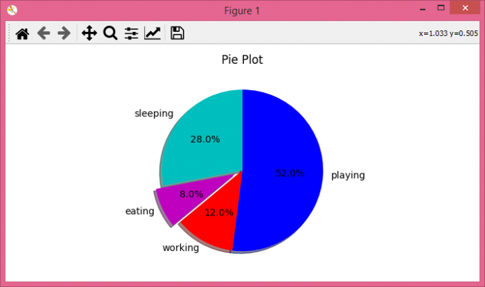
In this article, we can create a pie chart to show our daily activities, i.e., sleeping, eating, working, and playing. Using plt.pie() method, we can create a pie chart with the given different data sets for different activities.
Steps
Create a list of days, i.e., [1, 2, 3, 4, 5]. Similarly, make lists for sleeping, eating, playing, and working. There is an activities list that keeps “sleeping”, “eating”, “working” and “playing”.
Make a list of colors.
Use plt.pie() method to draw the pie chart, where slices, activities, colors as cols, etc. are passed.
Set a title for the axes, i.e., “Pie Chart”.
To show the figure use plt.show() method.
Example
import matplotlib.pyplot as plt

days = [1, 2, 3, 4, 5]

sleeping = [7, 8, 6, 11, 7]
eating = [2, 3, 4, 3, 2]
working = [7, 8, 7, 2, 2]
playing = [8, 5, 7, 8, 13]
slices = [7, 2, 3, 13]
activities = ['sleeping', 'eating', 'working', 'playing']
cols = ['c', 'm', 'r', 'b']

plt.pie(slices,
         labels=activities,
         colors=cols,
         startangle=90,
         shadow=True,
         explode=(0, 0.1, 0, 0),
         autopct='%1.1f%%')

plt.title('Pie Plot')
plt.show()
Output
When we execute the code, it will produce the following output −

Updated on: 2021-10-26T13:02:12+05:30
3K+ Views

Advertisements