
 Data Structure
 Networking
 RDBMS
RDBMS Operating System
 Java
Java MS Excel
 iOS
iOS HTML
HTML CSS
CSS Android
 Python
 C Programming
 C++
C++ C#
C# MongoDB
 MySQL
MySQL Javascript
 PHP
PHP
- Selected Reading
- UPSC IAS Exams Notes
- Developer's Best Practices
- Questions and Answers
- Effective Resume Writing
- HR Interview Questions
- Computer Glossary
- Who is Who
How can bubble charts be created using Matplotlib?
Matplotlib library is built upon Numpy. It is a Python library that is used to visualize data. It is a tree-like hierarchical structure which consists of objects that makeup each of these plots. A ’Figure’ in Matplotlib can be understood as the outermost storage for a graph. This ‘Figure’ can contains multiple ‘Axes’ objects. ‘Axes’ object is NOT the plural form of ‘Axis’ in this case.
‘Axes’ can be understood as a part of ‘Figure’, a subplot. It can be used to manipulate every part of the graph inside it. A ‘Figure’ object in Matplotlib is a box that stores one or more ‘Axes’ objects. Under ‘Axes’ comes the tick marks, lines, legends, and text boxes in the hierarchy. Every object in the Matplotlib can be manipulated. Let us see an example
Example
import matplotlib.pyplot as plt
import numpy as np
x = np.random.rand(50)
y = np.random.rand(50)
z = np.random.rand(50)
colors = np.random.rand(50)
plt.scatter(x, y, s=z*2000,c=colors)
plt.title("Bubble chart")
plt.xlabel("x−axis")
plt.ylabel("Y−axis")
plt.show()
Output
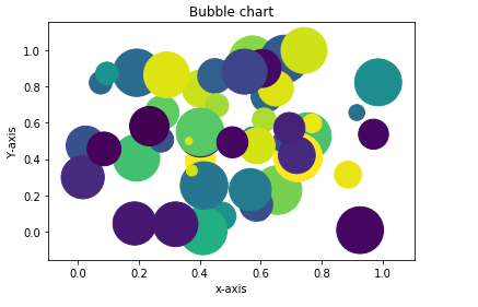
Explanation
The required packages are imported and aliased.
The ‘rand’ function present in ‘random’ class is used to generate data.
The ‘title’, x label, and y label of the plot is defined.
The ‘scatter’ function is called by passing the data.
The show function is used to display the data on the console.

324 Views
