- GWT - Home
- GWT - Overview
- GWT - Environment Setup
- GWT - Applications
- GWT - Create Application
- GWT - Deploy Application
- GWT - Style with CSS
- GWT - Basic Widgets
- GWT - Form Widgets
- GWT - Complex widgets
- GWT - Layout Panels
- GWT - Event Handling
- GWT - Custom Widgets
- GWT - UIBinder
- GWT - RPC Communication
- GWT - JUnit Integration
- GWT - Debugging Application
- GWT - Internationalization
- GWT - History Class
- GWT - Bookmark Support
- GWT - Logging Framework
GWT - UiBinder
Introduction
The UiBinder is a framework designed to separate Functionality and View of User Interface.
The UiBinder framework allows developers to build gwt applications as HTML pages with GWT widgets configured throughout them.
The UiBinder framework makes easier collaboration with UI designers who are more comfortable with XML, HTML and CSS than Java source code
The UIBinder provides a declarative way of defining User Interface.
The UIBinder seperates the programmic logic from UI.
The UIBinder is similar to what JSP is to Servlets.
UiBinder Workflow
Step 1 - Create UI Declaration XML File
Create a XML/HTML based User Interface declaration file. We've created a Login.ui.xml file in our example.
<ui:UiBinder xmlns:ui = 'urn:ui:com.google.gwt.uibinder'
   xmlns:gwt = 'urn:import:com.google.gwt.user.client.ui'
   xmlns:res = 'urn:with:com.tutorialspoint.client.LoginResources'>
   <ui:with type = "com.tutorialspoint.client.LoginResources" field = "res">
   </ui:with>
   <gwt:HTMLPanel>
   ...
   </gwt:HTMLPanel>
</ui:UiBinder>
Step 2 - Use ui:field for Later Binding
Use ui:field attribute in XML/HTML element to relate UI field in XML with UI field in JAVA file for later binding.
<gwt:Label ui:field = "completionLabel1" />
<gwt:Label ui:field = "completionLabel2" />
Step 3 - Create Java counterpart of UI XML
Create Java based counterpart of XML based layout by extending Composite widget. We've created a Login.java file in our example.
package com.tutorialspoint.client;
   ...
public class Login extends Composite {
   ...
}
Step 4 - Bind Java UI fields with UiField annotation
use @UiField annotation in Login.java to designate counterpart class members to bind to XML-based fields in Login.ui.xml
public class Login extends Composite {
   ...
   @UiField
   Label completionLabel1;

   @UiField
   Label completionLabel2;
   ...
}
Step 5 - Bind Java UI with UI XML with UiTemplate annotation
Instruct GWT to bind java based component Login.java and XML based layout Login.ui.xml using @UiTemplate annotation
public class Login extends Composite {

   private static LoginUiBinder uiBinder = GWT.create(LoginUiBinder.class);

   /*
    * @UiTemplate is not mandatory but allows multiple XML templates
    * to be used for the same widget.
    * Default file loaded will be <class-name>.ui.xml
    */

   @UiTemplate("Login.ui.xml")
   interface LoginUiBinder extends UiBinder<Widget, Login> {
   }
   ...
}
Step 6 - Create CSS File
Create an external CSS fileLogin.css and Java based Resource LoginResources.java file equivalent to css styles
.blackText {
   font-family: Arial, Sans-serif;
   color: #000000;
   font-size: 11px;
   text-align: left;
}
...
Step 7 - Create Java based Resource File for CSS File
package com.tutorialspoint.client;
...
public interface LoginResources extends ClientBundle {
   public interface MyCss extends CssResource {
      String blackText();

      ...
   }

   @Source("Login.css")
   MyCss style();
}
Step 8 - Attach CSS resource in Java UI Code file.
Attach an external CSS fileLogin.css using Contructor of Java based widget class Login.java
public Login() {
   this.res = GWT.create(LoginResources.class);
   res.style().ensureInjected();
   initWidget(uiBinder.createAndBindUi(this));
}
UIBinder Complete Example
This example will take you through simple steps to show usage of a UIBinder in GWT. Follow the following steps to update the GWT application we created in GWT - Create Application chapter −
| Step | Description |
|---|---|
| 1 | Create a project with a name HelloWorld under a package com.tutorialspoint as explained in the GWT - Create Application chapter. |
| 2 | Modify HelloWorld.gwt.xml, HelloWorld.css, HelloWorld.html and HelloWorld.java as explained below. Keep rest of the files unchanged. |
| 3 | Compile and run the application to verify the result of the implemented logic. |
Following is the content of the modified module descriptor src/com.tutorialspoint/HelloWorld.gwt.xml.
<?xml version = "1.0" encoding = "UTF-8"?>
<module rename-to = 'helloworld'>
   <!-- Inherit the core Web Toolkit stuff.                        -->
   <inherits name = 'com.google.gwt.user.User'/>

   <!-- Inherit the default GWT style sheet.                       -->
   <inherits name = 'com.google.gwt.user.theme.clean.Clean'/>
   <!-- Inherit the UiBinder module.                               -->
   <inherits name = "com.google.gwt.uibinder.UiBinder"/>
   <!-- Specify the app entry point class.                         -->
   <entry-point class = 'com.tutorialspoint.client.HelloWorld'/>

   <!-- Specify the paths for translatable code                    -->
   <source path ='client'/>
   <source path = 'shared'/>

</module>
Following is the content of the modified Style Sheet file war/HelloWorld.css.
body {
   text-align: center;
   font-family: verdana, sans-serif;
}

h1 {
   font-size: 2em;
   font-weight: bold;
   color: #777777;
   margin: 40px 0px 70px;
   text-align: center;
}
Following is the content of the modified HTML host file war/HelloWorld.html.
<html>
   <head>
      <title>Hello World</title>
      <link rel = "stylesheet" href = "HelloWorld.css"/>
      <script language = "javascript" src = "helloworld/helloworld.nocache.js">
      </script>
   </head>

   <body>
      <h1>UiBinder Demonstration</h1>
      <div id = "gwtContainer"></div>
   </body>
</html>
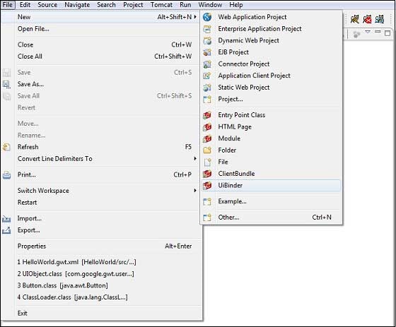
Now create a new UiBinder template and owner class (File → New → UiBinder).
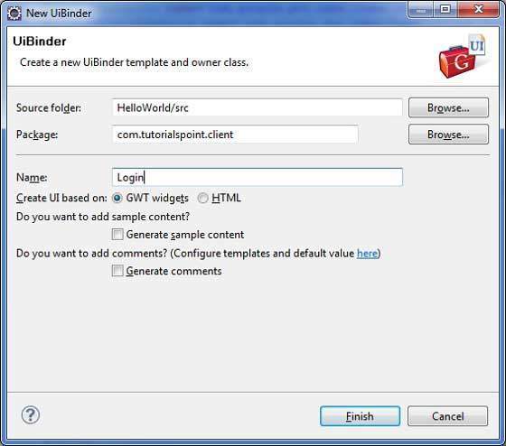
Choose the client package for the project and then name it Login. Leave all of the other defaults. Click Finish button and the plugin will create a new UiBinder template and owner class.
Now create Login.css file in the src/com.tutorialspoint/client package and place the following contents in it
.blackText {
   font-family: Arial, Sans-serif;
   color: #000000;
   font-size: 11px;
   text-align: left;
}

.redText {
   font-family: Arial, Sans-serif;
   color: #ff0000;
   font-size: 11px;
   text-align: left;
}

.loginButton {
   border: 1px solid #3399DD;
   color: #FFFFFF;
   background: #555555;
   font-size: 11px;
   font-weight: bold;
   margin: 0 5px 0 0;
   padding: 4px 10px 5px;
   text-shadow: 0 -1px 0 #3399DD;
}

.box {
   border: 1px solid #AACCEE;
   display: block;
   font-size: 12px;
   margin: 0 0 5px;
   padding: 3px;
   width: 203px;
}

.background {
   background-color: #999999;
   border: 1px none transparent;
   color: #000000;
   font-size: 11px;
   margin-left: -8px;
   margin-top: 5px;
   padding: 6px;
}
Now create LoginResources.java file in the src/com.tutorialspoint/client package and place the following contents in it
package com.tutorialspoint.client;

import com.google.gwt.resources.client.ClientBundle;
import com.google.gwt.resources.client.CssResource;

public interface LoginResources extends ClientBundle {
   /**
    * Sample CssResource.
    */
   public interface MyCss extends CssResource {
      String blackText();

      String redText();

      String loginButton();

      String box();

      String background();
   }

   @Source("Login.css")
   MyCss style();
}
Replace the contents of Login.ui.xml in src/com.tutorialspoint/client package with the following
<ui:UiBinder xmlns:ui = 'urn:ui:com.google.gwt.uibinder'
   xmlns:gwt = 'urn:import:com.google.gwt.user.client.ui'
   xmlns:res = 'urn:with:com.tutorialspoint.client.LoginResources'>

   <ui:with type = "com.tutorialspoint.client.LoginResources" field = "res">
   </ui:with>

   <gwt:HTMLPanel>
      <div align = "center">

         <gwt:VerticalPanel res:styleName = "style.background">
            <gwt:Label text = "Login" res:styleName = "style.blackText" />
            <gwt:TextBox ui:field="loginBox" res:styleName = "style.box" />
            <gwt:Label text = "Password" res:styleName = "style.blackText" />
            <gwt:PasswordTextBox ui:field = "passwordBox" res:styleName = "style.box" />

            <gwt:HorizontalPanel verticalAlignment = "middle">
               <gwt:Button ui:field = "buttonSubmit" text="Submit"
                  res:styleName = "style.loginButton" />
               <gwt:CheckBox ui:field = "myCheckBox" />
               <gwt:Label ui:field = "myLabel" text = "Remember me"
                  res:styleName = "style.blackText" />
            </gwt:HorizontalPanel>

            <gwt:Label ui:field = "completionLabel1" res:styleName = "style.blackText" />
            <gwt:Label ui:field = "completionLabel2" res:styleName = "style.blackText" />
         </gwt:VerticalPanel>

      </div>
   </gwt:HTMLPanel>

</ui:UiBinder>
Replace the contents of Login.java in src/com.tutorialspoint/client package with the following
package com.tutorialspoint.client;

import com.google.gwt.core.client.GWT;
import com.google.gwt.event.dom.client.ClickEvent;
import com.google.gwt.event.logical.shared.ValueChangeEvent;
import com.google.gwt.uibinder.client.UiBinder;
import com.google.gwt.uibinder.client.UiField;
import com.google.gwt.uibinder.client.UiHandler;
import com.google.gwt.uibinder.client.UiTemplate;
import com.google.gwt.user.client.Window;
import com.google.gwt.user.client.ui.Composite;
import com.google.gwt.user.client.ui.Label;
import com.google.gwt.user.client.ui.TextBox;
import com.google.gwt.user.client.ui.Widget;

public class Login extends Composite {

   private static LoginUiBinder uiBinder = GWT.create(LoginUiBinder.class);

   /*
    * @UiTemplate is not mandatory but allows multiple XML templates
    * to be used for the same widget.
    * Default file loaded will be <class-name>.ui.xml
    */
   @UiTemplate("Login.ui.xml")
   interface LoginUiBinder extends UiBinder<Widget, Login> {
   }

   @UiField(provided = true)
   final LoginResources res;

   public Login() {
      this.res = GWT.create(LoginResources.class);
      res.style().ensureInjected();
      initWidget(uiBinder.createAndBindUi(this));
   }

   @UiField
   TextBox loginBox;

   @UiField
   TextBox passwordBox;

   @UiField
   Label completionLabel1;

   @UiField
   Label completionLabel2;

   private Boolean tooShort = false;

   /*
    * Method name is not relevant, the binding is done according to the class
    * of the parameter.
    */
   @UiHandler("buttonSubmit")
   void doClickSubmit(ClickEvent event) {
      if (!tooShort) {
         Window.alert("Login Successful!");
      } else {
         Window.alert("Login or Password is too short!");
      }
   }

   @UiHandler("loginBox")
   void handleLoginChange(ValueChangeEvent<String> event) {
      if (event.getValue().length() < 6) {
         completionLabel1.setText("Login too short (Size must be > 6)");
         tooShort = true;
      } else {
         tooShort = false;
         completionLabel1.setText("");
      }
   }

   @UiHandler("passwordBox")
   void handlePasswordChange(ValueChangeEvent<String> event) {
      if (event.getValue().length() < 6) {
         tooShort = true;
         completionLabel2.setText("Password too short (Size must be > 6)");
      } else {
         tooShort = false;
         completionLabel2.setText("");
      }
   }
}
Let us have following content of Java file src/com.tutorialspoint/HelloWorld.java which will demonstrate use of UiBinder.
package com.tutorialspoint.client;

import com.google.gwt.core.client.EntryPoint;
import com.google.gwt.user.client.ui.RootPanel;

public class HelloWorld implements EntryPoint {
   public void onModuleLoad() {
      RootPanel.get().add(new Login());
   }
}
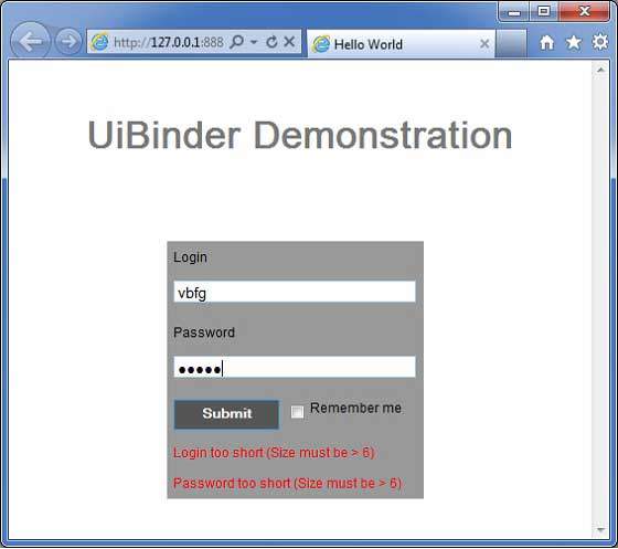
Once you are ready with all the changes done, let us compile and run the application in development mode as we did in GWT - Create Application chapter. If everything is fine with your application, this will produce following result −