- GWT - Home
- GWT - Overview
- GWT - Environment Setup
- GWT - Applications
- GWT - Create Application
- GWT - Deploy Application
- GWT - Style with CSS
- GWT - Basic Widgets
- GWT - Form Widgets
- GWT - Complex widgets
- GWT - Layout Panels
- GWT - Event Handling
- GWT - Custom Widgets
- GWT - UIBinder
- GWT - RPC Communication
- GWT - JUnit Integration
- GWT - Debugging Application
- GWT - Internationalization
- GWT - History Class
- GWT - Bookmark Support
- GWT - Logging Framework
GWT - ToggleButton Widget
Introduction
The ToggleButton widget represents a stylish stateful button which allows the user to toggle between up and down states.
Class Declaration
Following is the declaration for com.google.gwt.user.client.ui.ToggleButton class −
public class ToggleButton
   extends CustomButton
CSS Style Rules
Following default CSS Style rules will be applied to all the ToggleButton widget. You can override it as per your requirements.
.gwt-ToggleButton-up {}

.gwt-ToggleButton-down {}

.gwt-ToggleButton-up-hovering {}

.gwt-ToggleButton-down-hovering {}

.gwt-ToggleButton-up-disabled {}

.gwt-ToggleButton-down-disabled {}
Class Constructors
| Sr.No. | Constructor & Description |
|---|---|
| 1 |
ToggleButton() Constructor for ToggleButton. |
| 2 |
ToggleButton(Image upImage) Creates a ToggleButton with up state image. |
| 3 |
ToggleButton(Image upImage, ClickListener listener) Creates a ToggleButton with up state image and clickListener. |
| 4 |
ToggleButton(Image upImage, Image downImage) Creates a ToggleButton with up state image. |
| 5 |
ToggleButton(Image upImage, Image downImage, ClickListener listener) Creates a ToggleButton with up state image. |
| 6 |
ToggleButton(java.lang.String upText) Creates a ToggleButton with up state text. |
| 7 |
ToggleButton(java.lang.String upText, ClickListener listener) Creates a ToggleButton with up state text and clicklistener. |
| 8 |
ToggleButton(java.lang.String upText, java.lang.String downText) Creates a ToggleButton with up state and down state text. |
| 9 |
ToggleButton(java.lang.String upText, java.lang.String downText, ClickListener listener) Creates a ToggleButton with up state, down state text and click listener. |
Class Methods
| Sr.No. | Function name & Description |
|---|---|
| 1 |
boolean isDown() Is this button down? |
| 2 |
protected void onClick() Called when the user finishes clicking on this button. |
| 3 |
void setDown(boolean down) Sets whether this button is down. |
Methods Inherited
This class inherits methods from the following classes −
com.google.gwt.user.client.ui.UIObject
com.google.gwt.user.client.ui.Widget
com.google.gwt.user.client.ui.FocusWidget
com.google.gwt.user.client.ui.CustomWidget
java.lang.Object
ToggleButton Widget Example
This example will take you through simple steps to show usage of a ToggleButton Widget in GWT. Follow the following steps to update the GWT application we created in GWT - Create Application chapter −
| Step | Description |
|---|---|
| 1 | Create a project with a name HelloWorld under a package com.tutorialspoint as explained in the GWT - Create Application chapter. |
| 2 | Modify HelloWorld.gwt.xml, HelloWorld.css, HelloWorld.html and HelloWorld.java as explained below. Keep rest of the files unchanged. |
| 3 | Compile and run the application to verify the result of the implemented logic. |
Following is the content of the modified module descriptor src/com.tutorialspoint/HelloWorld.gwt.xml.
<?xml version = "1.0" encoding = "UTF-8"?>
<module rename-to = 'helloworld'>
   <!-- Inherit the core Web Toolkit stuff.                        -->
   <inherits name = 'com.google.gwt.user.User'/>

   <!-- Inherit the default GWT style sheet.                       -->
   <inherits name = 'com.google.gwt.user.theme.clean.Clean'/>

   <!-- Specify the app entry point class.                         -->
   <entry-point class = 'com.tutorialspoint.client.HelloWorld'/>

   <!-- Specify the paths for translatable code                    -->
   <source path = 'client'/>
   <source path = 'shared'/>

</module>
Following is the content of the modified Style Sheet file war/HelloWorld.css.
body {
   text-align: center;
   font-family: verdana, sans-serif;
}

h1 {
   font-size: 2em;
   font-weight: bold;
   color: #777777;
   margin: 40px 0px 70px;
   text-align: center;
}

.gwt-ToggleButton-up {
   color:green;
}

.gwt-ToggleButton-down {
   color:blue;
}

.gwt-ToggleButton-up-hovering {
   color:pink;
}

.gwt-ToggleButton-down-hovering {
   color:aqua;
}

.gwt-ToggleButton-up-disabled {
   color:lime;
}

.gwt-ToggleButton-down-disabled {
   color:maroon;
}
Following is the content of the modified HTML host file war/HelloWorld.html.
<html>
   <head>
      <title>Hello World</title>
      <link rel = "stylesheet" href = "HelloWorld.css"/>
      <script language = "javascript" src = "helloworld/helloworld.nocache.js">
      </script>
   </head>

   <body>
      <h1>ToggleButton Widget Demonstration</h1>
      <div id = "gwtContainer"></div>
   </body>
</html>
Let us have following content of Java file src/com.tutorialspoint/HelloWorld.java which will demonstrate use of ToggleButton widget.
public class HelloWorld implements EntryPoint {
   public void onModuleLoad() {

      //create toggle buttons
      ToggleButton toggleButton = new ToggleButton("Click Me!");
      ToggleButton toggleButton1 = new ToggleButton("Click Me!");

      //disable a toggle button
      toggleButton1.setEnabled(false);

      //add a clickListener to the toggle button
      toggleButton.addClickHandler(new ClickHandler() {
        @Override
         public void onClick(ClickEvent event) {
            Window.alert("Hello World!");
         }
      });

      // Add toggle button to the root panel.
      VerticalPanel panel = new VerticalPanel();
      panel.setSpacing(10);
      panel.add(toggleButton);
      panel.add(toggleButton1);

      RootPanel.get("gwtContainer").add(panel);
   }
}
Once you are ready with all the changes done, let us compile and run the application in development mode as we did in GWT - Create Application chapter. If everything is fine with your application, this will produce following result −
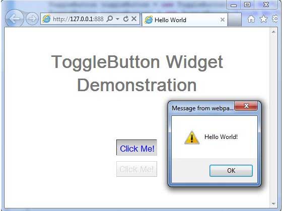
When you click Click Me button, it will show an alert message Hello World!
You can see color of button text will change with your interaction.
Hover over the button, color will be pink.
Press the button, color will be blue.
Release the button, button will remain down.
