- Flexbox - Home
- Flexbox - Overview
- Flexbox - Flex Containers
- Flexbox - Flex-Direction
- Flexbox - Flex-Wrap
- Flexbox - Justifying Contents
- Flexbox - Align Items
- Flexbox - Align Content
- Flexbox - Flex-Order
- Flexbox - Flexibility
- Flexbox - Align Self
Flexbox - Quick Guide
Flexbox - Overview
Cascading Style Sheets (CSS) is a simple design language intended to simplify the process of making web pages presentable. CSS handles the look and feel part of a web page.
Using CSS, you can control the color of the text, the style of fonts, the spacing between paragraphs, how columns are sized and laid out, what background images or colors are used, layout designs, variations in display for different devices and screen sizes as well as a variety of other effects.
To determine the position and dimensions of the boxes, in CSS, you can use one of the layout modes available −
The block layout − This mode is used in laying out documents.
The inline layout − This mode is used in laying out text.
The table layout − This mode is used in laying out tables.
The table layout − This mode is used in positioning the elements.
All these modes are used to align specific elements like documents, text, tables, etc., however, none of these provides a complete solution to lay out complex websites. Initially this is used to be done using a combination of floated elements, positioned elements, and table layout (often). But floats only allow to horizontally position the boxes.
What is Flexbox?
In addition to the above-mentioned modes, CSS3 provides another layout mode Flexible Box, commonly called as Flexbox.
Using this mode, you can easily create layouts for complex applications and web pages. Unlike floats, Flexbox layout gives complete control over the direction, alignment, order, size of the boxes.
Features of Flexbox
Following are the notable features of Flexbox layout −
Direction − You can arrange the items on a web page in any direction such as left to right, right to left, top to bottom, and bottom to top.
Order − Using Flexbox, you can rearrange the order of the contents of a web page.
Wrap − In case of inconsistent space for the contents of a web page (in single line), you can wrap them to multiple lines (both horizontally) and vertically.
Alignment − Using Flexbox, you can align the contents of the webpage with respect to their container.
Resize − Using Flexbox, you can increase or decrease the size of the items in the page to fit in available space.
Supporting browsers
Following are the browsers that support Flexbox.
- Chrome 29+
- Firefox 28+
- Internet Explorer 11+
- Opera 17+
- Safari 6.1+
- Android 4.4+
- iOS 7.1+
Flexbox - Flex Containers
To use Flexbox in your application, you need to create/define a flex container using the display property.
Usage −
display: flex | inline-flex
This property accepts two values
flex − Generates a block level flex container.
inline-flex − Generates an inline flex container box.
Now, we will see how to use the display property with examples.
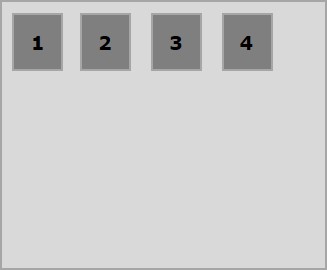
Flex
On passing this value to the display property, a block level flex container will be created. It occupies the full width of the parent container (browser).
The following example demonstrates how to create a block level flex container. Here, we are creating six boxes with different colors and we have used the flex container to hold them.
<!doctype html>
<html lang = "en">
   <style>
      .box1{background:green;}
      .box2{background:blue;}
      .box3{background:red;}
      .box4{background:magenta;}
      .box5{background:yellow;}
      .box6{background:pink;}

      .container{
         display:flex;
      }
      .box{
         font-size:35px;
         padding:15px;
      }
   </style>

   <body>
      <div class = "container">
         <div class = "box box1">One</div>
         <div class = "box box2">two</div>
         <div class = "box box3">three</div>
         <div class = "box box4">four</div>
         <div class = "box box5">five</div>
         <div class = "box box6">six</div>
      </div>
   </body>
</html>
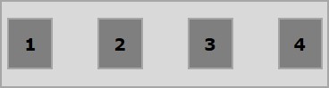
It will produce the following result −
Since we have given the value flex to the display property, the container uses the width of the container (browser).
You can observe this by adding a border to the container as shown below.
.container {
   display:inline-flex;
   border:3px solid black;
}
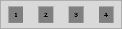
It will produce the following result −
Inline flex
On passing this value to the display property, an inline level flex container will be created. It just takes the place required for the content.
The following example demonstrates how to create an inline flex container. Here, we are creating six boxes with different colors and we have used the inline-flex container to hold them.
<!doctype html>
<html lang = "en">
   <style>
      .box1{background:green;}
      .box2{background:blue;}
      .box3{background:red;}
      .box4{background:magenta;}
      .box5{background:yellow;}
      .box6{background:pink;}

      .container{
         display:inline-flex;
         border:3px solid black;
      }
      .box{
         font-size:35px;
         padding:15px;
      }
   </style>

   <body>
      <div class = "container">
         <div class = "box box1">One</div>
         <div class = "box box2">two</div>
         <div class = "box box3">three</div>
         <div class = "box box4">four</div>
         <div class = "box box5">five</div>
         <div class = "box box6">six</div>
      </div>
   </body>
</html>
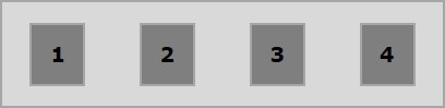
It will produce the following result −
Since we have used an inline flex container, it just took the space that is required to wrap its elements.
Flexbox - Flex-Direction
The flex-direction property is used to specify the direction in which the elements of flex container (flex-items) are needed to be placed.
usage −
flex-direction: row | row-reverse | column | column-reverse
This property accepts four values −
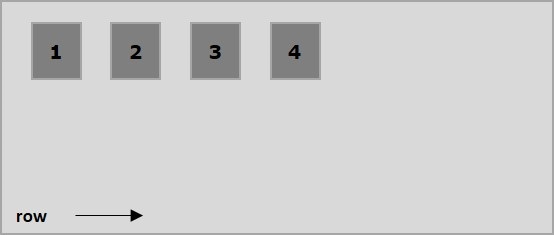
row − Arranges the elements of the container horizontally from left to right.
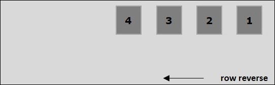
row-reverse − Arranges the elements of the container horizontally from right to left.
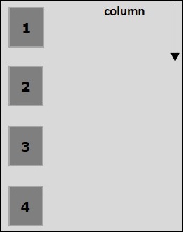
column − Arranges the elements of the container vertically from left to right.
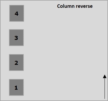
column-reverse − Arranges the elements of the container vertically from right to left.
Now, we will take a few examples to demonstrate the use of the direction property.
row
On passing this value to the direction property, the elements of the container are arranged horizontally from left to right as shown below.
The following example demonstrates the result of passing the value row to the flex-direction property. Here, we are creating six boxes with different colors with the flex-direction value row.
<!doctype html>
<html lang = "en">
   <style>
      .box1{background:green;}
      .box2{background:blue;}
      .box3{background:red;}
      .box4{background:magenta;}
      .box5{background:yellow;}
      .box6{background:pink;}

      .box{
         font-size:35px;
         padding:15px;
      }
      .container{
         display:inline-flex;
         border:3px solid black;
         flex-direction:row;
      }
   </style>

   <body>
      <div class = "container">
         <div class = "box box1">One</div>
         <div class = "box box2">two</div>
         <div class = "box box3">three</div>
         <div class = "box box4">four</div>
         <div class = "box box5">five</div>
         <div class = "box box6">six</div>
      </div>
   </body>
</html>
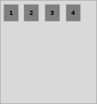
It will produce the following result −
row-reverse
On passing this value to the direction property, the elements of the container are arranged horizontally from right to left as shown below.
The following example demonstrates the result of passing the value row-reverse to the flex-direction property. Here, we are creating six boxes with different colors with the flex-direction value row-reverse.
<!doctype html>
<html lang = "en">
   <style>
      .box1{background:green;}
      .box2{background:blue;}
      .box3{background:red;}
      .box4{background:magenta;}
      .box5{background:yellow;}
      .box6{background:pink;}

      .box{
         font-size:35px;
         padding:15px;
      }
      .container{
         display:inline-flex;
         border:3px solid black;
         flex-direction:row-reverse;
      }
   </style>

   <body>
      <div class = "container">
         <div class = "box box1">One</div>
         <div class = "box box2">two</div>
         <div class = "box box3">three</div>
         <div class = "box box4">four</div>
         <div class = "box box5">five</div>
         <div class = "box box6">six</div>
      </div>
   </body>
</html>
It will produce the following result −
column
On passing this value to the direction property, the elements of the container are arranged vertically from top to bottom as shown below.
The following example demonstrates the result of passing the value column to the flex-direction property. Here, we are creating six boxes with different colors with the flex-direction value column.
<!doctype html>
<html lang = "en">
   <style>
      .box1{background:green;}
      .box2{background:blue;}
      .box3{background:red;}
      .box4{background:magenta;}
      .box5{background:yellow;}
      .box6{background:pink;}

      .box{
         font-size:35px;
         padding:15px;
      }
      .container{
         display:inline-flex;
         border:3px solid black;
         flex-direction:column;
      }
   </style>
   <body>
      <div class = "container">
         <div class = "box box1">One</div>
         <div class = "box box2">two</div>
         <div class = "box box3">three</div>
         <div class = "box box4">four</div>
         <div class = "box box5">five</div>
         <div class = "box box6">six</div>
      </div>
   </body>
</html>
It will produce the following result −
column-reverse
On passing this value to the direction property, the elements of the container are arranged vertically from bottom to top as shown below.
The following example demonstrates the result of passing the value column-reverse to the flex-direction property. Here, we are creating six boxes with different colors with the flex-direction value column-reverse.
<!doctype html>
<html lang = "en">
   <style>
      .box1{background:green;}
      .box2{background:blue;}
      .box3{background:red;}
      .box4{background:magenta;}
      .box5{background:yellow;}
      .box6{background:pink;}

      .box{
         font-size:35px;
         padding:15px;
      }
      .container{
         display:inline-flex;
         border:3px solid black;
         flex-direction:column-reverse;
      }
   </style>

   <body>
      <div class = "container">
         <div class = "box box1">One</div>
         <div class = "box box2">two</div>
         <div class = "box box3">three</div>
         <div class = "box box4">four</div>
         <div class = "box box5">five</div>
         <div class = "box box6">six</div>
      </div>
   </body>
</html>
It will produce the following result −
Flexbox - Flex-Wrap
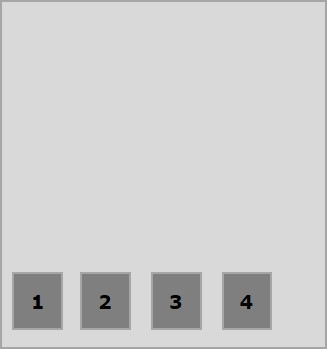
Generally, in case of insufficient space for the container, the rest of the flex items will be hidden as shown below.
The flex-wrap property is used to specify the controls whether the flex-container is single-line or multi-line.
usage −
flex-wrap: nowrap | wrap | wrap-reverse
flex-direction: column | column-reverse
This property accepts the following values −
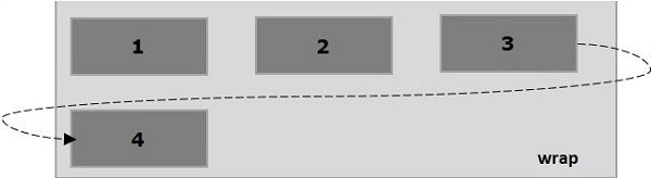
wrap − In case of insufficient space for them, the elements of the container (flexitems) will wrap into additional flex lines from top to bottom.
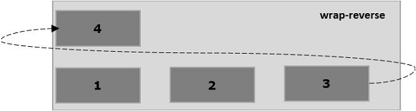
wrap-reverse − In case of insufficient space for them, the elements of the container (flex-items) will wrap into additional flex lines from bottom to top.
Now, we will see how to use the wrap property, with examples.
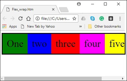
wrap
On passing the value wrap to the property flex-wrap, the elements of the container are arranged horizontally from left to right as shown below.
The following example demonstrates the result of passing the value wrap to the flex-wrap property. Here, we are creating six boxes with different colors with the flex-direction value row.
<!doctype html>
<html lang = "en">
   <style>
      .box1{background:green;}
      .box2{background:blue;}
      .box3{background:red;}
      .box4{background:magenta;}
      .box5{background:yellow;}
      .box6{background:pink;}

      .box{
         font-size:35px;
         padding:15px;
         width:100px;
      }
      .container{
         display:flex;
         border:3px solid black;
         flex-direction:row;
         flex-wrap:wrap;
      }
   </style>

   <body>
      <div class = "container">
         <div class = "box box1">One</div>
         <div class = "box box2">two</div>
         <div class = "box box3">three</div>
         <div class = "box box4">four</div>
         <div class = "box box5">five</div>
         <div class = "box box6">six</div>
      </div>
   </body>
</html>
It will produce the following result −
wrap-reverse
On passing the value wrap-reverse to the property flex-wrap, the elements of the container are arranged horizontally from left to right as shown below.
The following example demonstrates the result of passing the value wrap-reverse to the flex-wrap property. Here, we are creating six boxes with different colors with the flex-direction value row.
<!doctype html>
<html lang = "en">
   <style>
      .box1{background:green;}
      .box2{background:blue;}
      .box3{background:red;}
      .box4{background:magenta;}
      .box5{background:yellow;}
      .box6{background:pink;}

      .box{
         font-size:35px;
         padding:15px;
         width:100px;
      }
      .container{
         display:flex;
         border:3px solid black;
         flex-direction:row;
         flex-wrap:wrap-reverse;
      }
   </style>
   <body>
      <div class = "container">
         <div class = "box box1">One</div>
         <div class = "box box2">two</div>
         <div class = "box box3">three</div>
         <div class = "box box4">four</div>
         <div class = "box box5">five</div>
         <div class = "box box6">six</div>
      </div>
   </body>
</html>
It will produce the following result −
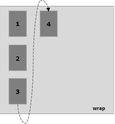
wrap (column)
On passing the value wrap to the property flex-wrap and the value column to the property flex-direction, the elements of the container are arranged horizontally from left to right as shown below.
The following example demonstrates the result of passing the value wrap to the flex-wrap property. Here, we are creating six boxes with different colors with the flex-direction value column.
<!doctype html>
<html lang = "en">
   <style>
      .box1{background:green;}
      .box2{background:blue;}
      .box3{background:red;}
      .box4{background:magenta;}
      .box5{background:yellow;}
      .box6{background:pink;}

      .box{
         font-size:35px;
         padding:15px;
         width:100px;
      }
      .container{
         display:flex;
         border:3px solid black;
         flex-direction:column;
         flex-wrap:wrap;
         height:100vh;
      }
   </style>

   <body>
      <div class = "container">
         <div class = "box box1">One</div>
         <div class = "box box2">two</div>
         <div class = "box box3">three</div>
         <div class = "box box4">four</div>
         <div class = "box box5">five</div>
         <div class = "box box6">six</div>
      </div>
   </body>
</html>
It will produce the following result −
wrap-reverse (column)
On passing the value wrap-reverse to the property flex-wrap and the value column to the property flex-direction, the elements of the container are arranged horizontally from left to right as shown below.
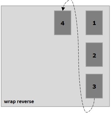
The following example demonstrates the result of passing the value wrap-reverse to the flex-wrap property. Here, we are creating six boxes with different colors and the with the flex-direction value column.
<!doctype html>
<html lang = "en">
   <style>
      .box1{background:green;}
      .box2{background:blue;}
      .box3{background:red;}
      .box4{background:magenta;}
      .box5{background:yellow;}
      .box6{background:pink;}

      .box{
         font-size:35px;
         padding:15px;
         width:100px;
      }
      .container{
         display:flex;
         border:3px solid black;
         flex-direction:column;
         flex-wrap:wrap-reverse;
         height:100vh;
      }
   </style>

   <body>
      <div class = "container">
         <div class = "box box1">One</div>
         <div class = "box box2">two</div>
         <div class = "box box3">three</div>
         <div class = "box box4">four</div>
         <div class = "box box5">five</div>
         <div class = "box box6">six</div>
      </div>
   </body>
</html>
It will produce the following result −
Flexbox - Justifying Contents
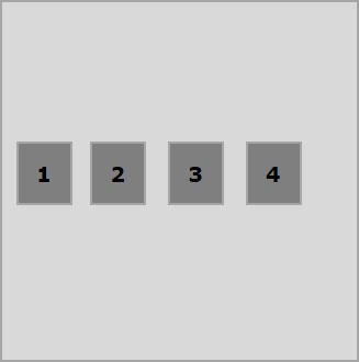
Often you can observe an extra space left in the container after arranging the flex items as shown below.
Using the property justify-content, you can align the contents along the main axis by distributing the extra space as intended. You can also adjust the alignment of the flexitems, in case they overflow the line.
usage −
justify-content: flex-start | flex-end | center | space-between | space-around| space-evenly;
This property accepts the following values −
flex-start − The flex-items are placed at the start of the container.
flex-end − The flex-items are placed at the end of the container.
center − The flex-items are placed at the center of the container, where the extra space is equally distributed at the start and at the end of the flex-items.
space-between − The extra space is equally distributed between the flex-items.
space-around − The extra space is equally distributed between the flex items such that the space between the edges of the container and its contents is half as the space between the flex-items.
Now, we will see how to use the justify-content property, with examples.
flex-start
On passing this value to the property justify-content, the flex-items are placed at the start of the container.
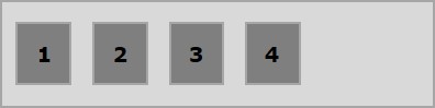
The following example demonstrates the result of passing the value flex-start to the justify-content property.
<!doctype html>
<html lang = "en">
   <style>
      .box1{background:green;}
      .box2{background:blue;}
      .box3{background:red;}
      .box4{background:magenta;}
      .box5{background:yellow;}
      .box6{background:pink;}

      .box{
         font-size:35px;
         padding:15px;
      }
      .container{
         display:flex;
         border:3px solid black;
         justify-content:flex-start;
      }
   </style>

   <body>
      <div class = "container">
         <div class = "box box1">One</div>
         <div class = "box box2">two</div>
         <div class = "box box3">three</div>
         <div class = "box box4">four</div>
         <div class = "box box5">five</div>
         <div class = "box box6">six</div>
      </div>
   </body>
</html>
It will produce the following result −
flex-end
On passing this value to the property justify-content, the flex-items are placed at the end of the container.
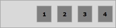
The following example demonstrates the result of passing the value flex-end to the justify-content property.
<!doctype html>
<html lang = "en">
   <style>
      .box1{background:green;}
      .box2{background:blue;}
      .box3{background:red;}
      .box4{background:magenta;}
      .box5{background:yellow;}
      .box6{background:pink;}

      .box{
         font-size:35px;
         padding:15px;
      }
      .container{
         display:flex;
         border:3px solid black;
         justify-content:flex-end;
      }
   </style>

   <body>
      <div class = "container">
         <div class = "box box1">One</div>
         <div class = "box box2">two</div>
         <div class = "box box3">three</div>
         <div class = "box box4">four</div>
         <div class = "box box5">five</div>
         <div class = "box box6">six</div>
      </div>
   </body>
</html>
It will produce the following result −
center
On passing this value to the property justify-content, the flex-items are placed at the center of the container, where the extra space is equally distributed at the start and at the end of the flex-items.
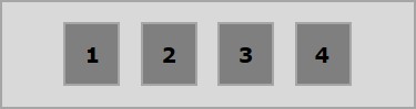
The following example demonstrates the result of passing the value center to the justify-content property.
<!doctype html>
<html lang = "en">
   <style>
      .box1{background:green;}
      .box2{background:blue;}
      .box3{background:red;}
      .box4{background:magenta;}
      .box5{background:yellow;}
      .box6{background:pink;}

      .box{
         font-size:35px;
         padding:15px;
      }
      .container{
         display:flex;
         border:3px solid black;
         justify-content:center;
      }
   </style>

   <body>
      <div class = "container">
         <div class = "box box1">One</div>
         <div class = "box box2">two</div>
         <div class = "box box3">three</div>
         <div class = "box box4">four</div>
         <div class = "box box5">five</div>
         <div class = "box box6">six</div>
      </div>
   </body>
</html>
It will produce the following result −
space-between
On passing this value to the property justify-content, the extra space is equally distributed between the flex items such that the space between any two flex-items is the same and the start and end of the flex-items touch the edges of the container.
The following example demonstrates the result of passing the value space-between to the justify-content property.
<!doctype html>
<html lang = "en">
   <style>
      .box1{background:green;}
      .box2{background:blue;}
      .box3{background:red;}
      .box4{background:magenta;}
      .box5{background:yellow;}
      .box6{background:pink;}

      .box{
         font-size:35px;
         padding:15px;
      }
      .container{
         display:flex;
         border:3px solid black;
         justify-content:space-between;
      }
   </style>

   <body>
      <div class = "container">
         <div class = "box box1">One</div>
         <div class = "box box2">two</div>
         <div class = "box box3">three</div>
         <div class = "box box4">four</div>
         <div class = "box box5">five</div>
         <div class = "box box6">six</div>
      </div>
   </body>
</html>
It will produce the following result −
space-around
On passing this value to the property justify-content, the extra space is equally distributed between the flex-items such that the space between any two flex-items is the same. However, the space between the edges of the container and its contents (the start and end of the flex-items) is half as the space between the flex items.
The following example demonstrates the result of passing the value space-around to the justify-content property.
<!doctype html>
<html lang = "en">
   <style>
      .box1{background:green;}
      .box2{background:blue;}
      .box3{background:red;}
      .box4{background:magenta;}
      .box5{background:yellow;}
      .box6{background:pink;}

      .box{
         font-size:35px;
         padding:15px;
      }
      .container{
         display:flex;
         border:3px solid black;
         justify-content:space-around;
      }
   </style>

   <body>
      <div class = "container">
         <div class = "box box1">One</div>
         <div class = "box box2">two</div>
         <div class = "box box3">three</div>
         <div class = "box box4">four</div>
         <div class = "box box5">five</div>
         <div class = "box box6">six</div>
      </div>
   </body>
</html>
It will produce the following result −
space-evenly
On passing this value to the property justify-content, the extra space is equally distributed between the flex-items such that the space between any two flex-items is the same (including the space to the edges).
The following example demonstrates the result of passing the value space-evenly to the justify-content property.
<!doctype html>
<html lang = "en">
   <style>
      .box1{background:green;}
      .box2{background:blue;}
      .box3{background:red;}
      .box4{background:magenta;}
      .box5{background:yellow;}
      .box6{background:pink;}

      .box{
         font-size:35px;
         padding:15px;
      }
      .container{
         display:flex;
         border:3px solid black;
         justify-content:space-evenly;
      }
   </style>

   <body>
      <div class = "container">
         <div class = "box box1">One</div>
         <div class = "box box2">two</div>
         <div class = "box box3">three</div>
         <div class = "box box4">four</div>
         <div class = "box box5">five</div>
         <div class = "box box6">six</div>
      </div>
   </body>
</html>
It will produce the following result −
Flexbox - Align Items
The align-items property is same as justify content. But here, the items were aligned across the cross access (vertically).
Usage −
align-items: flex-start | flex-end | center | baseline | stretch;
This property accepts the following values −
flex-start − The flex items were aligned vertically at the top of the container.
flex-end − The flex items were aligned vertically at the bottom of the container.
flex-center − The flex items were aligned vertically at the center of the container.
stretch − The flex items were aligned vertically such that they fill up the whole vertical space of the container.
baseline − The flex items were aligned such that the baseline of their text align along a horizontal line.
flex-start
On passing this value to the property align-items, the flex items were aligned vertically at the top of the container.
The following example demonstrates the result of passing the value flex-start to the align-items property.
<!doctype html>
<html lang = "en">
   <style>
      .box1{background:green;}
      .box2{background:blue;}
      .box3{background:red;}
      .box4{background:magenta;}
      .box5{background:yellow;}
      .box6{background:pink;}

      .box{
         font-size:35px;
         padding:15px;
      }
      .container{
         display:flex;
         height:100vh;
         align-items:flex-start;
      }
   </style>

   <body>
      <div class = "container">
         <div class = "box box1">One</div>
         <div class = "box box2">two</div>
         <div class = "box box3">three</div>
         <div class = "box box4">four</div>
         <div class = "box box5">five</div>
         <div class = "box box6">six</div>
      </div>
   </body>
</html>
It will produce the following result −
flex-end
On passing this value to the property align-items, the flex-items are aligned vertically at the bottom of the container.
The following example demonstrates the result of passing the value flex-end to the align-items property.
<!doctype html>
<html lang = "en">
   <style>
      .box1{background:green;}
      .box2{background:blue;}
      .box3{background:red;}
      .box4{background:magenta;}
      .box5{background:yellow;}
      .box6{background:pink;}

      .box{
         font-size:35px;
         padding:15px;
      }
      .container{
         display:flex;
         height:100vh;
         align-items:flex-end;
      }
   </style>

   <body>
      <div class = "container">
         <div class = "box box1">One</div>
         <div class = "box box2">two</div>
         <div class = "box box3">three</div>
         <div class = "box box4">four</div>
         <div class = "box box5">five</div>
         <div class = "box box6">six</div>
      </div>
   </body>
</html>
It will produce the following result −
center
On passing this value to the property align-items, the flex-items are aligned vertically at the center of the container.
The following example demonstrates the result of passing the value flex-center to the align-items property.
<!doctype html>
<html lang = "en">
   <style>
      .box1{background:green;}
      .box2{background:blue;}
      .box3{background:red;}
      .box4{background:magenta;}
      .box5{background:yellow;}
      .box6{background:pink;}

      .box{
         font-size:35px;
         padding:15px;
      }
      .container{
         display:flex;
         height:100vh;
         align-items:center;
      }
   </style>

   <body>
      <div class = "container">
         <div class = "box box1">One</div>
         <div class = "box box2">two</div>
         <div class = "box box3">three</div>
         <div class = "box box4">four</div>
         <div class = "box box5">five</div>
         <div class = "box box6">six</div>
      </div>
   </body>
</html>
It will produce the following result −
stretch
On passing this value to the property align-items, the flex-items are aligned vertically such that they fill up the whole vertical space of the container.
The following example demonstrates the result of passing the value stretch to the align-items property.
<!doctype html>
<html lang = "en">
   <style>
      .box1{background:green;}
      .box2{background:blue;}
      .box3{background:red;}
      .box4{background:magenta;}
      .box5{background:yellow;}
      .box6{background:pink;}

      .box{
         font-size:35px;
         padding:15px;
      }
      .container{
         display:flex;
         height:100vh;
         align-items:stretch;
      }
   </style>

   <body>
      <div class = "container">
         <div class = "box box1">One</div>
         <div class = "box box2">two</div>
         <div class = "box box3">three</div>
         <div class = "box box4">four</div>
         <div class = "box box5">five</div>
         <div class = "box box6">six</div>
      </div>
   </body>
</html>
It will produce the following result −
baseline
On passing this value to the property align-items, the flex-items are aligned such that the baseline of their text align along a horizontal line.
The following example demonstrates the result of passing the value baseline to the align-items property.
<!doctype html>
<html lang = "en">
   <style>
      .box1{background:green;}
      .box2{background:blue;}
      .box3{background:red;}
      .box4{background:magenta;}
      .box5{background:yellow;}
      .box6{background:pink;}

      .box{
         font-size:35px;
         padding:15px;
      }
      .container{
         display:flex;
         height:100vh;
         align-items:baseline;
      }
   </style>

   <body>
      <div class = "container">
      <div class = "box box1">One</div>
      <div class = "box box2">two</div>
      <div class = "box box3">three</div>
      <div class = "box box4">four</div>
      <div class = "box box5">five</div>
      <div class = "box box6">six</div>
      </div>
   </body>
</html>
It will produce the following result −
Flexbox - Align Content
In case the flex-container has multiple lines (when, flex-wrap: wrap), the align-content property defines the alignment of each line within the container.
Usage −
align-content: flex-start | flex-end | center | space-between | space-around | stretch;
This property accepts the following values −
stretch − The lines in the content will stretch to fill up the remaining space.
flex-start − All the lines in the content are packed at the start of the container.
flex-end − All the lines in the content are packed at the end of the container.
center − All the lines in the content are packed at the center of the container.
space-between − The extra space is distributed between the lines evenly.
space-around − The extra space is distributed between the lines evenly with equal space around each line (including the first and last lines)
center
On passing this value to the property align-content, all the lines are packed at the center of the container.
The following example demonstrates the result of passing the value center to the align-content property.
<!doctype html>
<html lang = "en">
   <style>
      .box1{background:green;}
      .box2{background:blue;}
      .box3{background:red;}
      .box4{background:magenta;}
      .box5{background:yellow;}
      .box6{background:pink;}

      .box{
         font-size:25px;
         padding:15px;
         width:43%;
      }
      .container{
         display:flex;
         height:100vh;
         flex-wrap:wrap;
         align-content:center;
      }
   </style>

   <body>
      <div class = "container">
         <div class = "box box1">One</div>
         <div class = "box box2">two</div>
         <div class = "box box3">three</div>
         <div class = "box box4">four</div>
         <div class = "box box5">five</div>
         <div class = "box box6">six</div>
      </div>
   </body>
</html>
It will produce the following result −
flex-start
On passing this value to the property align-content, all the lines are packed at the start of the container.
The following example demonstrates the result of passing the value flex-start to the align-content property.
<!doctype html>
<html lang = "en">
   <style>
      .box1{background:green;}
      .box2{background:blue;}
      .box3{background:red;}
      .box4{background:magenta;}
      .box5{background:yellow;}
      .box6{background:pink;}

      .box{
         font-size:25px;
         padding:15px;
         width:40%;
      }
      .container{
         display:flex;
         height:100vh;
         flex-wrap:wrap;
         align-content:flex-start;
      }
   </style>

   <body>
      <div class = "container">
         <div class = "box box1">One</div>
         <div class = "box box2">two</div>
         <div class = "box box3">three</div>
         <div class = "box box4">four</div>
         <div class = "box box5">five</div>
         <div class = "box box6">six</div>
      </div>
   </body>
</html>
It will produce the following result −
flex-end
On passing this value to the property align-content, all the lines are packed at the end of the container.
The following example demonstrates the result of passing the value flex-end to the align-content property.
<!doctype html>
<html lang = "en">
   <style>
      .box1{background:green;}
      .box2{background:blue;}
      .box3{background:red;}
      .box4{background:magenta;}
      .box5{background:yellow;}
      .box6{background:pink;}

      .box{
         font-size:25px;
         padding:15px;
         width:40%;
      }
      .container{
         display:flex;
         height:100vh;
         flex-wrap:wrap;
         align-content:flex-end;
      }
   </style>

   <body>
      <div class = "container">
         <div class = "box box1">One</div>
         <div class = "box box2">two</div>
         <div class = "box box3">three</div>
         <div class = "box box4">four</div>
         <div class = "box box5">five</div>
         <div class = "box box6">six</div>
      </div>
   </body>
</html>
It will produce the following result −
stretch
On passing this value to the property align-content, the lines will stretch to fill up the remaining space.
The following example demonstrates the result of passing the value stretch to the align-content property.
<!doctype html>
<html lang = "en">
   <style>
      .box1{background:green;}
      .box2{background:blue;}
      .box3{background:red;}
      .box4{background:magenta;}
      .box5{background:yellow;}
      .box6{background:pink;}

      .box{
         font-size:25px;
         padding:15px;
         width:40;
      }
      .container{
         display:flex;
         height:100vh;
         flex-wrap:wrap;
         align-content:stretch;
      }
   </style>

   <body>
      <div class = "container">
         <div class = "box box1">One</div>
         <div class = "box box2">two</div>
         <div class = "box box3">three</div>
         <div class = "box box4">four</div>
         <div class = "box box5">five</div>
         <div class = "box box6">six</div>
      </div>
   </body>
</html>
It will produce the following result −
space-around
On passing this value to the property align-content, the extra space is distributed between the lines evenly with equal space around each line (including the first and last lines).
The following example demonstrates the result of passing the value space-around to the align-content property.
<!doctype html>
<html lang = "en">
   <style>
      .box1{background:green;}
      .box2{background:blue;}
      .box3{background:red;}
      .box4{background:magenta;}
      .box5{background:yellow;}
      .box6{background:pink;}

      .box{
         font-size:25px;
         padding:15px;
         width:40%;
      }
      .container{
         display:flex;
         height:100vh;
         flex-wrap:wrap;
         align-content:space-around;
      }
   </style>

   <body>
      <div class = "container">
         <div class = "box box1">One</div>
         <div class = "box box2">two</div>
         <div class = "box box3">three</div>
         <div class = "box box4">four</div>
         <div class = "box box5">five</div>
         <div class = "box box6">six</div>
      </div>
   </body>
</html>
It will produce the following result −
space-between
On passing this value to the property align-content, the extra space is distributed between the lines evenly, where the first line will be at the top and the last line will be at the bottom of the container.
The following example demonstrates the result of passing the value space-between to the align-content property.
<!doctype html>
<html lang = "en">
   <style>
      .box1{background:green;}
      .box2{background:blue;}
      .box3{background:red;}
      .box4{background:magenta;}
      .box5{background:yellow;}
      .box6{background:pink;}

      .box{
         font-size:25px;
         padding:15px;
         width:40%;
      }
      .container{
         display:flex;
         height:100vh;
         flex-wrap:wrap;
         align-content:space-between;
      }
   </style>

   <body>
      <div class = "container">
         <div class = "box box1">One</div>
         <div class = "box box2">two</div>
         <div class = "box box3">three</div>
         <div class = "box box4">four</div>
         <div class = "box box5">five</div>
         <div class = "box box6">six</div>
      </div>
   </body>
</html>
It will produce the following result −
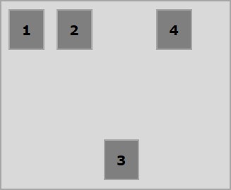
Flexbox - Flex-Order
The flex-order property is used to define the order of the flexbox item.
The following example demonstrates the order property. Here we are creating six colored boxes with the labels one, two, three, four, five, six, arranged in the same order, and we are reordering them in the order one, two, five, six, three, four, using the flex-order property.
<!doctype html>
<html lang = "en">
   <style>
      .box{
         font-size:35px;
         padding:15px;
      }
      .box1{background:green;}
      .box2{background:blue;}
      .box3{background:red; order:1}
      .box4{background:magenta; order:2}
      .box5{background:yellow;}
      .box6{background:pink;}

      .container{
         display:inline-flex;
         border:3px solid black;
         flex-direction:rows;
         flex-wrap:wrap;
      }
   </style>

   <body>
      <div class = "container">
         <div class = "box box1">One</div>
         <div class = "box box2">two</div>
         <div class = "box box3">three</div>
         <div class = "box box4">four</div>
         <div class = "box box5">five</div>
         <div class = "box box6">six</div>
      </div>
   </body>
</html>
It will produce the following result −
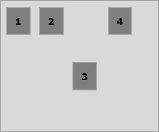
- ve ordering
You can also assign ve values to the order as shown below.
<!doctype html>
<html lang = "en">
   <style>
      .box{
         font-size:35px;
         padding:15px;
      }
      .box1{background:green;}
      .box2{background:blue;}
      .box3{background:red; order:-1}
      .box4{background:magenta; order:-2}
      .box5{background:yellow;}
      .box6{background:pink;}

      .container{
         display:inline-flex;
         border:3px solid black;
         flex-direction:row;
         flex-wrap:wrap;
      }
   </style>

   <body>
      <div class = "container">
         <div class = "box box1">One</div>
         <div class = "box box2">two</div>
         <div class = "box box3">three</div>
         <div class = "box box4">four</div>
         <div class = "box box5">five</div>
         <div class = "box box6">six</div>
      </div>
   </body>
</html>
It will produce the following result −
Flexbox - Flexibility
flex-basis
We use the flex-basis property to define the default size of the flex-item before the space is distributed.
The following example demonstrates the usage of the flex-basis property. Here we are creating 3 colored boxes and fixing their size to 150 px.
<!doctype html>
<html lang = "en">
   <style>
      .box{
         font-size:15px;
         padding:15px;
      }
      .box1{background:green; flex-basis:150px; }
      .box2{background:blue; flex-basis:150px;}
      .box3{background:red; flex-basis:150px;}

      .container{
         display:flex;
         height:100vh;
         align-items:flex-start;
      }
   </style>

   <body>
      <div class = "container">
         <div class = "box box1">One</div>
         <div class = "box box2">two</div>
         <div class = "box box3">three</div>
      </div>
   </body>
</html>
It will produce the following result −
flex-grow
We use the flex-grow property to set the flex-grow factor. In case of excess space in the container, it specifies how much a particular flex-item should grow.
<!doctype html>
<html lang = "en">
   <style>
      .box{
         font-size:15px;
         padding:15px;
      }
      .box1{background:green; flex-grow:10; flex-basis:100px; }
      .box2{background:blue; flex-grow:1; flex-basis:100px; }
      .box3{background:red; flex-grow:1; flex-basis:100px; }

      .container{
         display:flex;
         height:100vh;
         align-items:flex-start;
      }
   </style>

   <body>
      <div class = "container">
         <div class = "box box1">One</div>
         <div class = "box box2">two</div>
         <div class = "box box3">three</div>
      </div>
   </body>
</html>
It will produce the following result −
flex-shrink
We use the flex-shrink property is used to set the flex shrink-factor. In case there is not enough space in the container, it specifies how much a flex-item should shrink.
<!doctype html>
<html lang = "en">
   <style>
      .box{
         font-size:15px;
         padding:15px;
      }
      .box1{background:green; flex-basis:200px; flex-shrink:10}
      .box2{background:blue; flex-basis:200px; flex-shrink:1}
      .box3{background:red; flex-basis:200px; flex-shrink:1}

      .container{
         display:flex;
         height:100vh;
         align-items:flex-start;
      }
   </style>

   <body>
      <div class = "container">
         <div class = "box box1">One</div>
         <div class = "box box2">two</div>
         <div class = "box box3">three</div>
      </div>
   </body>
</html>
It will produce the following result −
flex
There is a shorthand to set values to all these three properties at once; it is called flex. Using this property, you can set values to flex-grow, flex-shrink, and flex-basis values at once. Here is the syntax of this property.
.item {
   flex: none | [ <'flex-grow'> <'flex-shrink'>? || <'flex-basis'> ]
}
Flexbox - Align Self
This property is similar to align-items, but here, it is applied to individual flex items.
Usage −
align-self: auto | flex-start | flex-end | center | baseline | stretch;
This property accepts the following values −
flex-start − The flex item will be aligned vertically at the top of the container.
flex-end − The flex item will be aligned vertically at the bottom of the container.
flex-center − The flex item will be aligned vertically at the center of the container.
Stretch − The flex item will be aligned vertically such that it fills up the whole vertical space of the container.
baseline − The flex item will be aligned at the base line of the cross axis.
flex-start
On passing this value to the property align-self, a particular flex-item will be aligned vertically at the top of the container.
The following example demonstrates the result of passing the value flex-start to the align-self property.
<!doctype html>
<html lang = "en">
   <style>
      .box1{background:green;}
      .box2{background:blue;}
      .box3{background:red;}
      .box4{background:magenta; align-self:start;}
      .box5{background:yellow;}
      .box6{background:pink;}
      .box{
         font-size:35px;
         padding:15px;
      }
      .container{
         display:flex;
         height:100vh;
         border:3px solid black;
         align-items:flex-start;
      }
   </style>

   <body>
      <div class = "container">
         <div class = "box box1">One</div>
         <div class = "box box2">two</div>
         <div class = "box box3">three</div>
         <div class = "box box4">four</div>
         <div class = "box box5">five</div>
         <div class = "box box6">six</div>
      </div>
   </body>
</html>
It will produce the following result −
flex-end
On passing this value to the property align-self, a particular flex-item will be aligned vertically at the bottom of the container.
The following example demonstrates the result of passing the value flex-end to the align-self property.
<!doctype html>
<html lang = "en">
   <style>
      .box1{background:green;}
      .box2{background:blue;}
      .box3{background:red;}
      .box4{background:magenta; align-self:flex-end;}
      .box5{background:yellow;}
      .box6{background:pink;}
      .box{
         font-size:35px;
         padding:15px;
      }
      .container{
         display:flex;
         height:100vh;
         border:3px solid black;
         align-items:flex-start;
      }
   </style>

   <body>
      <div class = "container">
         <div class = "box box1">One</div>
         <div class = "box box2">two</div>
         <div class = "box box3">three</div>
         <div class = "box box4">four</div>
         <div class = "box box5">five</div>
         <div class = "box box6">six</div>
      </div>
   </body>
</html>
It will produce the following result −
center
On passing the value center to the property align-self, a particular flex-item will be aligned vertically at the center of the container.
The following example demonstrates the result of passing the value center to the align-self property.
<!doctype html>
<html lang = "en">
   <style>
      .box1{background:green;}
      .box2{background:blue;}
      .box3{background:red;}
      .box4{background:magenta; align-self:center;}
      .box5{background:yellow;}
      .box6{background:pink;}
      .box{
         font-size:35px;
         padding:15px;
      }
      .container{
         display:flex;
         height:100vh;
         border:3px solid black;
         align-items:flex-start;
      }
   </style>

   <body>
      <div class = "container">
         <div class = "box box1">One</div>
         <div class = "box box2">two</div>
         <div class = "box box3">three</div>
         <div class = "box box4">four</div>
         <div class = "box box5">five</div>
         <div class = "box box6">six</div>
      </div>
   </body>
</html>
It will produce the following result −
stretch
On passing this value to the property align-self, a particular flex item it will be aligned vertically such that it fills up the whole vertical space of the container.
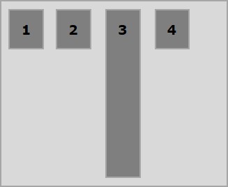
The following example demonstrates the result of passing the value stretch to the align-self property.
<!doctype html>
<html lang = "en">
   <style>
      .box1{background:green;}
      .box2{background:blue;}
      .box3{background:red;}
      .box4{background:magenta; align-self:stretch;}
      .box5{background:yellow;}
      .box6{background:pink;}
      .box{
         font-size:35px;
         padding:15px;
      }
      .container{
         display:flex;
         height:100vh;
         border:3px solid black;
         align-items:flex-start;
      }
   </style>

   <body>
      <div class = "container">
         <div class = "box box1">One</div>
         <div class = "box box2">two</div>
         <div class = "box box3">three</div>
         <div class = "box box4">four</div>
         <div class = "box box5">five</div>
         <div class = "box box6">six</div>
      </div>
   </body>
</html>
It will produce the following result −
