- Flexbox - Home
- Flexbox - Overview
- Flexbox - Flex Containers
- Flexbox - Flex-Direction
- Flexbox - Flex-Wrap
- Flexbox - Justifying Contents
- Flexbox - Align Items
- Flexbox - Align Content
- Flexbox - Flex-Order
- Flexbox - Flexibility
- Flexbox - Align Self
Flexbox - Flex-Direction
The flex-direction property is used to specify the direction in which the elements of flex container (flex-items) are needed to be placed.
usage −
flex-direction: row | row-reverse | column | column-reverse
This property accepts four values −
row − Arranges the elements of the container horizontally from left to right.
row-reverse − Arranges the elements of the container horizontally from right to left.
column − Arranges the elements of the container vertically from left to right.
column-reverse − Arranges the elements of the container vertically from right to left.
Now, we will take a few examples to demonstrate the use of the direction property.
row
On passing this value to the direction property, the elements of the container are arranged horizontally from left to right as shown below.
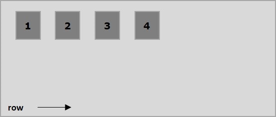
The following example demonstrates the result of passing the value row to the flex-direction property. Here, we are creating six boxes with different colors with the flex-direction value row.
<!doctype html>
<html lang = "en">
   <style>
      .box1{background:green;}
      .box2{background:blue;}
      .box3{background:red;}
      .box4{background:magenta;}
      .box5{background:yellow;}
      .box6{background:pink;}

      .box{
         font-size:35px;
         padding:15px;
      }
      .container{
         display:inline-flex;
         border:3px solid black;
         flex-direction:row;
      }
   </style>

   <body>
      <div class = "container">
         <div class = "box box1">One</div>
         <div class = "box box2">two</div>
         <div class = "box box3">three</div>
         <div class = "box box4">four</div>
         <div class = "box box5">five</div>
         <div class = "box box6">six</div>
      </div>
   </body>
</html>
It will produce the following result −
row-reverse
On passing this value to the direction property, the elements of the container are arranged horizontally from right to left as shown below.
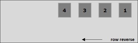
The following example demonstrates the result of passing the value row-reverse to the flex-direction property. Here, we are creating six boxes with different colors with the flex-direction value row-reverse.
<!doctype html>
<html lang = "en">
   <style>
      .box1{background:green;}
      .box2{background:blue;}
      .box3{background:red;}
      .box4{background:magenta;}
      .box5{background:yellow;}
      .box6{background:pink;}

      .box{
         font-size:35px;
         padding:15px;
      }
      .container{
         display:inline-flex;
         border:3px solid black;
         flex-direction:row-reverse;
      }
   </style>

   <body>
      <div class = "container">
         <div class = "box box1">One</div>
         <div class = "box box2">two</div>
         <div class = "box box3">three</div>
         <div class = "box box4">four</div>
         <div class = "box box5">five</div>
         <div class = "box box6">six</div>
      </div>
   </body>
</html>
It will produce the following result −
column
On passing this value to the direction property, the elements of the container are arranged vertically from top to bottom as shown below.
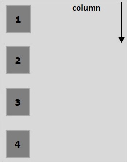
The following example demonstrates the result of passing the value column to the flex-direction property. Here, we are creating six boxes with different colors with the flex-direction value column.
<!doctype html>
<html lang = "en">
   <style>
      .box1{background:green;}
      .box2{background:blue;}
      .box3{background:red;}
      .box4{background:magenta;}
      .box5{background:yellow;}
      .box6{background:pink;}

      .box{
         font-size:35px;
         padding:15px;
      }
      .container{
         display:inline-flex;
         border:3px solid black;
         flex-direction:column;
      }
   </style>
   <body>
      <div class = "container">
         <div class = "box box1">One</div>
         <div class = "box box2">two</div>
         <div class = "box box3">three</div>
         <div class = "box box4">four</div>
         <div class = "box box5">five</div>
         <div class = "box box6">six</div>
      </div>
   </body>
</html>
It will produce the following result −
column-reverse
On passing this value to the direction property, the elements of the container are arranged vertically from bottom to top as shown below.
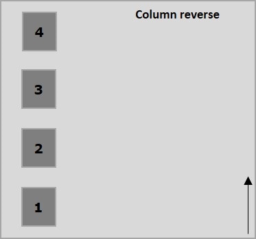
The following example demonstrates the result of passing the value column-reverse to the flex-direction property. Here, we are creating six boxes with different colors with the flex-direction value column-reverse.
<!doctype html>
<html lang = "en">
   <style>
      .box1{background:green;}
      .box2{background:blue;}
      .box3{background:red;}
      .box4{background:magenta;}
      .box5{background:yellow;}
      .box6{background:pink;}

      .box{
         font-size:35px;
         padding:15px;
      }
      .container{
         display:inline-flex;
         border:3px solid black;
         flex-direction:column-reverse;
      }
   </style>

   <body>
      <div class = "container">
         <div class = "box box1">One</div>
         <div class = "box box2">two</div>
         <div class = "box box3">three</div>
         <div class = "box box4">four</div>
         <div class = "box box5">five</div>
         <div class = "box box6">six</div>
      </div>
   </body>
</html>
It will produce the following result −
