- Flexbox - Home
- Flexbox - Overview
- Flexbox - Flex Containers
- Flexbox - Flex-Direction
- Flexbox - Flex-Wrap
- Flexbox - Justifying Contents
- Flexbox - Align Items
- Flexbox - Align Content
- Flexbox - Flex-Order
- Flexbox - Flexibility
- Flexbox - Align Self
Flexbox - Align Content
In case the flex-container has multiple lines (when, flex-wrap: wrap), the align-content property defines the alignment of each line within the container.
Usage −
align-content: flex-start | flex-end | center | space-between | space-around | stretch;
This property accepts the following values −
stretch − The lines in the content will stretch to fill up the remaining space.
flex-start − All the lines in the content are packed at the start of the container.
flex-end − All the lines in the content are packed at the end of the container.
center − All the lines in the content are packed at the center of the container.
space-between − The extra space is distributed between the lines evenly.
space-around − The extra space is distributed between the lines evenly with equal space around each line (including the first and last lines)
center
On passing this value to the property align-content, all the lines are packed at the center of the container.
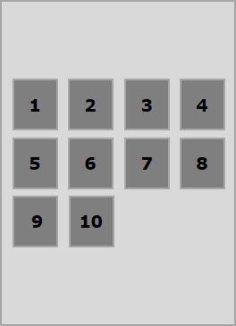
The following example demonstrates the result of passing the value center to the align-content property.
<!doctype html>
<html lang = "en">
   <style>
      .box1{background:green;}
      .box2{background:blue;}
      .box3{background:red;}
      .box4{background:magenta;}
      .box5{background:yellow;}
      .box6{background:pink;}

      .box{
         font-size:25px;
         padding:15px;
         width:43%;
      }
      .container{
         display:flex;
         height:100vh;
         flex-wrap:wrap;
         align-content:center;
      }
   </style>

   <body>
      <div class = "container">
         <div class = "box box1">One</div>
         <div class = "box box2">two</div>
         <div class = "box box3">three</div>
         <div class = "box box4">four</div>
         <div class = "box box5">five</div>
         <div class = "box box6">six</div>
      </div>
   </body>
</html>
It will produce the following result −
flex-start
On passing this value to the property align-content, all the lines are packed at the start of the container.
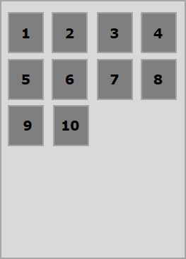
The following example demonstrates the result of passing the value flex-start to the align-content property.
<!doctype html>
<html lang = "en">
   <style>
      .box1{background:green;}
      .box2{background:blue;}
      .box3{background:red;}
      .box4{background:magenta;}
      .box5{background:yellow;}
      .box6{background:pink;}

      .box{
         font-size:25px;
         padding:15px;
         width:40%;
      }
      .container{
         display:flex;
         height:100vh;
         flex-wrap:wrap;
         align-content:flex-start;
      }
   </style>

   <body>
      <div class = "container">
         <div class = "box box1">One</div>
         <div class = "box box2">two</div>
         <div class = "box box3">three</div>
         <div class = "box box4">four</div>
         <div class = "box box5">five</div>
         <div class = "box box6">six</div>
      </div>
   </body>
</html>
It will produce the following result −
flex-end
On passing this value to the property align-content, all the lines are packed at the end of the container.
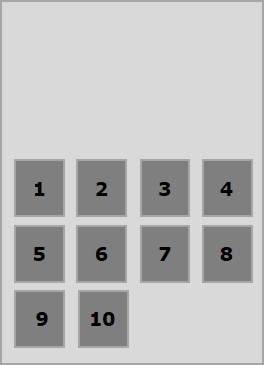
The following example demonstrates the result of passing the value flex-end to the align-content property.
<!doctype html>
<html lang = "en">
   <style>
      .box1{background:green;}
      .box2{background:blue;}
      .box3{background:red;}
      .box4{background:magenta;}
      .box5{background:yellow;}
      .box6{background:pink;}

      .box{
         font-size:25px;
         padding:15px;
         width:40%;
      }
      .container{
         display:flex;
         height:100vh;
         flex-wrap:wrap;
         align-content:flex-end;
      }
   </style>

   <body>
      <div class = "container">
         <div class = "box box1">One</div>
         <div class = "box box2">two</div>
         <div class = "box box3">three</div>
         <div class = "box box4">four</div>
         <div class = "box box5">five</div>
         <div class = "box box6">six</div>
      </div>
   </body>
</html>
It will produce the following result −
stretch
On passing this value to the property align-content, the lines will stretch to fill up the remaining space.
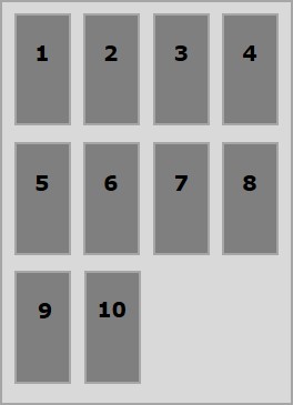
The following example demonstrates the result of passing the value stretch to the align-content property.
<!doctype html>
<html lang = "en">
   <style>
      .box1{background:green;}
      .box2{background:blue;}
      .box3{background:red;}
      .box4{background:magenta;}
      .box5{background:yellow;}
      .box6{background:pink;}

      .box{
         font-size:25px;
         padding:15px;
         width:40;
      }
      .container{
         display:flex;
         height:100vh;
         flex-wrap:wrap;
         align-content:stretch;
      }
   </style>

   <body>
      <div class = "container">
         <div class = "box box1">One</div>
         <div class = "box box2">two</div>
         <div class = "box box3">three</div>
         <div class = "box box4">four</div>
         <div class = "box box5">five</div>
         <div class = "box box6">six</div>
      </div>
   </body>
</html>
It will produce the following result −
space-around
On passing this value to the property align-content, the extra space is distributed between the lines evenly with equal space around each line (including the first and last lines).
The following example demonstrates the result of passing the value space-around to the align-content property.
<!doctype html>
<html lang = "en">
   <style>
      .box1{background:green;}
      .box2{background:blue;}
      .box3{background:red;}
      .box4{background:magenta;}
      .box5{background:yellow;}
      .box6{background:pink;}

      .box{
         font-size:25px;
         padding:15px;
         width:40%;
      }
      .container{
         display:flex;
         height:100vh;
         flex-wrap:wrap;
         align-content:space-around;
      }
   </style>

   <body>
      <div class = "container">
         <div class = "box box1">One</div>
         <div class = "box box2">two</div>
         <div class = "box box3">three</div>
         <div class = "box box4">four</div>
         <div class = "box box5">five</div>
         <div class = "box box6">six</div>
      </div>
   </body>
</html>
It will produce the following result −
space-between
On passing this value to the property align-content, the extra space is distributed between the lines evenly, where the first line will be at the top and the last line will be at the bottom of the container.
The following example demonstrates the result of passing the value space-between to the align-content property.
<!doctype html>
<html lang = "en">
   <style>
      .box1{background:green;}
      .box2{background:blue;}
      .box3{background:red;}
      .box4{background:magenta;}
      .box5{background:yellow;}
      .box6{background:pink;}

      .box{
         font-size:25px;
         padding:15px;
         width:40%;
      }
      .container{
         display:flex;
         height:100vh;
         flex-wrap:wrap;
         align-content:space-between;
      }
   </style>

   <body>
      <div class = "container">
         <div class = "box box1">One</div>
         <div class = "box box2">two</div>
         <div class = "box box3">three</div>
         <div class = "box box4">four</div>
         <div class = "box box5">five</div>
         <div class = "box box6">six</div>
      </div>
   </body>
</html>
It will produce the following result −
