- Excel Pivot Tables - Home
- Excel Pivot Tables - Overview
- Excel Pivot Tables - Creation
- Excel Pivot Tables - Fields
- Excel Pivot Tables - Areas
- Excel Pivot Tables - Exploring Data
- Excel Pivot Tables - Sorting Data
- Excel Pivot Tables - Filtering Data
- Filtering data using Slicers
- Excel Pivot Tables - Nesting
- Excel Pivot Tables - Tools
- Summarizing Values
- Excel Pivot Tables - Updating Data
- Excel Pivot Tables - Reports
Excel Pivot Tables - Reports
Major use of PivotTable is reporting. Once you have created a PivotTable, explored the data by arranging and rearranging the fields in its rows and columns, you will be ready to present the data to a wide range of audience. With filters, different summarizations, focusing on specific data, you will be able to generate several required reports based on a single PivotTable.
As a PivotTable report is interactive, you can quickly make the necessary changes to highlight the specific results, such as data trends, data summarizations, etc. while presenting it. You can also provide visual cues such as report filters, slicers, timeline, PivotCharts, etc. to the recipients so that they can visualize the details they want.
In this chapter, you will learn the different ways of making your PivotTable reports appealing with visual cues that enable quick exploration of the data.
Hierarchies
You have learnt how to nest fields to form a hierarchy, in the Chapter Nesting in a PivotTable in this tutorial. You have also learnt how to group / ungroup data in a PivotTable in the Chapter Using PivotTable Tools. We will take few examples to show you how to produce interactive PivotTable reports with hierarchies.
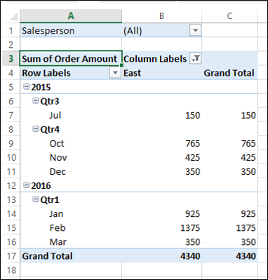
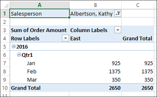
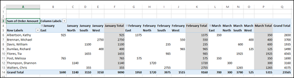
If you have an in-built structure for the fields in your data, such as, Year-Quarter-Month, nesting the fields to form a hierarchy will enable you to quickly expand/collapse fields to view the summarized values at the required level.
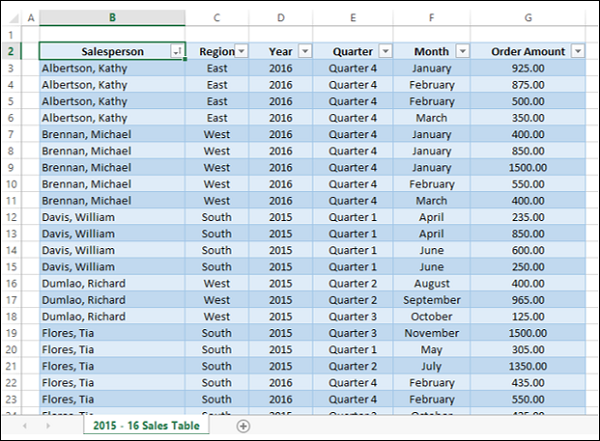
For example, suppose you have the sales data for the fiscal year 2015-16 for the regions East, North, South and West, as given below.
Create a PivotTable as shown below.
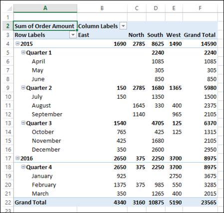
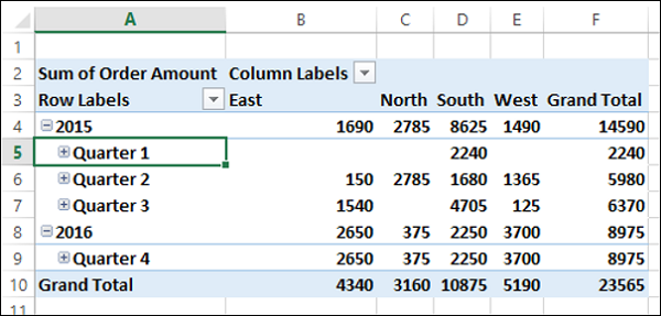
As you can observe, this is a comprehensive way of reporting the data using the nested fields as a hierarchy. If you want to display the results only at the level of Quarters, you can quickly collapse the Quarter field.
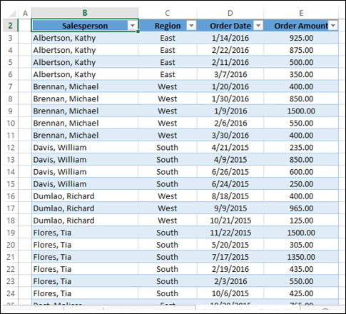
Suppose you have a Date field in your data as shown below.
In such a case, you can group the data by the Date field as follows −
Create a PivotTable.
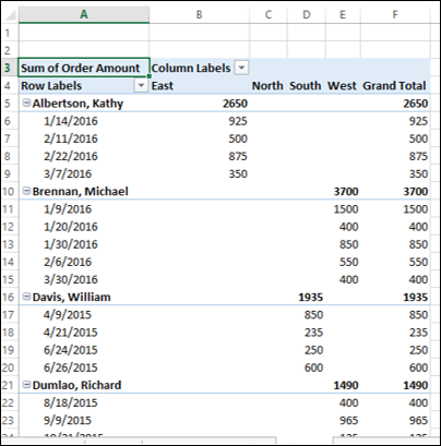
As you can observe, this PivotTable is not convenient to highlight significant data.
Group the PivotTable by Date field. (You have learnt grouping in the Chapter Exploring Data with PivotTable Tools in this tutorial).
Place the Salesperson field in Filters area.
Filter the Column labels to East Region.
Report Filter
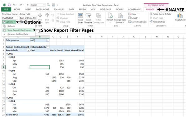
Suppose you want a report for each Salesperson separately. You can do it as follows −
- Ensure that you have Salesperson field in Filters area.
- Click on the PivotTable.
- Click the ANALYZE tab on the Ribbon.
- Click the arrow next to Options in the PivotTable group.
- Select Show Report Filter Pages from the dropdown list.
The Show Report Filter Pages dialog box appears. Select the field Salesperson and click OK.
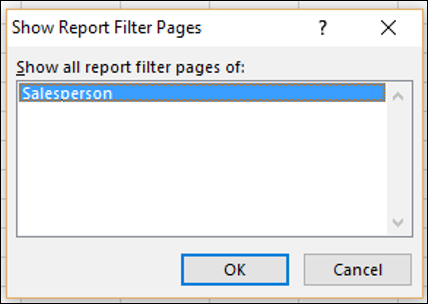
A separate worksheet for each of the values of the Salesperson field is created, with the PivotTable filtered to that value.
The worksheet will be named by the value of the field, which is visible on the tab of the worksheet.
Slicers
Another sophisticated feature that you have in PivotTables is Slicer that can be used to filter the fields visually.
Click on the PivotTable.
Click the ANALYZE tab.
Click Insert Slicer in the Filter group.
Click Order Date, Quarters and Years in the Insert Slicers dialog box. Three Slicers Order Date, Quarters and Year will get created.
Adjust the sizes of the slicers, adding more columns for the buttons on the slicers.
Create Slicers for Salesperson and Region fields also.
Choose the Slicer Styles so that date fields are grouped to one color and the other two fields get different colors.
Deselect Gridlines.
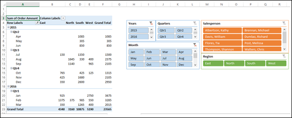
As you can see, you have not only an interactive report, but also an appealing one, that can be understood easily.
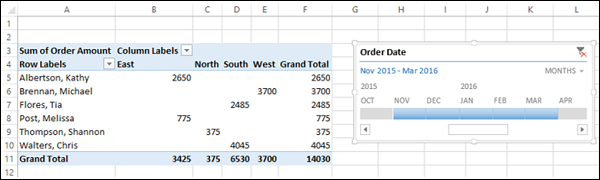
Timeline in PivotTable
When you have a Date field in your PivotTable, inserting a Timeline also is an option to produce an aesthetic report.
- Create a PivotTable with Salesperson in ROWS area and Region in COLUMNS area.
- Insert a Timeline for the field Order Date.
- Filter the Timeline to show 5 months data, from November 2015 to March 2016.
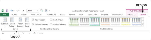
DESIGN Commands
The PIVOTTABLE TOOLS - DESIGN commands on the Ribbon provide you with the options to format a PivotTable, including the following −
- Layout
- PivotTable Style Options
- PivotTable Styles
Layout
You can have PivotTable Layout based on your preferences for the following −
- Subtotals
- Grand Totals
- Report Layout
- Blank Rows
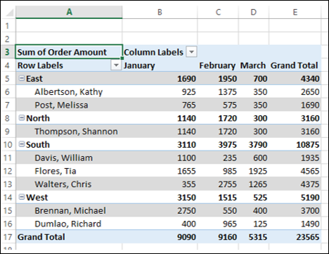
PivotTable Layout Subtotals
You have an option whether to display Subtotals or not. By default, Subtotals are displayed, at the top of the group.
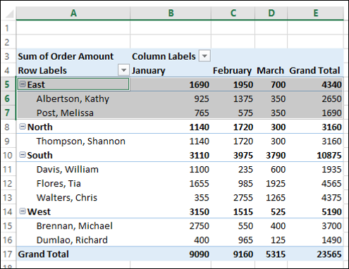
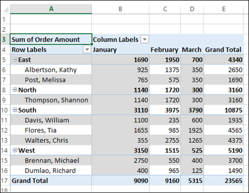
As you can observe the highlighted group East, the subtotals are at the top of the group. You can change the position of subtotals as follows −
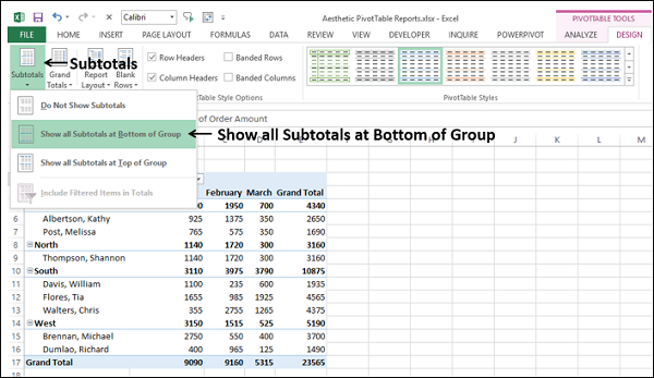
- Click on the PivotTable.
- Click the DESIGN tab on the Ribbon.
- Click Subtotals in the Layout Options group.
- Click Show all Subtotals at Bottom of Group.
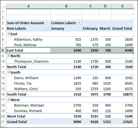
The Subtotals will now appear at the bottom of each group.
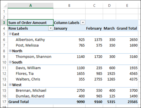
If you do not have to report the Subtotals, you can select - Do Not Show Subtotals.
Grand Totals
You can choose to either display Grand Totals or not. You have four possible combinations −
- Off for Rows and Columns
- On for Rows and Columns
- On for Rows Only
- On for Columns Only
By default, it is the second combination On for Rows and Columns.
Report Layout
You can choose from the several Report Layouts, the one that best suits your data.
- Compact Form.
- Outline Form.
- Tabular Form.
You can also choose whether to repeat all the item labels or not, in case of multiple occurrences.
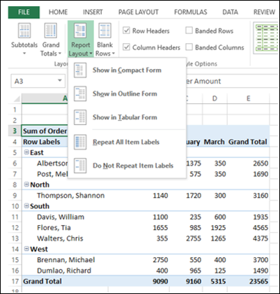
The default Report Layout is the Compact form that you are familiar with.
Compact Form
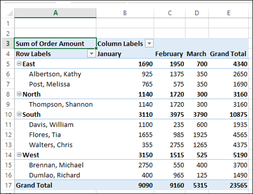
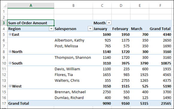
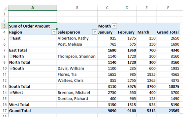
The Compact form optimizes the PivotTable for readability. The other two forms display the field headers also.
Click on Show in Outline Form.
Click Show in Tabular Form.
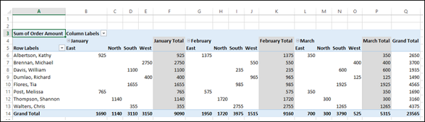
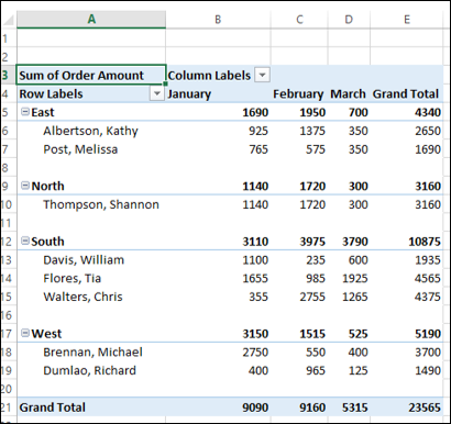
Consider the following PivotTable Layout, wherein the field Month is nested under the field Region −
As you can observe, the Month labels are repeated and this is the default.
Click Do Not Repeat Item Labels. The Month labels will be displayed only once and the PivotTable looks clear.
Blank Rows
To make your PivotTable Report more distinct, you can insert a blank line after each item. You can remove these Blank Lines anytime later.
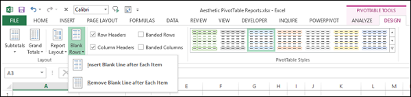
Click Insert Blank Line after Each Item.
PivotTable Style Options
You have the following PivotTable Style Options −
- Row Headers
- Column Headers
- Banded Rows
- Banded Columns
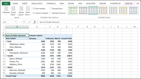
By default, the boxes for Row Headers and Column Headers are checked. These options are for displaying special formatting for the first row and the first column respectively. Check the box Banded Rows.
Check the box Banded Columns.
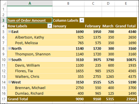
PivotTable Styles
You can choose several PivotTable Styles. Select the one that suits your report. For example, if you choose Pivot Style Dark 5, you will get the following style for the PivotTable.
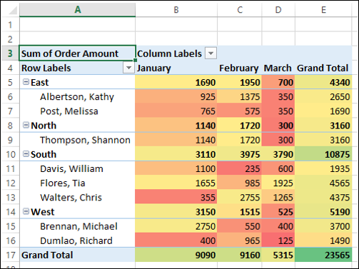
Conditional Formatting in PivotTable
You can set Conditional Formatting on the PivotTable cells by the values.
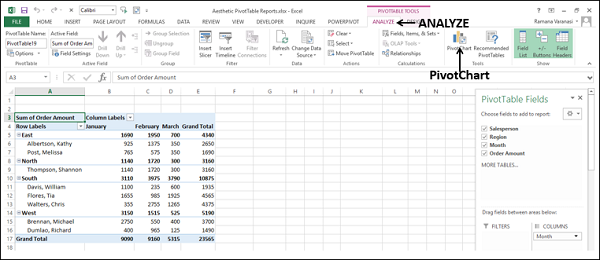
PivotCharts
PivotCharts add a visual emphasis on your PivotTable reports. You can insert a PivotChart tied to the data of a PivotTable as follows −
- Click on the PivotTable.
- Click the ANALYZE tab on the Ribbon.
- Click PivotChart.
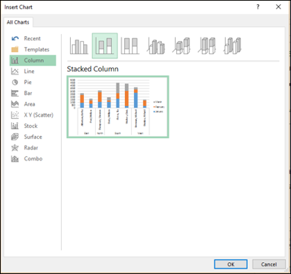
The Insert Chart dialog box appears.
Click Column in the left pane and select Stacked Column. Click OK.
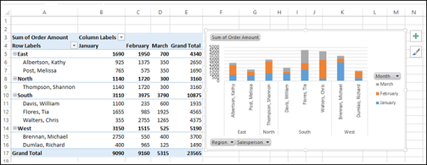
The stacked column chart is displayed.
- Click on Month on the PivotChart.
- Filter to February and click OK.
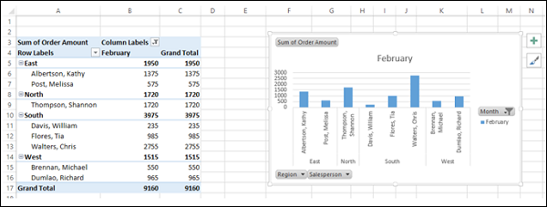
As you can observe, the PivotTable is also filtered as per the PivotChart.
