
Article Categories
- All Categories
-
 Data Structure
-
 Networking
-
 RDBMS
RDBMS
-
 Operating System
-
 Java
Java
-
 MS Excel
-
 iOS
iOS
-
 HTML
HTML
-
 CSS
CSS
-
 Android
-
 Python
-
 C Programming
-
 C++
C++
-
 C#
C#
-
 MongoDB
-
 MySQL
MySQL
-
 Javascript
-
 PHP
PHP
-
 Economics & Finance
Selected Reading
Why scale_fill_manual does not fill the bar with colors created by using ggplot2 in R?
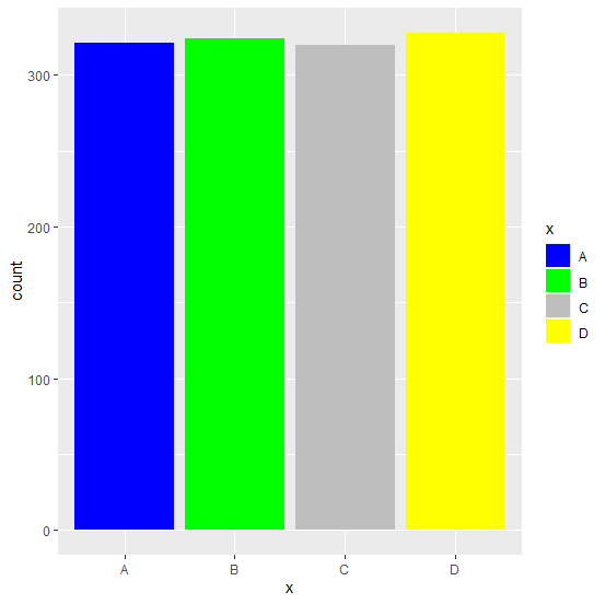
We can manually fill the color of bars in a bar plot which is created by using ggplot2 but for this we would be needing color aesthetics already used for the bars. That means we need to use filling of bars inside aes of ggplot2 and then the colors can be mentioned inside the scale_fill_manual function.
Example
Consider the below data frame:
> x<-c("A","B","C","D")
> count<-c(321,324,320,328)
> df<-data.frame(x,count)
> df
Output
x count
1 A 321
2 B 324
3 C 320
4 D 328
Loading ggplot2 package and creating bar plot:
Example
> library(ggplot2)
> ggplot(df,aes(x,count))+geom_bar(stat="identity")
Output:

Creating the bar plot by using scale_fill_manual:
Example
> ggplot(df,aes(x,count))+geom_bar(stat="identity")+scale_fill_manual(values=c("blue","green","grey","yellow"))
Output
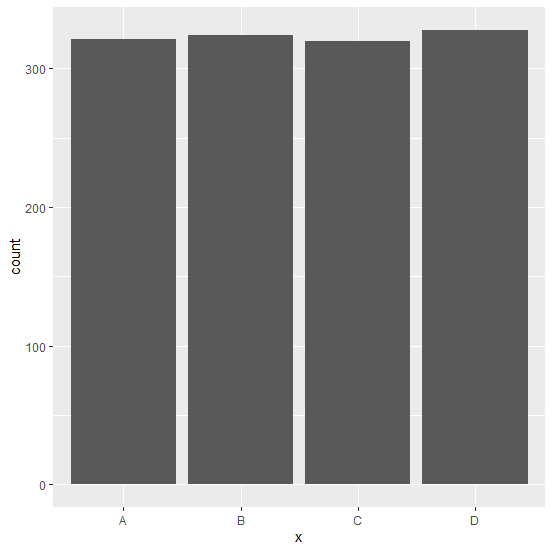
This does not change the color of bars.
Creating the bar plot by using scale_fill_manual but passing the fill of bars in aes:
Example
> ggplot(df,aes(x,count,fill=x))+geom_bar(stat="identity")+scale_fill_manual(values=c("blue","green","grey","yellow"))
Output:

Updated on: 2026-03-11T22:50:53+05:30
3K+ Views

Advertisements