- Materialize - Home
- Materialize - Overview
- Materialize - Environment Setup
- Materialize - Colors
- Materialize - Grids
- Materialize - Helpers
- Materialize - Media
- Materialize - Shadows
- Materialize - Tables
- Materialize - Typography
- Materialize - Badges
- Materialize - Buttons
- Materialize - Breadcrumb
- Materialize - Cards
- Materialize - Chips
- Materialize - Collections
- Materialize - Footer
- Materialize - Form
- Materialize - Icons
- Materialize - Navbar
- Materialize - Pagination
- Materialize - Preloader
- Materialize - Collapsible
- Materialize - Dialogs
- Materialize - Dropdowns
- Materialize - Tabs
- Materialize - Waves
- Materialize Useful Resources
- Materialize - Quick Guide
- Materialize - Useful Resources
- Materialize - Discussion
Selected Reading
Materialize - Media
Materialize has several classes to make images and videos responsive to different sizes.
responsive-img − It makes an image to resize itself based on the screen size.
video-container − For responsive container having embedded videos.
responsive-video − Makes HTML5 videos responsive.
Example
<!DOCTYPE html>
<html>
<head>
<title>The Materialize Example</title>
<meta name="viewport" content="width=device-width, initial-scale=1">
<link rel="stylesheet" href="https://fonts.googleapis.com/icon?family=Material+Icons">
<link rel="stylesheet" href="https://cdnjs.cloudflare.com/ajax/libs/materialize/0.97.3/css/materialize.min.css">
<script type="text/javascript" src="https://code.jquery.com/jquery-2.1.1.min.js"></script>
<script src="https://cdnjs.cloudflare.com/ajax/libs/materialize/0.97.3/js/materialize.min.js"></script>
</head>
<body class="container">
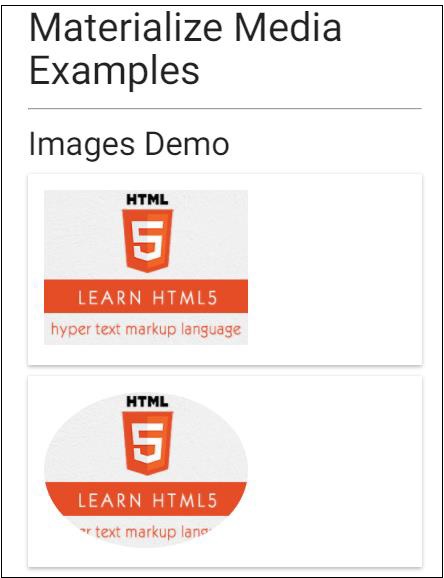
<h2>Materialize Media Examples</h2>
<hr/>
<h3>Images Demo</h3>
<div class="card-panel">
<img src="html5-mini-logo.jpg" alt="" class="responsive-img">
</div>
<div class="card-panel">
<img src="html5-mini-logo.jpg" alt="" class="circle responsive-img">
</div>
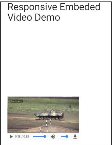
<h3>Responsive Embeded Video Demo</h3>
<div class="video-container">
<iframe width="540" height="200" src="http://www.youtube.com/embed/Q8TXgCzxEnw?rel=0" frameborder="0" allowfullscreen></iframe>
</div>
<div class="video-container">
<video width="300" height="200" controls autoplay>
<source src="http://www.tutorialspoint.com/html5/foo.ogg" type="video/ogg" />
<source src="http://www.tutorialspoint.com/html5/foo.mp4" type="video/mp4" />
Your browser does not support the video element.
</video>
</div>
</body>
</html>
Output
Verify the output.
Advertisements