
Article Categories
- All Categories
-
 Data Structure
-
 Networking
-
 RDBMS
RDBMS
-
 Operating System
-
 Java
Java
-
 MS Excel
-
 iOS
iOS
-
 HTML
HTML
-
 CSS
CSS
-
 Android
-
 Python
-
 C Programming
-
 C++
C++
-
 C#
C#
-
 MongoDB
-
 MySQL
MySQL
-
 Javascript
-
 PHP
PHP
-
 Economics & Finance
Responsive Video or Slideshow Embeds in Bootstrap with Examples
Bootstrap is a free open source and is one of the most famous HTML, CSS, and Javascript frameworks. It's used for user interfaces and themes that create what a user sees in a website or application, and it's utilized on the client rather than the server.
Responsive web applications automatically adapt to various screen sizes. It is used to create responsive mobile-first web apps and websites; mobile-first refers to designing for smaller displays first and then scaling up to bigger ones. As a result, you won't have to worry about your app not working on different devices or with different screen sizes.
In Bootstrap we have a class named “embed-responsive” for creating embeds. Written rules are directly applied to elements of parent class i.e
Example
Program for Responsive video embeds
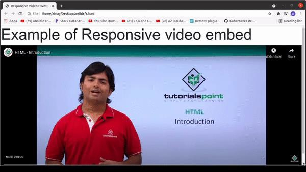
<!DOCTYPE html>
<html>
<head>
    <!-- Using Bootstrap CDN -->
    <link rel="stylesheet" href="https://stackpath.bootstrapcdn.com/bootstrap/4.3.1/css/bootstrap.min.css"
      integrity="sha384-ggOyR0iXCbMQv3Xipma34MD+dH/1fQ784/j6cY/iJTQUOhcWr7x9JvoRxT2MZw1T" crossorigin="anonymous">
    <title>
        Responsive Video Example
    </title>
</head>
<body>
    <h1 style="font-size:5vw;">Example of Responsive video embed</h1>
    <!--Using Class embed-responsive -->
    <div class="embed-responsive
    embed-responsive-21by9">
        <embed class="embed-responsive-item" src="https://www.youtube.com/embed/NAEHbzXMNpA" allowfullscreen>
        </video>
    </div>
</body>
</html>
Output
Below is the result of the Above Code
To modify the Aspect ratio we have some modifier classes provided by Bootstrap.
<!-- Aspect ratio 1:1>
<div class="embed-responsive embed-responsive-1by1"></div>

<!-- Aspect ratio 4:3>
<div class="embed-responsive embed-responsive-4by3"></div>

<!-- Aspect ratio 16:3>
<div class="embed-responsive embed-responsive-16by9"></div>

<!-- Aspect ratio 21:9>
<div class="embed-responsive embed-responsive-21by9"></div>
Conclusion
In this tutorial, we discussed the definition of Bootstrap and how it can be used in front-end Development for creating Responsive embeds to make applications compatible with different screen sizes. We also look at an example for creating Responsive embeds in Bootstrap where we discussed the Bootstrap class “embed-responsive”. We hope you find this tutorial helpful.

640 Views
