- Struts2 - Home
- Struts2 - Basic MVC Architecture
- Struts2 - Overview
- Struts2 - Environment Setup
- Struts2 - Architecture
- Struts2 - Examples
- Struts2 - Configuration
- Struts2 - Actions
- Struts2 - Interceptors
- Struts2 - Result Types
- Struts2 - Value Stack/OGNL
- Struts2 - File Uploads
- Struts2 - Database Access
- Struts2 - Sending Email
- Struts2 - Validations
- Struts2 - Localization
- Struts2 - Type Conversion
- Struts2 - Themes/Templates
- Struts2 - Exception Handling
- Struts2 - Annotations
- Struts 2 Integrations
- Struts2 - Spring
- Struts2 - Tiles
- Struts2 - Hibernate
- Struts 2 Useful Resources
- Struts2 - Questions and Answers
- Struts2 - Quick Guide
- Struts2 - Useful Resources
- Struts2 - Discussion
Struts 2 - The Form Tags
The list of form tags is a subset of Struts UI Tags. These tags help in the rendering of the user interface required for the Struts web applications and can be categorised into three categories. This chapter will take you thorugh all the three types of UI tags −
Simple UI Tags
We have used these tags in our examples already, we will brush them in this chapter. Let us look a simple view page email.jsp with several simple UI tags −
<%@ page language = "java" contentType = "text/html; charset = ISO-8859-1"
   pageEncoding = "ISO-8859-1"%>
<%@ taglib prefix = "s" uri = "/struts-tags"%>
<!DOCTYPE html PUBLIC "-//W3C//DTD HTML 4.01 Transitional//EN"
   "http://www.w3.org/TR/html4/loose.dtd">

<html>
   <head>
      <s:head/>
      <title>Hello World</title>
   </head>

   <body>
      <s:div>Email Form</s:div>
      <s:text name = "Please fill in the form below:" />

      <s:form action = "hello" method = "post" enctype = "multipart/form-data">
         <s:hidden name = "secret" value = "abracadabra"/>
         <s:textfield key = "email.from" name = "from" />
         <s:password key = "email.password" name = "password" />
         <s:textfield key = "email.to" name = "to" />
         <s:textfield key = "email.subject" name = "subject" />
         <s:textarea key = "email.body" name = "email.body" />
         <s:label for = "attachment" value = "Attachment"/>
         <s:file name = "attachment" accept = "text/html,text/plain" />
         <s:token />
         <s:submit key = "submit" />
      </s:form>

   </body>
</html>
If you are aware of HTML, then all the tags used are very common HTML tags with an additional prefix s: along with each tag and different attributes. When we execute the above program, we get the following user interface provided you have setup proper mapping for all the keys used.
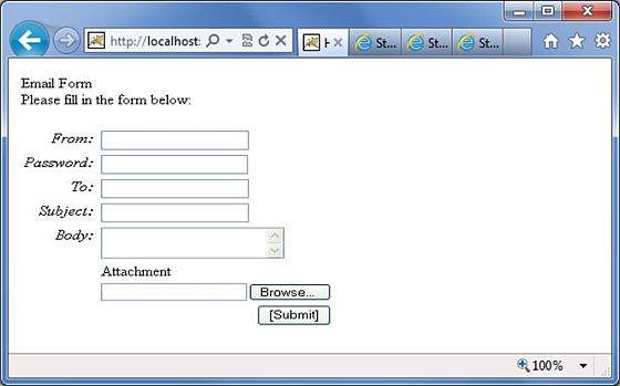
As shown, the s:head generates the javascript and stylesheet elements required for the Struts2 application.
Next, we have the s:div and s:text elements. The s:div is used to render a HTML Div element. This is useful for people who do not like to mix HTML and Struts tags together. For those people, they have the choice to use s:div to render a div.
The s:text as shown is used to render a text on the screen.
Next we have the famiilar s:form tag. The s:form tag has an action attribute that determines where to submit the form. Because we have a file upload element in the form, we have to set the enctype to multipart. Otherwise, we can leave this blank.
At the end of the form tag, we have the s:submit tag. This is used to submit the form. When the form is submitted, all the form values are submitted to the the action specified in the s:form tag.
Inside the s:form, we have a hidden attribute called secret. This renders a hidden element in the HTML. In our case, the "secret" element has the value "abracadabra". This element is not visible to the end user and is used to carry the state from one view to another.
Next we have the s:label, s:textfield, s:password and s:textarea tags. These are used to render the label, input field, password and the text area respectively. We have seen these in action in the "Struts - Sending Email" example.
The important thing to note here is the use of "key" attribute. The "key" attribute is used to fetch the label for these controls from the property file. We have already covered this feature in the Struts2 Localization, internationalization chapter.
Then, we have the s:file tag which renders a input file upload component. This component allows the user to upload files. In this example, we have used the "accept" parameter of the s:file tag to specify which file types are allowed to be uploaded.
Finally we have the s:token tag. The token tag generates an unique token which is used to find out whether a form has been double submitted
When the form is rendered, a hidden variable is placed as the token value. Let us say, for example that the token is "ABC". When this form is submitted, the Struts Fitler checks the token against the token stored in the session. If it matches, it removes the token from the session. Now, if the form is accidentally resubmitted (either by refreshing or by hitting the browser back button), the form will be resubmitted with "ABC" as the token. In this case, the filter checks the token against the token stored in the session again. But because the token "ABC" has been removed from the session, it will not match and the Struts filter will reject the request.
Group UI Tags
The group UI tags are used to create radio button and the checkbox. Let us look a simple view page HelloWorld.jsp with check box and radio button tags −
<%@ page contentType = "text/html; charset = UTF-8"%>
<%@ taglib prefix = "s" uri = "/struts-tags"%>

<html>
   <head>
      <title>Hello World</title>
      <s:head />
   </head>

   <body>
      <s:form action = "hello.action">
         <s:radio label = "Gender" name = "gender" list="{'male','female'}" />
         <s:checkboxlist label = "Hobbies" name = "hobbies"
         list = "{'sports','tv','shopping'}" />
      </s:form>

   </body>
</html>
When we execute the above program, our output will look similar to the following −
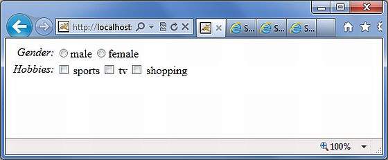
Let us look at the example now. In the first example, we are creating a simple radio button with the label "Gender". The name attribute is mandatory for the radio button tag, so we specify a name which is "gender". We then supply a list to the gender. The list is populated with the values "male" and "female". Therefore, in the output we get a radio button with two values in it.
In the second example, we are creating a checkbox list. This is to gather the user's hobbies. The user can have more than one hobby and therefore we are using the checkbox instead of the radiobutton. The checkbox is populated with the list "sports", "TV" and "Shopping". This presents the hobbies as a checkbox list.
Select UI Tags
Let us explore the different variations of the Select Tag offered by Struts. Let us look a simple view page HelloWorld.jsp with select tags −
<%@ page contentType = "text/html; charset = UTF-8"%>
<%@ taglib prefix = "s" uri = "/struts-tags"%>

<html>
   <head>
      <title>Hello World</title>
      <s:head />
   </head>

   <body>
      <s:form action = "login.action">
         <s:select name = "username" label = "Username"
            list = "{'Mike','John','Smith'}" />

         <s:select label = "Company Office" name = "mySelection"
            value = "%{'America'}" list="%{#{'America':'America'}}">
            <s:optgroup label = "Asia"
               list = "%{#{'India':'India','China':'China'}}" />
            <s:optgroup label = "Europe"
               list="%{#{'UK':'UK','Sweden':'Sweden','Italy':'Italy'}}" />
         </s:select>

         <s:combobox label = "My Sign" name = "mySign"
            list = "#{'aries':'aries','capricorn':'capricorn'}" headerkey = "-1"
            headervalue = "--- Please Select ---" emptyOption = "true" value = "capricorn" />
         <s:doubleselect label = "Occupation" name = "occupation"
            list = "{'Technical','Other'}" doublename = "occupations2"
            doubleList="top == 'Technical' ?
            {'I.T', 'Hardware'} : {'Accounting', 'H.R'}" />
      </s:form>
   </body>
</html>
When we execute the above program our output will look similar to the following −
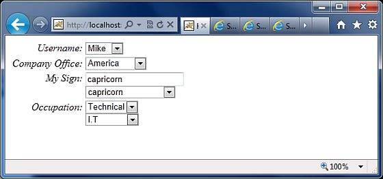
Let us now go through the individual cases, one by one.
First, the select tag renders the HTML select box. In the first example, we are creating a simple select box with name "username" and the label "username". The select box will be populated with a list that contains the names Mike, John and Smith.
In the second example, our company has head offices in America. It also has global offices in Asia and Europe. We want to display the offices in a select box but we want to group the global offices by the name of the continent. This is where the optgroup comes in handy. We use the s:optgroup tag to create a new group. We give the group a label and a separate list.
In the third example, the combobox is used. A combo box is a combination of an input field and a select box. The user can either select a value from the select box in which case the input field is automatically filled in with the value the user has selected. Should the user to enter a value directly, no values from the select box will be selected.
In our example we have the combobox listing the sun signs. The selectbox lists only four entries allowing the user to type in his sun sign if it is not in the list. We also add a header entry to the select box. The headerentry is the one that is displayed at the top of the select box. In our case we want to display "Please Select". If the user does not select anything, then we assume -1 as the value. In some cases, we do not want the user to select an empty value. In those conditions, one would set the "emptyOption" property to false. Finally, in our example we supply "capricorn" as the default value for the combobox.
In the fourth example, we have a double select. A double select is used when you want to display two select boxes. The value selected in the first select box determines what appears in the second select box. In our example the first select box displays "Technical" and "Other". If the user selects Technical, we will display IT and Hardware in the second select box. Otherwise we will display Accounting and HR. This is possible using the "list" and "doubleList" atrributes as shown in the example.
In the above example, we did a comparison to see if the top select box equals Technical. If it does, then we display IT and Hardware.
We also need to give a name for the top box ("name = 'Occupations') and the bottom box (doubleName = 'occupations2')
