- Python Pandas - Basics
- Python Pandas - Introduction to Data Structures
- Python Pandas - Index Objects
- Python Pandas - Panel
- Python Pandas - Basic Functionality
- Python Pandas - Indexing & Selecting Data
- Python Pandas - Series
- Python Pandas - Series
- Python Pandas - Slicing a Series Object
- Python Pandas - Attributes of a Series Object
- Python Pandas - Arithmetic Operations on Series Object
- Python Pandas - Converting Series to Other Objects
- Python Pandas - DataFrame
- Python Pandas - DataFrame
- Python Pandas - Accessing DataFrame
- Python Pandas - Slicing a DataFrame Object
- Python Pandas - Modifying DataFrame
- Python Pandas - Removing Rows from a DataFrame
- Python Pandas - Arithmetic Operations on DataFrame
- Python Pandas - IO Tools
- Python Pandas - IO Tools
- Python Pandas - Working with CSV Format
- Python Pandas - Reading & Writing JSON Files
- Python Pandas - Reading Data from an Excel File
- Python Pandas - Writing Data to Excel Files
- Python Pandas - Working with HTML Data
- Python Pandas - Clipboard
- Python Pandas - Working with HDF5 Format
- Python Pandas - Comparison with SQL
- Python Pandas - Data Handling
- Python Pandas - Sorting
- Python Pandas - Reindexing
- Python Pandas - Iteration
- Python Pandas - Concatenation
- Python Pandas - Statistical Functions
- Python Pandas - Descriptive Statistics
- Python Pandas - Working with Text Data
- Python Pandas - Function Application
- Python Pandas - Options & Customization
- Python Pandas - Window Functions
- Python Pandas - Aggregations
- Python Pandas - Merging/Joining
- Python Pandas - MultiIndex
- Python Pandas - Basics of MultiIndex
- Python Pandas - Indexing with MultiIndex
- Python Pandas - Advanced Reindexing with MultiIndex
- Python Pandas - Renaming MultiIndex Labels
- Python Pandas - Sorting a MultiIndex
- Python Pandas - Binary Operations
- Python Pandas - Binary Comparison Operations
- Python Pandas - Boolean Indexing
- Python Pandas - Boolean Masking
- Python Pandas - Data Reshaping & Pivoting
- Python Pandas - Pivoting
- Python Pandas - Stacking & Unstacking
- Python Pandas - Melting
- Python Pandas - Computing Dummy Variables
- Python Pandas - Categorical Data
- Python Pandas - Categorical Data
- Python Pandas - Ordering & Sorting Categorical Data
- Python Pandas - Comparing Categorical Data
- Python Pandas - Handling Missing Data
- Python Pandas - Missing Data
- Python Pandas - Filling Missing Data
- Python Pandas - Interpolation of Missing Values
- Python Pandas - Dropping Missing Data
- Python Pandas - Calculations with Missing Data
- Python Pandas - Handling Duplicates
- Python Pandas - Duplicated Data
- Python Pandas - Counting & Retrieving Unique Elements
- Python Pandas - Duplicated Labels
- Python Pandas - Grouping & Aggregation
- Python Pandas - GroupBy
- Python Pandas - Time-series Data
- Python Pandas - Date Functionality
- Python Pandas - Timedelta
- Python Pandas - Sparse Data Structures
- Python Pandas - Sparse Data
- Python Pandas - Visualization
- Python Pandas - Visualization
- Python Pandas - Additional Concepts
- Python Pandas - Caveats & Gotchas
- Python Pandas Useful Resources
- Python Pandas - Quick Guide
- Python Pandas - Cheatsheet
- Python Pandas - Useful Resources
- Python Pandas - Discussion
Python Pandas - Visualization
Visualization of data plays an important role in data analysis, it helps you represent the data graphically for better understanding, and identifying the patterns. However, Pandas library is primarily used for data manipulation and analysis but it also provides the data visualization capabilities by using the Python's Matplotlib library support.
In Python, the Pandas library provides a basic method called .plot() for generating a wide variety of visualizations along the different specialized plotting methods. These visualizations tools are built on top of the Python's Matplotlib library, offering flexibility and customization options.
Behind the scenes, every plot generated by Pandas is actually a Matplotlib object. This integration allows users to leverage Matplotlib's extensive customization options for fine-tuning Pandas-generated plots.
In this tutorial, we will learn about basics of visualizing data using the Pandas data structures.
Setting Up the Environment for Visualization
Before learning about Pandas data Visualization, we should ensure that Matplotlib library is installed. Following is the command for installing the Matplotlib library −
pip install pandas matplotlib
Importing Libraries
Along with the import pandas as pd you need to import the Matplotlib's functional interface for displaying, customizing, and saving plots using the following command −
import matplotlib.pyplot as plt
Displaying the plots
In environments like Jupyter Notebook or IPython shell, plots are often displayed automatically as they are generated. However, in a standard Python script or shell, this does not happen automatically. To explicitly display a plot in such environments, we need to call the following command −
plt.show()
This command renders the Matplotlib figure object in a GUI window.
Pandas Basic Plotting Method
The Pandas library provides a basic plotting method called plot() on both the Series and DataFrame objects for plotting different kind plots. This method is a simple wrapper around the matplotlib plt.plot() method.
Syntax
Following is the syntax of the Pandas .plot() method −
DataFrame.plot(*args, **kwargs)
Where,
kind: Specifies the type of plot (default: 'line').
*args:
**kwargs:
Example
Here is the following example of plotting a random DataFrame data using the Pandas plot() method.
import pandas as pd
import numpy as np
import matplotlib.pyplot as plt

# Creating a random DataFrame
df = pd.DataFrame(np.random.randn(10,4),index=pd.date_range('1/1/2000',
   periods=10), columns=list('ABCD'))

# Plotting the DataFrame
df.plot()
plt.show()
Output
Its output is as follows −
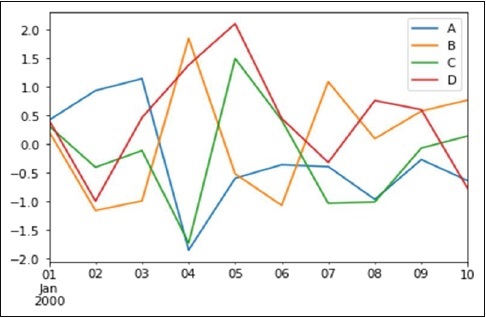
If the index consists of dates, then the pandas .plot() method calls the Matplotlib gct().autofmt_xdate() to format the x-axis labels.
Also we can plot one column versus another using the x and y keywords.
Types of Plots Available in Pandas
Pandas supports various plot types through the kind parameter or specialized plotting methods. Following is the overview of the different plotting methods −
| Plot Type | kind Value | Specialized Method | Use Case |
|---|---|---|---|
| Line | 'line' | .line() | Visualizing trends over time or a sequence. |
| Bar | 'bar' | .bar() | Comparing quantities across categories. |
| Horizontal Bar | 'barh' | .barh() | Same as bar charts, but horizontal. |
| Histogram | 'hist' | .hist() | Visualizing Distribution of numeric data. |
| Box Plot | 'box' | .box() | Summarizing data distribution and outliers. |
| Area | 'area' | .area() | Highlighting trends with cumulative data. |
| Scatter | 'scatter' | .scatter() | Relationship between two variables, for DataFrame only. |
| Hexbin | 'hexbin' | .hexbin() | Visualizing data density in two dimensions, for DataFrame only. |
| Density | 'kde' or 'density' | .kde() or .density() | Smoothing data distributions (Kernel Density Estimation). |
| Pie | 'pie' | .pie() | Proportional data in a circular graph. |
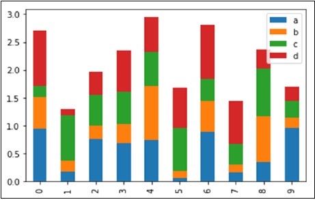
Example: Plotting Bar Plot with plot() method
Let us now see what a Bar Plot is by creating one. A bar plot can be created in the following way −
import pandas as pd
import numpy as np
import matplotlib.pyplot as plt

# Creating a random DataFrame
df = pd.DataFrame(np.random.rand(10,4), columns=['a','b','c','d'])

# Plotting the bar plot
df.plot(kind='bar')
plt.show()
Output
Its output is as follows −
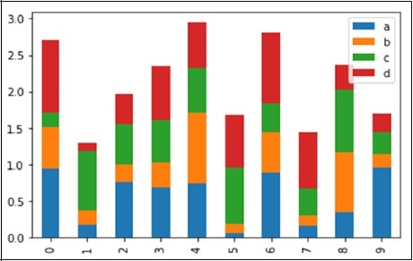
To produce a stacked bar plot, pass stacked=True −
import pandas as pd
import numpy as np
import matplotlib.pyplot as plt

# Creating a random DataFrame
df = pd.DataFrame(np.random.rand(10,4), columns=['a','b','c','d'])

# Plotting the stacked Bar plot
df.plot(kind='bar', stacked=True)
plt.show()
Output
Its output is as follows −
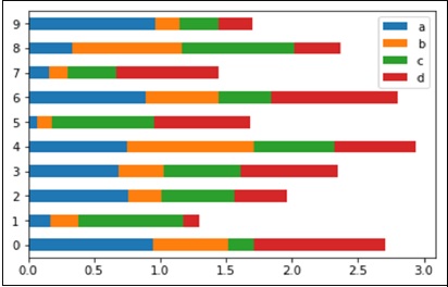
To get horizontal bar plots, use the barh option −
import pandas as pd
import numpy as np
import matplotlib.pyplot as plt

# Creating a random DataFrame
df = pd.DataFrame(np.random.rand(10,4), columns=['a','b','c','d'])

# Plotting the horizontal bar plot
df.plot(kind='barh', stacked=True)
plt.show()
Output
Its output is as follows −
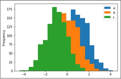
Histograms
Histograms can be plotted using the hist option of the plot() method kind argument. We can specify number of bins.
import pandas as pd
import numpy as np
import matplotlib.pyplot as plt

# Creating a random DataFrame
df = pd.DataFrame({'a':np.random.randn(1000)+1,'b':np.random.randn(1000),
'c':np.random.randn(1000) - 1}, columns=['a', 'b', 'c'])

df.plot(kind='hist', bins=20)
plt.show()
Output
Its output is as follows −
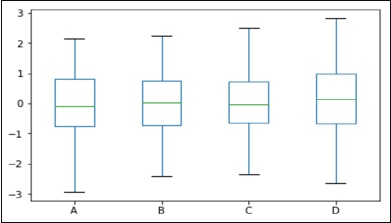
Box Plots
Box plot can be drawn calling 'box' option for both the Series and DataFrame objects to visualize the distribution of values within each column.
For instance, here is a boxplot representing five trials of 10 observations of a uniform random variable on [0,1).
import pandas as pd
import numpy as np
import matplotlib.pyplot as plt

# Creating a random DataFrame
df = pd.DataFrame(np.random.rand(10, 5), columns=['A', 'B', 'C', 'D', 'E'])

df.plot(kind='box')
plt.show()
Output
Its output is as follows −
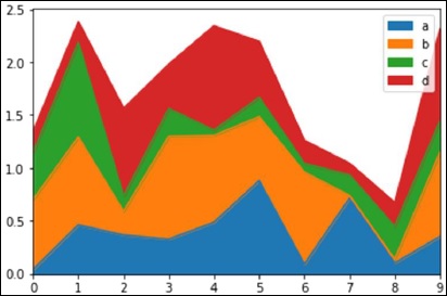
Area Plot
Area plot can be created using the plot(kind='area') option.
import pandas as pd
import numpy as np
import matplotlib.pyplot as plt

# Creating a random DataFrame
df = pd.DataFrame(np.random.rand(10, 4), columns=['a', 'b', 'c', 'd'])
df.plot(kind='area')

plt.show()
Output
Its output is as follows −
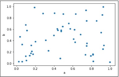
Scatter Plot
Scatter plot can be created using the plot(kind='scatter') option.
import pandas as pd
import numpy as np
import matplotlib.pyplot as plt

# Creating a random DataFrame
df = pd.DataFrame(np.random.rand(50, 4), columns=['a', 'b', 'c', 'd'])
df.plot(kind='scatter', x='a', y='b')

plt.show()
Output
Its output is as follows −
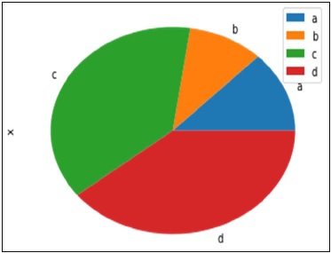
Pie Chart
Pie chart can be created using the plot(kind='pie') option.
import pandas as pd
import numpy as np
import matplotlib.pyplot as plt

# Creating a random DataFrame
df = pd.DataFrame(3 * np.random.rand(4), index=['a', 'b', 'c', 'd'], columns=['x'])
df.plot(kind='pie', subplots=True)

plt.show()
Output
Its output is as follows −