- Python Pandas - Basics
- Python Pandas - Introduction to Data Structures
- Python Pandas - Index Objects
- Python Pandas - Panel
- Python Pandas - Basic Functionality
- Python Pandas - Indexing & Selecting Data
- Python Pandas - Series
- Python Pandas - Series
- Python Pandas - Slicing a Series Object
- Python Pandas - Attributes of a Series Object
- Python Pandas - Arithmetic Operations on Series Object
- Python Pandas - Converting Series to Other Objects
- Python Pandas - DataFrame
- Python Pandas - DataFrame
- Python Pandas - Accessing DataFrame
- Python Pandas - Slicing a DataFrame Object
- Python Pandas - Modifying DataFrame
- Python Pandas - Removing Rows from a DataFrame
- Python Pandas - Arithmetic Operations on DataFrame
- Python Pandas - IO Tools
- Python Pandas - IO Tools
- Python Pandas - Working with CSV Format
- Python Pandas - Reading & Writing JSON Files
- Python Pandas - Reading Data from an Excel File
- Python Pandas - Writing Data to Excel Files
- Python Pandas - Working with HTML Data
- Python Pandas - Clipboard
- Python Pandas - Working with HDF5 Format
- Python Pandas - Comparison with SQL
- Python Pandas - Data Handling
- Python Pandas - Sorting
- Python Pandas - Reindexing
- Python Pandas - Iteration
- Python Pandas - Concatenation
- Python Pandas - Statistical Functions
- Python Pandas - Descriptive Statistics
- Python Pandas - Working with Text Data
- Python Pandas - Function Application
- Python Pandas - Options & Customization
- Python Pandas - Window Functions
- Python Pandas - Aggregations
- Python Pandas - Merging/Joining
- Python Pandas - MultiIndex
- Python Pandas - Basics of MultiIndex
- Python Pandas - Indexing with MultiIndex
- Python Pandas - Advanced Reindexing with MultiIndex
- Python Pandas - Renaming MultiIndex Labels
- Python Pandas - Sorting a MultiIndex
- Python Pandas - Binary Operations
- Python Pandas - Binary Comparison Operations
- Python Pandas - Boolean Indexing
- Python Pandas - Boolean Masking
- Python Pandas - Data Reshaping & Pivoting
- Python Pandas - Pivoting
- Python Pandas - Stacking & Unstacking
- Python Pandas - Melting
- Python Pandas - Computing Dummy Variables
- Python Pandas - Categorical Data
- Python Pandas - Categorical Data
- Python Pandas - Ordering & Sorting Categorical Data
- Python Pandas - Comparing Categorical Data
- Python Pandas - Handling Missing Data
- Python Pandas - Missing Data
- Python Pandas - Filling Missing Data
- Python Pandas - Interpolation of Missing Values
- Python Pandas - Dropping Missing Data
- Python Pandas - Calculations with Missing Data
- Python Pandas - Handling Duplicates
- Python Pandas - Duplicated Data
- Python Pandas - Counting & Retrieving Unique Elements
- Python Pandas - Duplicated Labels
- Python Pandas - Grouping & Aggregation
- Python Pandas - GroupBy
- Python Pandas - Time-series Data
- Python Pandas - Date Functionality
- Python Pandas - Timedelta
- Python Pandas - Sparse Data Structures
- Python Pandas - Sparse Data
- Python Pandas - Visualization
- Python Pandas - Visualization
- Python Pandas - Additional Concepts
- Python Pandas - Caveats & Gotchas
- Python Pandas Useful Resources
- Python Pandas - Quick Guide
- Python Pandas - Cheatsheet
- Python Pandas - Useful Resources
- Python Pandas - Discussion
Python Pandas - Pie Plot
A pie plot is a circular chart that shows data as slices, with each slice representing a portion of the dataset. It is useful for visualizing the relative sizes of different data values. In a pie chart, the size of each slice, including its angle, area, and arc length, corresponds to the value or percentage it represents. The total of all percentages equals 100%, and the sum of all slice angles is 360.
For instance, consider a dataset that records the pass percentages of boys and girls in a classroom. A pie plot visually represents this data, where each slice indicates the proportion of boys and girls passing.

In this tutorial, we will learn how to create and customize pie plots in Python using the Pandas library.
Pie Plot in Pandas
In Pandas, pie plot can be created using the plot.pie() method for both the Series and DataFrames objects. This method internally use Matplotlib and return either a matplotlib.axes.Axes object or NumPy array np.ndarray of Axes when subplots parameter is set to True.
DataFrame.plot.pie(): Creates pie plot for one or more columns in a DataFrame.
Series.plot.pie(): Creates a pie plot for a specific column or Series.
Syntax
Following is the syntax of the plot.pie() method for both the Series and DataFrames objects −
Series.plot.pie(**kwargs)
Where,
y: Specify the column label or position to plot. Required when using DataFrame.plot.pie() without subplots=True.
**kwargs: Additional keyword arguments to customize the plot appearance.
Example: Creating Pie Plot for Series Data
This example demonstrates using the Series.plot.pie() method on a pandas Series object to generate the pie plot.
import pandas as pd
import numpy as np
import matplotlib.pyplot as plt

# Create a Pandas Series
series = pd.Series(3 * np.random.rand(4), index=["a", "b", "c", "d"])

# Generate a pie plot
series.plot.pie(figsize=(7, 4))

# Set title and Display the plot
plt.title('Basic Pie Plot')
plt.show()
Output
Following is the output of the above code −

Example: Creating Pie Plot for a DataFrame
This example uses the DataFrame.plot.pie() method for the creating the pie plot.
import pandas as pd
import matplotlib.pyplot as plt

# Create a DataFrame with pass percentages
data = {"Category": ["Boys", "Girls"], "Pass Percentage": [75, 85]}

df = pd.DataFrame(data)

# Plotting the pie chart
df.plot.pie(y="Pass Percentage", labels=df["Category"], figsize=(7, 4))

# Set title and Display the plot
plt.title('Pie Plot for DataFrame')
plt.show()
Output
After executing the above code, we get the following output −

Customizing a Pie Plot
Pandas allows customization of pie plots through various parameters such as, labels, colors, autopct, fontsize, and more.
Example
This example demonstrates customizing the pie plot using the addition keyword arguments.
import pandas as pd
import matplotlib.pyplot as plt

# Create a DataFrame with pass percentages
data = {
    "Category": ["Boys", "Girls"],
    "Pass Percentage": [75, 85]
}

df = pd.DataFrame(data)

# Plotting the pie chart
df.plot.pie(y="Pass Percentage", labels=df["Category"],
autopct="%.1f%%", colors=["skyblue", "pink"], figsize=(7, 4))

# Set title and
plt.title('Customizing a Pie Plot')
plt.show()
Output
Following is the output of the above code −

Pie Plots for All DataFrame Columns
When plotting a pie plot from a DataFrame, you must specify a column using the y parameter or use subplots=True to plot multiple pie charts for all numerical columns.
Example
This example demonstrates creating pie plot for all DataFrame columns in a multiple subplots.
import pandas as pd
import matplotlib.pyplot as plt
import numpy as np

# Create a DataFrame
df = pd.DataFrame(3 * np.random.rand(4, 2),
index=["a", "b", "c", "d"],
columns=["Column1", "Column2"])

# Plotting the pie chart
df.plot.pie(subplots=True, autopct="%.1f%%", figsize=(7, 4), title='Pie Plots for All Columns')

# Display the Plot
plt.show()
Output
Following is the output of the above code −

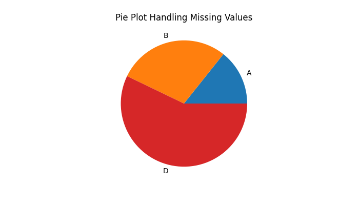
Pie Plot Handling NaN Values
Pandas plot.pie() method easily handles the missing values (NaN), if your data contains any. The method automatically fills the missing data with 0 when creating a pie plot.
Example
The following example shows how the plot.pie() method handles the missing values.
import pandas as pd
import numpy as np
import matplotlib.pyplot as plt

# Create a Pandas Series
series = pd.Series([1, 2, np.nan, 4], index=["A", "B", "C", "D"])

# Generate a pie plot
series.plot.pie(figsize=(7, 4))

# Set title and Display the plot
plt.title('Pie Plot Handling Missing Values')
plt.show()
Output
On executing the above code we will get the following output −