
Article Categories
- All Categories
-
 Data Structure
-
 Networking
-
 RDBMS
RDBMS
-
 Operating System
-
 Java
Java
-
 MS Excel
-
 iOS
iOS
-
 HTML
HTML
-
 CSS
CSS
-
 Android
-
 Python
-
 C Programming
-
 C++
C++
-
 C#
C#
-
 MongoDB
-
 MySQL
MySQL
-
 Javascript
-
 PHP
PHP
-
 Economics & Finance
Selected Reading
Plotting a probability density function by sample with Matplotlib
To plot a probability density function by sample with Matplotlib, we can use NumPy to generate data points and create a smooth curve. This is particularly useful for visualizing Gaussian distributions and other probability functions.
Steps
- Create x and p data points using NumPy
- Plot x and p data points using
plot()method - Scale the X-axis to focus on the relevant range
- Display the figure using
show()method
Example
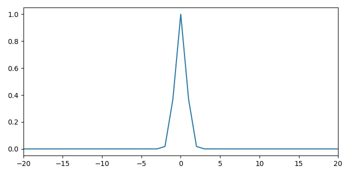
Here's how to create a probability density function plot ?
import numpy as np
from matplotlib import pyplot as plt

# Set figure size and layout
plt.rcParams["figure.figsize"] = [7.00, 3.50]
plt.rcParams["figure.autolayout"] = True

# Create data points
x = np.arange(-100, 100)
p = np.exp(-x ** 2)

# Plot the probability density function
plt.plot(x, p)
plt.xlim(-20, 20)
plt.xlabel('x')
plt.ylabel('Probability Density')
plt.title('Probability Density Function')
plt.show()
Enhanced Example with Normal Distribution
For a more realistic probability density function, let's create a proper normal distribution ?
import numpy as np
from matplotlib import pyplot as plt

# Parameters for normal distribution
mu = 0      # mean
sigma = 2   # standard deviation

# Create x values
x = np.linspace(-10, 10, 100)

# Calculate probability density function
pdf = (1 / (sigma * np.sqrt(2 * np.pi))) * np.exp(-0.5 * ((x - mu) / sigma) ** 2)

# Plot the PDF
plt.figure(figsize=(8, 5))
plt.plot(x, pdf, 'b-', linewidth=2, label=f'Normal(?={mu}, ?={sigma})')
plt.xlabel('x')
plt.ylabel('Probability Density')
plt.title('Normal Distribution PDF')
plt.grid(True, alpha=0.3)
plt.legend()
plt.show()
Key Points
-
Data Generation: Use
np.linspace()for smoother curves thannp.arange() - PDF Formula: For normal distribution: PDF = (1/(??(2?))) × e^(-0.5×((x-?)/?)²)
- Visualization: Add labels, title, and grid for better readability
-
Range Selection: Use
xlim()to focus on the meaningful range of the distribution
Output
Conclusion
Plotting probability density functions with Matplotlib helps visualize statistical distributions effectively. Use NumPy for mathematical calculations and Matplotlib's plotting functions for clear, informative graphs with proper labels and formatting.

Updated on: 2026-03-25T20:05:10+05:30
2K+ Views

Advertisements