- JSF - Home
- JSF - Overview
- JSF - Environment Setup
- JSF - Architecture
- JSF - Life Cycle
- JSF - First Application
- JSF - Managed Beans
- JSF - Page Navigation
- JSF - Basic Tags
- JSF - Facelet Tags
- JSF - Convertor Tags
- JSF - Validator Tags
- JSF - DataTable
- JSF - Composite Components
- JSF - Ajax
- JSF - Event Handling
- JSF - JDBC Integration
- JSF - Spring Integration
- JSF - Expression Language
- JSF - Internationalization
JSF - h:selectBooleanCheckbox
The h:selectBooleanCheckbox tag renders an HTML input element of the type "checkbox".
JSF Tag
<h:selectBooleanCheckbox value = "Remember Me" id = "chkRememberMe" />
Rendered Output
<input id = "jsfForm1:chkRememberMe" type = "checkbox"
   name = "jsfForm1:chkRememberMe" checked = "checked" />
Tag Attributes
| S.No | Attribute & Description |
|---|---|
| 1 | id Identifier for a component |
| 2 | binding Reference to the component that can be used in a backing bean |
| 3 | rendered A boolean; false suppresses rendering |
| 4 | styleClass Cascading stylesheet (CSS) class name |
| 5 | value A components value, typically a value binding |
| 6 | valueChangeListener A method binding to a method that responds to value changes |
| 7 | converter Converter class name |
| 8 | validator Class name of a validator thats created and attached to a component |
| 9 | required A boolean; if true, requires a value to be entered in the associated field |
| 10 | accesskey A key, typically combined with a system-defined metakey, that gives focus to an element |
| 11 | accept Comma-separated list of content types for a form |
| 12 | accept-charset Comma- or space-separated list of character encodings for a form. The accept-charset attribute is specified with the JSF HTML attribute named acceptcharset. |
| 13 | alt Alternative text for nontextual elements such as images or applets |
| 14 | charset Character encoding for a linked resource |
| 15 | coords Coordinates for an element whose shape is a rectangle, circle, or polygon |
| 16 | dir Direction for text. Valid values are ltr (left to right) and rtl (right to left). |
| 17 | disabled Disabled state of an input element or button |
| 18 | hreflang Base language of a resource specified with the href attribute; hreflang may only be used with href.. |
| 19 | lang Base language of an elements attributes and text |
| 20 | maxlength Maximum number of characters for text fields |
| 21 | readonly Read-only state of an input field; text can be selected in a readonly field but not edited |
| 22 | rel Relationship between the current document and a link specified with the href attribute |
| 23 | rev Reverse link from the anchor specified with href to the current document. The value of the attribute is a space-separated list of link types. |
| 24 | rows Number of visible rows in a text area. h:dataTable has a rows attribute, but its not an HTML pass-through attribute. |
| 25 | shape Shape of a region. Valid values: default, rect,circle, poly. (default signifies the entire region) |
| 26 | style Inline style information |
| 27 | tabindex Numerical value specifying a tab index |
| 28 | target The name of a frame in which a document is opened |
| 29 | title A title, used for accessibility, that describes an element. Visual browsers typically create tooltips for the titles value |
| 30 | type Type of a link; for example, stylesheet |
| 31 | width Width of an element |
| 32 | onblur Element loses focus |
| 33 | onchange Elements value changes |
| 34 | onclick Mouse button is clicked over the element |
| 35 | ondblclick Mouse button is double-clicked over the element |
| 36 | onfocus Element receives focus |
| 37 | onkeydown Key is pressed |
| 38 | onkeypress Key is pressed and subsequently released |
| 39 | onkeyup Key is released |
| 40 | onmousedown Mouse button is pressed over the element |
| 41 | onmousemove Mouse moves over the element |
| 42 | onmouseout Mouse leaves the elements area |
| 43 | onmouseover Mouse moves onto an element |
| 44 | onmouseup Mouse button is released |
| 45 | onreset Form is reset |
| 46 | onselect Text is selected in an input field |
Example Application
Let us create a test JSF application to test the above tag.
| Step | Description |
|---|---|
| 1 | Create a project with a name helloworld under a package com.tutorialspoint.test as explained in the JSF - First Application chapter. |
| 2 | Modify home.xhtml as explained below. Keep rest of the files unchanged. |
| 3 | Compile and run the application to make sure business logic is working as per the requirements. |
| 4 | Finally, build the application in the form of war file and deploy it in Apache Tomcat Webserver. |
| 5 | Launch your web application using appropriate URL as explained below in the last step. |
home.xhtml
<!DOCTYPE html PUBLIC "-//W3C//DTD XHTML 1.0 Transitional//EN"
"http://www.w3.org/TR/xhtml1/DTD/xhtml1-transitional.dtd">
<html xmlns = "http://www.w3.org/1999/xhtml">
<head>
<title>JSF Tutorial!</title>
<h:head>
<script type = "text/javascript">
function showCheckedValue() {
alert(document.getElementById('jsfForm1:chkRememberMe').checked);
}
</script>
</h:head>
</head>
<body>
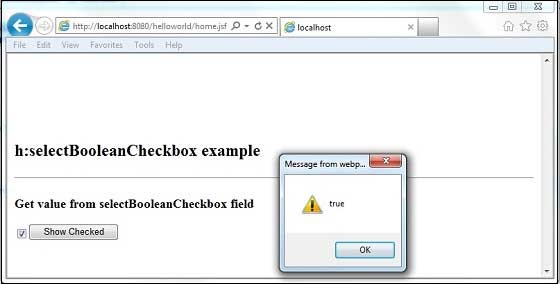
<h2>h:selectBooleanCheckbox example</h2>
<hr />
<h:form id = "jsfForm1">
<h3>Get value from selectBooleanCheckbox field</h3>
<h:selectBooleanCheckbox value = "Remember Me" id = "chkRememberMe" />
<h:commandButton value = "Show Checked" onclick = "showCheckedValue()" />
</h:form>
</body>
</html>
Once you are ready with all the changes done, let us compile and run the application as we did in JSF - First Application chapter. If everything is fine with your application, this will produce the following result.