- React Native - Overview
- React Native - Environment Setup
- React Native - App
- React Native - State
- React Native - Props
- React Native - Styling
- React Native - Flexbox
- React Native - ListView
- React Native - Text Input
- React Native - ScrollView
- React Native - Images
- React Native - HTTP
- React Native - Buttons
- React Native - Animations
- React Native - Debugging
- React Native - Router
- React Native - Running IOS
- React Native - Running Android
- Components and APIs
- React Native - View
- React Native - WebView
- React Native - Modal
- React Native - ActivityIndicator
- React Native - Picker
- React Native - Status Bar
- React Native - Switch
- React Native - Text
- React Native - Alert
- React Native - Geolocation
- React Native - AsyncStorage
- React Native Useful Resources
- React Native - Quick Guide
- React Native - Useful Resources
- React Native - Discussion
Selected Reading
React Native - Flexbox
To accommodate different screen sizes, React Native offers Flexbox support.
We will use the same code that we used in our React Native - Styling chapter. We will only change the PresentationalComponent.
Layout
To achieve the desired layout, flexbox offers three main properties flexDirection justifyContent and alignItems.
The following table shows the possible options.
| Property | Values | Description |
|---|---|---|
| flexDirection | 'column', 'row' | Used to specify if elements will be aligned vertically or horizontally. |
| justifyContent | 'center', 'flex-start', 'flex-end', 'space-around', 'space-between' | Used to determine how should elements be distributed inside the container. |
| alignItems | 'center', 'flex-start', 'flex-end', 'stretched' | Used to determine how should elements be distributed inside the container along the secondary axis (opposite of flexDirection) |
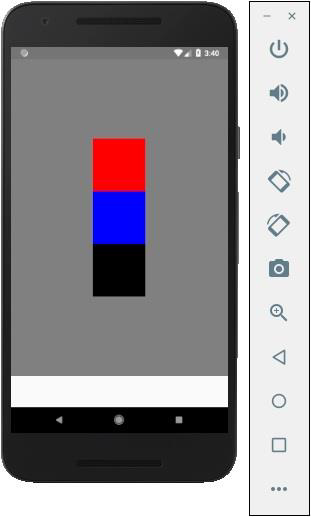
If you want to align the items vertically and centralize them, then you can use the following code.
App.js
import React, { Component } from 'react'
import { View, StyleSheet } from 'react-native'

const Home = (props) => {
   return (
      <View style = {styles.container}>
         <View style = {styles.redbox} />
         <View style = {styles.bluebox} />
         <View style = {styles.blackbox} />
      </View>
   )
}

export default Home

const styles = StyleSheet.create ({
   container: {
      flexDirection: 'column',
      justifyContent: 'center',
      alignItems: 'center',
      backgroundColor: 'grey',
      height: 600
   },
   redbox: {
      width: 100,
      height: 100,
      backgroundColor: 'red'
   },
   bluebox: {
      width: 100,
      height: 100,
      backgroundColor: 'blue'
   },
   blackbox: {
      width: 100,
      height: 100,
      backgroundColor: 'black'
   },
})
Output
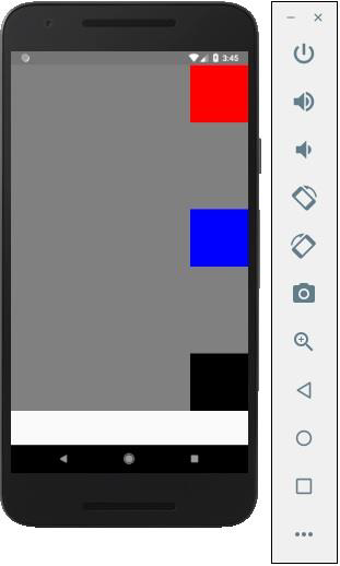
If the items need to be moved to the right side and spaces need to be added between them, then we can use the following code.
App.js
import React, { Component } from 'react'
import { View, StyleSheet } from 'react-native'

const App = (props) => {
   return (
      <View style = {styles.container}>
         <View style = {styles.redbox} />
         <View style = {styles.bluebox} />
         <View style = {styles.blackbox} />
      </View>
   )
}

export default App

const styles = StyleSheet.create ({
   container: {
      flexDirection: 'column',
      justifyContent: 'space-between',
      alignItems: 'flex-end',
      backgroundColor: 'grey',
      height: 600
   },
   redbox: {
      width: 100,
      height: 100,
      backgroundColor: 'red'
   },
   bluebox: {
      width: 100,
      height: 100,
      backgroundColor: 'blue'
   },
   blackbox: {
      width: 100,
      height: 100,
      backgroundColor: 'black'
   },
})

Advertisements