
Article Categories
- All Categories
-
 Data Structure
-
 Networking
-
 RDBMS
RDBMS
-
 Operating System
-
 Java
Java
-
 MS Excel
-
 iOS
iOS
-
 HTML
HTML
-
 CSS
CSS
-
 Android
-
 Python
-
 C Programming
-
 C++
C++
-
 C#
C#
-
 MongoDB
-
 MySQL
MySQL
-
 Javascript
-
 PHP
PHP
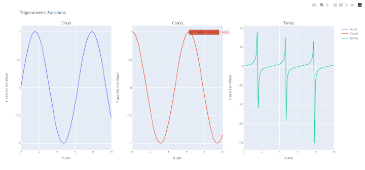
How to apply different titles for each different subplots using Plotly in Python?
Introduction
Subplot creation is one of several tools for data visualization provided by the Python library Plotly. A big narrative can be broken up into multiple smaller ones using subplots. Sometimes, in order to give the main story greater depth and consistency, it may be essential to give each subplot its own title.
Syntax
Customizing subplot titles in plot grids is made possible through the usage of the subplot_titles parameter, which enables us to create unique titles for each plot. The make_subplots() function is essentially a factory method that allows us to establish a plot grid with a designated number of rows and columns. Let's delve into some of the key parameters we can manipulate with make_subplots() ?
rows ? This parameter specifies the number of rows in the plot grid.
cols ? This parameter specifies the number of columns in the plot grid.
specs ? An array of arrays that delineates the type of each subplot in the grid. Each element in the specs array should comprise two values: the number of rows and columns the subplot spans, respectively, and the subplot type.
subplot_titles ? An array of strings that illustrates the titles of each subplot in the grid. The size of this array should equal the number of subplots in the grid.
In the code below we will be do the in a way like this to give each subplot a unique title ?
fig = make_subplots(rows=1, cols=3, subplot_titles=("Subplot 1", "Subplot 2", "Subplot 3"))
Example
Before writing the actual code, understand the algorithm for it.
Import the necessary modules - plotly.graph_objs and plotly.subplots as well as numpy.
Create some data using numpy to be plotted.
Use the make_subplots function to create a grid of subplots with 1 row and 3 columns. Pass the subplot_titles parameter to give each subplot a unique title.
Add traces to each subplot using the add_trace method. For each subplot, pass a go.Scatter object containing the data to be plotted and a name parameter to label the data.
Use the update_layout method to assign a title to the entire plot.
Use the update_xaxes and update_yaxes methods to assign unique titles to the x-axis and y-axis of each subplot.
Display the plot using the show method.
import plotly.graph_objs as go
from plotly.subplots import make_subplots
import numpy as np

# Create data
x = np.linspace(0, 10, 100)
y1 = np.sin(x)
y2 = np.cos(x)
y3 = np.tan(x)

# Create subplots
fig = make_subplots(rows=1, cols=3, subplot_titles=("Sin(x)", "Cos(x)",
"Tan(x)"))

# Add traces
fig.add_trace(go.Scatter(x=x, y=y1, name='Sin(x)'), row=1, col=1)
fig.add_trace(go.Scatter(x=x, y=y2, name='Cos(x)'), row=1, col=2)
fig.add_trace(go.Scatter(x=x, y=y3, name='Tan(x)'), row=1, col=3)

# Assign unique titles to each subplot
fig.update_layout(title_text="Trigonometric Functions")
fig.update_xaxes(title_text="X-axis for Sin Wave", row=1, col=1)
fig.update_xaxes(title_text="X-axis for Cos Wave", row=1, col=2)
fig.update_xaxes(title_text="X-axis Tan Wave", row=1, col=3)
fig.update_yaxes(title_text="Y-axis for Sin Wave", row=1, col=1)
fig.update_yaxes(title_text="Y-axis for Cos Wave", row=1, col=2)
fig.update_yaxes(title_text="Y-axis Tan Wave", row=1, col=3)

# Display the plot
fig.show()
Import plotly.graph objs and plotly.subplots first, as these are required libraries. In order to create some example data, we also import the numpy library.
The numpy library is then used to create some example data. The sin, cos, and tan functions of the array x are represented by the three arrays y1, y2, and y3 that we generate. Using the make subplots() method, we next produce a subplot grid with one row and three columns.
The subplot titles option is additionally sent an array of three strings with the values "Sin(x)", "Cos(x)," and "Tan(x)". Each grid subplot's titles are determined by this.
With the add trace() function, each subplot is given a trace after the subplot grid has been created. For each of the three y1, y2, and y3 arrays, a Scatter trace is added. For the three traces, we additionally supply the name parameters as "Sin(x)," "Cos(x)," and "Tan(x)," accordingly. By utilizing the row and col arguments of the add trace() method, we can define the subplot for each trace.
The general title of the plot is then changed to "Trigonometric Functions" using the update layout() method.
Now set the x-axis and y-axis titles for each subplot using the update xaxes() and update yaxes() methods to give each subplot a special title. To indicate the subplot we wish to update, we supply the row and col parameters. We also pass the title text argument to set the title for the x-axis or y-axis.
The plot is finally shown using the show() method.
Conclusion
Plotly's make subplots() function offers a practical method for making a grid of subplots. Every subplot in the grid can have a different title by using the subplot titles argument. Besides that, the update xaxes() and update yaxes() routines allow us to change the names of the x- and y-axes for each subplot.

5K+ Views
