
Article Categories
- All Categories
-
 Data Structure
-
 Networking
-
 RDBMS
RDBMS
-
 Operating System
-
 Java
Java
-
 MS Excel
-
 iOS
iOS
-
 HTML
HTML
-
 CSS
CSS
-
 Android
-
 Python
-
 C Programming
-
 C++
C++
-
 C#
C#
-
 MongoDB
-
 MySQL
MySQL
-
 Javascript
-
 PHP
PHP
-
 Economics & Finance
Selected Reading
How to plot multiple time series using ggplot2 in R?
For a one point of time, we might have multiple time series data, this could be weather for multiple cities, price variation in multiple products, demand expectancy at different locations, or anything that changes with time and measured for multiple things or locations. If we have such type of time series data then we would be needing to plot that data in a single plot and it can be done with the help of geom_line function of ggplot2 package.
Example
Consider the below data frames −
> x1<-1:10
> y1<-rnorm(10)
> df1<-data.frame(x1,y1)
> df1
Output
   x1 y1
1 1 -0.1165387
2 2 -0.9084062
3 3 0.4696637
4 4 1.5597274
5 5 -0.1101060
6 6 1.4060137
7 7 -0.8310496
8 8 -0.2272508
9 9 -0.2153751
10 10 0.9463936
Example
> x2<-1:10
> y2<-rnorm(10)
> df2<-data.frame(x2,y2)
> df2
Output
   x2 y2
1 1 -1.0545341
2 2 0.3791710
3 3 -1.5611182
4 4 -1.1212776
5 5 -0.7441233
6 6 -0.5665797
7 7 -1.1247473
8 8 -0.3644471
9 9 0.8933615
10 10 0.8809048
Example
> x3<-1:10
> y3<-rnorm(10)
> df3<-data.frame(x3,y3)
> df3
Output
   x3 y3
1 1 0.53114394
2 2 0.76319036
3 3 -0.09477086
4 4 0.54543062
5 5 1.57865385
6 6 -0.72168934
7 7 0.57577687
8 8 0.03108040
9 9 -0.97440541
10 10 -0.09145164
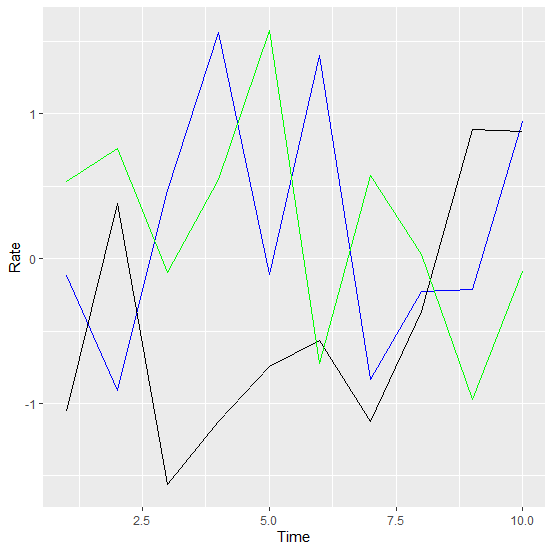
Creating a single time series plot for the above three data frames using ggplot2 −
> library(ggplot2)
>
ggplot(df1,aes(x1,y1))+geom_line(color="blue")+geom_line(aes(x2,y2),color="black")+
geom_line(aes(x3,y3),color="green")+xlab("Time")+ylab("Rate")
Output

Updated on: 2026-03-11T22:50:51+05:30
1K+ Views

Advertisements