
Article Categories
- All Categories
-
 Data Structure
-
 Networking
-
 RDBMS
RDBMS
-
 Operating System
-
 Java
Java
-
 MS Excel
-
 iOS
iOS
-
 HTML
HTML
-
 CSS
CSS
-
 Android
-
 Python
-
 C Programming
-
 C++
C++
-
 C#
C#
-
 MongoDB
-
 MySQL
MySQL
-
 Javascript
-
 PHP
PHP
-
 Economics & Finance
Selected Reading
How to join points in a point chart with lines using ggplot2 in R?
Usually, a point chart is created to assess the relationship or movement of two variables together but sometimes these points are scattered in a way that makes confusion. Hence, data analyst or researcher try to visualize this type of graph by joining the points with lines. In ggplot2, this joining can be done by using geom_line() function.
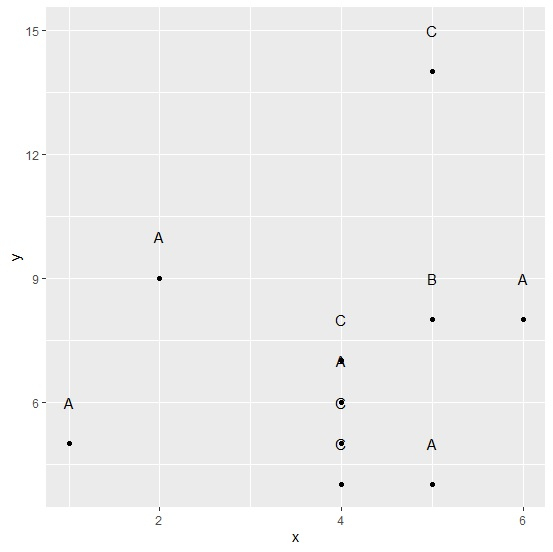
Consider the below data frame −
Example
set.seed(111)
x<-rpois(10,5)
y<-rpois(10,8)
grp<-sample(LETTERS[1:3],10,replace=TRUE)
df<-data.frame(x,y,grp)
df
Output
  x  y grp
1 5 8  B
2 6 8  A
3 4 4  B
4 5 4  B
5 4 5  C
6 4 7  A
7 1 5  B
8 5 14 A
9 4 6  C
10 2 9 B
Loading ggplot2 package and creating a point chart between x and y −
Example
library(ggplot2)
ggplot(df,aes(x,y))+geom_point()+geom_text(data=df,aes(x=x,y=y+1,label=grp))
Output
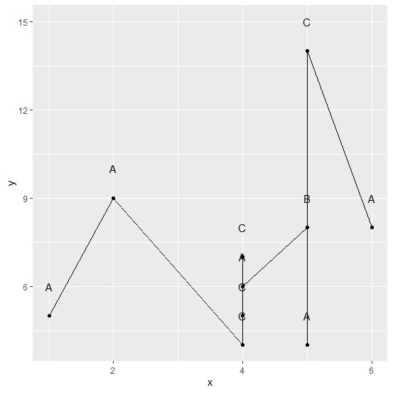
Creating point chart between x and y with lines joining the points −
Example
ggplot(df,aes(x,y))+geom_point()+geom_line()+geom_text(data=df,aes(x=x,y=y+1,label=grp))
Output

Updated on: 2026-03-11T22:50:52+05:30
682 Views

Advertisements