
Article Categories
- All Categories
-
 Data Structure
-
 Networking
-
 RDBMS
RDBMS
-
 Operating System
-
 Java
Java
-
 MS Excel
-
 iOS
iOS
-
 HTML
HTML
-
 CSS
CSS
-
 Android
-
 Python
-
 C Programming
-
 C++
C++
-
 C#
C#
-
 MongoDB
-
 MySQL
MySQL
-
 Javascript
-
 PHP
PHP
-
 Economics & Finance
How to Insert in-cell Bar Chart in Excel?
In this article, the user will understand how to insert in?cell bar chart in Excel. It is useful as it allows users to visualize the trends, and patterns, and to state the variations of data. It is also useful to provide quick insights into data within a worksheet or table. It can be inserted within a single cell or in a group of cells.
The few benefits of embedding the in?cell bar chart in Excel are listed below:
Contextual Understanding: Sparklines or in?cell bar charts can be used with the same rows or columns, it depends on our requirement and scenario. However, using the in?cell charts is useful to interpret the relationship between the values.
Real?Time Updates: In?cell bar charts users can link the dynamic data range, to ensure that the visualizations are always up to date, saving user time and effort to update the old types of charts manually.
Example 1: To Insert in?cell bar chart by using the conditional formatting options.
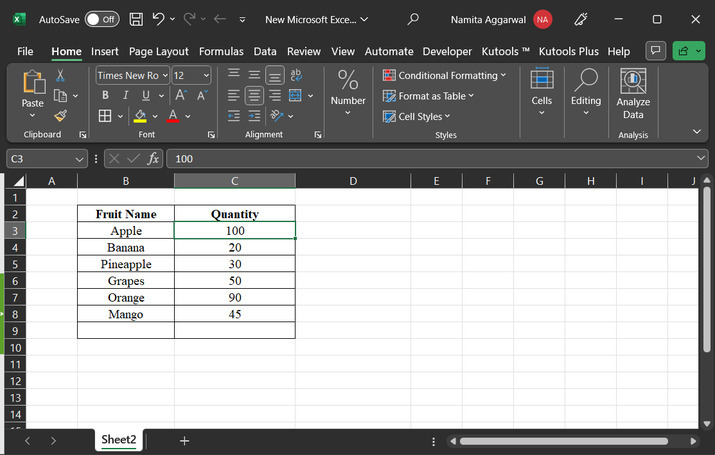
Step 1
To understand the process of implementing the in?cell bar chart, first create an Excel sheet, with some sample data. Go to the B2 cell and create a cell header for "Fruit Name". After that go to the C2 cell and type the cell "Quantity". From B3 to B8 cell type any fruit names. After that from the C3 to C8 cell, type the quantity of described fruits. Proper more clarification, the user can refer to the below?provided image:
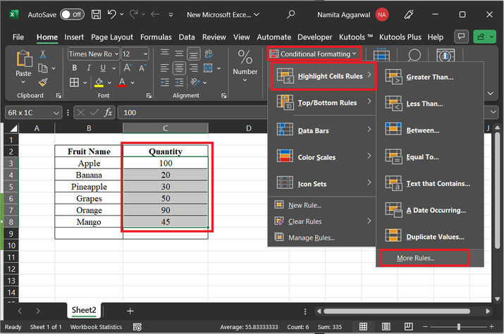
Step 2
After that go to the "Home" tab, and then select the "Conditional Formatting" option, further click on the "More Rules" option, available in the newly appeared list. Consider the snapshot of data for proper reference:
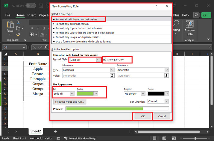
Step 3
The above step will open a "New Formatting Rule" dialog box. In the first ?Select a Rule Type label", click on the first provided option "Format all cells based on their values". After that go to the second label "Edit the rule description". In the format style option click on the first drop?down arrow and select the option "Data Bar" and tick the side option "Show Bar Only". After that go to the "Bar Appearance", in the fill drop down select "Solid Fill", and in the color, drop?down user can select any required color, but here will be using the cell color for demonstration. The selected color will be displayed in the preview option. Finally, click on the "OK" button. snapshot for reference is depicted below:
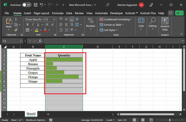
Step 4
As soon as user click on the "Ok" option, the quantity cell will display the data as a bar chart values. Snapshot for the same is provided below:
Conclusion
In this article, the user needs to create a cell chart for all the provided values. The detailed instructions are depicted in the example along with screenshots for a clear understanding of all consecutive steps. The guided explanation helps beginners to learn all the concepts easily and effectively.

2K+ Views
