
Article Categories
- All Categories
-
 Data Structure
-
 Networking
-
 RDBMS
RDBMS
-
 Operating System
-
 Java
Java
-
 MS Excel
-
 iOS
iOS
-
 HTML
HTML
-
 CSS
CSS
-
 Android
-
 Python
-
 C Programming
-
 C++
C++
-
 C#
C#
-
 MongoDB
-
 MySQL
MySQL
-
 Javascript
-
 PHP
PHP
-
 Economics & Finance
How to group by range in an Excel pivot table?
In this article, the user will understand how to group by range in an Excel pivot table. A pivot table is the best way to take critical decisions related to business data and present the summarized data. Grouping by range is a way to group numerical data into specific ranges or intervals in the pivot table. This feature allows you to summarize and analyze data based on different ranges of values, instead of individual values. Filtering, aggregating, and sorting of data are the various features of the pivot table.
Example: To group a pivot table by range in Excel by using the pivot table option
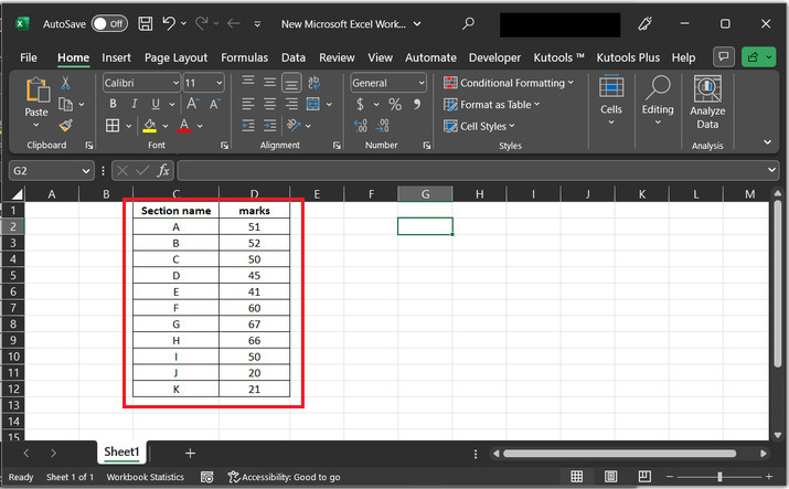
Step 1
Consider an Excel spreadsheet, that contains two columns with multiple row values.
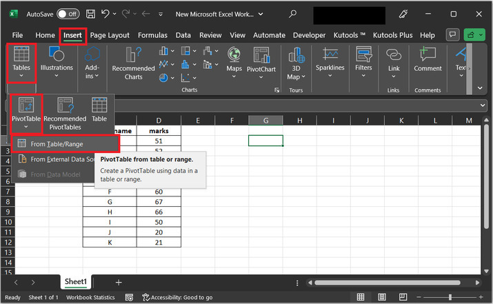
Step 2
In this step, the user needs to go to the "Insert" tab. In the insert tab click on the "Tables" option. Under the table option select the first appeared option "PivotTable", and after that click on the first available option "From Table/Range".
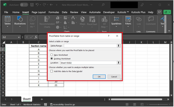
Step 3
The above step will open a "Pivot Table from table or range" dialog box. This dialog box contains options for a range of considerable tables, and the location where the user wants to place the available data.
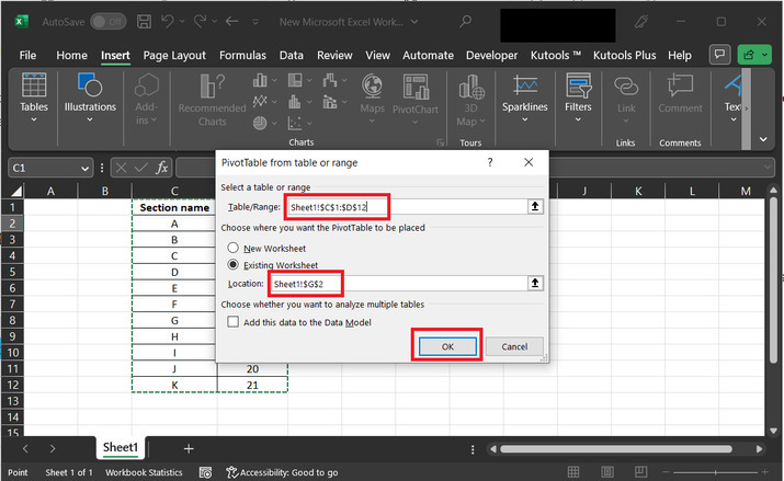
Step 4
In the below-given dialog box "Pivot Table from table or range"." In the first label, "Table/range"" select the table data from the sheet. From the two provided radio buttons select the second option which is "Existing Worksheet"." In the location label, add the data values for the location. This location is the place where the new table is going to be located.
Step 4
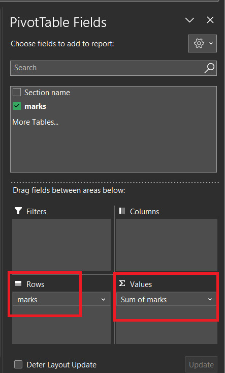
The above step will display a pivot table fields dialog box, as specified below. In the rows category, drag data values for rows, and in the values label, drag the row for the sum of values.
Step 5
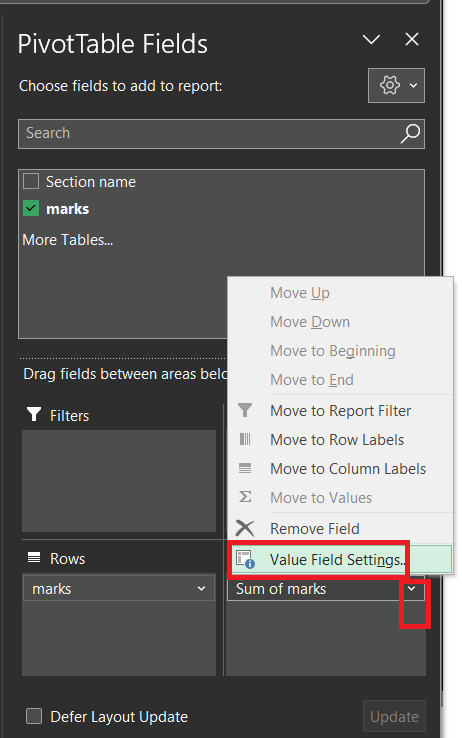
Again, click on the drop-down arrow box of "Sum of Marks", and select the option for "value field settings". As depicted below:
Step 6
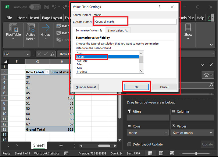
The above step will open a "Value Field Settings" option. In the custom name label, add the name for the column as "Count of marks". Under the "Summarize value field by " tab, select the field for "Count", and click on the "OK" button.
Step 7
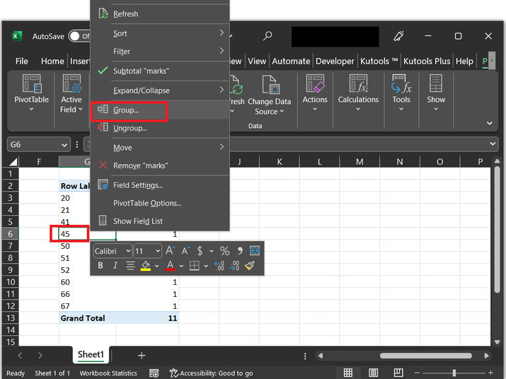
The above step will modify the column table. Select any row value from the row label option and select the option for "Group". Consider the below-given image for reference ?
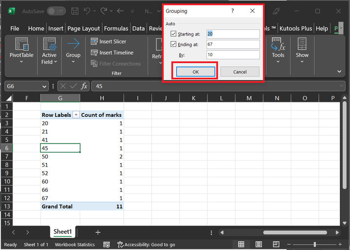
Step 8
The above step will display a "Grouping" dialog box, as given below. Tick the option for "Starting at" and set the value to the initial value, for this case, the value can be 20, and after that tick the option for "Ending at", and set the value to the final or last value. For this case, the chosen value is 67. In the by label, set the range interval, here will set the value to 10. Finally, click the "OK" button.
Step 9
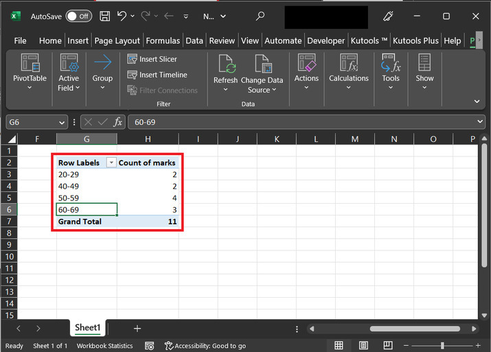
The above step will display the table with provided row labels, and in the second column the count for provided marks range is displayed, as shown below in the pivot table ?
Conclusion
After going through all the provided steps, the user will be able to generate a pivot table from the provided normal table in Excel and can also be able to group the data according to the situation requires. This example describes a simple way to solve the required task. It is very important to note that by referring to the article precisely the user can perform other possible similar tasks as well.

4K+ Views
