
 Data Structure
 Networking
 RDBMS
RDBMS Operating System
 Java
Java MS Excel
 iOS
iOS HTML
HTML CSS
CSS Android
 Python
 C Programming
 C++
C++ C#
C# MongoDB
 MySQL
MySQL Javascript
 PHP
PHP
- Selected Reading
- UPSC IAS Exams Notes
- Developer's Best Practices
- Questions and Answers
- Effective Resume Writing
- HR Interview Questions
- Computer Glossary
- Who is Who
Basic Gantt Chart Using Python Matplotlib
Project management could be a complex endeavor that requires cautious arranging, organization, and following of errands and timelines. Gantt charts have long been a staple in extended administration, giving a visual representation of venture plans, errand lengths, and conditions. These charts empower venture directors and groups to successfully arrange, screen, and communicate extend advance.
In this article, we'll set out on a travel to make essential basic fundamental essential Synonyms Gantt charts utilizing the effective Python library, Matplotlib. By leveraging Matplotlib's plotting capabilities, we will make energetic and instructive Gantt charts that upgrade and extend visualization and decision-making.
Basic Gantt Chart Using Python Matplotlib
Gantt charts are crucial apparatuses for venture supervisors, permitting them to outline extended plans and track assignment execution over time. Python, with its broad environment of libraries, offers a flexible arrangement for making Gantt charts. Matplotlib, one of the foremost prevalent information visualization libraries in Python, gives a strong stage for producing customizable Gantt charts. With Matplotlib, ready to effectively plot errands, set terms, and visualize venture timelines with clarity and exactness. Whether it's for individual ventures, group collaborations, or professional project management, acing the creation of essential Gantt charts utilizing Python Matplotlib may be an important aptitude.
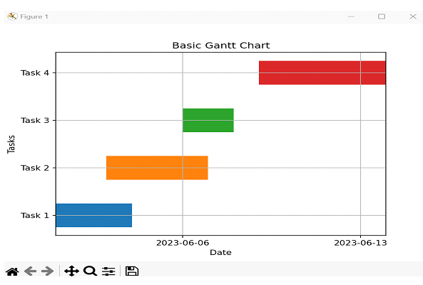
Approach 1: Python - Basic Gantt Chart using Python Matplotlib using Horizonal Bar Plots
In this approach, we are going to utilize the horizontal bar plots of Matplotlib to make a Gantt chart. We are going to plot each errand as a flat bar with its beginning and finishing dates.
Algorithm
Step 1 ? Import the necessary libraries: Matplotlib and NumPy.
Step 2 ? Create the data for the Gantt chart, including the task names, start dates, and duration.
Step 3 ? Initialize the figure and axis for the chart.
Step 4 ? Set the y-axis tick labels as task names.
Step 5 ? Loop through the tasks and plot each task as a horizontal bar.
Step 6 ? Set the x-axis limits according to the start and end dates of the tasks.
Step 7 ? Customize the chart with appropriate labels, titles, and gridlines.
Step 8 ? Display the Gantt chart using ?plt.show()'.
Example
import matplotlib.pyplot as plt
import numpy as np
import pandas as pd
import matplotlib.dates as mdates

# Step 2: Create the data for the Gantt chart
tasks = ['Task 1', 'Task 2', 'Task 3', 'Task 4']
start_dates = ['2023-06-01', '2023-06-03', '2023-06-06', '2023-06-09']
durations = [3, 4, 2, 5]

# Step 3: Initialize the figure and axis
fig, ax = plt.subplots()

# Step 4: Set y-axis tick labels
ax.set_yticks(np.arange(len(tasks)))
ax.set_yticklabels(tasks)

# Step 5: Plot each task as a horizontal bar
for i in range(len(tasks)):
    start_date = pd.to_datetime(start_dates[i])
    end_date = start_date + pd.DateOffset(days=durations[i])
    ax.barh(i, end_date - start_date, left=start_date, height=0.5, align='center')

# Step 6: Set x-axis limits
min_date = pd.to_datetime(min(start_dates))
max_date = pd.to_datetime(max(start_dates)) + pd.DateOffset(days=max(durations))
ax.set_xlim(min_date, max_date)

# Step 7: Customize the chart
ax.xaxis_date()
ax.xaxis.set_major_locator(mdates.WeekdayLocator())
ax.xaxis.set_major_formatter(mdates.DateFormatter('%Y-%m-%d'))
ax.set_xlabel('Date')
ax.set_ylabel('Tasks')
ax.set_title('Basic Gantt Chart')

# Step 8: Display the chart
plt.grid(True)
plt.show()
Output
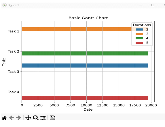
Approach 2: Python - Basic Gantt Chart using Python Matplotlib using Seaborn's Barplot
In this approach, we'll use the Seaborn library, which is built on best of Matplotlib, to form the Gantt chart. We'll utilize the barplot() work of Seaborn, which gives a high-level interface to make bar plots.
Algorithm
Step 1 ? Import the necessary libraries: Seaborn and Pandas.
Step 2 ? Create a Pandas Data Frame to hold the task data, including task names, start dates, and duration
Step 3 ? Initialize the figure and axis for the chart.
Step 4 ? Use Seaborn's barplot() function to create the Gantt chart.
Step 5 ? Customize the chart with appropriate labels, titles, and grid lines.
Step 6 ? Display the Gantt chart using plt.show().
Example
import seaborn as sns
import pandas as pd
import matplotlib.pyplot as plt
import matplotlib.dates as mdates

# Step 2: Create the data for the Gantt chart
data = {
    'Tasks': ['Task 1', 'Task 2', 'Task 3', 'Task 4'],
    'Start Dates': ['2023-06-01', '2023-06-03', '2023-06-06', '2023-06-09'],
    'Durations': [3, 4, 2, 5]
}
df = pd.DataFrame(data)

# Convert 'Start Dates' to numeric duration values
df['Start Dates'] = mdates.datestr2num(df['Start Dates'])

# Step 3: Initialize the figure and axis
fig, ax = plt.subplots()

# Step 4: Create the Gantt chart
sns.barplot(data=df, x='Start Dates', y='Tasks', hue='Durations', ax=ax)

# Step 5: Customize the chart
ax.set_xlabel('Date')
ax.set_ylabel('Tasks')
ax.set_title('Basic Gantt Chart')
ax.grid(True)

# Step 6: Display the chart
plt.show()
Output
Conclusion
In this article, we explored three different approaches to creating a simple Gantt chart using Python's Matplotlib library. The first approach used horizontal bar charts, the second approach used Seaborn's Barplot functionality, and the third approach used Plotly Express to create interactive charts.

5K+ Views
