
Article Categories
- All Categories
-
 Data Structure
-
 Networking
-
 RDBMS
RDBMS
-
 Operating System
-
 Java
Java
-
 MS Excel
-
 iOS
iOS
-
 HTML
HTML
-
 CSS
CSS
-
 Android
-
 Python
-
 C Programming
-
 C++
C++
-
 C#
C#
-
 MongoDB
-
 MySQL
MySQL
-
 Javascript
-
 PHP
PHP
-
 Economics & Finance
How to display Y-axis labels with more decimal places in R?
To display Y-axis labels with more decimal places, we would need to round the values of the vector or column for which we want to create the plot to the appropriate number of decimal places.
After that axis function will be used for creating the graph. Before doing all this, the graph of original values should be created without axes.
Check out the below example to understand how it works.
Example
Following snippet creates a sample data frame −
x<-rnorm(10)
x
Output
The following dataframe is created −
[1] -0.3002845 -0.6121883 1.9147725 -2.1135920 0.6575177 0.3540003
[7] -0.4564178 1.3474739 -0.6195008 -0.7050753
To display Y-axis labels with more decimal places in R, add the following code to the above snippet −
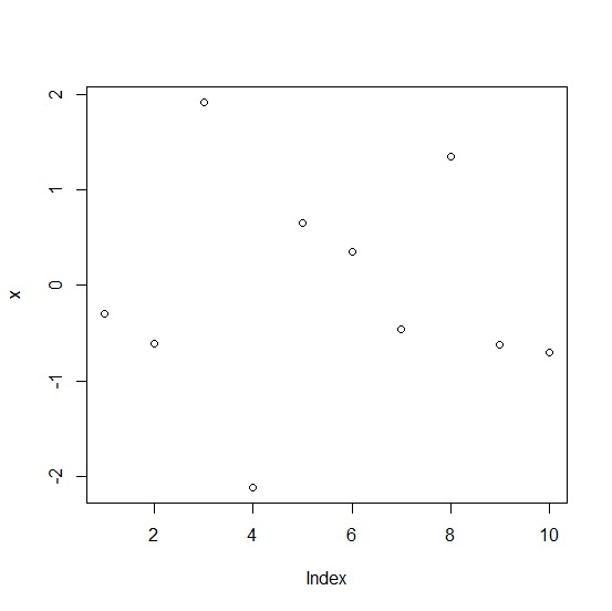
x<-rnorm(10)
plot(x)
Output
If you execute all the above given snippets as a single program, it generates the following output −
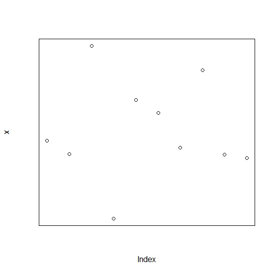
To display Y-axis labels with more decimal places in R, add the following code to the above snippet −
x<-rnorm(10)
plot(x,axes=FALSE,frame.plot=TRUE)
Output
If you execute all the above given snippets as a single program, it generates the following output −
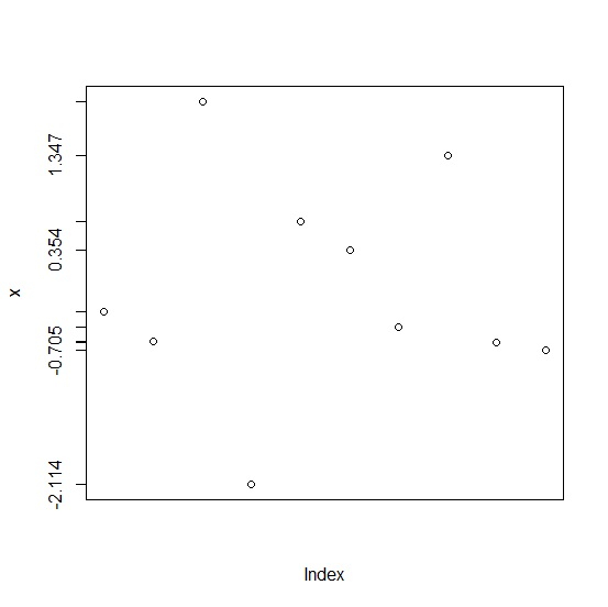
To display Y-axis labels with more decimal places in R, add the following code to the above snippet −
x<-rnorm(10)
plot(x,axes=FALSE,frame.plot=TRUE)
Labels<-round(x,3)
axis(2,at=Labels,labels=Labels)
Output
If you execute all the above given snippets as a single program, it generates the following output −

2K+ Views
