- Matplotlib - Home
- Matplotlib - Introduction
- Matplotlib - Vs Seaborn
- Matplotlib - Environment Setup
- Matplotlib - Anaconda distribution
- Matplotlib - Jupyter Notebook
- Matplotlib - Pyplot API
- Matplotlib - Simple Plot
- Matplotlib - Saving Figures
- Matplotlib - Markers
- Matplotlib - Figures
- Matplotlib - Styles
- Matplotlib - Legends
- Matplotlib - Colors
- Matplotlib - Colormaps
- Matplotlib - Colormap Normalization
- Matplotlib - Choosing Colormaps
- Matplotlib - Colorbars
- Matplotlib - Working With Text
- Matplotlib - Text properties
- Matplotlib - Subplot Titles
- Matplotlib - Images
- Matplotlib - Image Masking
- Matplotlib - Annotations
- Matplotlib - Arrows
- Matplotlib - Fonts
- Matplotlib - Font Indexing
- Matplotlib - Font Properties
- Matplotlib - Scales
- Matplotlib - LaTeX
- Matplotlib - LaTeX Text Formatting in Annotations
- Matplotlib - PostScript
- Matplotlib - Mathematical Expressions
- Matplotlib - Animations
- Matplotlib - Celluloid Library
- Matplotlib - Blitting
- Matplotlib - Toolkits
- Matplotlib - Artists
- Matplotlib - Styling with Cycler
- Matplotlib - Paths
- Matplotlib - Path Effects
- Matplotlib - Transforms
- Matplotlib - Ticks and Tick Labels
- Matplotlib - Radian Ticks
- Matplotlib - Dateticks
- Matplotlib - Tick Formatters
- Matplotlib - Tick Locators
- Matplotlib - Basic Units
- Matplotlib - Autoscaling
- Matplotlib - Reverse Axes
- Matplotlib - Logarithmic Axes
- Matplotlib - Symlog
- Matplotlib - Unit Handling
- Matplotlib - Ellipse with Units
- Matplotlib - Spines
- Matplotlib - Axis Ranges
- Matplotlib - Axis Scales
- Matplotlib - Axis Ticks
- Matplotlib - Formatting Axes
- Matplotlib - Axes Class
- Matplotlib - Twin Axes
- Matplotlib - Figure Class
- Matplotlib - Multiplots
- Matplotlib - Grids
- Matplotlib - Object-oriented Interface
- Matplotlib - PyLab module
- Matplotlib - Subplots() Function
- Matplotlib - Subplot2grid() Function
- Matplotlib - Anchored Artists
- Matplotlib - Manual Contour
- Matplotlib - Coords Report
- Matplotlib - AGG filter
- Matplotlib - Ribbon Box
- Matplotlib - Fill Spiral
- Matplotlib - Findobj Method
- Matplotlib - Hyperlinks
- Matplotlib - Image Thumbnail
- Matplotlib - Plotting with Keywords
- Matplotlib - Create Logo
- Matplotlib - Multipage PDF
- Matplotlib - Multiprocessing
- Matplotlib - Print Stdout
- Matplotlib - Compound Path
- Matplotlib - Sankey Class
- Matplotlib - MRI with EEG
- Matplotlib - Stylesheets
- Matplotlib - Background Colors
- Matplotlib - Basemap
Matplotlib Events
- Matplotlib - Event Handling
- Matplotlib - Close Event
- Matplotlib - Mouse Move
- Matplotlib - Click Events
- Matplotlib - Scroll Event
- Matplotlib - Keypress Event
- Matplotlib - Pick Event
- Matplotlib - Looking Glass
- Matplotlib - Path Editor
- Matplotlib - Poly Editor
- Matplotlib - Timers
- Matplotlib - Viewlims
- Matplotlib - Zoom Window
Matplotlib Widgets
- Matplotlib - Cursor Widget
- Matplotlib - Annotated Cursor
- Matplotlib - Button Widget
- Matplotlib - Check Buttons
- Matplotlib - Lasso Selector
- Matplotlib - Menu Widget
- Matplotlib - Mouse Cursor
- Matplotlib - Multicursor
- Matplotlib - Polygon Selector
- Matplotlib - Radio Buttons
- Matplotlib - RangeSlider
- Matplotlib - Rectangle Selector
- Matplotlib - Ellipse Selector
- Matplotlib - Slider Widget
- Matplotlib - Span Selector
- Matplotlib - Textbox
Matplotlib Plotting
- Matplotlib - Line Plots
- Matplotlib - Area Plots
- Matplotlib - Bar Graphs
- Matplotlib - Histogram
- Matplotlib - Pie Chart
- Matplotlib - Scatter Plot
- Matplotlib - Box Plot
- Matplotlib - Arrow Demo
- Matplotlib - Fancy Boxes
- Matplotlib - Zorder Demo
- Matplotlib - Hatch Demo
- Matplotlib - Mmh Donuts
- Matplotlib - Ellipse Demo
- Matplotlib - Bezier Curve
- Matplotlib - Bubble Plots
- Matplotlib - Stacked Plots
- Matplotlib - Table Charts
- Matplotlib - Polar Charts
- Matplotlib - Hexagonal bin Plots
- Matplotlib - Violin Plot
- Matplotlib - Event Plot
- Matplotlib - Heatmap
- Matplotlib - Stairs Plots
- Matplotlib - Errorbar
- Matplotlib - Hinton Diagram
- Matplotlib - Contour Plot
- Matplotlib - Wireframe Plots
- Matplotlib - Surface Plots
- Matplotlib - Triangulations
- Matplotlib - Stream plot
- Matplotlib - Ishikawa Diagram
- Matplotlib - 3D Plotting
- Matplotlib - 3D Lines
- Matplotlib - 3D Scatter Plots
- Matplotlib - 3D Contour Plot
- Matplotlib - 3D Bar Plots
- Matplotlib - 3D Wireframe Plot
- Matplotlib - 3D Surface Plot
- Matplotlib - 3D Vignettes
- Matplotlib - 3D Volumes
- Matplotlib - 3D Voxels
- Matplotlib - Time Plots and Signals
- Matplotlib - Filled Plots
- Matplotlib - Step Plots
- Matplotlib - XKCD Style
- Matplotlib - Quiver Plot
- Matplotlib - Stem Plots
- Matplotlib - Visualizing Vectors
- Matplotlib - Audio Visualization
- Matplotlib - Audio Processing
Matplotlib Useful Resources
- Matplotlib - Quick Guide
- Matplotlib - Cheatsheet
- Matplotlib - Useful Resources
- Matplotlib - Discussion
Matplotlib - Stacked Plots
A stacked plot is a type of chart where multiple sets of data are represented on top of each other, creating a stack or layer. Each set of data is represented as a colored section, and when you stack them together, you can see how they contribute to the whole.
Imagine you have different categories fruits, and you want to show how much of each fruit contributes to the total quantity. In a stacked plot, you would have a bar for each fruit, and these bars would be stacked on top of each other. The total height of the stack represents the overall quantity, and the height of each individual bar within the stack shows the contribution of that specific fruit to the total.
Stacked Plots in Matplotlib
We can create a stacked plot in Matplotlib using the stackplot() function. This function takes multiple arrays or sequences as input, each representing a different layer of the stack. The areas between the layers are then filled with different colors.
The stackplot() Function
In Matplotlib, the stackplot() function takes the x-axis values and multiple sets of y-axis values, stacking them on top of each other. Each set of y-values represents a different layer in the stack.
Syntax
Following is the syntax of the stackplot() function in Matplotlib −
matplotlib.pyplot.stackplot(x, *args, labels=None, colors=None, baseline='zero', **kwargs)
Where,
- x represents x-axis values.
- *args is the multiple sets of y-axis values. You can provide them as separate arguments, like y1, y2, y3, ....
- labels (optional) is list of labels for each set of y-values.
- colors is a list of colors for each set of y-values. If not provided, Matplotlib automatically selects colors.
- baseline specifies where the baseline of the stack should be. The default is 'zero', but you can also use 'sym' for symmetric, 'wiggle' for a wiggly baseline, or a specific value.
- **kwargs are the additional keyword arguments that can be passed to customize the plot.
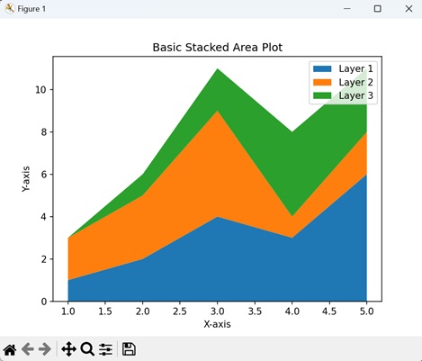
Example - Basic Stacked Area Plot
A Basic Stacked Area Plot in Matplotlib is like stacking different layers of colors on top of each other to create a colorful mountain-like shape. Each color represents a category of data, and as you move from left to right on the plot, you see how the combined "height" of the colors changes. It is a way to show the overall pattern and the individual parts that make up the whole.
In the following example, we are creating a simple stacked area plot of three layers (y1, y2, and y3) on top of each other along the x-axis (x) using the stackplot() function with default colors −
import matplotlib.pyplot as plt

# Data
x = [1, 2, 3, 4, 5]
y1 = [1, 2, 4, 3, 6]
y2 = [2, 3, 5, 1, 2]
y3 = [0, 1, 2, 4, 3]

# Basic stacked area plot
plt.stackplot(x, y1, y2, y3, labels=['Layer 1', 'Layer 2', 'Layer 3'])

# Adding labels and legend
plt.xlabel('X-axis')
plt.ylabel('Y-axis')
plt.legend()
plt.title('Basic Stacked Area Plot')

# Displaying the plot
plt.show()
Output
After executing the above code, we get the following output −
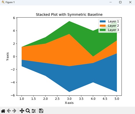
Example - Stacked Plot with Symmetric Baseline
A symmetric baseline in a stacked plot means that the different parts of the plot are arranged above and below a central line (usually at zero on the y-axis) in a balanced way. It is like having a see-saw where the weights on both sides are equal, ensuring that the positive and negative elements of the stacked bars are evenly distributed above and below the baseline.
Using a symmetric baseline helps us to show the contribution of each part visually, maintaining a clear starting reference for comparison at the center point (at zero).
In here, we are creating a stacked plot with symmetric baseline, by setting the "baseline" parameter to "sym" −
import matplotlib.pyplot as plt

# Data
x = [1, 2, 3, 4, 5]
y1 = [1, 2, 4, 3, 6]
y2 = [2, 3, 5, 1, 2]
y3 = [0, 1, 2, 4, 3]

# Stacked plot with symmetric baseline
plt.stackplot(x, y1, y2, y3, labels=['Layer 1', 'Layer 2', 'Layer 3'], baseline='sym')

# Adding labels and legend
plt.xlabel('X-axis')
plt.ylabel('Y-axis')
plt.legend()
plt.title('Stacked Plot with Symmetric Baseline')

# Displaying the plot
plt.show()
Output
Following is the output of the above code −
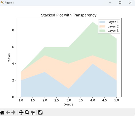
Example - Stacked Plot with Transparency
To create a stacked plot with transparency in Matplotlib, you can adjust the alpha parameter to control the opacity of each layer. This helps us to enhance the visualization by allowing overlapping areas to be visible to some extent, providing a clear view of the overall pattern.
Now, we are customizing the stacked plot by setting the alpha parameter to 0.7 in the stackplot() function, making each layer semi-transparent −
import matplotlib.pyplot as plt

# Data
x = [1, 2, 3, 4, 5]
y1 = [2, 3, 1, 4, 2]
y2 = [1, 2, 3, 1, 2]
y3 = [0, 1, 2, 4, 3]

# Creating a stacked plot with transparency
plt.stackplot(x, y1, y2, y3, alpha=0.2, labels=['Layer 1', 'Layer 2', 'Layer 3'])

# Adding labels, legend, and title
plt.xlabel('X-axis')
plt.ylabel('Y-axis')
plt.legend()
plt.title('Stacked Plot with Transparency')

# Showing the plot
plt.show()
Output
Output of the above code is as follows −
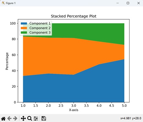
Example - Stacked Percentage Plot
A Stacked Percentage Plot in Matplotlib is like a colorful graph that shows the proportion of different parts in a whole for each category. The height of the stack at any point represents the percentage contribution of each component to the total.
You can create a stacked percentage plot in Matplotlib by taking the total for each category, calculating the percentage of each component (normalizing data), and then using the stackplot() function to visualize the proportions.
In the example below, we first calculate the percentages for each layer (y1, y2, y3) by dividing each value by the total sum of values at that position. The resulting y1_percent, y2_percent, and y3_percent represent the percentages of each layer relative to the total at each position. The stackplot() function is then used to create a stacked plot using these percentages −
import matplotlib.pyplot as plt

# Data
x = [1, 2, 3, 4, 5]
y1 = [10, 20, 15, 25, 30]
y2 = [15, 25, 20, 15, 10]
y3 = [5, 10, 8, 12, 15]

# Calculating percentages
total = [sum(i) for i in zip(y1, y2, y3)]
y1_percent = [i / t * 100 for i, t in zip(y1, total)]
y2_percent = [i / t * 100 for i, t in zip(y2, total)]
y3_percent = [i / t * 100 for i, t in zip(y3, total)]

# Creating a stacked percentage plot
plt.stackplot(x, y1_percent, y2_percent, y3_percent, labels=['Component 1', 'Component 2', 'Component 3'], baseline='zero')

# Adding labels, legend, and title
plt.xlabel('X-axis')
plt.ylabel('Percentage')
plt.legend(loc='upper left')
plt.title('Stacked Percentage Plot')

# Showing the plot
plt.show()
Output
The output obtained is as shown below −