
 Data Structure
 Networking
 RDBMS
RDBMS Operating System
 Java
Java MS Excel
 iOS
iOS HTML
HTML CSS
CSS Android
 Python
 C Programming
 C++
C++ C#
C# MongoDB
 MySQL
MySQL Javascript
 PHP
PHP
- Selected Reading
- UPSC IAS Exams Notes
- Developer's Best Practices
- Questions and Answers
- Effective Resume Writing
- HR Interview Questions
- Computer Glossary
- Who is Who
Generate a Waffle chart using pyWaffle in Python
Data visualization is crucial for efficient information comprehension and presentation. Among the many chart types available, waffle charts offer a novel way to display data as square tiles in a grid-like structure. The powerful Python module PyWaffle facilitates Waffle chart development, similar to many calculations and data analysis methods. In this article, we'll look at how to create a waffle chart using the sophisticated Python module PyWaffle. Let's install PyWafle and see how categorical data can be visualized with it.
Run the following command in your cmd to install the library and then import it into your code.
pip install pywaffle
Example 1
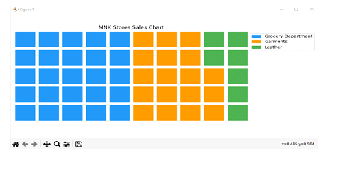
In this example, we have examined the monthly sales report of a shopping mall to analyze the sale status of each department.
Algorithm
Step-1: Import the required libraries. Now start the code by creating a data set. This data set will be passed to the library and the waffle chart will be based on this dataset. The data set created here is also termed as data dictionary.
Step-2: name the categories in the data set and assign the values to create a chart. These catagory names are also displayed on the chart so make them meaningful.
Step-3: Use plt.figure() function to pass the parameters.
Step-4: Add title and additional parameters to customize the chart.
Step-5: Display the chart with plt.show() method.
import matplotlib.pyplot as plt
from pywaffle import Waffle

# Data
data = {'Category A': 15,
    'Category B': 35,
    'Category C': 50}

# Plot
fig = plt.figure(
   FigureClass=Waffle,
   rows=5,
   columns=10,
   values=data,
   legend={'loc': 'upper left', 'bbox_to_anchor': (1, 1)},
   colors=['#2196f3', '#ff9800', '#4caf50'],
)

# Add a title
plt.title('Sales Distribution by Category')

# Show the chart
plt.show()
Output
Example 2
In this example, we will try to create another chart for the score of four matches of a tournament.
Algorithm
Step-1: List the match results in the data block by creating a data dictionary.
Step-2: Create categories in the data set and name them with the winning team name.
Step-3: Now assign the values to create a chart. These values are the parameters for the chart.
Step-4: Use plt.figure() function and add the parameters in it you can also add a title and additional parameters to customize the chart.
Step- 5: Display the chart with plt.show() method.
import matplotlib.pyplot as plt
from pywaffle import Waffle

# Data
data = {'Team Australia': 230,
    'Team England': 290,
    'Team India': 250}

# Plot
fig = plt.figure(
   FigureClass=Waffle,
   rows=5,
   columns=10,
   values=data,
   legend={'loc': 'upper left', 'bbox_to_anchor': (1, 1)},
   colors=['#2196f3', '#ff9800', '#4caf50'],
)

# Add a title
plt.title('Tournament Match Score')

# Show the chart
plt.show()
Output

Conclusion
PyWaffle makes it simple to create waffle charts in Python, enabling users to easily visualize categorical data. Numerous customization options are available, including icons, icon_legend, block_aspect, and size. Waffle charts that incorporate these factors tend to be more instructive and appealing to the viewer. When it comes to data visualization, PyWaffle may be a useful tool so try to add more features to your application by using this library.

640 Views
