
Article Categories
- All Categories
-
 Data Structure
-
 Networking
-
 RDBMS
RDBMS
-
 Operating System
-
 Java
Java
-
 MS Excel
-
 iOS
iOS
-
 HTML
HTML
-
 CSS
CSS
-
 Android
-
 Python
-
 C Programming
-
 C++
C++
-
 C#
C#
-
 MongoDB
-
 MySQL
MySQL
-
 Javascript
-
 PHP
PHP
-
 Economics & Finance
How to create histogram like plot with different color of bars in R?
To create histogram like plot with different color of bars, we can use col argument and provide the range up to the number of bars we expect in the histogram like plot.
For example, if we have a vector of length 10 called X then we can create histogram like plot of X with different color of bars using the command given below −
plot(X,type="h",col=1:10,lwd=5)
Check out the below example to understand how it works.
Example
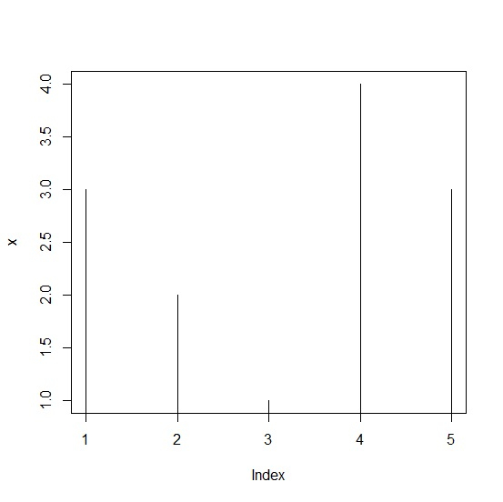
To create histogram like plot with different color of bars, use the following command −
x<-rpois(5,2)
plot(x,type="h")
Output
If you execute the above given command, it generates the following output −
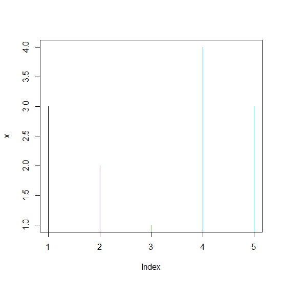
To create histogram like plot with different color of bars, add the following code to the above snippet −
x<-rpois(5,2)
plot(x,type="h",col=1:5)
Output
If you execute all the above given snippets as a single program, it generates the following output −
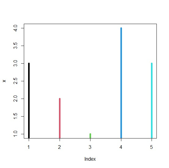
To create histogram like plot with different color of bars, add the following code to the above snippet −
x<-rpois(5,2)
plot(x,type="h",col=1:5,lwd=5)
Output
If you execute all the above given snippets as a single program, it generates the following output −

267 Views
