
Article Categories
- All Categories
-
 Data Structure
-
 Networking
-
 RDBMS
RDBMS
-
 Operating System
-
 Java
Java
-
 MS Excel
-
 iOS
iOS
-
 HTML
HTML
-
 CSS
CSS
-
 Android
-
 Python
-
 C Programming
-
 C++
C++
-
 C#
C#
-
 MongoDB
-
 MySQL
MySQL
-
 Javascript
-
 PHP
PHP
-
 Economics & Finance
Selected Reading
How to create bars with gap among them if there are more categories using ggplot2 in R?
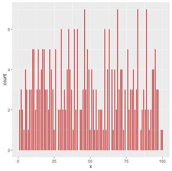
When the number of categories is large in numbers for a variable and we want to create a bar plot then the display of the bar plot becomes a little ambiguous because the bars are plotted very close to each other. To make the bars clearly visible, we can reduce the width of the bars and set different colors for them to make them visually attractive.
geom_bar(width=0.2,color="red")
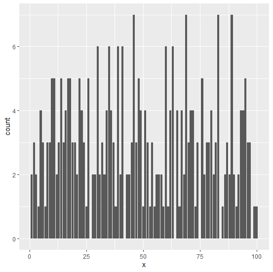
Consider the below data frame −
x<-sample(1:100,300,replace=TRUE)
df<-data.frame(x)
Loading ggplot2 package and creating the bar plot of x −
Example
library(ggplot2)
ggplot(df,aes(x))+geom_bar()
Output
Creating the same bar plot with gap between bars −
Example
ggplot(df,aes(x))+geom_bar(width=0.2,color="red")
Output

Updated on: 2020-09-09T08:38:50+05:30
212 Views

Advertisements