
Article Categories
- All Categories
-
 Data Structure
-
 Networking
-
 RDBMS
RDBMS
-
 Operating System
-
 Java
Java
-
 MS Excel
-
 iOS
iOS
-
 HTML
HTML
-
 CSS
CSS
-
 Android
-
 Python
-
 C Programming
-
 C++
C++
-
 C#
C#
-
 MongoDB
-
 MySQL
MySQL
-
 Javascript
-
 PHP
PHP
-
 Economics & Finance
Selected Reading
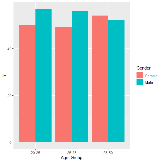
How to create bar chart based on two groups in an R data frame?
To create a bar chart based on two groups, we can use geom_bar function of ggplot2 package with position argument that defines the position of the groups. For example, if we have a data frame called df that contains two categorical variable x1 and x2 and the one response variable y then the bar chart can be created by using the below command −
ggplot(df,aes(x1,y,fill=x2))+geom_bar(position=position_dodge(),stat="identity")
Example
library(ggplot2)
ggplot(df,aes(Age_Group,Y,fill=Gender))+geom_bar(position=position_dodge(),stat="identity")
Output

Updated on: 2026-03-11T23:22:53+05:30
768 Views

Advertisements