
Article Categories
- All Categories
-
 Data Structure
-
 Networking
-
 RDBMS
RDBMS
-
 Operating System
-
 Java
Java
-
 MS Excel
-
 iOS
iOS
-
 HTML
HTML
-
 CSS
CSS
-
 Android
-
 Python
-
 C Programming
-
 C++
C++
-
 C#
C#
-
 MongoDB
-
 MySQL
MySQL
-
 Javascript
-
 PHP
PHP
-
 Economics & Finance
How to find the autocorrelation values from ACF plot in R?
The autocorrelation plot or ACF plot is a display of serial correlation in data that changes over time. The ACF plot can be easily created by using acf function.
For example, if we have a vector called V then we can create its autocorrelation plot by using the command acf(V). If we want to extract autocorrelation values then we would need to save the plot values in an object by using the below command. This will not create the plot.
Autocorrelation_x<-acf(x,plot=FALSE)
Example 1
Consider the following snippet −
x<-rpois(10,2)
acf(x)
Output
If you execute the above given snippet, it generates the following Output −
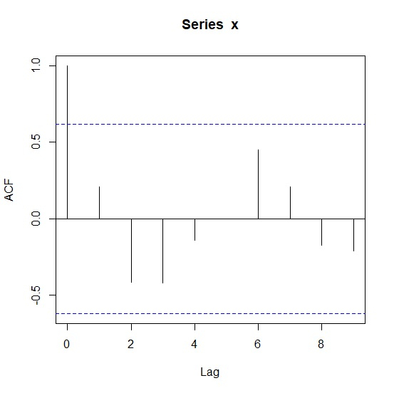
To find the autocorrelation values from ACF plot in R, add the following code to the above snippet −
Example
Autocorrelation_x<-acf(x,plot=FALSE)
Autocorrelation_x
Output
If you execute all the above given snippets as a single program, it generates the following Output −
Autocorrelations of series ‘x’, by lag

   0    1      2      3      4      5     6    7      8      9
1.000 0.207 -0.416 -0.420 -0.143 -0.002 0.451 0.209 -0.176 -0.211
Example 2
Consider the following snippet −
y<-rpois(5,10)
acf(y)
Output
If you execute the above given snippet, it generates the following Output −
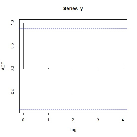
To find the autocorrelation values from ACF plot in R, add the following code to the above snippet −
Example
Autocorrelation_y<-acf(y,plot=FALSE)
Autocorrelation_y
Output
If you execute all the above given snippets as a single program, it generates the following Output −
Autocorrelations of series ‘y’, by lag

    0    1     2     3      4
1.000 0.019 -0.557 -0.038 0.077

4K+ Views
