
Article Categories
- All Categories
-
 Data Structure
-
 Networking
-
 RDBMS
RDBMS
-
 Operating System
-
 Java
Java
-
 MS Excel
-
 iOS
iOS
-
 HTML
HTML
-
 CSS
CSS
-
 Android
-
 Python
-
 C Programming
-
 C++
C++
-
 C#
C#
-
 MongoDB
-
 MySQL
MySQL
-
 Javascript
-
 PHP
PHP
-
 Economics & Finance
How to create a scatterplot with larger distance between facets in R?
By default, the distance/space between facets created by using ggplot2 is very less and it becomes a little uneasy for viewers to separately read the facets. Therefore, to deal with this problem we can increase the space between facets and it can be done with the help of theme function as shown in the example below.
Example
Following snippet creates a sample data frame &miuns;
xOutput
The following dataframe is created −
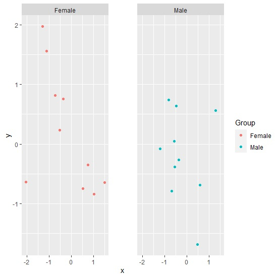
x y Group 1 1.2867663 0.55866491 Male 2 0.7391027 -0.34618436 Female 3 0.5235874 -0.74887181 Female 4 0.5888993 -0.68957351 Male 5 -0.3590756 0.75730314 Female 6 -0.5554565 -0.38544639 Male 7 0.4637831 -1.68509743 Male 8 -0.3665099 -0.26642702 Male 9 -0.4825639 0.63628373 Male 10 -1.1191989 1.55902395 Female 11 -0.5730155 0.04807617 Male 12 1.0237728 -0.84262752 Female 13 -1.2894423 1.97032059 Female 14 -0.6856492 -0.78864269 Male 15 -0.5171276 0.23602206 Female 16 -0.7189031 0.81558755 Female 17 1.4954506 -0.64333891 Female 18 -1.1988800 -0.07535623 Male 19 -0.8260068 0.73747420 Male 20 -2.0534583 -0.63682645 FemaleTo load ggplot2 package and create point chart between x and y with facets defined by Group column, add the following code to the above snippet −
library(ggplot2) ggplot(df,aes(x,y,color=Group))+geom_point()+facet_grid(~Group)Output
If you execute all the above given snippets as a single program, it generates the following Output −
To create point chart between x and y with facets at a larger distance defined by Group column, add the following code to the above snippet −
ggplot(df,aes(x,y,color=Group))+geom_point()+facet_grid(~Group)+theme(panel.spacing=unit(3,"lines"))Output
If you execute all the above given snippets as a single program, it generates the following Output −


179 Views
