
Article Categories
- All Categories
-
 Data Structure
-
 Networking
-
 RDBMS
RDBMS
-
 Operating System
-
 Java
Java
-
 MS Excel
-
 iOS
iOS
-
 HTML
HTML
-
 CSS
CSS
-
 Android
-
 Python
-
 C Programming
-
 C++
C++
-
 C#
C#
-
 MongoDB
-
 MySQL
MySQL
-
 Javascript
-
 PHP
PHP
-
 Economics & Finance
Selected Reading
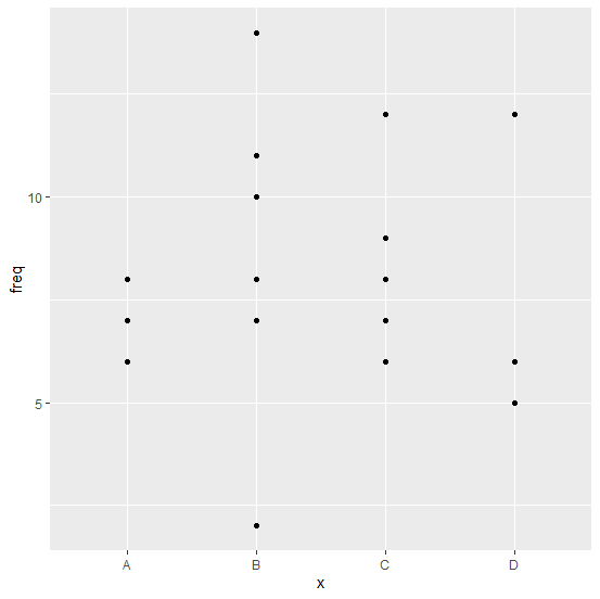
How to create a point chart for categorical variable in R?
The point chart of a categorical has points corresponding to the categories just like the bar chart has bars. If we want to create point chart for categorical variable then we just need to use geom_point function of ggplot2 package. For example, if we have a data frame df that contains categorical column x and frequency column defined sd freq then the point chart for the categories in x can be ggplot(df,aes(x,freq))+geom_point().
Example
Consider the below data frame:
> set.seed(3521)
> x<-sample(LETTERS[1:4],20,replace=TRUE)
> freq<-rpois(20,8)
> df<-data.frame(x,freq)
> df
Output
x freq
1 B 2
2 C 12
3 A 8
4 D 12
5 C 8
6 C 9
7 B 11
8 B 10
9 B 8
10 C 6
11 D 5
12 B 10
13 D 6
14 B 7
15 B 14
16 C 7
17 A 7
18 A 6
19 A 6
20 A 7
Loading ggplot2 package and creating the point chart:
> library(ggplot2)
> ggplot(df,aes(x,freq))+geom_point()
Output:

Updated on: 2026-03-11T22:50:53+05:30
561 Views

Advertisements