
Article Categories
- All Categories
-
 Data Structure
-
 Networking
-
 RDBMS
RDBMS
-
 Operating System
-
 Java
Java
-
 MS Excel
-
 iOS
iOS
-
 HTML
HTML
-
 CSS
CSS
-
 Android
-
 Python
-
 C Programming
-
 C++
C++
-
 C#
C#
-
 MongoDB
-
 MySQL
MySQL
-
 Javascript
-
 PHP
PHP
-
 Economics & Finance
Selected Reading
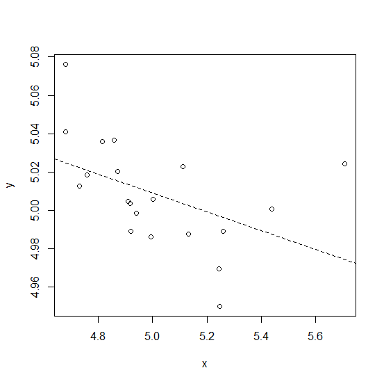
How to create a plot with dashed regression line in base R?
To create a regression line in base R, we use abline function after creating the scatterplot but if we want to have the line dash format then lty argument must also be used with value equals to 2 after defining the regression model inside abline. For example, if we have two columns x and y stored in a data frame called df then the plot with dashed regression line can be created by using −
plot(y~x,data=df)
abline(lm(df$y~df$x),lty=2)
Example
Consider the below data frame −
> x<-rnorm(20,5,0.27)
> y<-rnorm(20,5,0.04)
> df<-data.frame(x,y)
> df
Output
      x       y
1 5.243553 4.969598
2 4.681088 5.076128
3 4.681055 5.041027
4 5.258455 4.989137
5 5.131443 4.987677
6 4.758463 5.018593
7 5.112578 5.022733
8 4.920249 4.989048
9 4.859121 5.036731
10 5.706240 5.024192
11 5.245567 4.950013
12 5.437835 5.000518
13 4.870448 5.020207
14 4.815908 5.035733
15 4.732599 5.012715
16 4.994069 4.986095
17 4.908797 5.004708
18 4.918521 5.003732
19 5.002987 5.005675
20 4.941110 4.998503
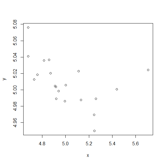
Creating the scatterplot between x and y −
Example
plot(y~x,data=df)
Output
Adding the dashed regression line to the above plot −
Example
abline(lm(df$y~df$x),lty=2)
Output

Updated on: 2026-03-11T22:50:54+05:30
1K+ Views

Advertisements