- Python Pandas - Basics
- Python Pandas - Introduction to Data Structures
- Python Pandas - Index Objects
- Python Pandas - Panel
- Python Pandas - Basic Functionality
- Python Pandas - Indexing & Selecting Data
- Python Pandas - Series
- Python Pandas - Series
- Python Pandas - Slicing a Series Object
- Python Pandas - Attributes of a Series Object
- Python Pandas - Arithmetic Operations on Series Object
- Python Pandas - Converting Series to Other Objects
- Python Pandas - DataFrame
- Python Pandas - DataFrame
- Python Pandas - Accessing DataFrame
- Python Pandas - Slicing a DataFrame Object
- Python Pandas - Modifying DataFrame
- Python Pandas - Removing Rows from a DataFrame
- Python Pandas - Arithmetic Operations on DataFrame
- Python Pandas - IO Tools
- Python Pandas - IO Tools
- Python Pandas - Working with CSV Format
- Python Pandas - Reading & Writing JSON Files
- Python Pandas - Reading Data from an Excel File
- Python Pandas - Writing Data to Excel Files
- Python Pandas - Working with HTML Data
- Python Pandas - Clipboard
- Python Pandas - Working with HDF5 Format
- Python Pandas - Comparison with SQL
- Python Pandas - Data Handling
- Python Pandas - Sorting
- Python Pandas - Reindexing
- Python Pandas - Iteration
- Python Pandas - Concatenation
- Python Pandas - Statistical Functions
- Python Pandas - Descriptive Statistics
- Python Pandas - Working with Text Data
- Python Pandas - Function Application
- Python Pandas - Options & Customization
- Python Pandas - Window Functions
- Python Pandas - Aggregations
- Python Pandas - Merging/Joining
- Python Pandas - MultiIndex
- Python Pandas - Basics of MultiIndex
- Python Pandas - Indexing with MultiIndex
- Python Pandas - Advanced Reindexing with MultiIndex
- Python Pandas - Renaming MultiIndex Labels
- Python Pandas - Sorting a MultiIndex
- Python Pandas - Binary Operations
- Python Pandas - Binary Comparison Operations
- Python Pandas - Boolean Indexing
- Python Pandas - Boolean Masking
- Python Pandas - Data Reshaping & Pivoting
- Python Pandas - Pivoting
- Python Pandas - Stacking & Unstacking
- Python Pandas - Melting
- Python Pandas - Computing Dummy Variables
- Python Pandas - Categorical Data
- Python Pandas - Categorical Data
- Python Pandas - Ordering & Sorting Categorical Data
- Python Pandas - Comparing Categorical Data
- Python Pandas - Handling Missing Data
- Python Pandas - Missing Data
- Python Pandas - Filling Missing Data
- Python Pandas - Interpolation of Missing Values
- Python Pandas - Dropping Missing Data
- Python Pandas - Calculations with Missing Data
- Python Pandas - Handling Duplicates
- Python Pandas - Duplicated Data
- Python Pandas - Counting & Retrieving Unique Elements
- Python Pandas - Duplicated Labels
- Python Pandas - Grouping & Aggregation
- Python Pandas - GroupBy
- Python Pandas - Time-series Data
- Python Pandas - Date Functionality
- Python Pandas - Timedelta
- Python Pandas - Sparse Data Structures
- Python Pandas - Sparse Data
- Python Pandas - Visualization
- Python Pandas - Visualization
- Python Pandas - Additional Concepts
- Python Pandas - Caveats & Gotchas
- Python Pandas Useful Resources
- Python Pandas - Quick Guide
- Python Pandas - Cheatsheet
- Python Pandas - Useful Resources
- Python Pandas - Discussion
Python Pandas - Histograms
A histogram is a graphical representation of the distribution of a dataset. It helps you to visualize the frequency of data within defined intervals, called bins. A histogram looks similar to a bar plot but the difference is, histograms represents the distribution of numerical data grouped into ranges (bins), whereas bar plots represent categorical data, with each bar corresponding to a specific category.
In this tutorial, we will learn how to create and customize histograms using the Pandas library with different examples.
Creating Histograms in Pandas
In Pandas, histograms can be created using the plot.hist() method for both the Series and DataFrames objects. This method results a matplotlib.AxesSubplot object containing the histogram plot.
DataFrame.plot.hist(): Creates histogram for one or more columns in a DataFrame.
Series.plot.hist(): Creates a histogram for a specific column or Series.
Syntax
Following is the syntax of the hist() method −
DataFrame.plot.hist(by=None, bins=10, **kwargs)
Where,
by: Groups the DataFrame by a column.
bins: The number of bins to use for the histogram. The default value is 10.
**kwargs: Additional arguments to customize the plot.
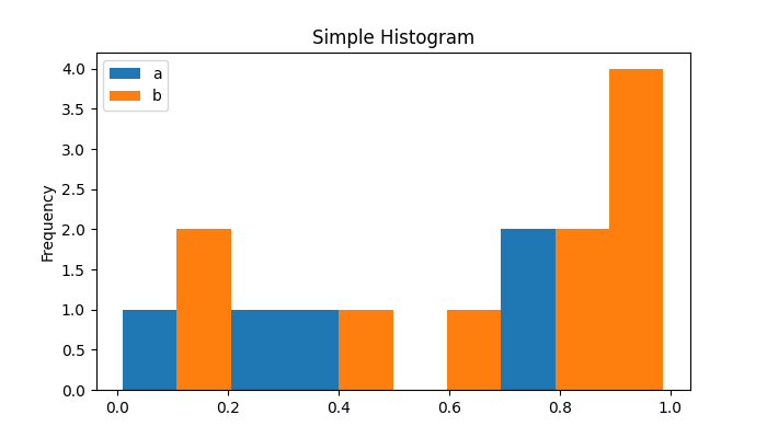
Example
Here is a basic example of creating a histogram for a DataFrame using the plot.hist() method.
import pandas as pd
import numpy as np
import matplotlib.pyplot as plt

plt.rcParams["figure.figsize"] = [7, 4]

# Create a DataFrame with random data
df = pd.DataFrame(np.random.rand(10, 2), columns=["a", "b"])

# Plot histogram
ax = df.plot.hist()

plt.title("Simple Histogram")
plt.show()
Following is the output of the above code −
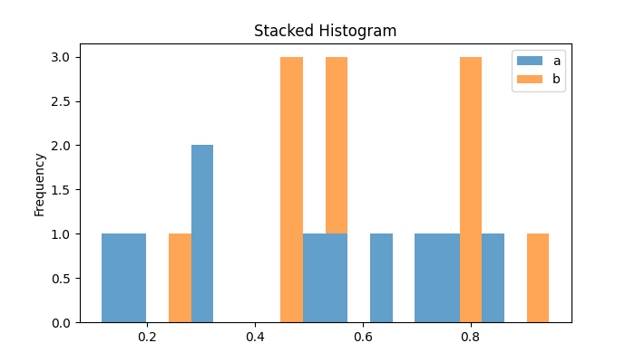
Plotting a Stacked Histogram
A stacked histogram displays multiple numerical columns stacked on top of each other. This can be done by using the stacked=True parameter.
Example
This example creates a stacked histogram for a DataFrame using the stacked=True parameter.
import pandas as pd
import numpy as np
import matplotlib.pyplot as plt

plt.rcParams["figure.figsize"] = [7, 4]

# Create a DataFrame with random data
df = pd.DataFrame(np.random.rand(10, 2), columns=["a", "b"])

# Plot the stacked histogram
df.plot.hist(stacked=True, bins=20, alpha=0.7, title="Stacked Histogram")
plt.show()
On executing the above code we will get the following output −
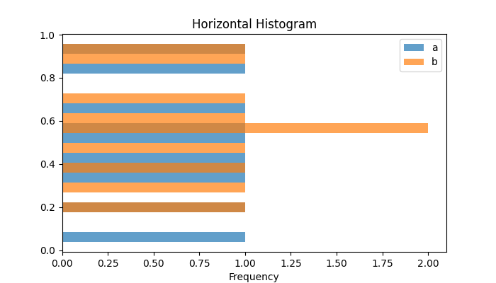
Creating the Horizontal Histograms
To create a horizontal histogram, you can use orientation='horizontal' parameter of the plot.hist() method.
Example
This example creates a stacked histogram for a DataFrame using the stacked=True parameter.
import pandas as pd
import numpy as np
import matplotlib.pyplot as plt

plt.rcParams["figure.figsize"] = [7, 4]

# Create a DataFrame with random data
df = pd.DataFrame(np.random.rand(10, 2), columns=["a", "b"])

# Plot the stacked histogram
df.plot.hist(orientation='horizontal', bins=20, alpha=0.7, title="Horizontal Histogram")
plt.show()
Following is the output of the above code −
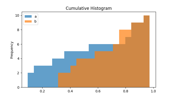
Plotting the Cumulative Histogram
Cumulative histograms show the cumulative frequency distribution. Plotting the cumulative histogram can be done by setting the cumulative parameter to True.
Example
This example demonstrates plotting a cumulative histogram for a DataFrame using the cumulative=True parameter of the plot.hist() method.
import pandas as pd
import numpy as np
import matplotlib.pyplot as plt

plt.rcParams["figure.figsize"] = [7, 4]

# Create a DataFrame with random data
df = pd.DataFrame(np.random.rand(10, 2), columns=["a", "b"])

# Plot the Cumulative histogram
df.plot.hist(cumulative='horizontal', bins=20, alpha=0.7, title="Cumulative Histogram")
plt.show()
On executing the above code we will get the following output −
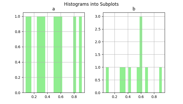
Subplots for Histograms
You can create individual subplots for histograms of each column of a DataFrame using the direct DataFrame.hist() method.
Example
This example creates subplots for histogram of DataFrame columns using the DataFrame.hist() method.
import pandas as pd
import numpy as np
import matplotlib.pyplot as plt

plt.rcParams["figure.figsize"] = [7, 4]

# Create a DataFrame with random data
df = pd.DataFrame(np.random.rand(10, 2), columns=["a", "b"])

# Subplots for each column
df.hist(color='lightgreen', bins=20)
plt.suptitle("Histograms into Subplots")
plt.show()
Following is the output of the above code −
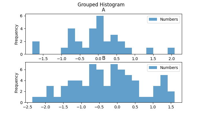
Grouped Histograms
Grouped histograms allow you to visualize data distribution by specific categories. We can use the by parameter to create histograms grouped by a column.
Example
This example creates a grouped histogram for DataFrame columns using the by parameter.
import pandas as pd
import numpy as np
import matplotlib.pyplot as plt

plt.rcParams["figure.figsize"] = [7, 4]

# Create a DataFrame with random data
x = ['A']*30 + ['B']*70
y = np.random.randn(100)
df = pd.DataFrame({'Letter': x, 'Numbers': y})

# Plot the Grouped histogram
df.plot.hist(by='Letter', bins=20, alpha=0.7, title="Grouped Histogram")
plt.show()
Following is the output of the above code −