
Article Categories
- All Categories
-
 Data Structure
-
 Networking
-
 RDBMS
RDBMS
-
 Operating System
-
 Java
Java
-
 MS Excel
-
 iOS
iOS
-
 HTML
HTML
-
 CSS
CSS
-
 Android
-
 Python
-
 C Programming
-
 C++
C++
-
 C#
C#
-
 MongoDB
-
 MySQL
MySQL
-
 Javascript
-
 PHP
PHP
-
 Economics & Finance
Selected Reading
How to create a bar chart using ggplot2 with facets that are in the order of the data in R?
Since visualization is an essential part of data analysis, we should make sure that the plots are created in a form that is easily readable for users. For this purpose, the facets in a bar chart helps us to understand the factor variable levels for another factor. To create such type of bar chart, we can use facet_grid function of ggplot2 package.
Example
Consider the below data frame −
> set.seed(99)
> y<-sample(1:100,50,replace=TRUE)
> class<-rep(c(letters[1:5]),times=10)
> quantity<-as.factor(rep(c(5,10,15,20,25),each=10))
> df<-data.frame(y,class,quantity)
Here, we have class and quantity as factor variables. Suppose we want to use quantity as a facet.
Loading ggplot2 package −
> library(ggplot2)
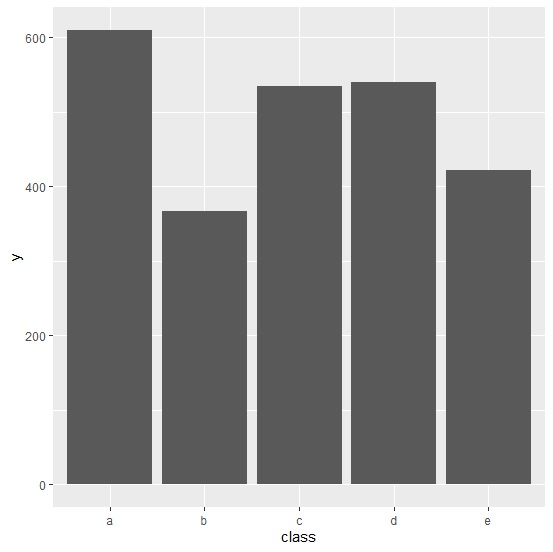
Creating the plot with class on X-axis and y on Y-axis without any facet −
> ggplot(df,aes(class,y))+
+ geom_bar(stat="identity")
Output
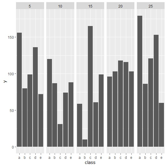
Creating the plot with class on X-axis, y on Y-axis, and quantity as facet −
> ggplot(df,aes(class,y))+
+ geom_bar(stat="identity")+
+ facet_grid(.~quantity)
Output

Updated on: 2020-08-10T12:01:51+05:30
2K+ Views

Advertisements