
Article Categories
- All Categories
-
 Data Structure
-
 Networking
-
 RDBMS
RDBMS
-
 Operating System
-
 Java
Java
-
 MS Excel
-
 iOS
iOS
-
 HTML
HTML
-
 CSS
CSS
-
 Android
-
 Python
-
 C Programming
-
 C++
C++
-
 C#
C#
-
 MongoDB
-
 MySQL
MySQL
-
 Javascript
-
 PHP
PHP
-
 Economics & Finance
Selected Reading
How to change the scale of Y-axis if the histogram bars are higher than the axis size in R?
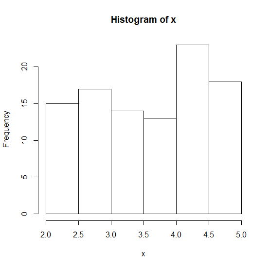
When we create a histogram using hist function in R, often the Y-axis labels are smaller than the one or more bars of the histogram. Therefore, the histogram does not look appealing and it becomes a little difficult to match the Y-axis values with the bars size.
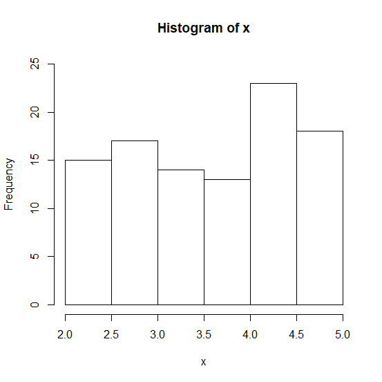
To solve this problem, we can use ylim argument of hist function in which the range can be supplied to plot on the Y-axis labels.
Example
Consider the below data and its histogram −
set.seed(101)
x<-runif(100,2,5)
hist(x)
Output
Creating the same histogram with higher Y-axis −
Example
hist(x,ylim=c(0,25))
Output

Updated on: 2026-03-11T22:50:51+05:30
2K+ Views

Advertisements