
Article Categories
- All Categories
-
 Data Structure
-
 Networking
-
 RDBMS
RDBMS
-
 Operating System
-
 Java
Java
-
 MS Excel
-
 iOS
iOS
-
 HTML
HTML
-
 CSS
CSS
-
 Android
-
 Python
-
 C Programming
-
 C++
C++
-
 C#
C#
-
 MongoDB
-
 MySQL
MySQL
-
 Javascript
-
 PHP
PHP
-
 Economics & Finance
How to change the border style of a plot using ggplot2 in R?
To change the border style of a plot using ggplot2 in R, we can use theme function with panel.border argument where we can change the linetype for the plot border using element_rect. There are many linetypes and we can use them as desired.
Check out the Example given below to understand how it can be done.
Example
Following snippet creates a sample data frame −
x<-rnorm(20)
y<-rnorm(20)
df<-data.frame(x,y)
df
The following dataframe is created
            x           y
 1  0.07659587  0.04662568
 2 -0.09346513 -1.54421904
 3 -0.15442334  0.84076938
 4  0.30773228 -0.52740013
 5 -2.12669288 -0.72532478
 6  0.04613070  0.77757258
 7  0.26543808  0.60828079
 8 -1.02039121 -0.08895102
 9 -1.73303082  0.93566679
10  1.36236728  0.31907879
11 -0.41927039 -0.38939094
12  1.06971384  0.12146098
13  0.63973606  0.71795862
14 -0.34179992 -0.12283619
15 -1.11315207 -0.10712006
16  0.19498220 -1.52575895
17 -0.58071405  0.20655197
18 -0.70292599  1.43570793
19 -0.57065356 -1.00393263
20  1.59348973 -1.31773976
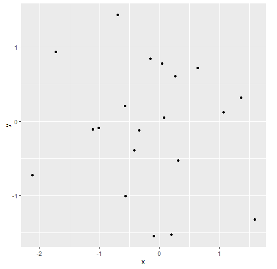
To load ggplot2 package and create scatterplot between x and y on the above created data frame, add the following code to the above snippet −
x<-rnorm(20)
y<-rnorm(20)
df<-data.frame(x,y)
library(ggplot2)
ggplot(df,aes(x,y))+geom_point()
Output
If you execute all the above given snippets as a single program, it generates the following Output −
To create scatterplot between x and y with different border style on the above created data frame, add the following code to the above snippet −
x<-rnorm(20)
y<-rnorm(20)
df<-data.frame(x,y)
library(ggplot2)
ggplot(df,aes(x,y))+geom_point()+theme(panel.border=element_rect(linetype=3,fill=NA))
Output
If you execute all the above given snippets as a single program, it generates the following Output −

Add the following code to the above snippet −
x<-rnorm(20)
y<-rnorm(20)
df<-data.frame(x,y)
library(ggplot2)
ggplot(df,aes(x,y))+geom_point()+theme(panel.border=element_rect(linetype=11,fill=NA))
Output
If you execute all the above given snippets as a single program, it generates the following Output −


2K+ Views
