
 Data Structure
 Networking
 RDBMS
RDBMS Operating System
 Java
Java MS Excel
 iOS
iOS HTML
HTML CSS
CSS Android
 Python
 C Programming
 C++
C++ C#
C# MongoDB
 MySQL
MySQL Javascript
 PHP
PHP
- Selected Reading
- UPSC IAS Exams Notes
- Developer's Best Practices
- Questions and Answers
- Effective Resume Writing
- HR Interview Questions
- Computer Glossary
- Who is Who
How to Annotate Bars in Grouped Barplot in Python?
Introduction
As data visualization becomes an integral part of every data analysis project, bar plots serve as a great tool to represent categorical data. Grouped bar plots in particular are useful when we want to compare multiple groups side-by-side.
Syntax and Use Cases
Annotations can be added to a bar plot to provide additional information or clarification to the data being presented. The annotation function of matplotlib can be used to add these annotations to each bar. The function takes the following parameters ?
text ? The text to be displayed in the annotation.
xy ? The point (x, y) to annotate.
xytext ? Determine text location.
ha ? The horizontal alignment of the text (e.g. 'center', 'left', 'right').
va ? The vertical alignment of the text (e.g. 'center', 'top', 'bottom').
A grouped barplot's readability and interpretability can be improved with the use of annotations. Here are two instances in which it might be helpful to annotate the bars in a grouped barplot ?
Comparing absolute and relative values
It might be difficult to compare the absolute values of bars with varied heights in a grouped barplot. The reader may find it simpler to compare the absolute values of each group if the bars are annotated with their corresponding values. The distribution of values within each category can also be made clearer to readers by annotating the bars with their relative values.
Highlighting significant differences
To compare the means or proportions of several groups, group bar plots can be utilized. Adding p-values or confidence intervals to the bars might aid readers in recognising significant differences between groups. Moreover, you may visually highlight bars with statistically significant differences by placing asterisks or other symbols above them. This can help readers comprehend the findings of statistical analyses and draw inferences from the data.
Code and Explanation
Algorithm
Import necessary libraries: matplotlib and numpy
Create a dataset to plot
Define the figure and axis objects using matplotlib's subplots function
Plot the grouped bar chart using the bar function
Loop through each bar and add text annotations using matplotlib's annotate function
import matplotlib.pyplot as plt
import numpy as np

# create sample dataset
data = np.array([[3, 4, 5], [2, 3, 4]])

# define labels and groups
labels = ['Group 1', 'Group 2']
groups = ['A', 'B', 'C']

# define figure and axis objects
fig, ax = plt.subplots()

# plot the grouped bar chart
width = 0.35
x = np.arange(len(groups))
ax.bar(x - width/2, data[0], width, label=labels[0])
ax.bar(x + width/2, data[1], width, label=labels[1])

# add text annotations to each bar
for i, j in enumerate(data):
   for x_val, y_val in zip(x, j):
      ax.annotate(str(y_val), xy=(x_val+i*width-width/2, y_val), ha='center', va='bottom')

# add labels and legend
ax.set_xticks(x)
ax.set_xticklabels(groups)
ax.set_xlabel('Groups')
ax.set_ylabel('Count')
ax.legend()
plt.show()
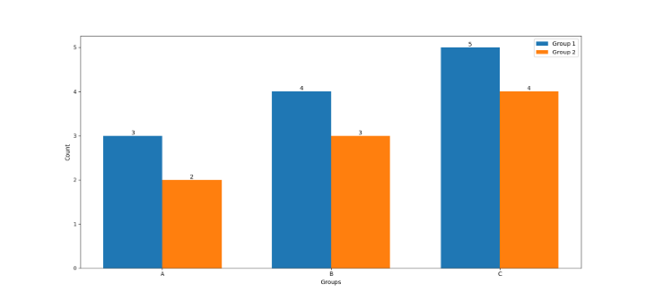
At first, the essential libraries for the task are imported, specifically the well-known numpy and matplotlib.
A sample dataset is produced by applying the numpy array with two rows and three columns. The labels for the groups and bars are defined with the purpose of properly identifying the plot.
To create the plot, the figure and axis objects are generated via the subplots function of matplotlib. The grouped bar chart is then plotted with the bar function, where each bar's width is specified to be 0.35. Each group's bars are then plotted using the corresponding data, which is selected using the labels parameter.
The annotate function is utilized inside of a nested for loop to add text annotations to each bar. The function accepts the x and y coordinates of each bar along with the bar's height as the text annotation.
The plot is labeled with the set_xticks, set_xticklabels, set_xlabel, set_ylabel, and legend functions of matplotlib, which permit the correct labeling of the x-axis and y-axis, plot title, and the inclusion of a legend on the plot.
Conclusion
Adding annotations to a grouped bar plot in Python can provide additional information or clarification to the data being presented. Using the annotation function of matplotlib, we can easily add text annotations to each bar by following the step-by-step algorithm outlined in this article.

2K+ Views
