
Article Categories
- All Categories
-
 Data Structure
-
 Networking
-
 RDBMS
RDBMS
-
 Operating System
-
 Java
Java
-
 MS Excel
-
 iOS
iOS
-
 HTML
HTML
-
 CSS
CSS
-
 Android
-
 Python
-
 C Programming
-
 C++
C++
-
 C#
C#
-
 MongoDB
-
 MySQL
MySQL
-
 Javascript
-
 PHP
PHP
-
 Economics & Finance
How to add Popup in NextJS?
We can add a Popup in NextJS by using a library such as react-modal or reactjs-popup. This will allow us to create a modal component that can be easily integrated into our NextJS application. We can also use CSS to style the popup to match the design of our website.
Let us first learn what Next.js is. Next.js is an open-source web development framework. The Next.js is React Based framework with server side rendering capability. Both speed and SEO are excellent. You can simply build and test sophisticated react-based applications using Next.js.
Next.js is written in Typescripts. It offers a Link component that links other components together and has a prefetch property that allows for background prefetching of page resources. It enables dynamic import of React Components and JavaScript modules. Additionally enables you to export your web application's entire static site.
Next.js allows you to import CSS files from a JavaScript file. This is possible because Next.js extjavascends the concept of import beyond JavaScript.
A popup in web development refers to a small window that appears on top of the current web page, usually containing additional information or options for the user.
Popups can be triggered by various actions, such as clicking on a button or link, hovering over an element, or by timed events. Popups can be used for various purposes such as displaying a message, form, or advertisement. They can also be used to gather information or confirm an action before proceeding. Popups can be implemented using JavaScript and various libraries or frameworks such as jQuery, AngularJS, React and Vue.js.
To get started first create a new NextJS app and run it on our dev server like this ?
npx create-next-app popup-app
cd phone-input
npm start
Approach
Install the react-modal package ?Run the command npm install react-modal in your terminal.
Import the react-modal component in your Next.js component ?
import Modal from 'react-modal'
Create a state variable to control the visibility of the modal ?
const [isOpen, setIsOpen] = useState(false)
Add a button or link that will trigger the modal to open ?
<button onClick={() => setIsOpen(true)}>Open Modal</button>
Add the react-modal component to your JSX ?
<Modal isOpen={isOpen} onRequestClose={() => setIsOpen(false)}>
Add the content of the modal inside the react-modal component ?
<Modal isOpen={isOpen} onRequestClose={() => setIsOpen(false)}> <h1>Modal Content</h1> </Modal>
Add a button or link to close the modal ?
<button onClick={() => setIsOpen(false)}>Close Modal</button>
Add styles to the modal using the style prop ?
<Modal isOpen={isOpen} onRequestClose={() => setIsOpen(false)} style={customStyles}>
Add the customStyles variable in your component ?
const customStyles = { overlay: { backgroundColor: 'rgba(0, 0, 0, 0.6)' }, content: { top: '50%', left: '50%', right: 'auto', bottom: 'auto', marginRight: '-50%', transform: 'translate(-50%, -50%)' } }
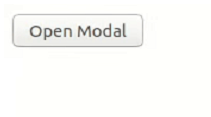
Test the modal by clicking the Open Modal button and make sure it opens and closes as expected.
The final for the modal to work will be ?
Example
<div class="code-mirror  language-javascript" contenteditable="plaintext-only" spellcheck="false" style="outline: none; overflow-wrap: break-word; overflow-y: auto; white-space: pre-wrap;">MyComponent<span class="token punctuation">.</span>js<span class="token operator">:</span>
<span class="token keyword">import</span> React<span class="token punctuation">,</span> <span class="token punctuation">{</span> useState <span class="token punctuation">}</span> <span class="token keyword">from</span> <span class="token string">'react'</span>
<span class="token keyword">import</span> Modal <span class="token keyword">from</span> <span class="token string">'react-modal'</span>
<span class="token keyword">const</span> <span class="token function-variable function">MyComponent</span> <span class="token operator">=</span> <span class="token punctuation">(</span><span class="token punctuation">)</span> <span class="token operator">=></span> <span class="token punctuation">{</span>
   <span class="token keyword">const</span> <span class="token punctuation">[</span>isOpen<span class="token punctuation">,</span> setIsOpen<span class="token punctuation">]</span> <span class="token operator">=</span> <span class="token function">useState</span><span class="token punctuation">(</span><span class="token boolean">false</span><span class="token punctuation">)</span>
   <span class="token keyword">const</span> customStyles <span class="token operator">=</span> <span class="token punctuation">{</span>
      overlay<span class="token operator">:</span> <span class="token punctuation">{</span>
         backgroundColor<span class="token operator">:</span> <span class="token string">'rgba(0, 0, 0, 0.6)'</span>
      <span class="token punctuation">}</span><span class="token punctuation">,</span>
      content<span class="token operator">:</span> <span class="token punctuation">{</span>
         top<span class="token operator">:</span> <span class="token string">'50%'</span><span class="token punctuation">,</span>
         left<span class="token operator">:</span> <span class="token string">'50%'</span><span class="token punctuation">,</span>
         right<span class="token operator">:</span> <span class="token string">'auto'</span><span class="token punctuation">,</span>
         bottom<span class="token operator">:</span> <span class="token string">'auto'</span><span class="token punctuation">,</span>
         marginRight<span class="token operator">:</span> <span class="token string">'-50%'</span><span class="token punctuation">,</span>
         transform<span class="token operator">:</span> <span class="token string">'translate(-50%, -50%)'</span>
      <span class="token punctuation">}</span>
   <span class="token punctuation">}</span>
   <span class="token keyword">return</span> <span class="token punctuation">(</span>
      <span class="token operator"><</span>div<span class="token operator">></span>
         <span class="token operator"><</span>button onClick<span class="token operator">=</span><span class="token punctuation">{</span><span class="token punctuation">(</span><span class="token punctuation">)</span> <span class="token operator">=></span> <span class="token function">setIsOpen</span><span class="token punctuation">(</span><span class="token boolean">true</span><span class="token punctuation">)</span><span class="token punctuation">}</span><span class="token operator">></span>Open Modal<span class="token operator"><</span><span class="token operator">/</span>button<span class="token operator">></span>
         <span class="token operator"><</span>Modal isOpen<span class="token operator">=</span><span class="token punctuation">{</span>isOpen<span class="token punctuation">}</span> onRequestClose<span class="token operator">=</span><span class="token punctuation">{</span><span class="token punctuation">(</span><span class="token punctuation">)</span> <span class="token operator">=></span> <span class="token function">setIsOpen</span><span class="token punctuation">(</span><span class="token boolean">false</span><span class="token punctuation">)</span><span class="token punctuation">}</span> style<span class="token operator">=</span><span class="token punctuation">{</span>customStyles<span class="token punctuation">}</span><span class="token operator">></span>
            <span class="token operator"><</span>h1<span class="token operator">></span>Modal Content<span class="token operator"><</span><span class="token operator">/</span>h1<span class="token operator">></span>
            <span class="token operator"><</span>button onClick<span class="token operator">=</span><span class="token punctuation">{</span><span class="token punctuation">(</span><span class="token punctuation">)</span> <span class="token operator">=></span> <span class="token function">setIsOpen</span><span class="token punctuation">(</span><span class="token boolean">false</span><span class="token punctuation">)</span><span class="token punctuation">}</span><span class="token operator">></span>Close Modal<span class="token operator"><</span><span class="token operator">/</span>button<span class="token operator">></span>
         <span class="token operator"><</span><span class="token operator">/</span>Modal<span class="token operator">></span>
      <span class="token operator"><</span><span class="token operator">/</span>div<span class="token operator">></span>
   <span class="token punctuation">)</span>
<span class="token punctuation">}</span>
<span class="token keyword">export</span> <span class="token keyword">default</span> MyComponent
</div>
Index.js
<div class="code-mirror  language-javascript" contenteditable="plaintext-only" spellcheck="false" style="outline: none; overflow-wrap: break-word; overflow-y: auto; white-space: pre-wrap;"><span class="token keyword">import</span> <span class="token punctuation">{</span> StrictMode <span class="token punctuation">}</span> <span class="token keyword">from</span> <span class="token string">"react"</span><span class="token punctuation">;</span>
<span class="token keyword">import</span> <span class="token punctuation">{</span> createRoot <span class="token punctuation">}</span> <span class="token keyword">from</span> <span class="token string">"react-dom/client"</span><span class="token punctuation">;</span>
<span class="token keyword">import</span> MyComponent <span class="token keyword">from</span> <span class="token string">"./MyComponent"</span><span class="token punctuation">;</span>
<span class="token keyword">const</span> rootElement <span class="token operator">=</span> document<span class="token punctuation">.</span><span class="token function">getElementById</span><span class="token punctuation">(</span><span class="token string">"root"</span><span class="token punctuation">)</span><span class="token punctuation">;</span>
<span class="token keyword">const</span> root <span class="token operator">=</span> <span class="token function">createRoot</span><span class="token punctuation">(</span>rootElement<span class="token punctuation">)</span><span class="token punctuation">;</span>
root<span class="token punctuation">.</span><span class="token function">render</span><span class="token punctuation">(</span>
   <span class="token operator"><</span>StrictMode<span class="token operator">></span>
      <span class="token operator"><</span>MyComponent <span class="token operator">/</span><span class="token operator">></span>
   <span class="token operator"><</span><span class="token operator">/</span>StrictMode<span class="token operator">></span>
<span class="token punctuation">)</span><span class="token punctuation">;</span>
</div>
Output

17K+ Views
