
Article Categories
- All Categories
-
 Data Structure
-
 Networking
-
 RDBMS
RDBMS
-
 Operating System
-
 Java
Java
-
 MS Excel
-
 iOS
iOS
-
 HTML
HTML
-
 CSS
CSS
-
 Android
-
 Python
-
 C Programming
-
 C++
C++
-
 C#
C#
-
 MongoDB
-
 MySQL
MySQL
-
 Javascript
-
 PHP
PHP
-
 Economics & Finance
How to change the color of gridlines of a ggplot2 graph in R?
To change the color of gridlines of a ggplot2 graph in R, we can use theme function with panel.grid.major and panel.grid.minor arguments where we can set the minor and major gridlines color of the plot panel to desired color.
To understand how it can be done, check out the below Example.
Example
Following snippet creates a sample data frame −
x<-sample(0:9,20,replace=TRUE)
y<-sample(0:9,20,replace=TRUE)
df<-data.frame(x,y)
df
The following dataframe is created
  x y
1  5 7
2  7 5
3  1 5
4  5 9
5  6 4
6  2 5
7  4 2
8  7 7
9  6 7
10 7 2
11 1 3
12 2 9
13 7 0
14 6 9
15 5 7
16 6 6
17 5 9
18 5 7
19 4 5
20 4 4
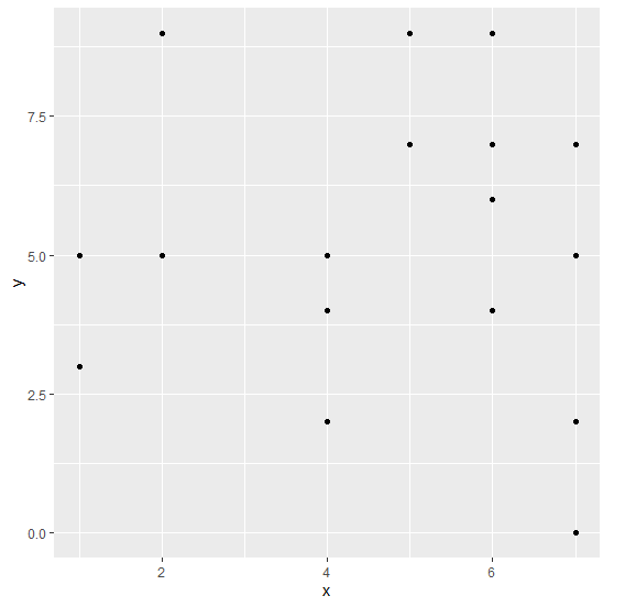
To load ggplot2 package and create scatterplot between x and y on the above created data frame, add the following code to the above snippet −
x<-sample(0:9,20,replace=TRUE)
y<-sample(0:9,20,replace=TRUE)
df<-data.frame(x,y)
library(ggplot2)
ggplot(df,aes(x,y))+geom_point()
Output
If you execute all the above given snippets as a single program, it generates the following Output −
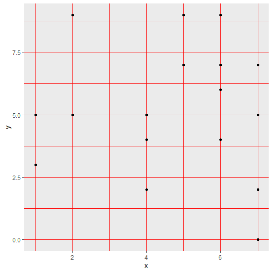
To create scatterplot between x and y with red color gridlines on the above created data frame, add the following code to the above snippet −
x<-sample(0:9,20,replace=TRUE)
y<-sample(0:9,20,replace=TRUE)
df<-data.frame(x,y)
library(ggplot2)
ggplot(df,aes(x,y))+geom_point()+theme(panel.grid.major=element_line(colour="re
d"),panel.grid.minor=element_line(colour="red"))
Output
If you execute all the above given snippets as a single program, it generates the following Output −

4K+ Views
