
Article Categories
- All Categories
-
 Data Structure
-
 Networking
-
 RDBMS
RDBMS
-
 Operating System
-
 Java
Java
-
 MS Excel
-
 iOS
iOS
-
 HTML
HTML
-
 CSS
CSS
-
 Android
-
 Python
-
 C Programming
-
 C++
C++
-
 C#
C#
-
 MongoDB
-
 MySQL
MySQL
-
 Javascript
-
 PHP
PHP
-
 Economics & Finance
Create a Scatter Chart using Recharts in ReactJS
In this article, are going to explore the Rechart JS Library and implement it in a React application to watch how they are used. Rechart Libraries are specifically used for creating different types of charts over the React Application. Charts that can be built using this library are Line Charts, Bar Charts, Pie Charts, Scatter Charts, etc.
In this tutorial, we will create a Scatter Chart with the required data points and display the same to the user. The dataset for the scatter chart will have x and y coordinate details. Then with the help of a Cartesian product, we will create a grid over both axes. Finally, the Scatter points will be drawn over the Cartesian grid.
Creating the React Application
1. Create a simple react application by using the following command −
npx create-react-app myApp
2. Once the application is created, traverse to its application folder.
cd myApp
3. Now, install the recharts module to be used inside the ReactJS application using the below command.
npm install --save recharts
Once the Library is added we can use this library for creating the pie charts.
Example 1
In this example, we create a Simple Scatter Chart using the Recharts dependency. Please dd the below code in your app.js file to configure the pie chart in your React Application.
# app.js
import React from "react";
import {
ScatterChart,
Scatter,
XAxis,
YAxis,
CartesianGrid,
Tooltip
} from "recharts";
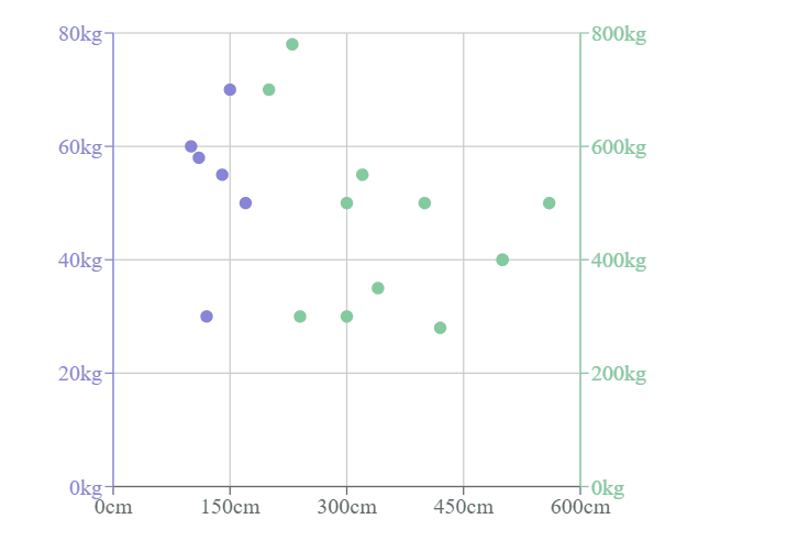
const data01 = [
{ x: 100, y: 60, z: 200 },
{ x: 120, y: 30, z: 260 },
{ x: 170, y: 50, z: 400 },
{ x: 140, y: 55, z: 280 },
{ x: 150, y: 70, z: 500 },
{ x: 110, y: 58, z: 200 }
];
const data02 = [
{ x: 300, y: 300, z: 200 },
{ x: 400, y: 500, z: 260 },
{ x: 200, y: 700, z: 400 },
{ x: 340, y: 350, z: 280 },
{ x: 560, y: 500, z: 500 },
{ x: 230, y: 780, z: 200 },
{ x: 500, y: 400, z: 200 },
{ x: 300, y: 500, z: 260 },
{ x: 240, y: 300, z: 400 },
{ x: 320, y: 550, z: 280 },
{ x: 500, y: 400, z: 500 },
{ x: 420, y: 280, z: 200 }
];
export default class Example extends React.Component {
render() {
return (
<ScatterChart
width={500}
height={400}
margin={{
top: 20,
right: 20,
bottom: 20,
left: 20
}} >
<CartesianGrid />
<XAxis type="number" dataKey="x" name="height" unit="cm" />
<YAxis
yAxisId="left"
type="number"
dataKey="y"
name="weight"
unit="kg"
stroke="#8884d8"/>
<YAxis
yAxisId="right"
type="number"
dataKey="y"
name="weight"
unit="kg"
orientation="right"
stroke="#82ca9d"/>
<Tooltip cursor={{ strokeDasharray: "3 3" }} />
<Scatter yAxisId="left" name="A school" data={data01} fill="#8884d8" />
<Scatter yAxisId="right" name="A school" data={data02} fill="#82ca9d" />
</ScatterChart>
);
}
}
Output
On successful execution of the above program, it will produce a scatter chart. When you hover over the points, it shows the height (in cm) and weight (in kg).

2K+ Views
