
Article Categories
- All Categories
-
 Data Structure
-
 Networking
-
 RDBMS
RDBMS
-
 Operating System
-
 Java
Java
-
 MS Excel
-
 iOS
iOS
-
 HTML
HTML
-
 CSS
CSS
-
 Android
-
 Python
-
 C Programming
-
 C++
C++
-
 C#
C#
-
 MongoDB
-
 MySQL
MySQL
-
 Javascript
-
 PHP
PHP
-
 Economics & Finance
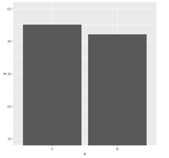
Change the starting point of bars in bar plot for a ggplot2 graph in R.
To change the starting point of bars in bar plot for a ggplot2 graph in R, we can use coord_cartesian function of ggplot2 package with ylim argument where we can change the starting and ending point for the bar plot values.
Check out the Example given below to understand how it can be done.
Example
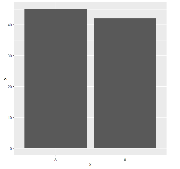
Following snippet creates a sample data frame −
x<-c("A","B")
y<-c(45,42)
df<-data.frame(x,y)
df
The following dataframe is created
  x  y
1 A 45
2 B 42
To load ggplot2 package and create bar plot for data in df on the above created data frame, add the following code to the above snippet −
x<-c("A","B")
y<-c(45,42)
df<-data.frame(x,y)
library(ggplot2)
ggplot(df,aes(x,y))+geom_bar(stat="identity")
Output
If you execute all the above given snippets as a single program, it generates the following Output −
To create bar plot for data in df with bar starting at 10 on the above created data frame, add the following code to the above snippet −
x<-c("A","B")
y<-c(45,42)
df<-data.frame(x,y)
library(ggplot2)
ggplot(df,aes(x,y))+geom_bar(stat="identity")+coord_cartesian(ylim=c(10,50))
Output
If you execute all the above given snippets as a single program, it generates the following Output −

2K+ Views
