- Biopython - Home
- Biopython - Introduction
- Biopython - Installation
- Creating Simple Application
- Biopython - Sequence
- Advanced Sequence Operations
- Sequence I/O Operations
- Biopython - Sequence Alignments
- Biopython - Overview of BLAST
- Biopython - Entrez Database
- Biopython - PDB Module
- Biopython - Motif Objects
- Biopython - BioSQL Module
- Biopython - Population Genetics
- Biopython - Genome Analysis
- Biopython - Phenotype Microarray
- Biopython - Plotting
- Biopython - Cluster Analysis
- Biopython - Machine Learning
- Biopython - Testing Techniques
Biopython Resources
Biopython - Plotting
This chapter explains about how to plot sequences. Before moving to this topic, let us understand the basics of plotting.
Plotting
Matplotlib is a Python plotting library which produces quality figures in a variety of formats. We can create different types of plots like line chart, histograms, bar chart, pie chart, scatter chart, etc.
pyLab is a module that belongs to the matplotlib which combines the numerical module numpy with the graphical plotting module pyplot.Biopython uses pylab module for plotting sequences. To do this, we need to import the below code −
>>>import pylab
Before importing, we need to install the matplotlib package using pip command with the command given below −
(myenv) D:\biopython\myenv>pip3 install matplotlib
Sample Input File - plot.fasta
Create a sample file named plot.fasta in your Biopython directory and add the following changes −
>gi|2765658|emb|Z78533.1|CIZ78533 C.irapeanum 5.8S rRNA gene and ITS1 and ITS2 DNA
CGTAACAAGGTTTCCGTAGGTGAACCTGCGGAAGGATCATTGATGAGACCGTGGAATAAACGATCGAGTG
AATCCGGAGGACCGGTGTACTCAGCTCACCGGGGGCATTGCTCCCGTGGTGACCCTGATTTGTTGTTGGG
CCGCCTCGGGAGCGTCCATGGCGGGTTTGAACCTCTAGCCCGGCGCAGTTTGGGCGCCAAGCCATATGAA
AGCATCACCGGCGAATGGCATTGTCTTCCCCAAAACCCGGAGCGGCGGCGTGCTGTCGCGTGCCCAATGA
ATTTTGATGACTCTCGCAAACGGGAATCTTGGCTCTTTGCATCGGATGGAAGGACGCAGCGAAATGCGAT
AAGTGGTGTGAATTGCAAGATCCCGTGAACCATCGAGTCTTTTGAACGCAAGTTGCGCCCGAGGCCATCA
GGCTAAGGGCACGCCTGCTTGGGCGTCGCGCTTCGTCTCTCTCCTGCCAATGCTTGCCCGGCATACAGCC
AGGCCGGCGTGGTGCGGATGTGAAAGATTGGCCCCTTGTGCCTAGGTGCGGCGGGTCCAAGAGCTGGTGT
TTTGATGGCCCGGAACCCGGCAAGAGGTGGACGGATGCTGGCAGCAGCTGCCGTGCGAATCCCCCATGTT
GTCGTGCTTGTCGGACAGGCAGGAGAACCCTTCCGAACCCCAATGGAGGGCGGTTGACCGCCATTCGGAT
GTGACCCCAGGTCAGGCGGGGGCACCCGCTGAGTTTACGC

>gi|2765657|emb|Z78532.1|CCZ78532 C.californicum 5.8S rRNA gene and ITS1 and ITS2 DNA
CGTAACAAGGTTTCCGTAGGTGAACCTGCGGAAGGATCATTGTTGAGACAACAGAATATATGATCGAGTG
AATCTGGAGGACCTGTGGTAACTCAGCTCGTCGTGGCACTGCTTTTGTCGTGACCCTGCTTTGTTGTTGG
GCCTCCTCAAGAGCTTTCATGGCAGGTTTGAACTTTAGTACGGTGCAGTTTGCGCCAAGTCATATAAAGC
ATCACTGATGAATGACATTATTGTCAGAAAAAATCAGAGGGGCAGTATGCTACTGAGCATGCCAGTGAAT
TTTTATGACTCTCGCAACGGATATCTTGGCTCTAACATCGATGAAGAACGCAGCTAAATGCGATAAGTGG
TGTGAATTGCAGAATCCCGTGAACCATCGAGTCTTTGAACGCAAGTTGCGCTCGAGGCCATCAGGCTAAG
GGCACGCCTGCCTGGGCGTCGTGTGTTGCGTCTCTCCTACCAATGCTTGCTTGGCATATCGCTAAGCTGG
CATTATACGGATGTGAATGATTGGCCCCTTGTGCCTAGGTGCGGTGGGTCTAAGGATTGTTGCTTTGATG
GGTAGGAATGTGGCACGAGGTGGAGAATGCTAACAGTCATAAGGCTGCTATTTGAATCCCCCATGTTGTT
GTATTTTTTCGAACCTACACAAGAACCTAATTGAACCCCAATGGAGCTAAAATAACCATTGGGCAGTTGA
TTTCCATTCAGATGCGACCCCAGGTCAGGCGGGGCCACCCGCTGAGTTGAGGC

>gi|2765656|emb|Z78531.1|CFZ78531 C.fasciculatum 5.8S rRNA gene and ITS1 and ITS2 DNA
CGTAACAAGGTTTCCGTAGGTGAACCTGCGGAAGGATCATTGTTGAGACAGCAGAACATACGATCGAGTG
AATCCGGAGGACCCGTGGTTACACGGCTCACCGTGGCTTTGCTCTCGTGGTGAACCCGGTTTGCGACCGG
GCCGCCTCGGGAACTTTCATGGCGGGTTTGAACGTCTAGCGCGGCGCAGTTTGCGCCAAGTCATATGGAG
CGTCACCGATGGATGGCATTTTTGTCAAGAAAAACTCGGAGGGGCGGCGTCTGTTGCGCGTGCCAATGAA
TTTATGACGACTCTCGGCAACGGGATATCTGGCTCTTGCATCGATGAAGAACGCAGCGAAATGCGATAAG
TGGTGTGAATTGCAGAATCCCGCGAACCATCGAGTCTTTGAACGCAAGTTGCGCCCGAGGCCATCAGGCT
AAGGGCACGCCTGCCTGGGCGTCGTGTGCTGCGTCTCTCCTGATAATGCTTGATTGGCATGCGGCTAGTC
TGTCATTGTGAGGACGTGAAAGATTGGCCCCTTGCGCCTAGGTGCGGCGGGTCTAAGCATCGGTGTTCTG
ATGGCCCGGAACTTGGCAGTAGGTGGAGGATGCTGGCAGCCGCAAGGCTGCCGTTCGAATCCCCCGTGTT
GTCGTACTCGTCAGGCCTACAGAAGAACCTGTTTGAACCCCCAGTGGACGCAAAACCGCCCTCGGGCGGT
GATTTCCATTCAGATGCGACCCCAGTCAGGCGGGCCACCCGTGAGTAA

>gi|2765655|emb|Z78530.1|CMZ78530 C.margaritaceum 5.8S rRNA gene and ITS1 and ITS2 DNA
CGTAACAAGGTTTCCGTAGGTGAACCTGCGGAAGGATCATTGTTGAAACAACATAATAAACGATTGAGTG
AATCTGGAGGACTTGTGGTAATTTGGCTCGCTAGGGATATCCTTTTGTGGTGACCATGATTTGTCATTGG
GCCTCATTGAGAGCTTTCATGGCGGGTTTGAACCTCTAGCACGGTCCAGTTTGCACCAAGGTATATAAAG
AATCACCGATGAATGACATTATTGCCCCACACAACGTCGGAGGTGTGGTGTGTTAATGTTCATTCCAATG
AATTTTGATGACTCTCGGCAGACGGATATCTTGACTCTTGCATCGATGAAGAACGCACCGAAATGTGATA
AGTGGTGTGAATTGCAGAATCCCGTGAACCATCGAGTCTTTGAACGCAAGTTGCGCCCGAGGCCATCAGG
CTAAGGGCACGCCTGCCTGGGCGTCGTATGTTTTATCTCTCCTTCCAATGCTTGTCCAGCATATAGCTAG
GCCATCATTGTGTGGATGTGAAAGATTGGCCCCTTGTGCTTAGGTGCGGTGGGTCTAAGGATATGTGTTT
TGATGGTCTGAAACTTGGCAAGAGGTGGAGGATGCTGGCAGCCGCAAGGCTATTGTTTGAATCCCCCATG
TTGTCATGTTTGTTGGGCCTATAGAACAACTTGTTTGGACCCTAATTAAGGCAAAACAATCCTTGGGTGG
TTGATTTCCAATCAGATGCGACCCCAGTCAGGGGGCCACCCCAT

>gi|2765654|emb|Z78529.1|CLZ78529 C.lichiangense 5.8S rRNA gene and ITS1 and ITS2 DNA
ACGGCGAGCTGCCGAAGGACATTGTTGAGACAGCAGAATATACGATTGAGTGAATCTGGAGGACTTGTGG
TTATTTGGCTCGCTAGGGATTTCCTTTTGTGGTGACCATGATTTGTCATTGGGCCTCATTGAGAGCTTTC
ATGGCGGGTTTGAACCTCTAGCACGGTGCAGTTTGCACCAAGGTATATAAAGAATCACCGATGAATGACA
TTATTGTCAAAAAAGTCGGAGGTGTGGTGTGTTATTGGTCATGCCAATGAATTGTTGATGACTCTCGCCG
AGGGATATCTTGGCTCTTGCATCGATGAAGAATCCCACCGAAATGTGATAAGTGGTGTGAATTGCAGAAT
CCCGTGAACCATCGAGTCTTTGAACGCAAGTTGCGCCCGAGGCCATCAGGCTAAGGGCACGCCTGCCTGG
GCGTCGTATGTTTTATCTCTCCTTCCAATGCTTGTCCAGCATATAGCTAGGCCATCATTGTGTGGATGTG
AAAGATTGGCCCCTTGTGCTTAGGTGCGGTGGGTCTAAGGATATGTGTTTTGATGGTCTGAAACTTGGCA
AGAGGTGGAGGATGCTGGCAGCCGCAAGGCTATTGTTTGAATCCCCCATGTTGTCATATTTGTTGGGCCT
ATAGAACAACTTGTTTGGACCCTAATTAAGGCAAAACAATCCTTGGGTGGTTGATTTCCAATCAGATGCG
ACCCCAGTCAGCGGGCCACCAGCTGAGCTAAAA
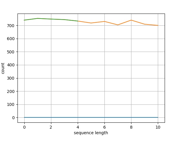
Line Plot
Now, let us create a simple line plot for the above fasta file.
Step 1 − Import SeqIO module to read fasta file.
>>> from Bio import SeqIO
Step 2 − Parse the input file.
>>> records = [len(rec) for rec in SeqIO.parse("plot.fasta", "fasta")]
>>> len(records)
>>> len(records)
5
>>> max(records)
753
>>> min(records)
733
Step 3 − Let us import pylab module.
>>> import pylab
Step 4 − Configure the line chart by assigning x and y axis labels.
>>> pylab.xlabel("sequence length")
Text(0.5, 0, 'sequence length')

>>> pylab.ylabel("count")
Text(0, 0.5, 'count')
>>>
Step 5 − Configure the line chart by setting grid display.
>>> pylab.grid()
Step 6 − Draw simple line chart by calling plot method and supplying records as input.
>>> pylab.plot(records)
[<matplotlib.lines.Line2D object at 0x000001CDC4BC6D80>]
Step 7 − Finally save the chart using the below command.
>>> pylab.savefig("lines.png")
Result
After executing the above command, you could see the following image saved in your Biopython directory.
Histogram Chart
A histogram is used for continuous data, where the bins represent ranges of data. Drawing histogram is same as line chart except pylab.plot. Instead, call hist method of pylab module with records and some custum value for bins (5). The complete coding is as follows −
Step 1 − Import SeqIO module to read fasta file.
>>> from Bio import SeqIO
Step 2 − Parse the input file.
>>> records = [len(rec) for rec in SeqIO.parse("plot.fasta", "fasta")]
>>> len(records)
5
>>> max(records)
753
>>> min(records)
733
Step 3 − Let us import pylab module.
>>> import pylab
Step 4 − Configure the line chart by assigning x and y axis labels.
>>> pylab.xlabel("sequence length")
Text(0.5, 0, 'sequence length')

>>> pylab.ylabel("count")
Text(0, 0.5, 'count')
>>>
Step 5 − Configure the line chart by setting grid display.
>>> pylab.grid()
Step 6 − Draw simple line chart by calling plot method and supplying records as input.
>>> pylab.hist(records,bins=5)
array([1., 1., 1., 1., 1.]), array([733., 737., 741., 745., 749., 753.]), <BarContainer object of 5 artists>)
>>>
Step 7 − Finally save the chart using the below command.
>>> pylab.savefig("hist.png")
Result
After executing the above command, you could see the histogram saved in your Biopython directory.
